Mastering Abstract Branding: A Journey Beyond the Ordinary

02/23/2025

Branding / Brand Strategy

Abstract branding pushes the boundaries of traditional marketing, crafting unique and evocative identities that leave a lasting impression beyond the ordinary.

In a crowded branding world, being ordinary is not an option; it’s a necessity. While regular branding is about clear and direct communication of a brand’s identity and offerings, abstract branding is about the art and the concept. We will get into the nitty gritty of abstract branding, what it is, how it’s different from regular branding, and what its unique characteristics are.

Sloane Avery
Play IconPause Icon
0:00
0:00

What is Abstract Branding?

Creative professionals gather around a table covered with color swatches and printed materials, actively collaborating on a design or branding project.
Business professionals engage in conversation in front of a wall filled with bright pink and orange sticky notes, suggesting a brainstorming or workshop session.
Overhead shot of a person using a laptop surrounded by teammates, reviewing visual design assets and digital branding concepts.
No items found.

Abstract branding is a creative strategy that uses non-representational visuals, symbols and abstract logo designs to convey a brand’s personality and soul.

Unlike traditional branding which uses recognisable images and straightforward messages, abstract branding thrives on ambiguity and interpretation. It evokes emotions, sparks imagination and creates a unique identity that sets a brand or company apart from the competition.

The Key Differences Between Abstract Branding and Regular Branding

1. Interpretation vs Directness

  • Abstract: Abstract branding is open to interpretation. It uses artistic elements that allow the consumer to make their own connections and meaning. This can lead to a deeper more personal relationship with the brand.
  • Regular: Regular branding aims for clarity and directness. It uses explicit visuals and messages so the consumer can understand immediately what the brand offers and stands for.

2. Visual Style

  • Abstract: The visual elements in abstract branding are often artistic and non-representational. They may be shapes, colours and patterns that evoke feelings rather than depict concrete images.
  • Regular: Regular branding uses literal and recognisable images, icons and symbols directly related to the brand’s products or services.

3. Messaging

  • Abstract: Messaging is philosophical and conceptual. It’s about values, emotions and experiences rather than product attributes.
  • Regular: Clear and direct messaging that highlights the benefits and features of the products or services.

4. Application

  • Abstract: Used by high-end, luxury or artistic brands that want to create an exclusive and premium image.
  • Regular: Used by brands that want broad recognition and straightforward communication, consumer goods, technology and services.

Strategies for Implementing Branding

Abstract branding requires thought and strategy. Here’s how:

Build a Conceptual Foundation

Philosophy and Values: What are the core philosophies and values your brand stands for? These should be the reasons behind your brand guidelines and abstract branding.

Storytelling: Create a brand story that can be told through abstract visuals and messaging. The story should resonate with your target audience.

Design with Purpose

Abstract Logos and Symbols: Create a logo that’s open to interpretation but memorable. Use shapes, lines and colours that evoke the desired emotions, ideas and associations.

Artistic Visuals: Incorporate artistic elements into your branding materials, such as website design, packaging and marketing collateral. These should be aligned to reflect your brand’s conceptual foundation.

Emotional Connection

Feelings: Use visuals and messaging that evoke specific feelings in your audience. This will create a stronger and longer-lasting connection to your brand.

Interactive Elements: Consider incorporating interactive elements into your branding, such as immersive website experiences or AR features, to deepen engagement.

Use Ambiguity

Open to Interpretation: Leave room for different types of interpretation in your branding. This will make your brand more interesting and encourage consumers to engage more.

Subtle Messaging: Use subtle and layered messaging that makes consumers think and feel rather than just understand. This will create a deeper brand experience.

Consistent but Adaptable

Consistency: Be consistent in your abstract branding across all touchpoints to build recognition and credibility.

Evolution: Let your abstract form of branding evolve over time as your brand’s philosophy, values and the world change.

Want to learn more about brand platforms, Brand Strategy and Brand Identity? Keep reading!

If you need help with your companies brand strategy and identity, contact us for a free custom quote.

Why Choose Abstract Branding?

Abstract branding has many benefits that can make it a great strategy for some brands, great example:

  • Differentiation: In a market full of literal and straightforward branding, abstract branding stands out as unique and cool.
  • Emotional Connection: By focusing on emotions and values abstract branding can create a deeper more personal relationship with the audience.
  • Flexibility: Abstract elements can be versatile and adaptable, gives you creative freedom across multiple marketing channels.
  • Memorability: The uniqueness and artistic nature of abstract branding makes a brand more memorable.

Abstract Branding Examples

  • Fashion Brands: High-end fashion brands like Chanel and Prada use abstract logos and artistic visuals to create a sense of luxury and exclusivity.
  • Technology Startups: Some tech startups use abstract branding to convey innovation and futurism with futuristic design and conceptual messaging.
  • Luxury Goods: Brands like Montblanc and Rolls-Royce use abstract branding to be symbols of luxury.

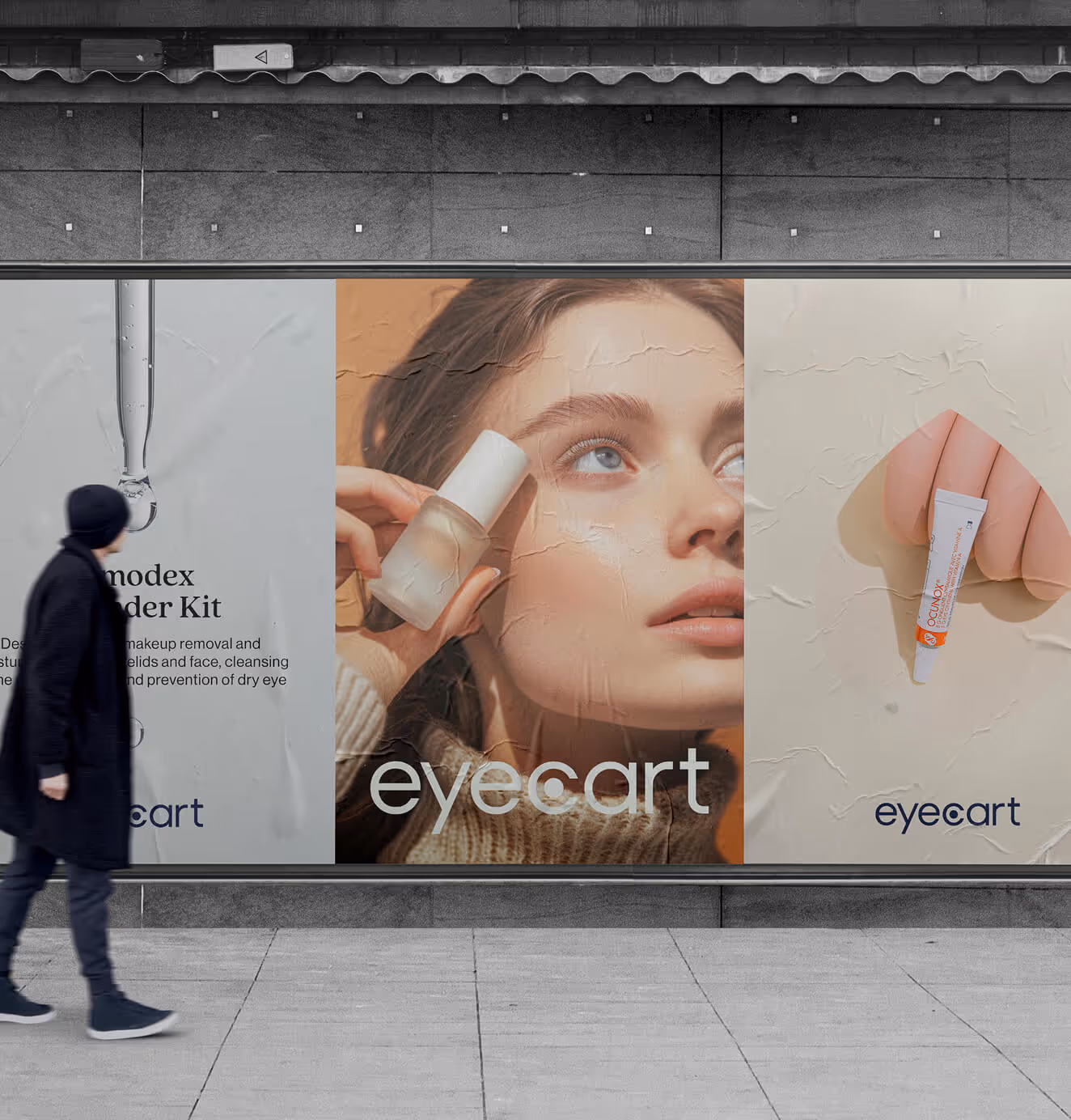
Abstract Branding Logos

Abstract branding uses minimalism, minimal font, symbolism and multiple abstract icon design techniques to communicate a brands values and ethos without using imagery or literal messaging.

Abstract Logos

Abstract logos are a collection of designs that use non-literal elements to represent a brand’s identity. These logos use geometric shapes, lines and colours to create a visual language that communicates the brand’s values and message. Abstraction allows for multiple interpretations, so the logo has a dynamic and multi-faceted character. Abstract logos are perfect for industries where innovation, creativity and forward-thinking are key. By not using literal representations, these logos can capture the essence of a brand in a modern and sophisticated way that appeals to many.

A Few Logo Variations

Having a few logo variations is key to maintaining brand consistency across different platforms and mediums. These variations can include different colour schemes, simplified versions for smaller sizes and alternate layouts for different applications.

For example a brand might have a primary logo for use on their website and marketing materials, a monochrome version for merchandise and a bright colors compact icon for social media profiles.

By using multiple concepts and having a range of logo variations brands can ensure their visual identity is recognisable and cohesive no matter where it appears. This is crucial for effective brand communication in a multi channel world.

Illustrative Abstract Logos

Illustrative abstract logos combine the creativity of illustration with the conceptual nature of abstract design. These logos often feature intricate, abstract line work throughout, detailed patterns and symbolic imagery that together create a visually interesting and engaging representation of a brand.

Illustrative abstract logos are perfect for brands and designers that want to convey artistry and individuality. They can tell a story or evoke a feeling through their design elements so are memorable and impactful. This type of abstract logo is suited to brands in the arts, fashion and creative industries, where visual impact, expression and originality are key.

The Psychology Behind Abstract Branding: Colors, Shapes, and Words

Abstract branding uses the psychology of design elements like colours, shapes and words to create a unique and emotional brand identity.

These elements are key to shaping consumer perception and building a deep connection with potential customers of the brand.

Color Psychology in Branding

Red: Conveys energy, passion, and action; attracts attention (Source: Aventive Studio).

Blue: Linked to trust, dependability, and confidence; used by brands like Facebook and LinkedIn (Source: Fiverr).

Green: Associated with growth, calm, and health; often used by nature and wellness brands (Source: Aventive Studio).

Yellow and Orange: Evoke happiness, optimism, and friendliness; used to appear approachable and cheerful (Source: HubSpot).

Shape Psychology in Branding

Circles and Ovals: Community, unity, warmth. Abstract branding can use these shapes in creating fluid, dynamic compositions to convey inclusivity and harmony, especially in icons and abstract illustration (Source: Crowdspring).

Squares and Rectangles: Stability, reliability. Even in abstract branding, these shapes can create a sense of order and trust through structured yet artistic layouts, abstract line work and multiple abstract design techniques (Source: Crowdspring).

Triangles: Power, dynamism. Abstract brands can use triangles in different orientations and combinations to create a sense of movement and innovation through abstract logo design and abstract line art (Source: Fiverr).

Word Psychology in Branding

Brand Name Connotations: The phonetic and semantic qualities of a brand name can have a big impact on abstract branding. Names with soft sounds can create a calming effect, names with hard consonants like K can create strength and resilience.

Slogans and Taglines: In abstract branding the words in slogans and taglines should create emotions and make you think. Simple and effective language can create a lasting impact, like Nike’s “Just Do It” but for the abstract brand (Source: Wix).

Conclusion: Navigating the Future of Abstract Branding

In abstract branding, the combination right color palette of colours, shapes and words is more than just a design choice; it’s a tool to build an emotional and memorable brand.

By understanding and applying the psychology behind these elements, brands can create a unique and sticky presence that speaks to their audience.

Abstract branding is a flexible and adaptable identity that can move with the cultural and consumer landscape, it’s a powerful tool for forward thinking brands. Adding abstract logos, icons and line art to the brand’s visual identity will make it more emotional and different in the market.

An image of the author Sloane Avery

Sloane Avery

As entrepreneurs, they’ve built and scaled their own ventures from zero to millions. They’ve been in the trenches, navigating the chaos of high-growth phases, making the hard calls, and learning firsthand what actually moves the needle. That’s what makes us different—we don’t just “consult,” we know what it takes because we’ve done it ourselves.

Want to learn more about brand platform?

If you need help with your companies brand strategy and identity, contact us for a free custom quote.

We do great work. And get great results.

Eyecart
Made eye care feel modern, then marketed it like a DTC darling—with the results to match.

91%
Increase in conversion rate

46%
Increase in AOV

READ MORE
A woman with long brown hair smiles playfully with her tongue out while balancing two jars of Acknowledge gummies, labeled “Sleep Support” and “Focus Support,” on her head.
A large outdoor billboard reads "Discover the ease of keeping your eyes healthy," featuring Eyecart branding and product images, set against a black background.
Multiple laptop screens showcase Eyecart’s e-commerce website displaying eye care products, with one laptop centered among overlapping screen views.
A person walks past a row of large street posters featuring Eyecart branding, product shots, and a close-up of a woman applying eye care serum.
Acknowledge
Where brand thinking meets performance execution.

+493%
Revenue growth

+15x
Increase in conversion rate

READ MORE
A jar of Acknowledge Focus Support Gummies sits on moss inside a clear glass dome in a lush green forest.
Flat lay of Acknowledge branding materials, including a product catalog of CBD oils, a green notebook, and a bottle of tincture with a dropper.
A collection of Acknowledge gummy jars in different colors (Focus, Performance, Sleep, Mood) placed on moss with bees, a caterpillar, and a green moth.
Acknowledge CBD oil bottle with its dropper lifted above, golden oil dripping into the bottle.
Paren
Powering clarity in a fast-moving category.

$3M
Seed capital raised

READ MORE
White electric car driving past a large digital billboard in a modern city displaying the glowing Paren logo in blue and purple.
Close-up of a person wearing a suit and lanyard with a blue Paren ID badge, featuring the brand’s logo and gradient background.
Large outdoor billboard with the Paren logo and colorful gradient design, featuring the tagline “Powering Electric Mobility” against a clear sky.
Futuristic Paren logo glowing in blue and purple gradients, with the silhouette of a person and a sleek car with illuminated headlights in the foreground.