Revitalizing Toronto's Engineering Community: A Journey through the TMUES Rebranding

What We Did
Logo Design
Brand Identity
Brand Bible
Creative
Toronto Metropolitan University (TMU), formerly known as Ryerson University, underwent a name change in recent years. As a result, many clubs and societies affiliated with the university followed suit, including the Ryerson Engineering Student Society (RESS), which changed its name to Metropolitan Undergraduate Engineering Society (MUES) to align with the university's new name. MUES is a student-led organization founded in 1988 that represents over 4500 full-time undergraduate engineering students at TMU. The society's primary objective is to provide high-quality co-curricular programming throughout the academic year, including academic, athletic, social, charitable, and career-focused events. In this case study, we explore the rebranding journey of MUES, completed by The Branded Agency, to showcase the society's revitalized identity and its impact on the TMU engineering community.
The Project Brief: Toronto Metropolitan University (TMU)
MUES wanted to give their brand a facelift and approached us, The Branded Agency, to bring their vision to life. They were on a mission to showcase their newly updated name and create a modern image that would be the envy of all their peers. With such an exciting brief, our team was thrilled to get to work and create something amazing.
We took inspiration from the iconic imagery and classic design of universities, but we knew we had to add a contemporary twist to set MUES apart from the crowd. So, we got creative and played around with simple geometric shapes to design a brand that was modern, timeless, and friendly.
Our team wanted the new logo and brand identity to be minimalistic and adaptable to fit a variety of platforms and applications. The result was a sleek, uncomplicated design that perfectly captures the essence of MUES.
With our team's expertise, we were able to deliver a brand image that truly represents MUES's values and mission. The rebranding was not only visually appealing but also helped MUES to create a strong and memorable identity that resonates with their audience.

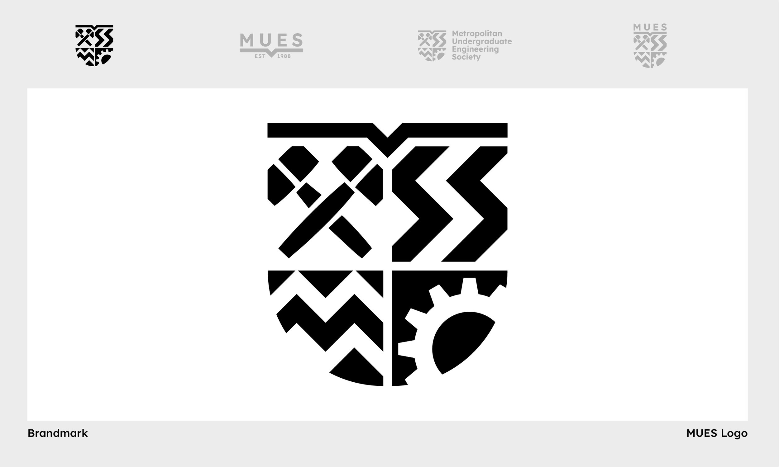
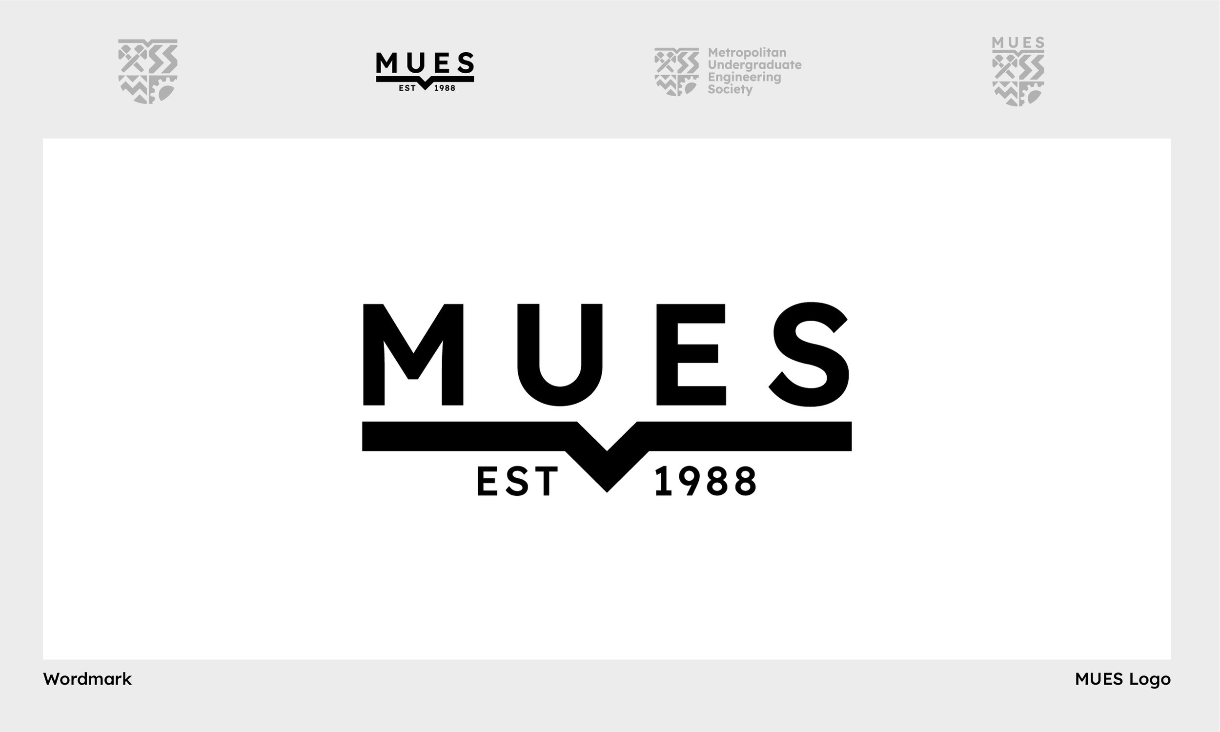
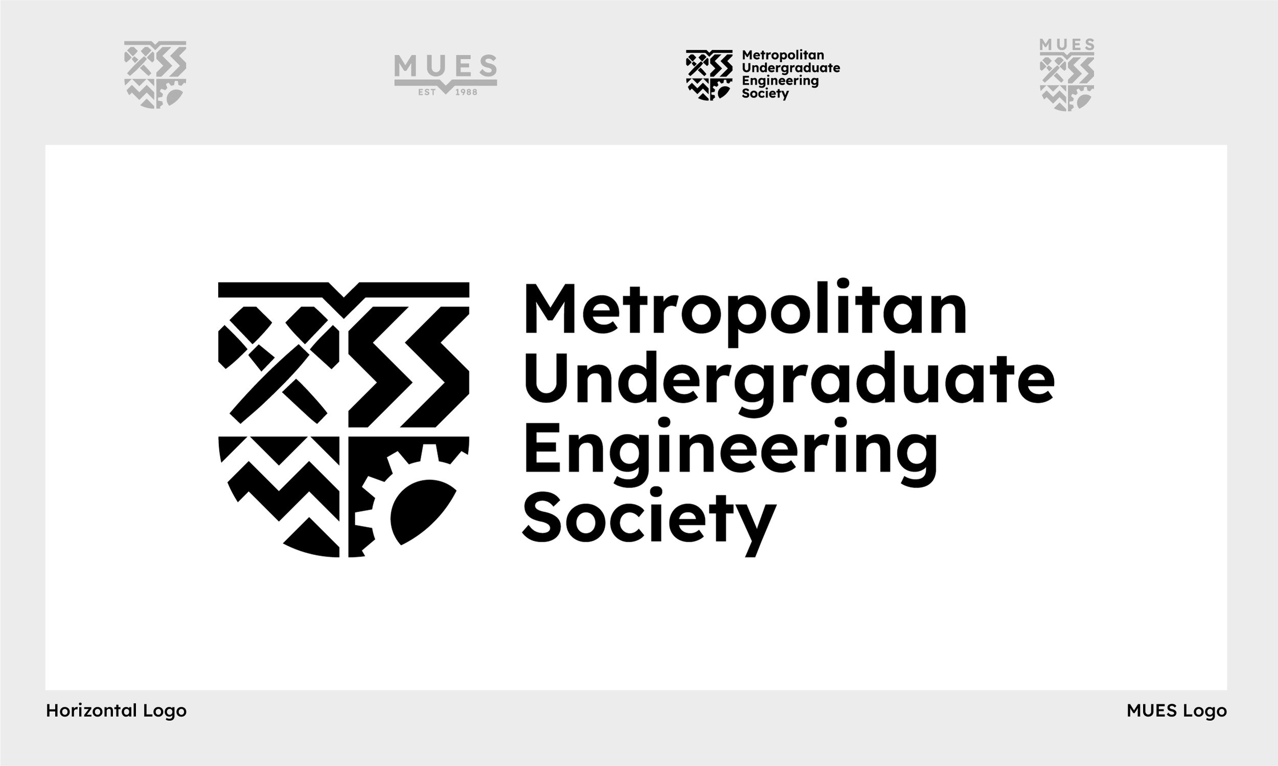
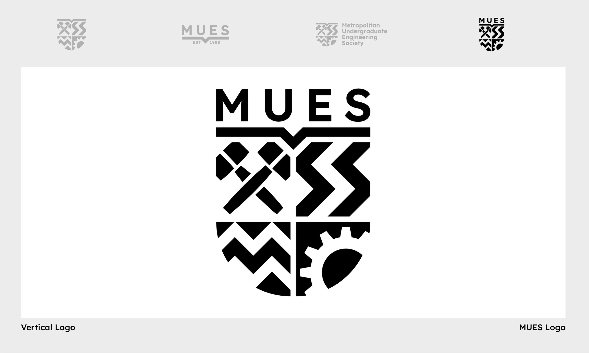
Logo Design
Our team at The Branded Agency took a meticulous approach when it came to designing the new logo for MUES. We recognized the importance of maintaining some continuity with the previous logo and wanted to ensure that we incorporated some elements from it into the new design. Therefore, we made sure to take into account the previous icons and re-incorporate them into the newly designed logo.
To give the logo a contemporary twist, we opted for a modern take on a classic design. We created a shield emblem using simple shapes and lines that created negative space quadrants within the emblem design. This approach not only gave the logo a clean and sophisticated look but also made it easily recognizable and memorable.
The wordmark also received a modern upgrade, using a minimal and clean geometric sans-serif typeface. The font choice added to the overall modern and friendly brand image that we wanted to convey.
We recognized the importance of ensuring that the logo design was adaptable for various sizes and applications. The logo was designed with scalability in mind, so it could be applied to different mediums without losing its visual impact. Our team went the extra mile to ensure that the logo could be adapted for various applications, including digital and print mediums.
With this innovative and adaptable logo design, MUES was ready to make a statement and showcase their new and modern identity. The result was a brand image that was not only visually appealing but also effectively communicated MUES's mission and values.
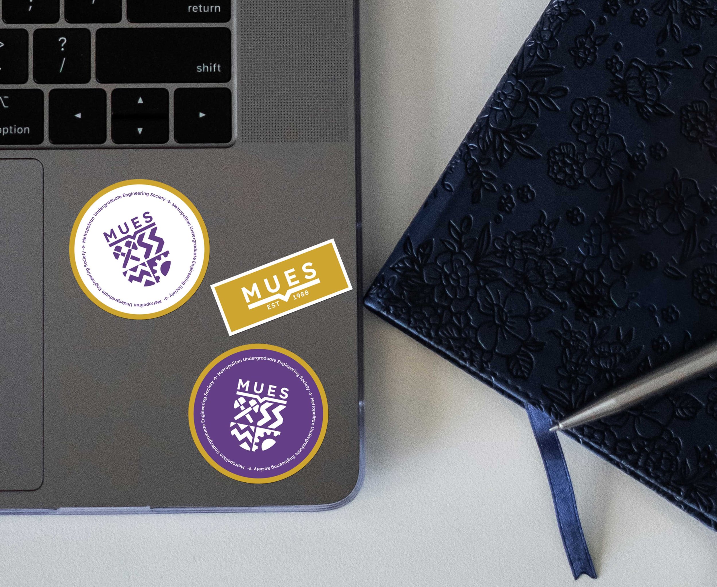
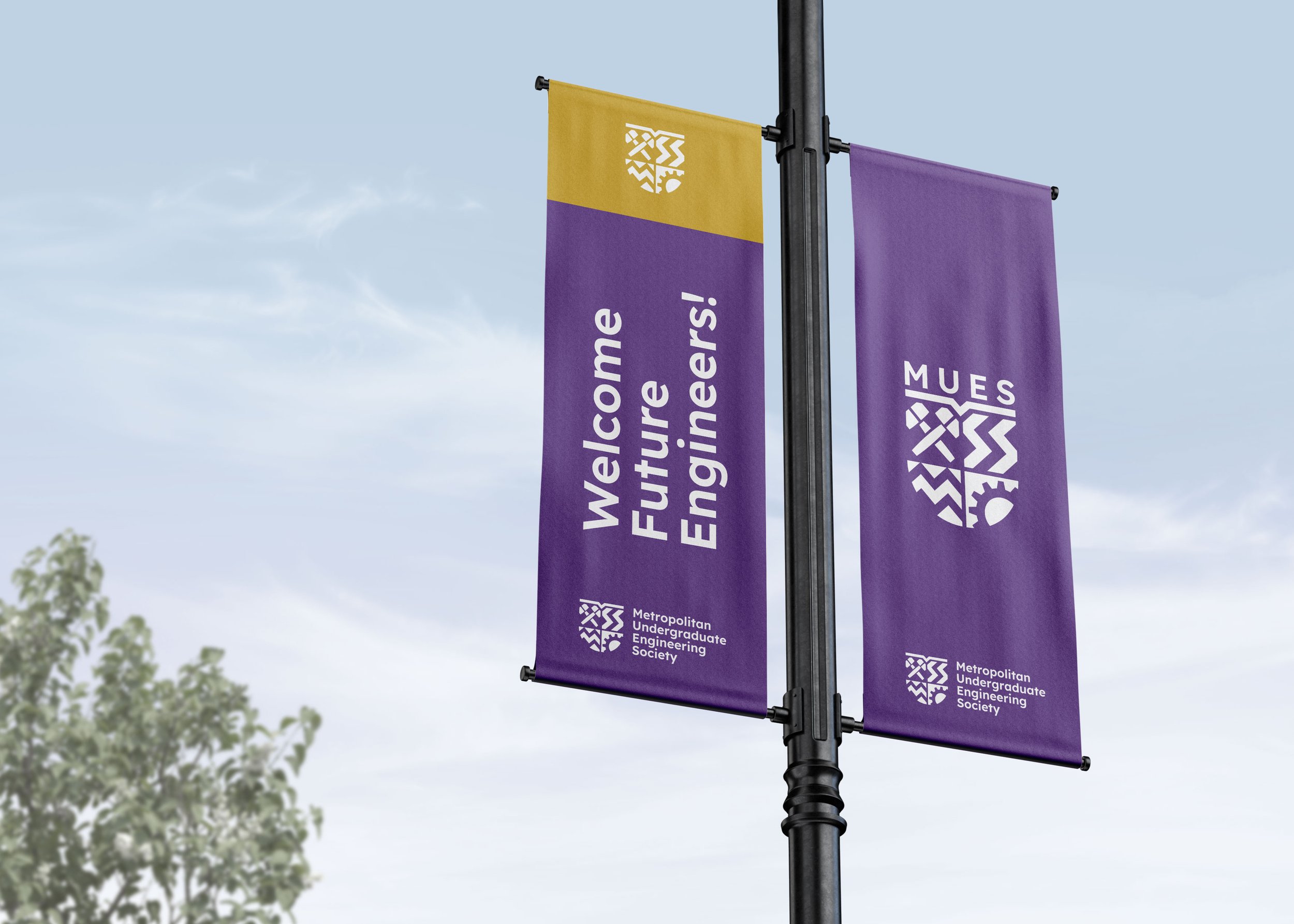
Brand Elements
In addition to the main logo, MUES also had various brand elements for different sections and products within the society. Our team recognized the importance of creating a cohesive brand image and wanted to ensure that all brand elements aligned with the new logo and overall brand identity.
We noticed that the previous emblems used RESS typography and imagery, which needed updating to align with the new MUES brand identity. We took on the challenge of modernizing the emblems to create more coherent and recognizable brand elements.
We used a similar approach for the emblems as we did for the main logo, using simple shapes and lines to create a clean and modern design. The updated emblems were designed to be more versatile and adaptable to different applications, just like the main logo.
Our team also focused on consistency when it came to typography and color schemes, ensuring that all brand elements followed the same guidelines. This approach not only gave MUES a consistent and professional look but also made the brand elements easily recognizable.
The result was a set of updated brand elements that aligned with the new MUES brand identity, adding to the overall cohesiveness and professionalism of the brand image. These brand elements were versatile, adaptable, and could be applied to different sections and products within the society, creating a unified and consistent brand image across all platforms.


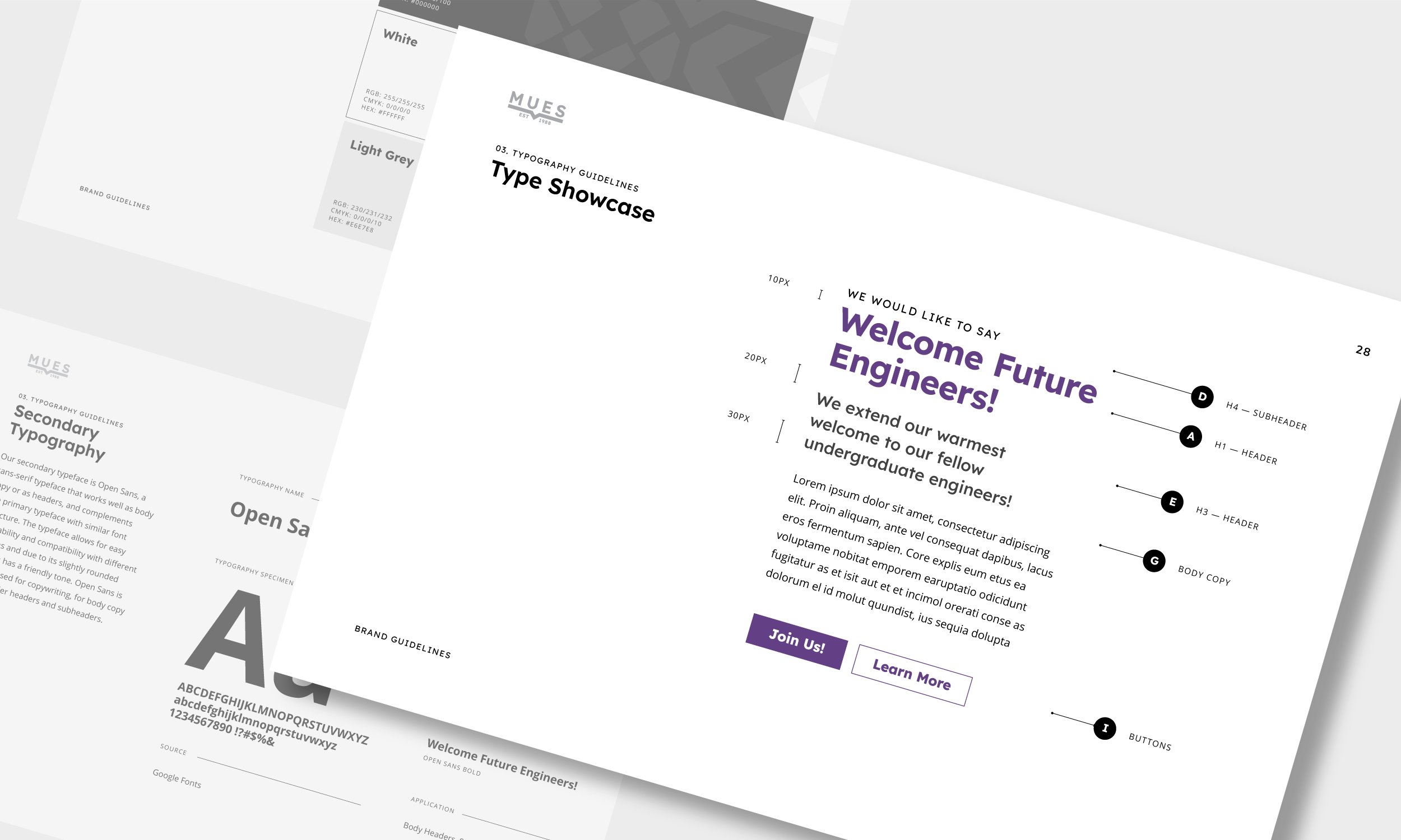
Brand Guidelines
At The Branded Agency, we understand the importance of creating a strong brand image, and the role that brand guidelines play in achieving that. Therefore, we created a comprehensive brand guideline for MUES to ensure that the brand identity was consistent and cohesive across all platforms.
The brand guideline included various elements, including logo guidelines, a color palette, typography, photography, and more. Each element was carefully considered and chosen to align with the brand's tone and values.
The logo guidelines section of the brand guideline provided clear and concise instructions on how to use the logo in different settings, ensuring that it remained recognizable and consistent across all mediums. The color palette section provided guidance on the colors that were to be used in various applications, ensuring consistency in branding across all platforms.
The typography section provided guidance on the fonts that should be used in different materials, such as posters, flyers, and other print and digital media. The photography section provided guidance on the style and quality of images to be used, ensuring that they aligned with the brand's tone and values.
The brand guideline was an extension of the brand identity and was designed with the same tone and values in mind. It was created to be easy to understand and use, providing a clear set of rules and guidelines for anyone using MUES's brand elements.
The result was a comprehensive brand guideline that helped solidify the brand identity of MUES, ensuring consistency and cohesiveness across all platforms. By following the guidelines, MUES was able to maintain a professional and recognizable brand image, which effectively communicated their mission and values.