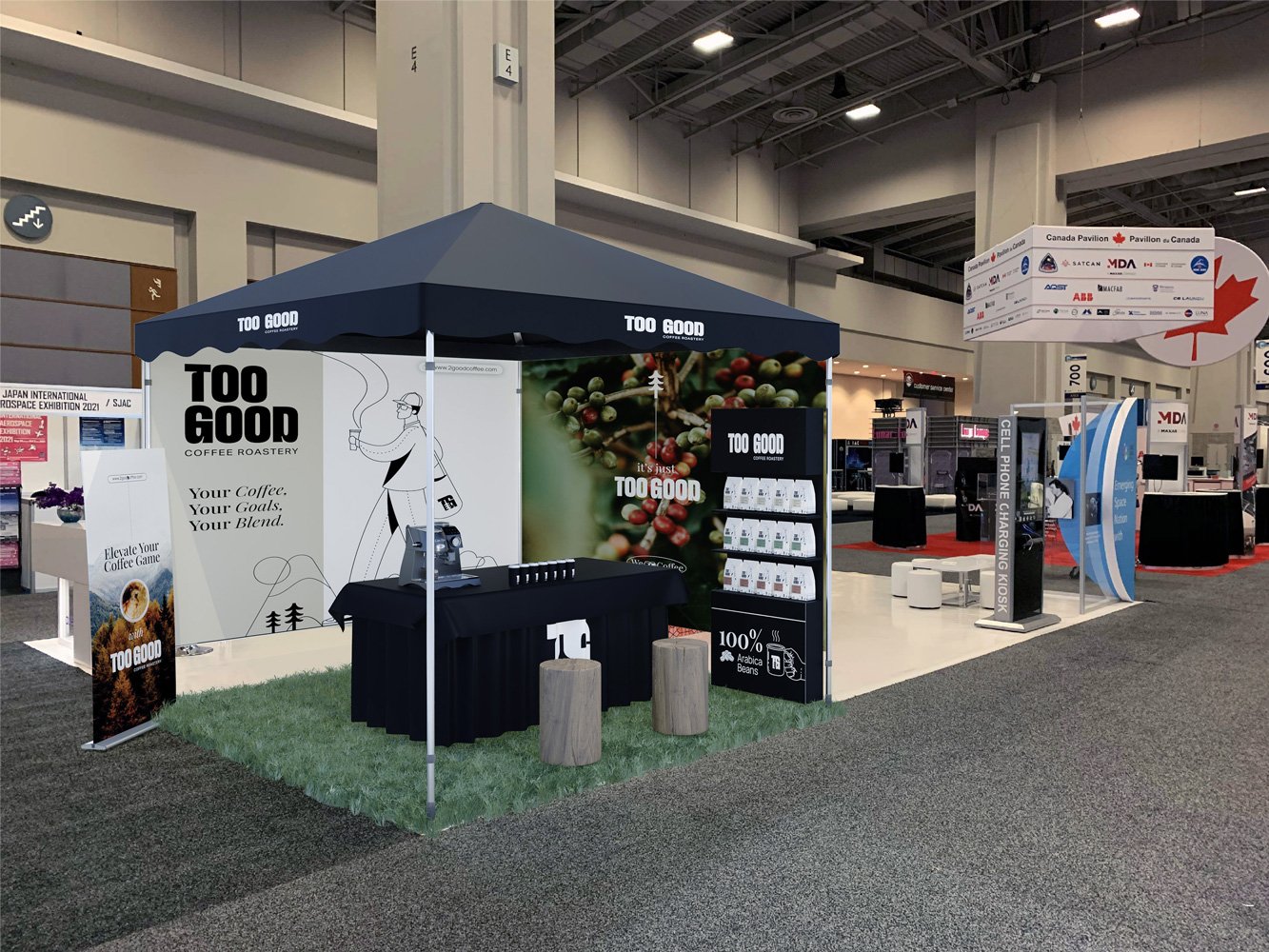
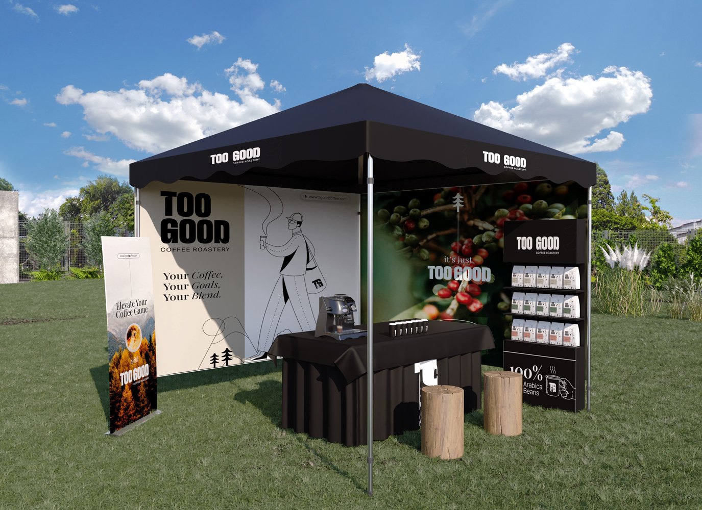
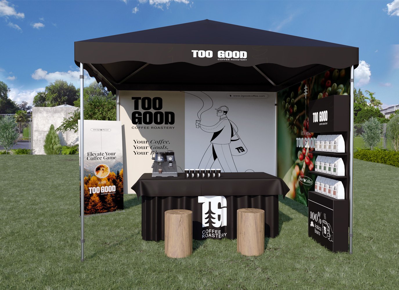
TOO GOOD Coffee Roastery
Branding, Packaging Design and Positioning for TOO GOOD
A brand that goes beyond merely serving excellent coffee; it's about nurturing a sense of togetherness and fostering meaningful connections.
TOO GOOD actively blends the concepts of connection and adventure into their brand ethos, utilizing coffee as a medium to unite people. The founder, Steve, self-professed as a coffee nerd, turned his obsession into the ultimate coffee experience, where every cup is Too Good to be true. His journey began not just with a love for drinking coffee, but with an insatiable curiosity about every aspect of it - from the meticulous selection of beans to the artistry of brewing.
Our main goal was to create a brand concept and identity where we were able to incorporate Vancouver's vibrant coffee culture, drawing inspiration from the city's enthusiasm for making the most of each day and their shared passion for adventure, and the journey of the coffee nerd behind the brew, that began in the lush coffee fields around the globe, where he developed a profound respect for the art of coffee.
Welcome to the rebranding of TOO GOOD Coffee, a brand tailored for adventurous individuals who value the simplicity of preparing a great cup of coffee and are constantly on the go.
Brand Positioning
Logo Design
Brand Identity
Packaging
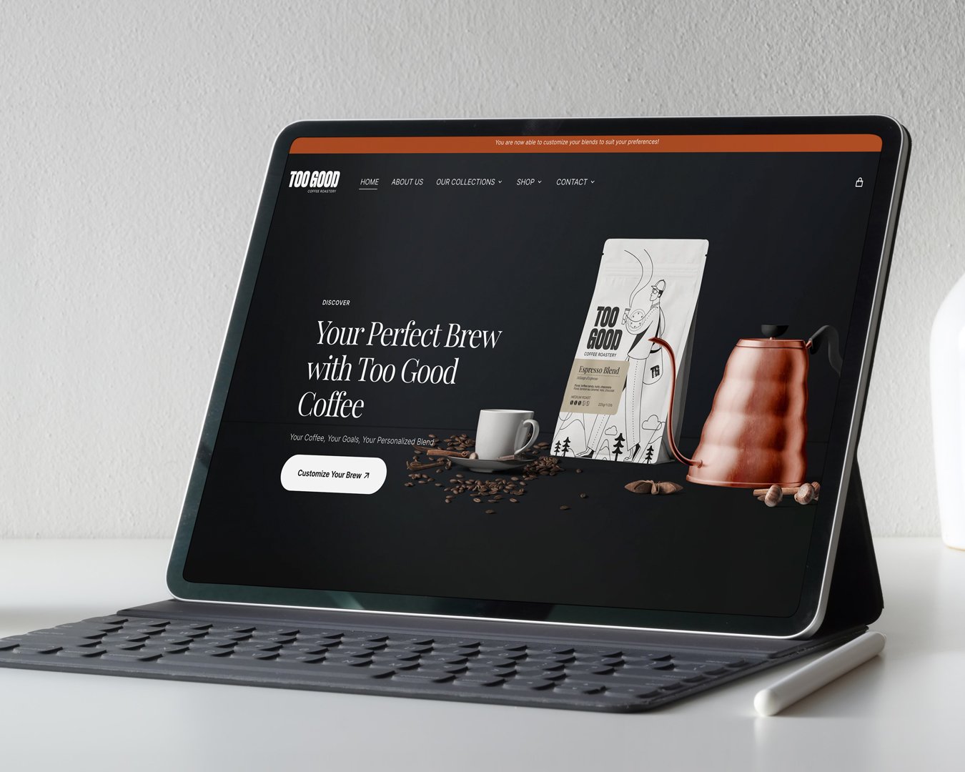
Website
Print Marketing Materials
Photoshoot Creative Direction
Social Media Strategy and Content Creation
What We Did
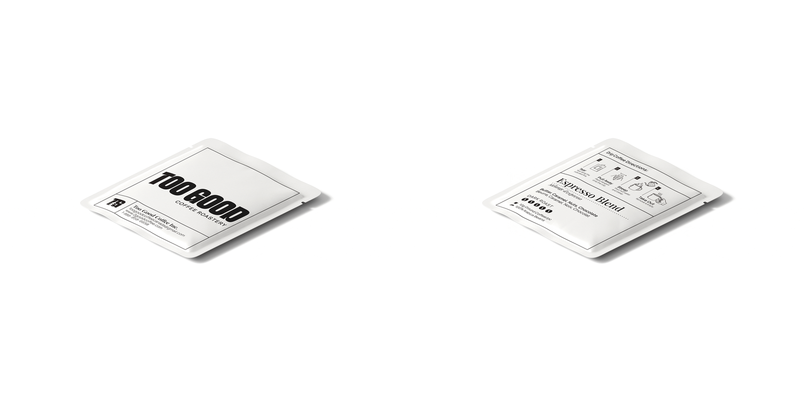
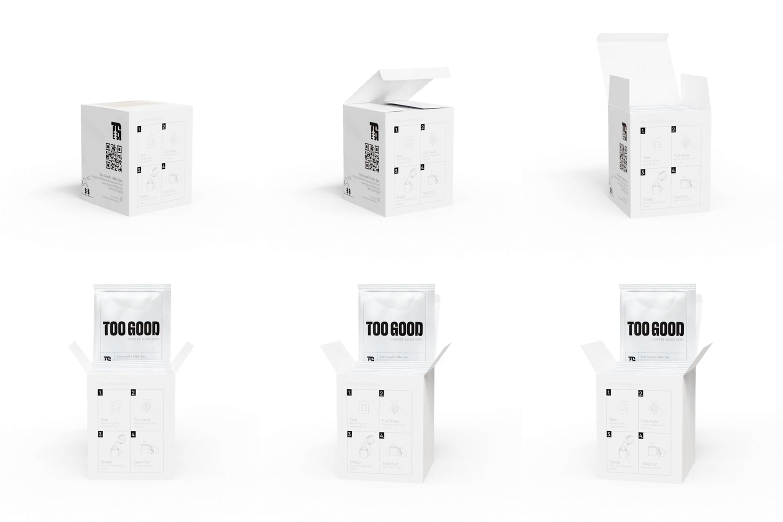
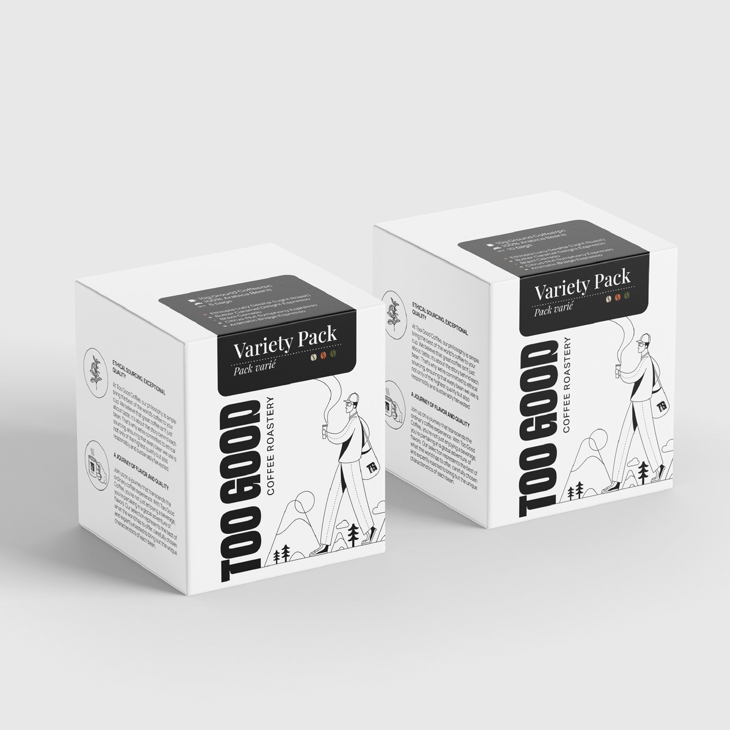
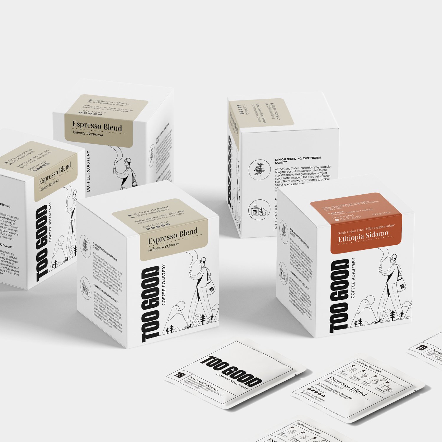
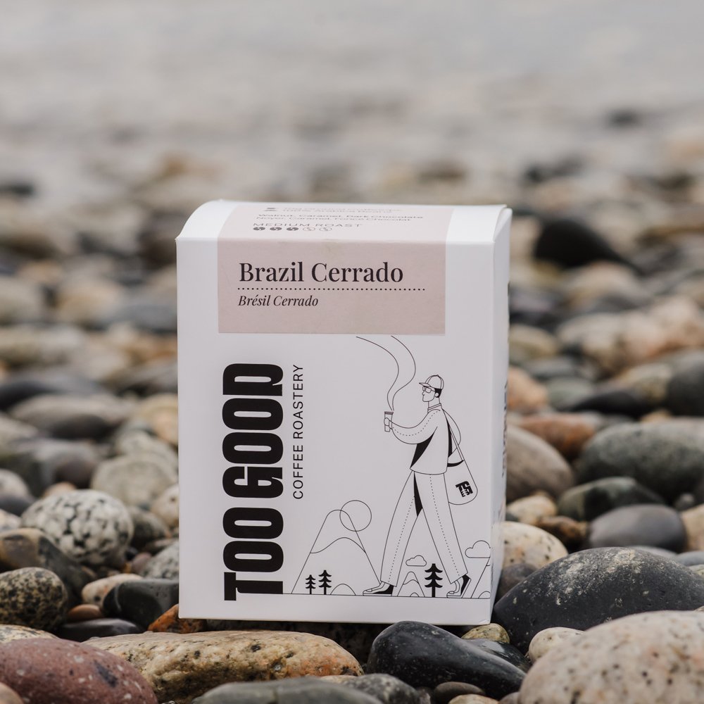
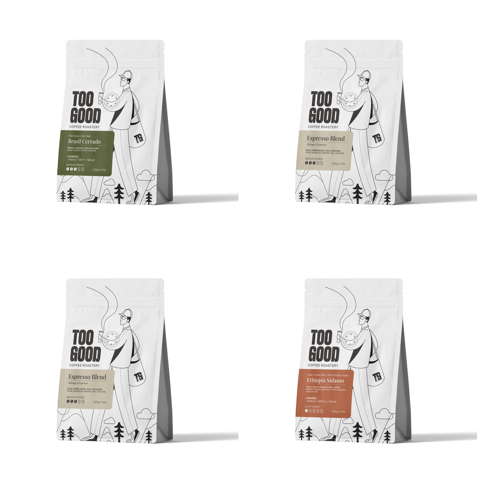
The East Van Nerd Meets North Van Nature
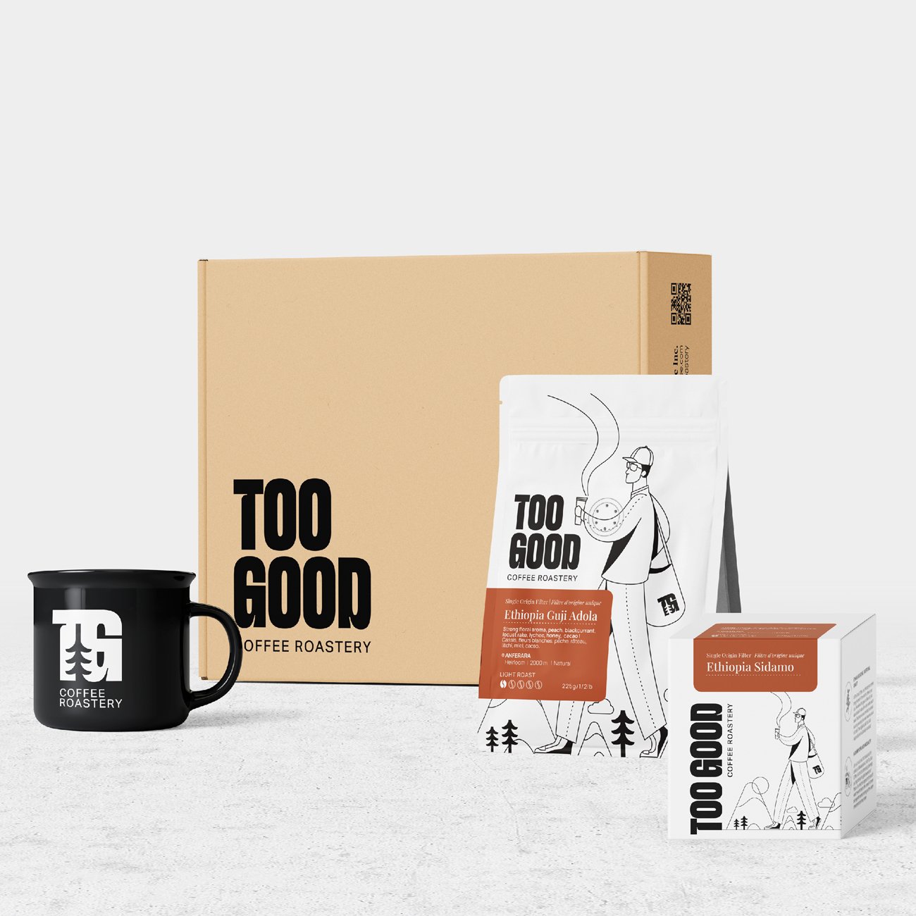
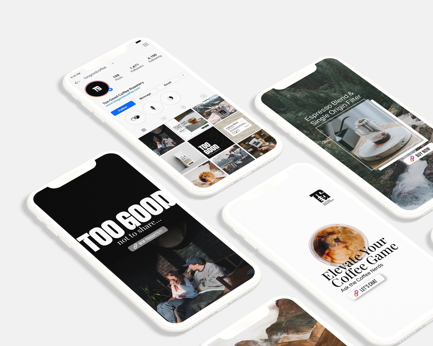
Inspired by this concept we merged visual elements that capture the hipster/nerd culture of East Vancouver with the stunning wilderness of North Vancouver. We feature images showcasing nature and the products set against outdoor backdrops, highlighting how TOO GOOD coffee perfectly enhances adventurous outdoor experiences. This unique blend of visuals communicates the expertise and nerdiness while also evoking the aspirational allure of adventure, offering a distinct narrative about Vancouver.
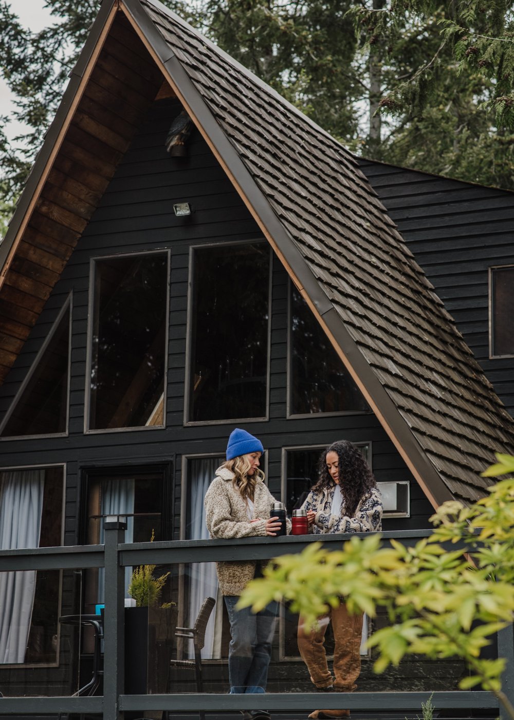
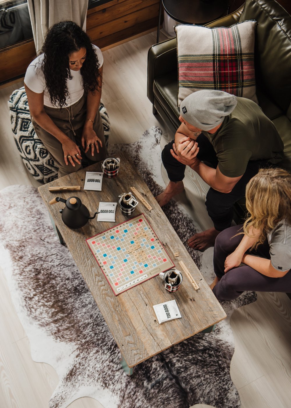
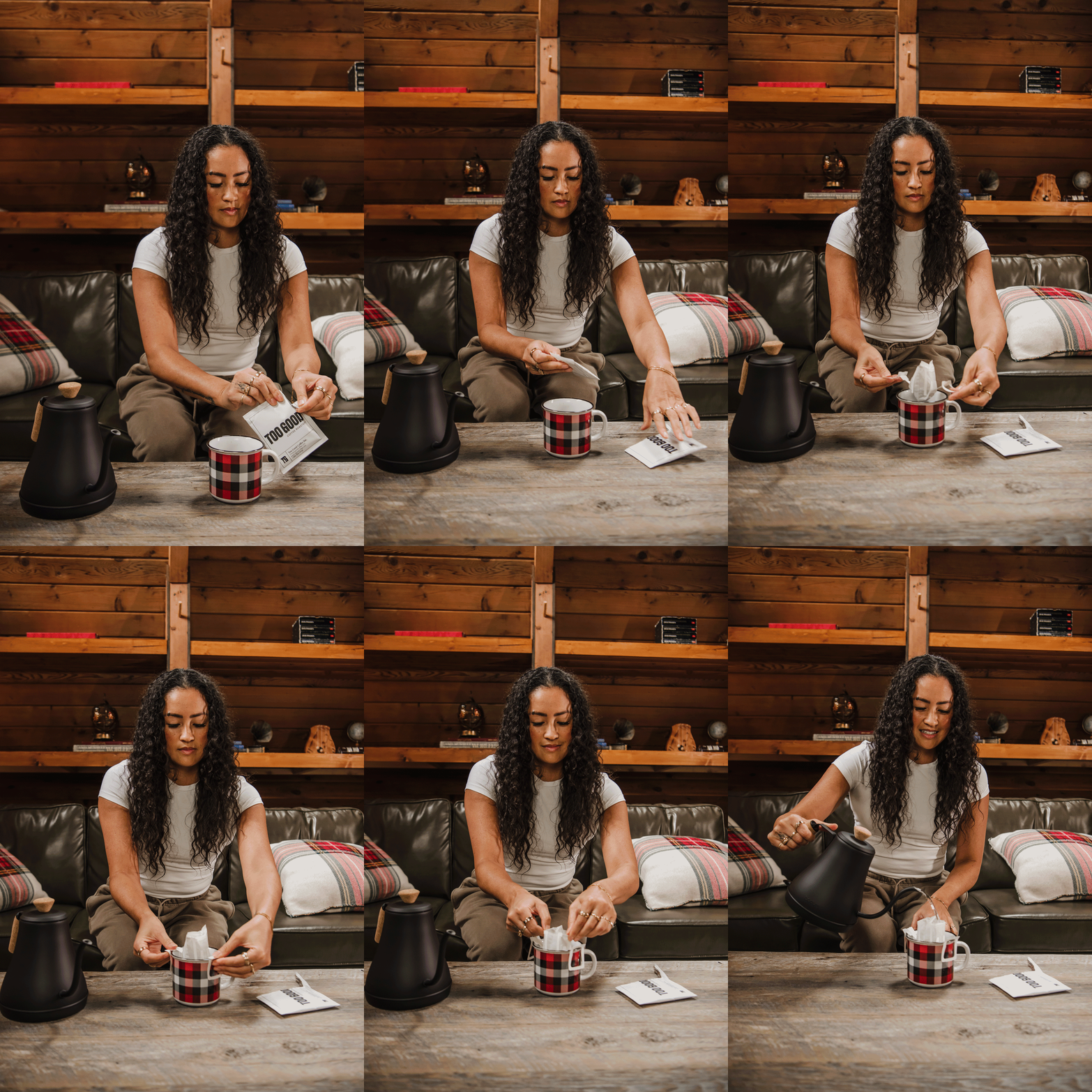
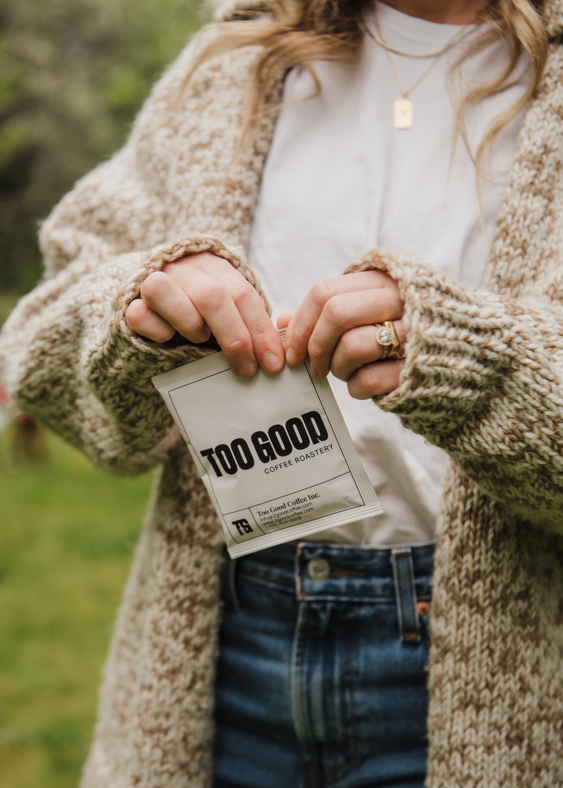
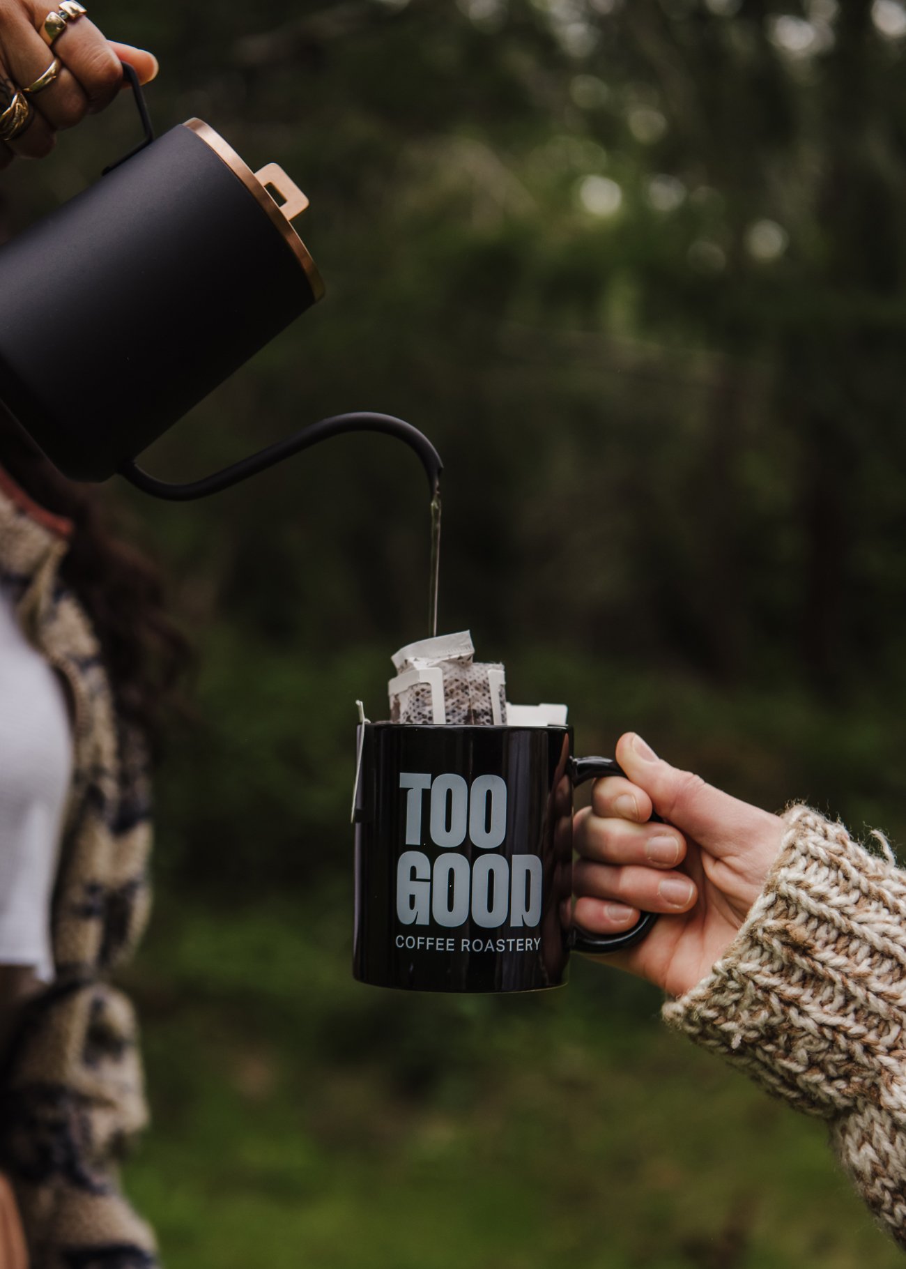
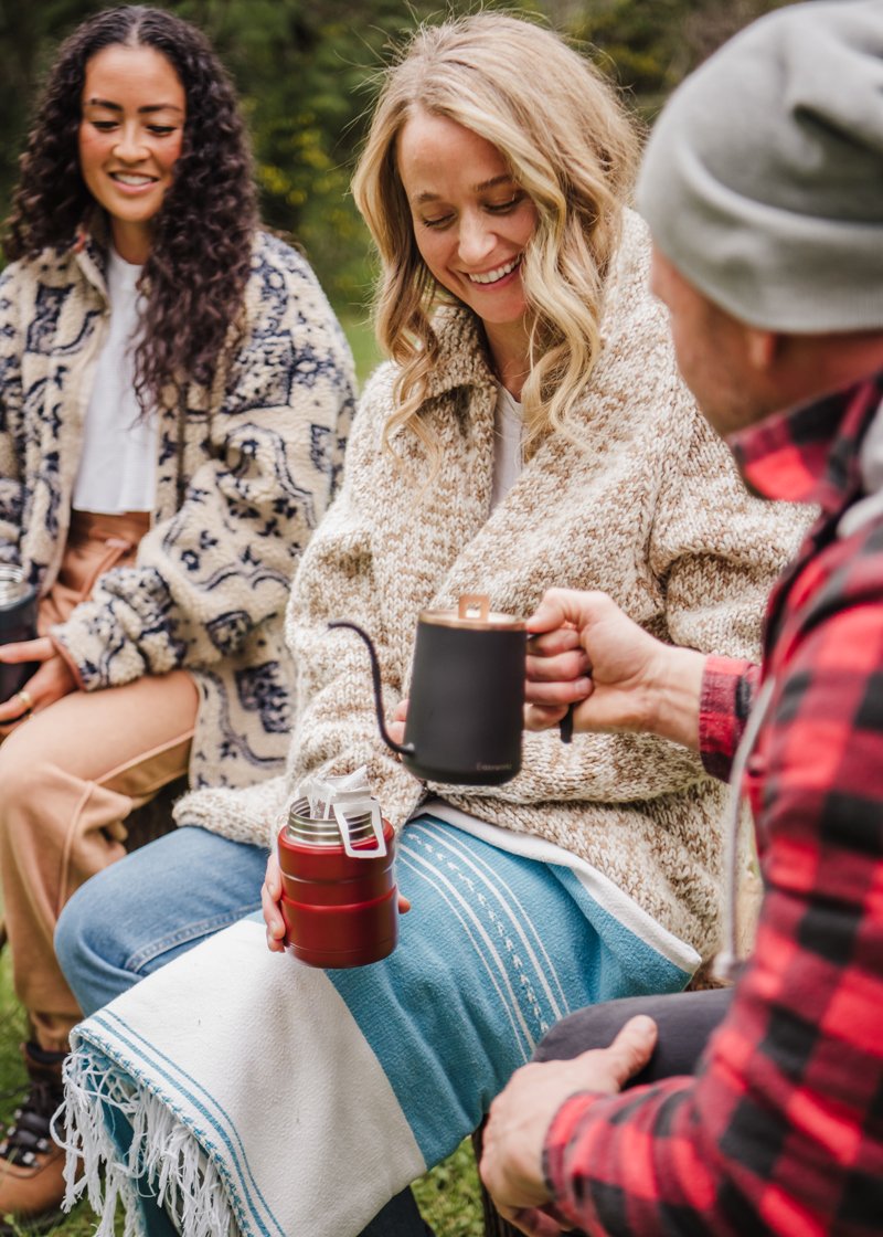
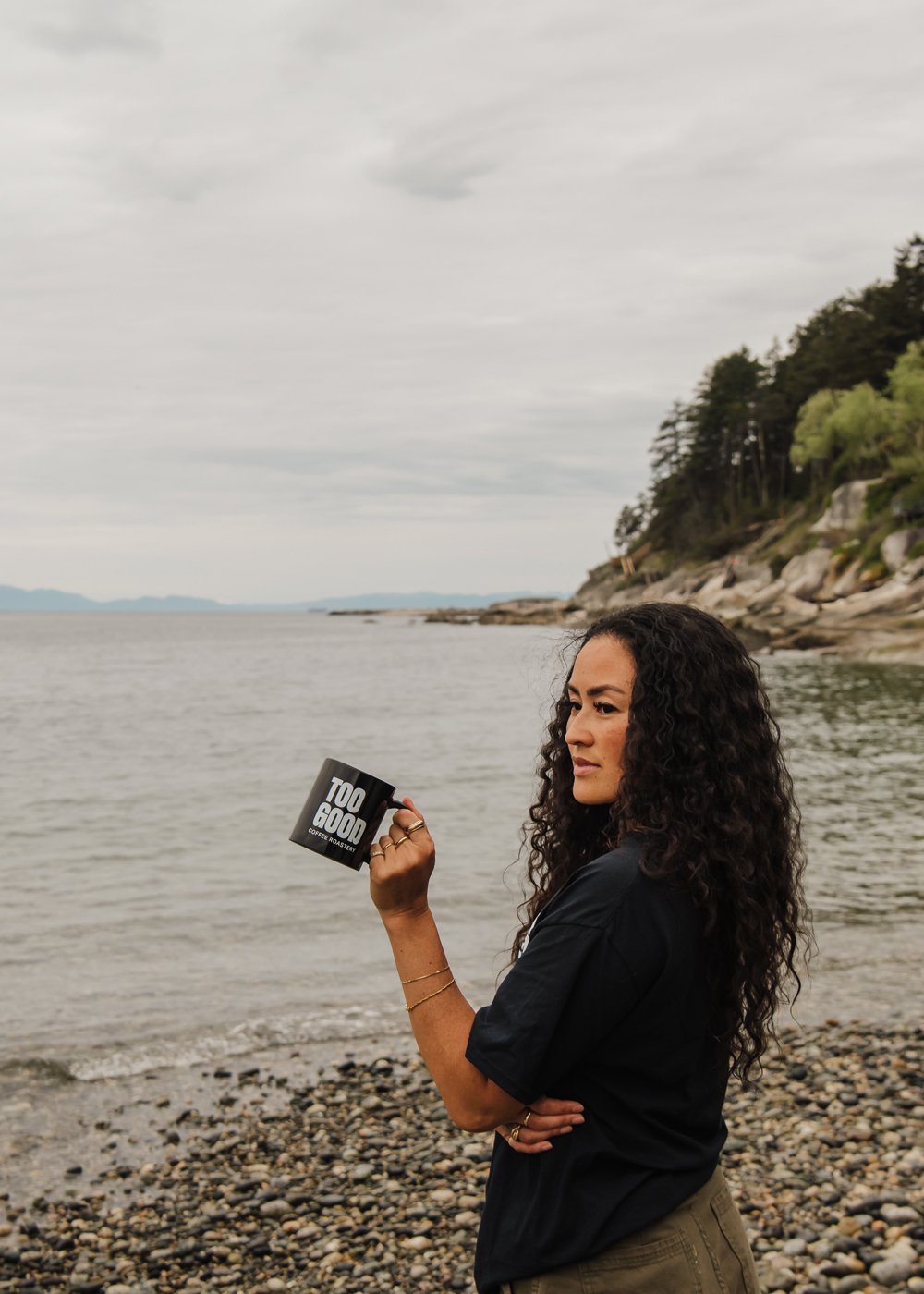
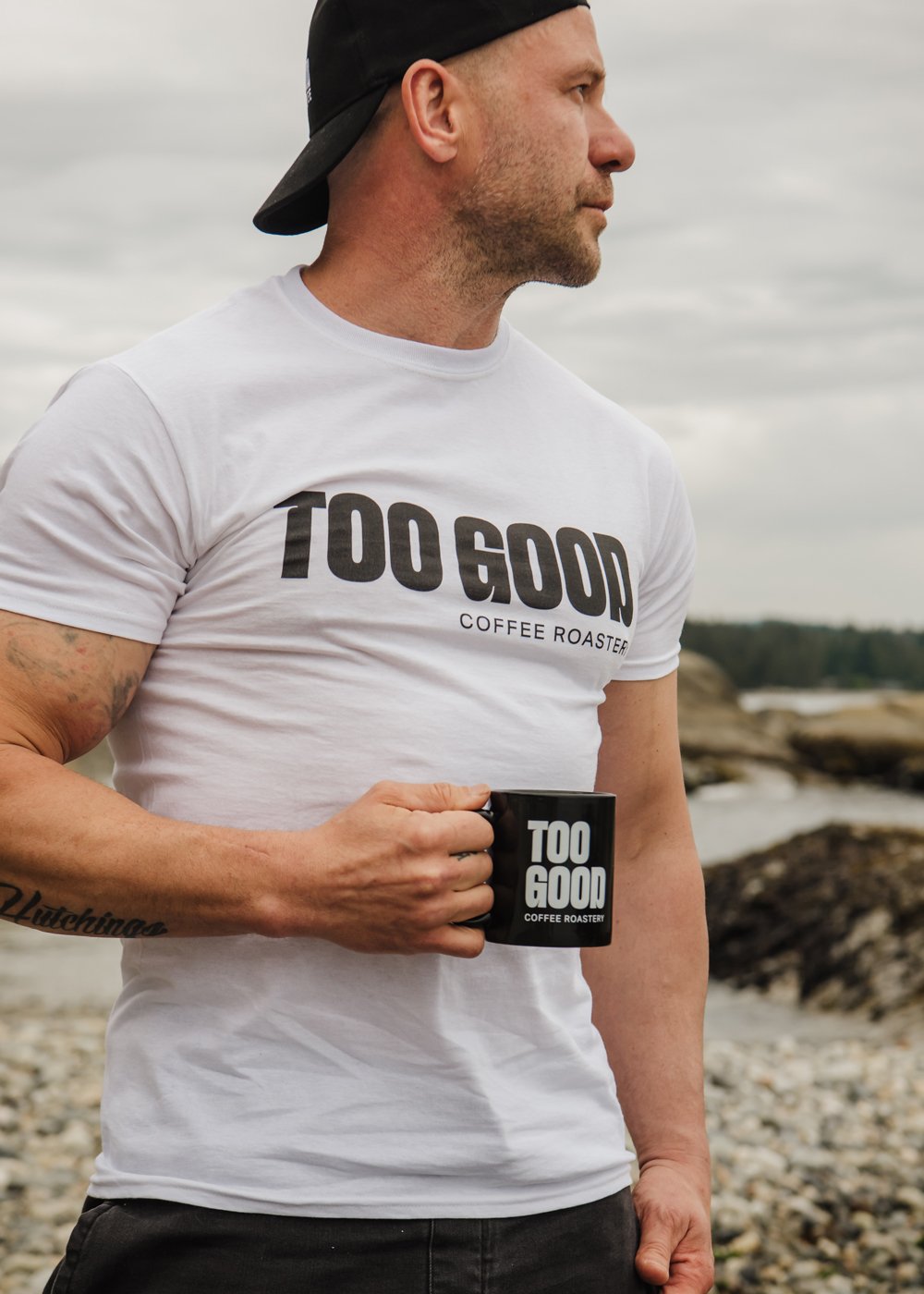

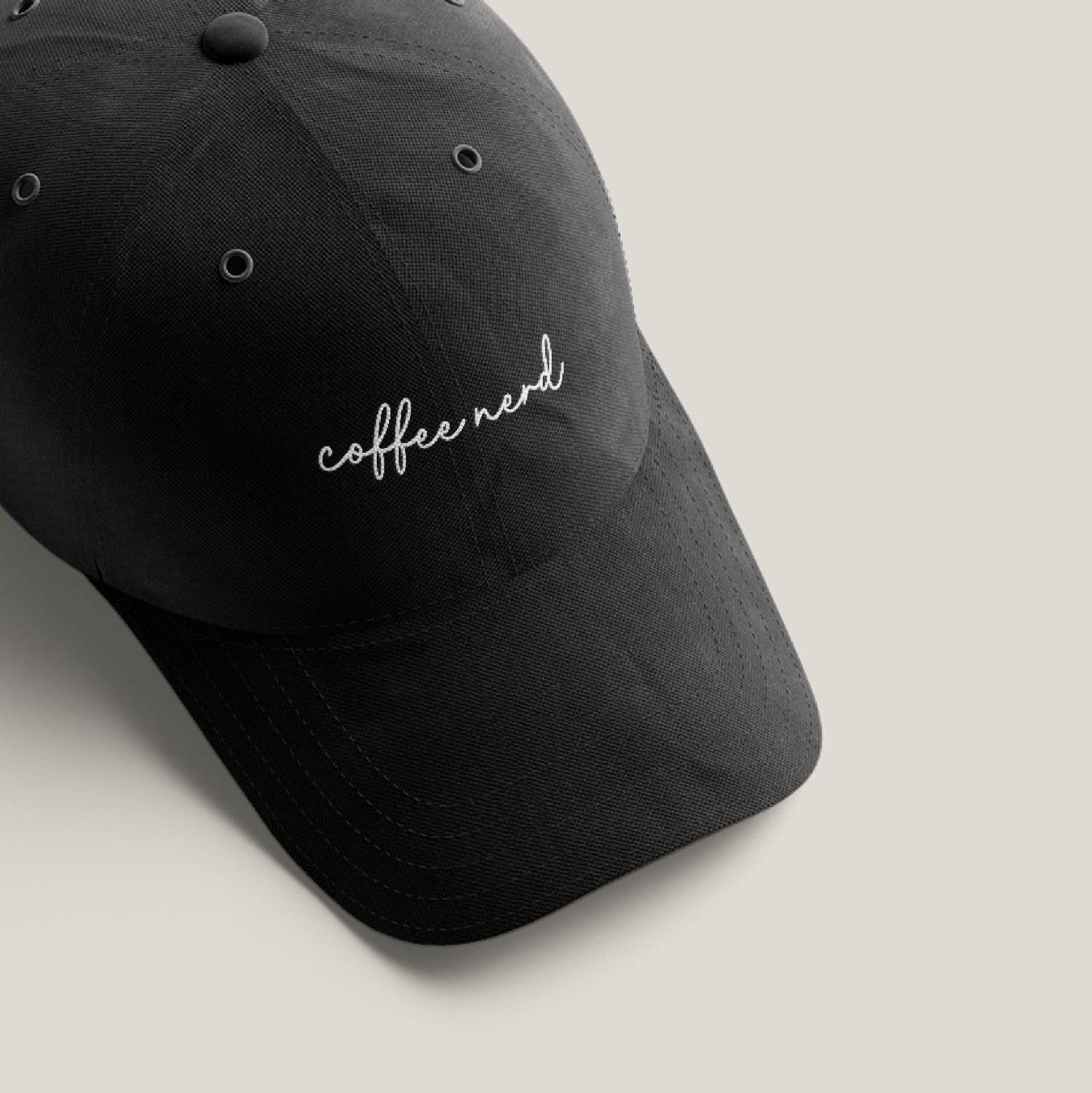
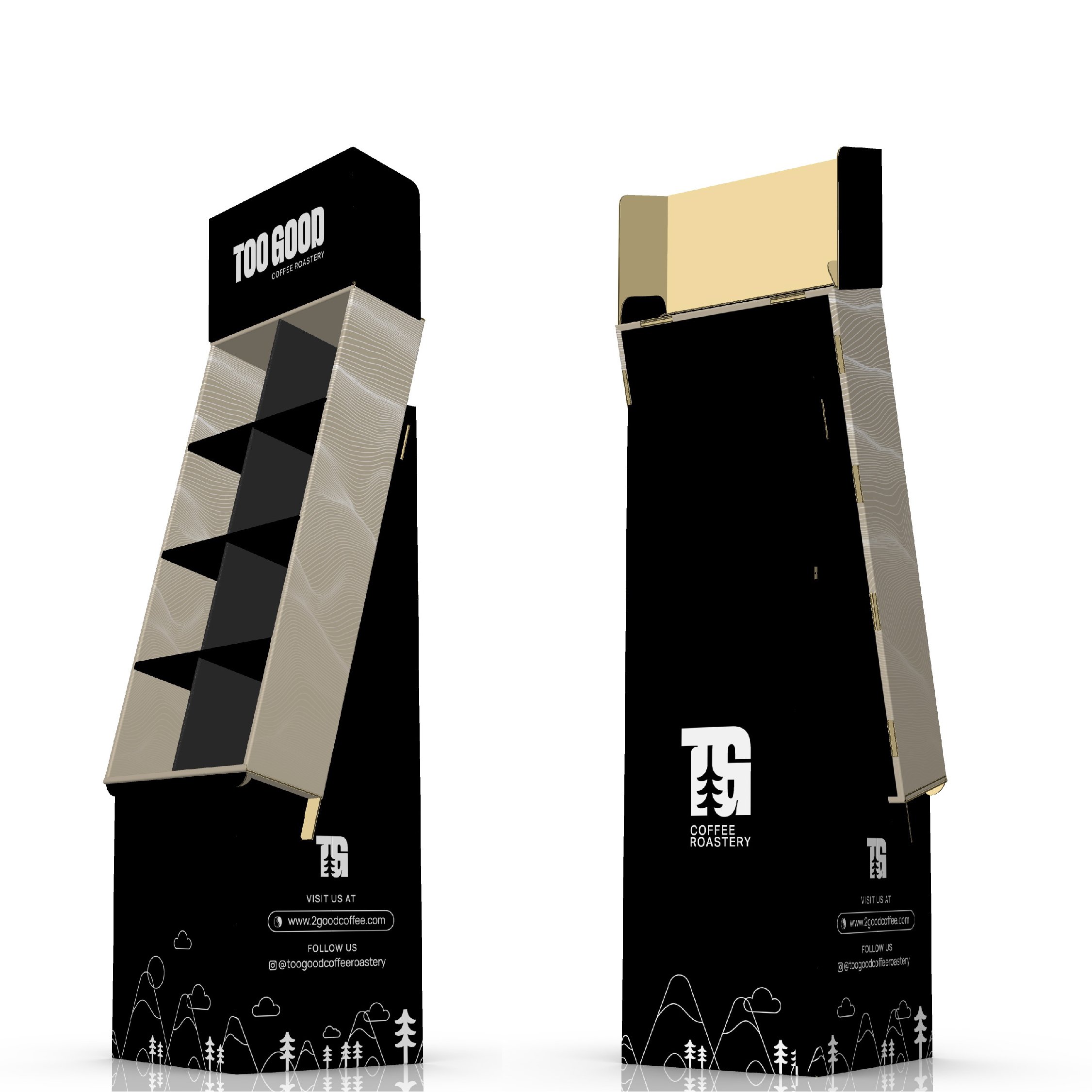
Adventurer/Hipster/Nerdy
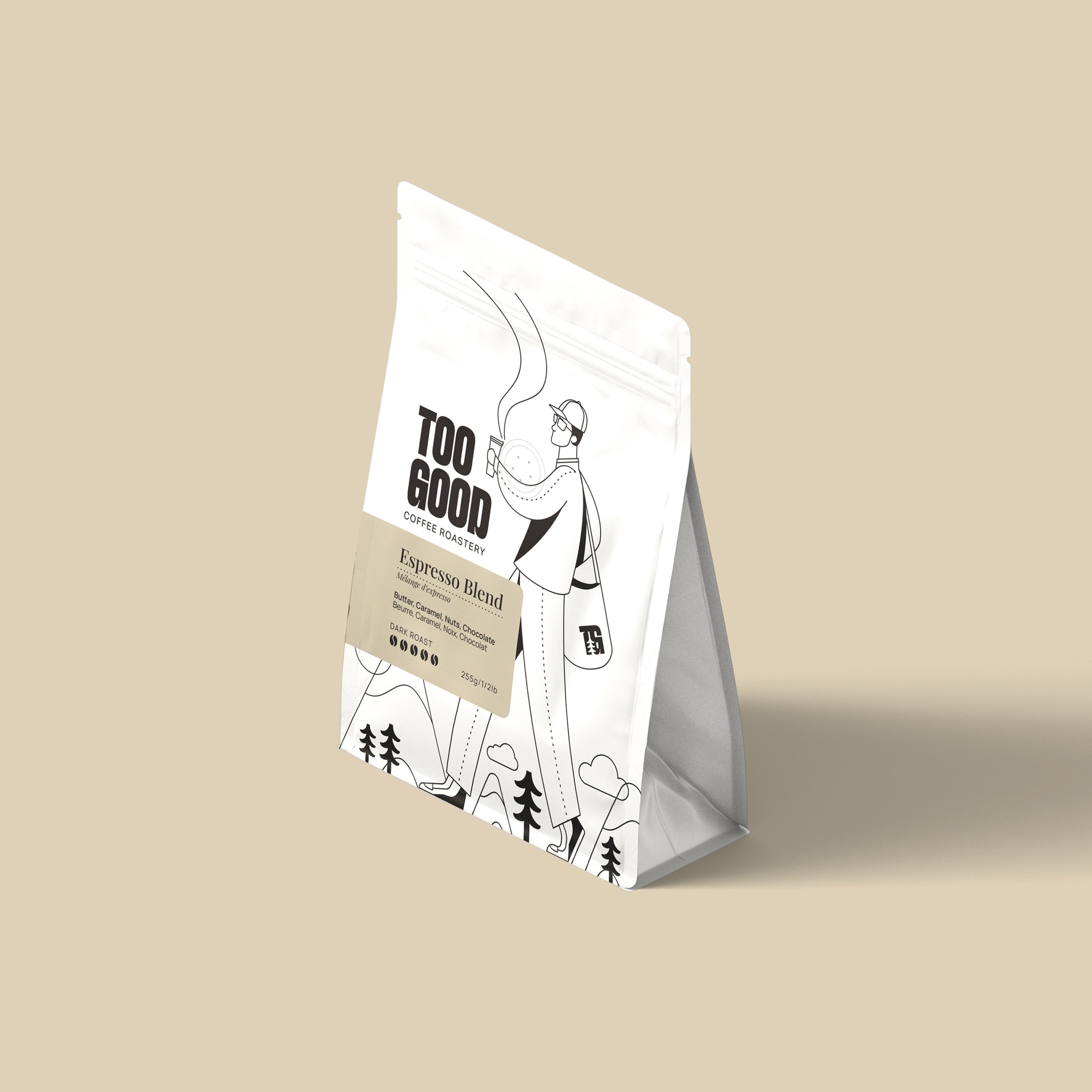
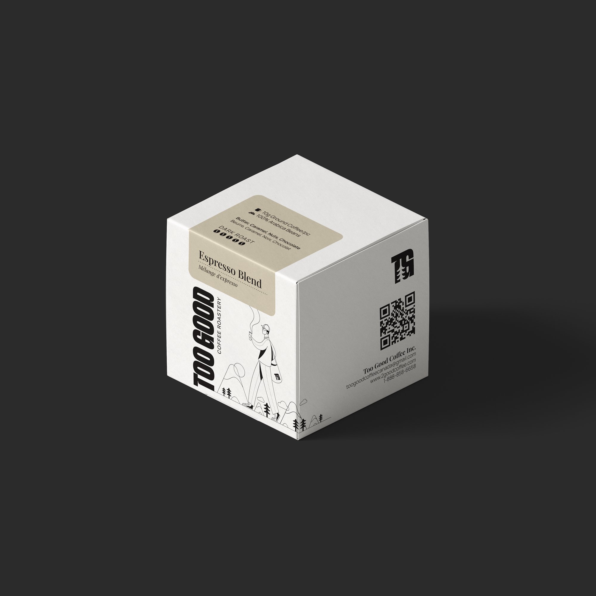
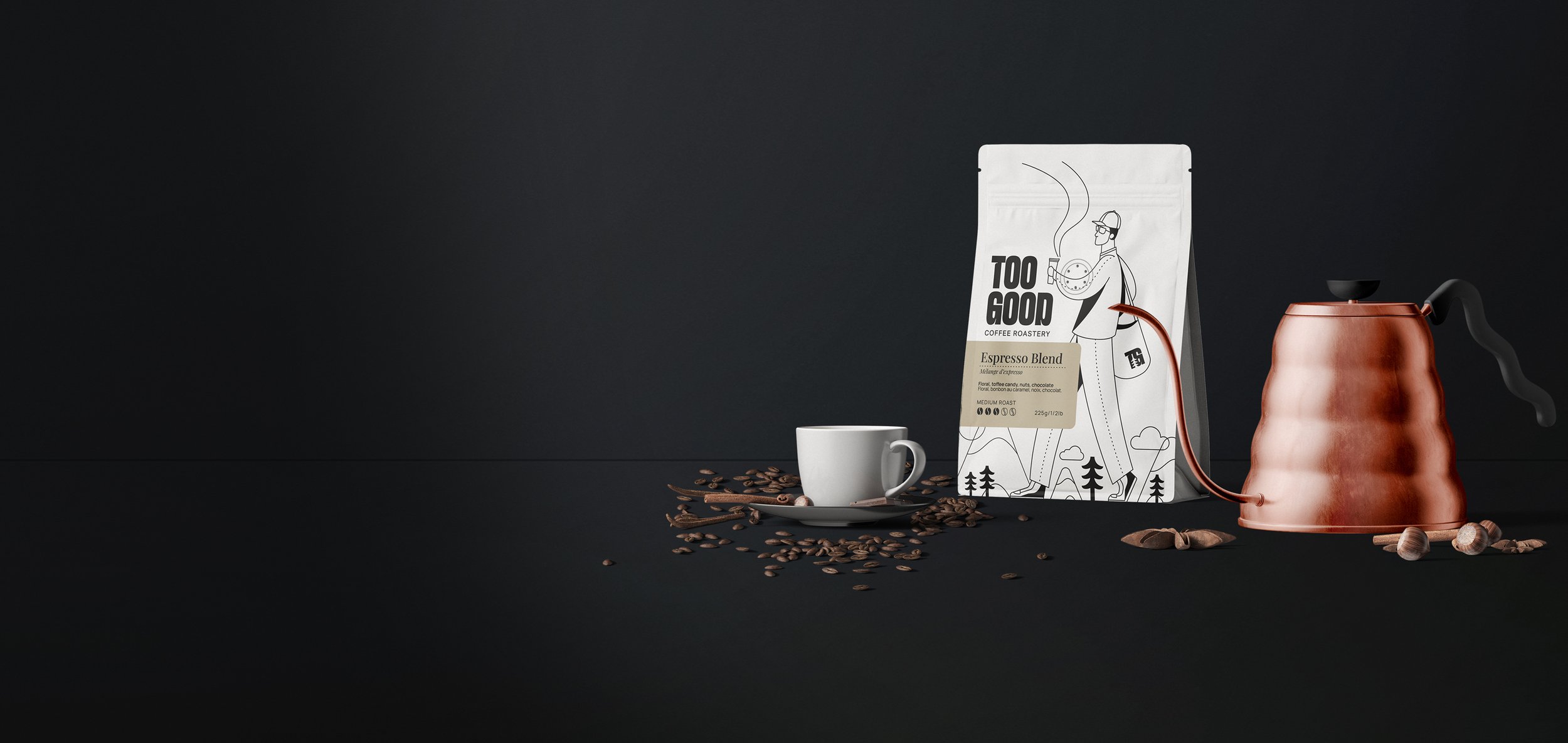
For the packaging illustration Steve is depicted in motion, holding a cup of coffee and wearing a tote bag from TOO GOOD. The illustration features a mountain landscape at his feet, emphasizing the brand concept inspired by the hipster/nerd culture of East Vancouver and the breathtaking wilderness of North Vancouver.
Brand Identity:
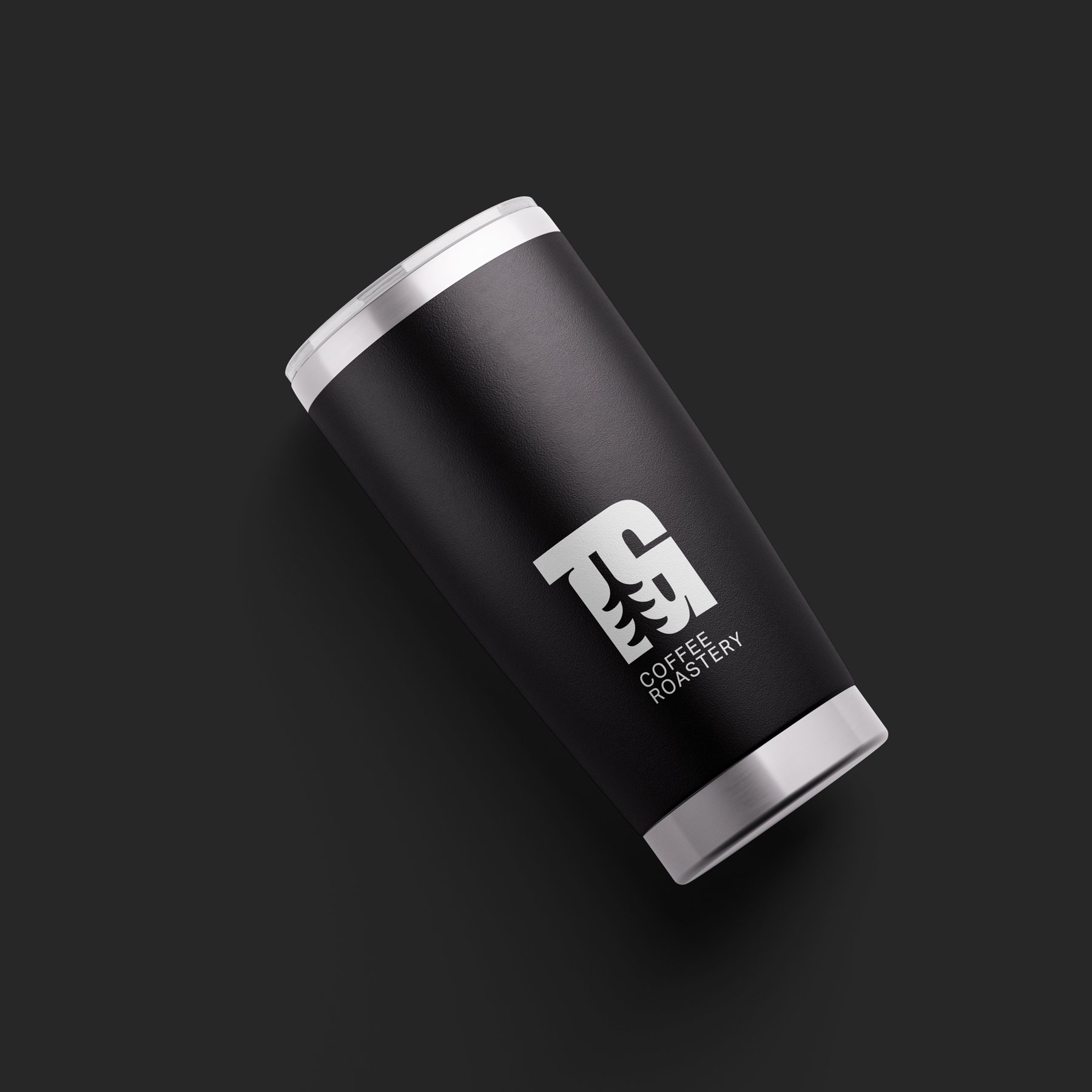
We created a bold and modern wordmark that exudes an adventurous spirit. The letters carry a heavy presence, embodying strength and reliability. To infuse a touch of nature, each letter is intricately cut, mimicking the delicate shape of a branch. This detail not only adds a unique visual element but also symbolizes the rich and natural origins of the coffee beans.
We chose a bold and tall typography to convey confidence and emphasize the products high quality.
