Metropolitan Undergraduate Engineering Society
Branding
Education
Background
The Challenge
When Ryerson University rebranded as Toronto Metropolitan University, one of its longest-standing communities—the engineering student society—was left without a visual identity that matched its new name or purpose. But this wasn't just a logo redesign. It was a chance to reimagine how a deeply rooted institution could look, feel, and show up for a new generation.
Much like a neighborhood shaped by its past but eager to define its future, the Metropolitan Undergraduate Engineering Society needed to preserve its cultural memory while building a more inclusive, dynamic identity that aligned with a modern vision.
The Insight
Engineering culture has an image problem. It's seen as rigid, traditional, and frankly, uncool. But today's engineering students are creative problem-solvers, innovators, and culture-makers. They needed an association that reflected who they actually are.
Our strategy: Keep the DNA, change the expression.


The Solution
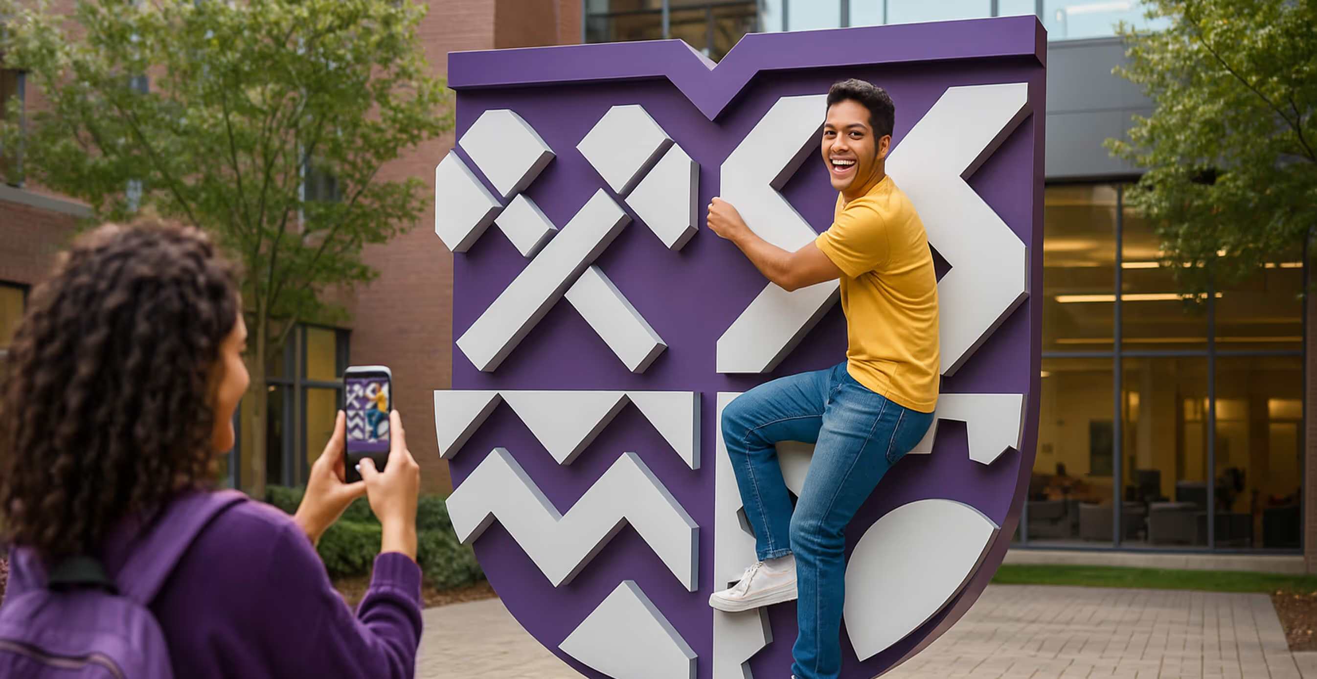
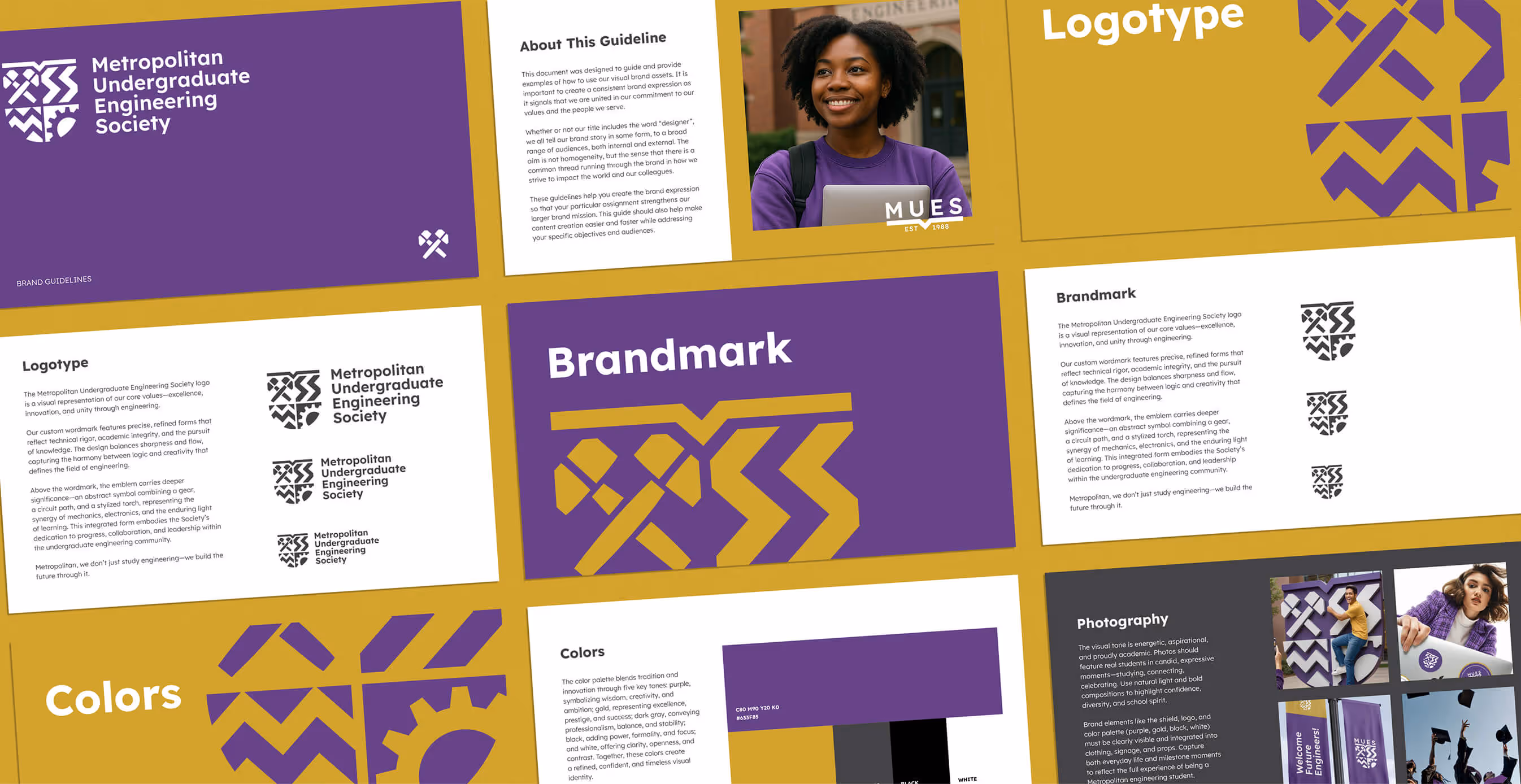
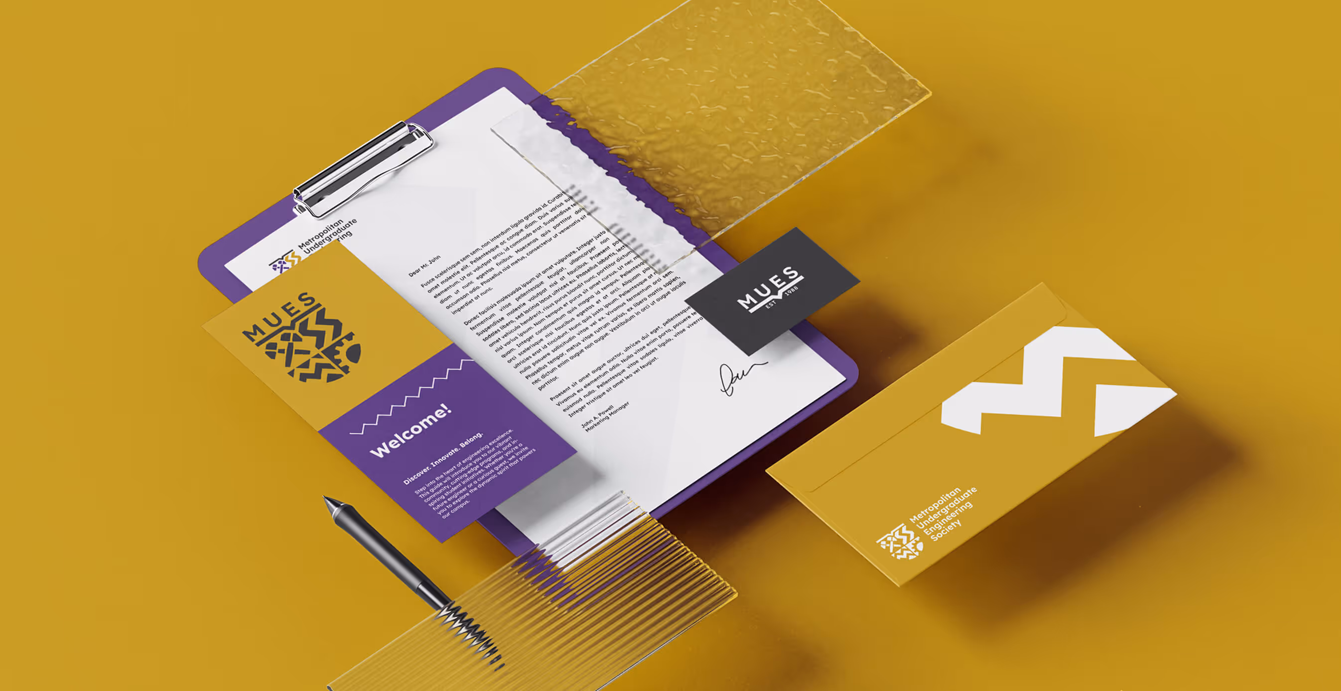
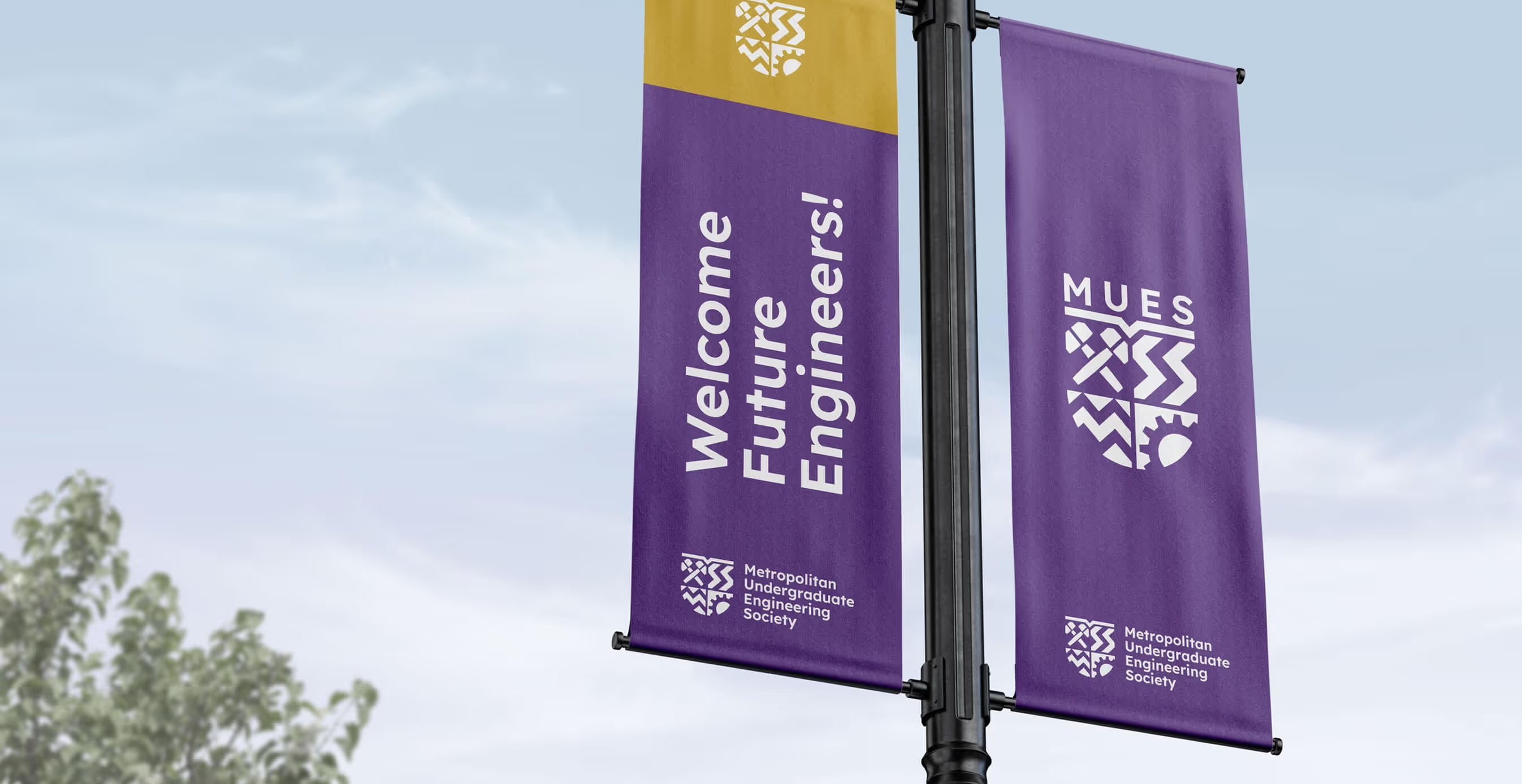
We didn't erase history—we evolved it. The new MUES identity preserves iconic elements from the original crest that alumni would recognize, reimagined through a contemporary lens. Think of it as architectural preservation meets modern engineering.
Key Design Decisions
- Geometric Evolution: Transformed traditional emblems into clean, modular shapes that feel both timeless and current.
- Typography as Statement: Selected a minimal geometric sans-serif that says "precision" without screaming "boring".
- Flexible System: Created a visual language that works equally well on a hoodie or a hackathon banner.
The Impact
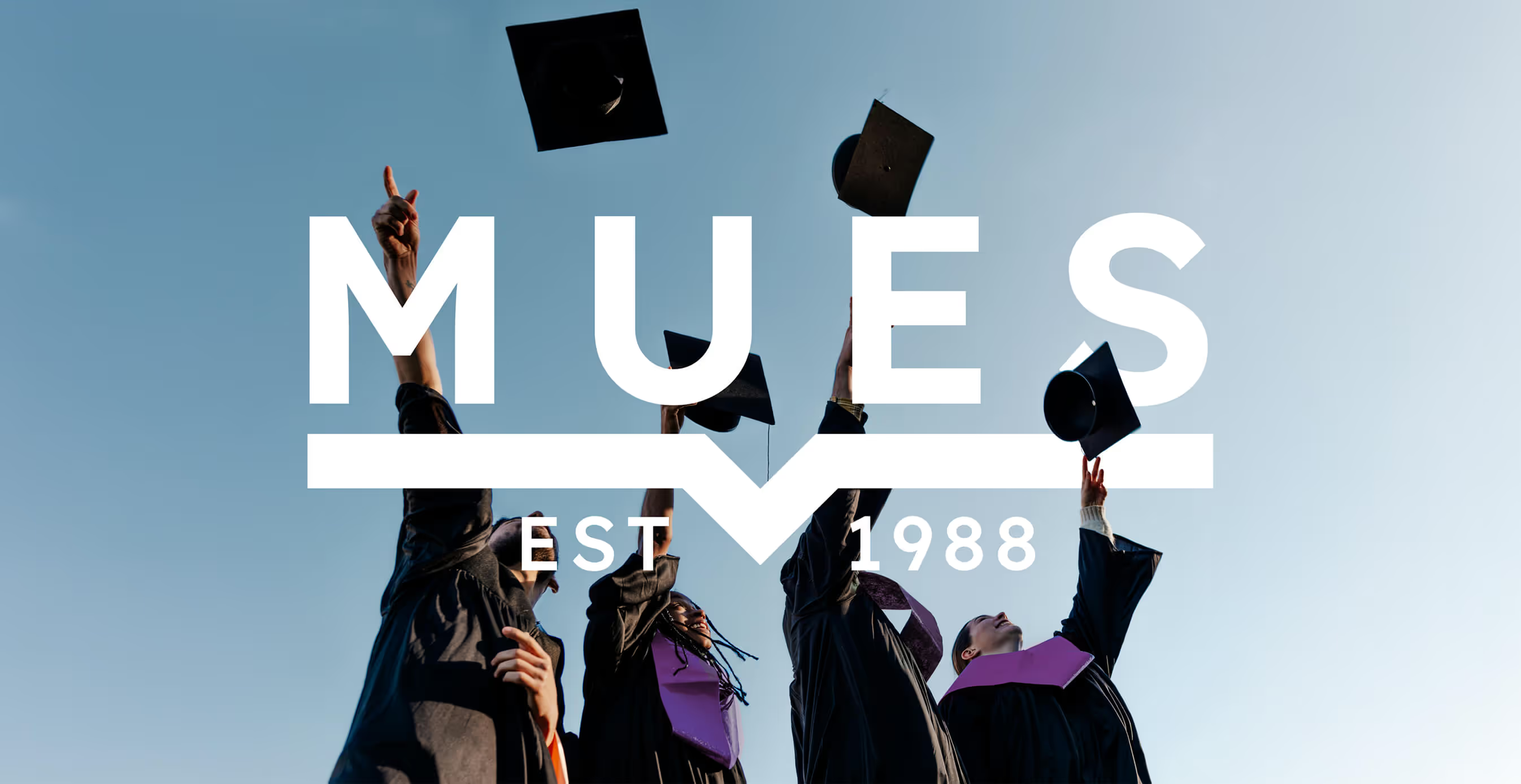
The new MUES identity does what great engineering does—it solves multiple problems elegantly. Alumni see their legacy respected. Current students see themselves reflected. And prospective students see a society worth joining.
Most importantly, we made engineering culture look like what it actually is: innovative, inclusive, and yes—cool.


We’d love to partner with you and your team.
We partner with the world’s most ambitious companies—at every stage of growth. By understanding your unique challenges and opportunities, we design tailored solutions to move your business forward. Let’s talk about what’s next.