Thousand Acres
Logo Design and Brand Identity for Thousand Acres - Local Market & Café

Foster transformative experiences that nourish bodies and souls, forging connections among communities, farmers, and the land.
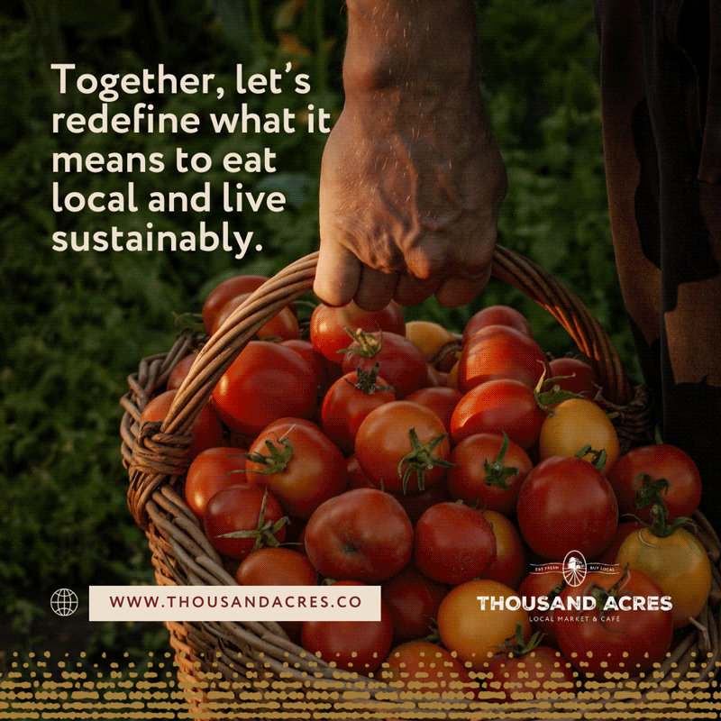
Coming soon to View Royal, Victoria. A fresh take on the community market and cafe. We're thrilled to have worked with Thousand Acres, a modern, community-focused grocer and café where every item tells a story of local dedication, sustainability, and unmatched freshness. It supports not only local growers and artisans but also a vision for a more connected, transparent, and eco-conscious community.
"Thousand Acres" takes its inspiration from the remarkable fact that Vancouver Island is home to 3,000 farms. We've built an identity around this concept, highlighting the short journey our food takes to reach our store shelves, the farm-to-market path our produce follows, and our strong connection to the Earth.
Our main goal was to create a brand that exudes sophistication and warmth. We carefully chose a color palette that reflects the seamless fusion of artisanal charm and premium quality. In addition, we designed handcrafted, minimalist visuals and graphics that draw inspiration from both the aesthetics of farming and the cozy atmosphere of a coffee shop, adding a touch of playful elegance. This approach enables us to remain faithful to the brand's core principles and maintain their strong connection with the community of farmers and shoppers they serve.
Brand Positioning
Naming
Logo Design
Brand Identity
Brand Applications
Social Media Templates
Website
What We Did


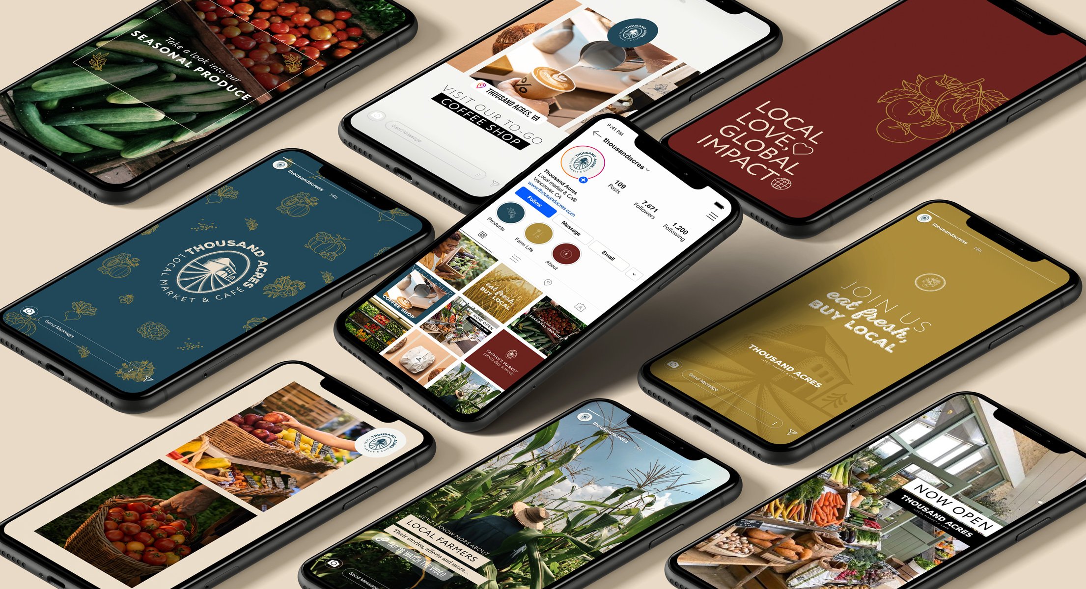


LOCAL LOVE, GLOBAL IMPACT.
LOCAL LOVE, GLOBAL IMPACT.
LOCAL LOVE, GLOBAL IMPACT. LOCAL LOVE, GLOBAL IMPACT.

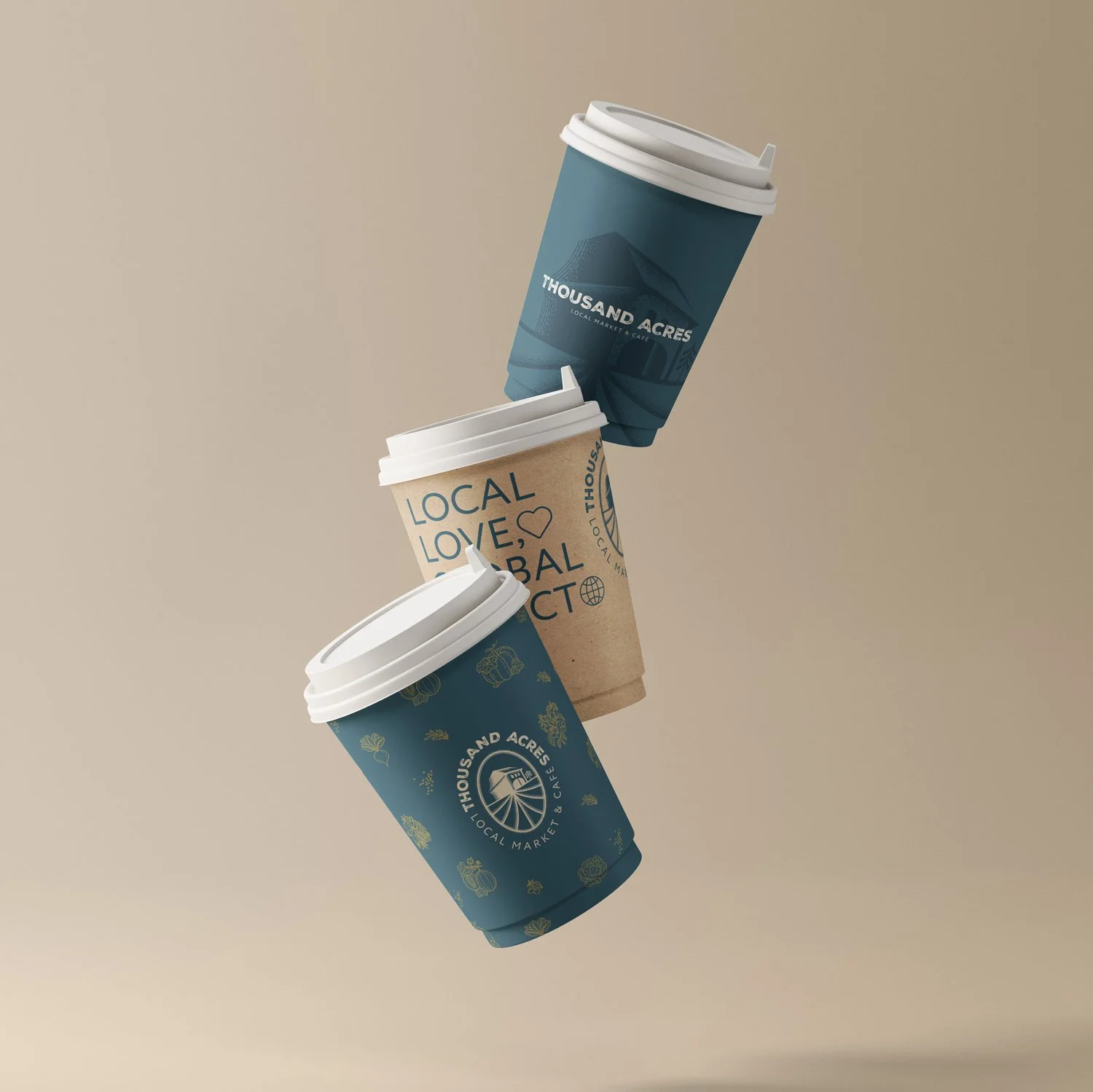
Color inspiration
The brand’s color palette reflects the seamless blend of artisanal charm and premium quality, while remaining accessible and inviting to the audience.
Beautiful warm shades like muted red found in a big variety of fruits and vegetables and a golden green/yellow, inspired by the colors of a sunset over the fields, holds tremendous potential to add warmth and energy to the brand’s visuals. The soothing bluish green complements the warm beige neutrals in the palette, enhancing the overall visual experience. This color can be used to add depth and sophistication to backgrounds, infographics, and subtle accents in packaging design. Also, It plays a role in creating a sense of tranquility and serenity, which may be beneficial in creating a calm and enjoyable shopping atmosphere.

Thousand Acres Creative Principles
Premium/Rustic
Abundance
Local
Inviting