How to Evaluate Webflow Agency Portfolios: 10 Signs of Quality Work
10/28/2025
Web Design / Web Dev
Before hiring a Webflow agency, learn how to evaluate portfolios that go beyond aesthetics—revealing real strategy, performance, and measurable growth potential.
A Webflow agency’s portfolio is more than just a gallery of websites; it's a window into how they think, build, and deliver results.


Why Portfolio Quality Tells the Real Story


At The Branded Agency, we tell clients that a great-looking site doesn’t necessarily mean it performs well. The real measure of quality is how well design, content, and performance come together to drive measurable growth.
If you’re comparing agencies, knowing what to look for in a portfolio can help you separate design-driven marketing partners from template-based vendors.
The Problem with Surface-Level Portfolios
Aesthetic ≠ Strategy
Many portfolios showcase beautiful visuals but reveal little about business impact.
A polished interface means nothing if it’s not backed by thoughtful UX, structured CMS architecture, and conversion-focused strategy.
Quantity Over Quality
If an agency shows hundreds of quick-turnaround projects but few in-depth case studies, that’s a sign they’re focused on volume, not outcomes.
The best Webflow agencies highlight a handful of detailed stories showing their process, problem-solving, and measurable impact.
10 Signs of a High-Quality Webflow Portfolio


1. Strategic Design That Reflects Business Goals
A great Webflow site starts with clarity of purpose. Look for evidence of goal-driven design not just color and typography, but how the layout supports conversions, readability, and brand storytelling.
Quality portfolios explain why choices were made, not just what was built.
2. Consistency in Brand Systems and UX Patterns
Strong Webflow agencies create visual systems consistent buttons, spacing, interactions, and typography.
That consistency signals system thinking, meaning your future site will scale smoothly across new pages and campaigns.
3. Strong Information Architecture and Navigation
Navigation is one of the biggest indicators of UX maturity.
If pages flow logically, content hierarchy is clear, and menus are intuitive, that’s a mark of thoughtful architecture not haphazard page stacking.
4. Fast, Responsive, and Optimized Performance
Test their showcased sites using Google’s PageSpeed Insights or WebPageTest.
A professional Webflow agency will prioritize speed, image optimization, and mobile-first design ensuring performance is as beautiful as the visuals.
5. Clean CMS and Content Architecture
Ask agencies how they structure their CMS collections.
Do they use meaningful fields, proper relationships, and scalable models? A clean CMS setup is the backbone of flexibility and a sign of long-term thinking.
6. SEO-Ready Structure and Schema Use
Look for evidence of on-page SEO, clean URL structures, and schema markup.
A high-quality portfolio often includes projects where sites rank well or demonstrate strong organic visibility showing technical SEO expertise, not just design ability.
7. Accessibility and ADA Compliance
True professionals design for everyone.
Check for legible text contrast, alt text use, keyboard navigation, and logical reading order.
Agencies that bake accessibility into their builds show they understand modern design responsibility.
8. Advanced Interactions That Enhance, Not Distract
Animations should guide the user not overwhelm them.
If an agency’s sites use subtle scroll effects, hover feedback, and motion storytelling that serve UX goals, that’s craftsmanship.
If animations are random or excessive, that’s flair over function.
9. Case Studies with Measurable Results
Look for before-and-after data, testimonials, or KPIs like lead increases, bounce rate reductions, or conversion lifts.
If the agency connects design choices to performance outcomes, that’s a sign of accountability and strategic partnership.
10. Demonstrated Expertise Across Industries
A strong Webflow agency shows adaptability whether it’s scaling SaaS platforms, boutique e-commerce, or brand storytelling.
Look for diversity that proves they can customize strategy to match different brand voices and goals.
Red Flags When Reviewing a Webflow Portfolio
Overuse of Templates and Cloneables
If multiple sites look identical or rely on common cloneables, it’s a red flag.
Custom design and structure are what distinguish experts from hobbyists.
No Mention of Process or Metrics
If the agency only talks about colors and typography but never mentions UX, SEO, or outcomes, that’s surface-level work.
Top agencies discuss process and impact, not just visuals.
Want to learn more about Website Design, Development and E-commerce? Keep reading!
If you need help with your company’s website and development, contact us for a free custom quote.
How to Compare Webflow Portfolios Effectively

Look Beyond Design Ask About Performance
Ask agencies to share Core Web Vitals data or SEO benchmarks from their featured projects.
A visually stunning site that loads slowly or ranks poorly isn’t true quality work.
Ask for Live Links, Not Screenshots
Static screenshots can hide broken interactions or poor responsiveness. Always review live websites to experience the flow, responsiveness, and accessibility firsthand.
Consider Fit for Your Brand Type and Scale
An agency might excel at startups but struggle with enterprise systems or vice versa.
Look for examples that align with your business size, complexity, and digital maturity.
FAQs About Evaluating Webflow Agency Portfolios
1. Why does portfolio quality matter when choosing a Webflow agency?
A portfolio is more than a gallery of visuals—it reveals how an agency thinks, structures content, and aligns design with measurable business goals. It’s the clearest indicator of their real capabilities.
2. What are red flags to watch for in a Webflow portfolio?
Be cautious if you see overused templates, cookie-cutter layouts, or no mention of UX, SEO, or measurable results. Strong agencies highlight processes, outcomes, and custom solutions—not just pretty screenshots.
3. How do I know if an agency’s portfolio shows strategy, not just style?
Look for case studies that explain why design choices were made, not just what was built. If they connect design decisions to KPIs like conversions or SEO performance, that’s a good sign of strategy-first work.
4. Why is branding important when reviewing a Webflow agency’s portfolio?
A great site should feel like an authentic extension of a brand. Portfolios that show how an agency translated brand identity into visuals, messaging, and UX demonstrate deeper strategic thinking.
5. How can I tell if an agency’s portfolio reflects strong brand strategy?
Check for consistency across color systems, typography, interactions, and messaging. If each project looks custom-tailored to the client’s voice and goals—not recycled from templates—it’s a strong sign of branding expertise.
6. Can Webflow bring a brand to life better than other platforms?
Yes. Unlike rigid CMS platforms, Webflow allows for complete creative freedom. Specialists can craft unique interactions, animations, and layouts that align perfectly with your brand’s voice and customer experience.
7. Should I only focus on the design aesthetics of a portfolio?
No. While visuals matter, the best portfolios highlight performance, UX architecture, accessibility, and SEO—all of which impact how the site actually performs for users and search engines.
8. How do I evaluate performance when reviewing portfolio work?
Always test live sites instead of screenshots. Check speed (Core Web Vitals), responsiveness on mobile, accessibility, and navigation flow. These factors reveal the agency’s attention to detail.
9. What types of portfolios should I look for if my brand is scaling?
If you’re a startup, look for agencies with experience in SaaS or boutique brands. For larger organizations, seek examples of enterprise-level builds with complex CMS setups, governance, and scalability.
10. How can portfolios show measurable results?
High-quality agencies showcase case studies with metrics—such as lead generation, bounce rate improvements, or organic search growth. If results are missing, the work may be surface-level.
Look for Strategy, Not Just Style

A Webflow agency’s portfolio is more than a design showcase; it's a reflection of how deeply they understand business, brand, and performance.
The best agencies combine strategy, structure, and creativity to build Webflow sites that drive measurable results, not just visual appeal.
At The Branded Agency, we design and develop Webflow experiences that blend storytelling, scalability, and search performance helping brands grow through creative precision and strategic execution.
If you’re evaluating Webflow agencies and want to understand what great work truly looks like, contact us and we'll show you how real results look in motion.

Quincy Samycia
As entrepreneurs, they’ve built and scaled their own ventures from zero to millions. They’ve been in the trenches, navigating the chaos of high-growth phases, making the hard calls, and learning firsthand what actually moves the needle. That’s what makes us different—we don’t just “consult,” we know what it takes because we’ve done it ourselves.
Want to learn more about brand platform?
If you need help with your companies brand strategy and identity, contact us for a free custom quote.
We do great work. And get great results.
+2.3xIncrease in revenue YoY
+126%Increase in repurchase rate YoY




+93%Revenue growth in first 90 days
+144% Increase in attributed revenue


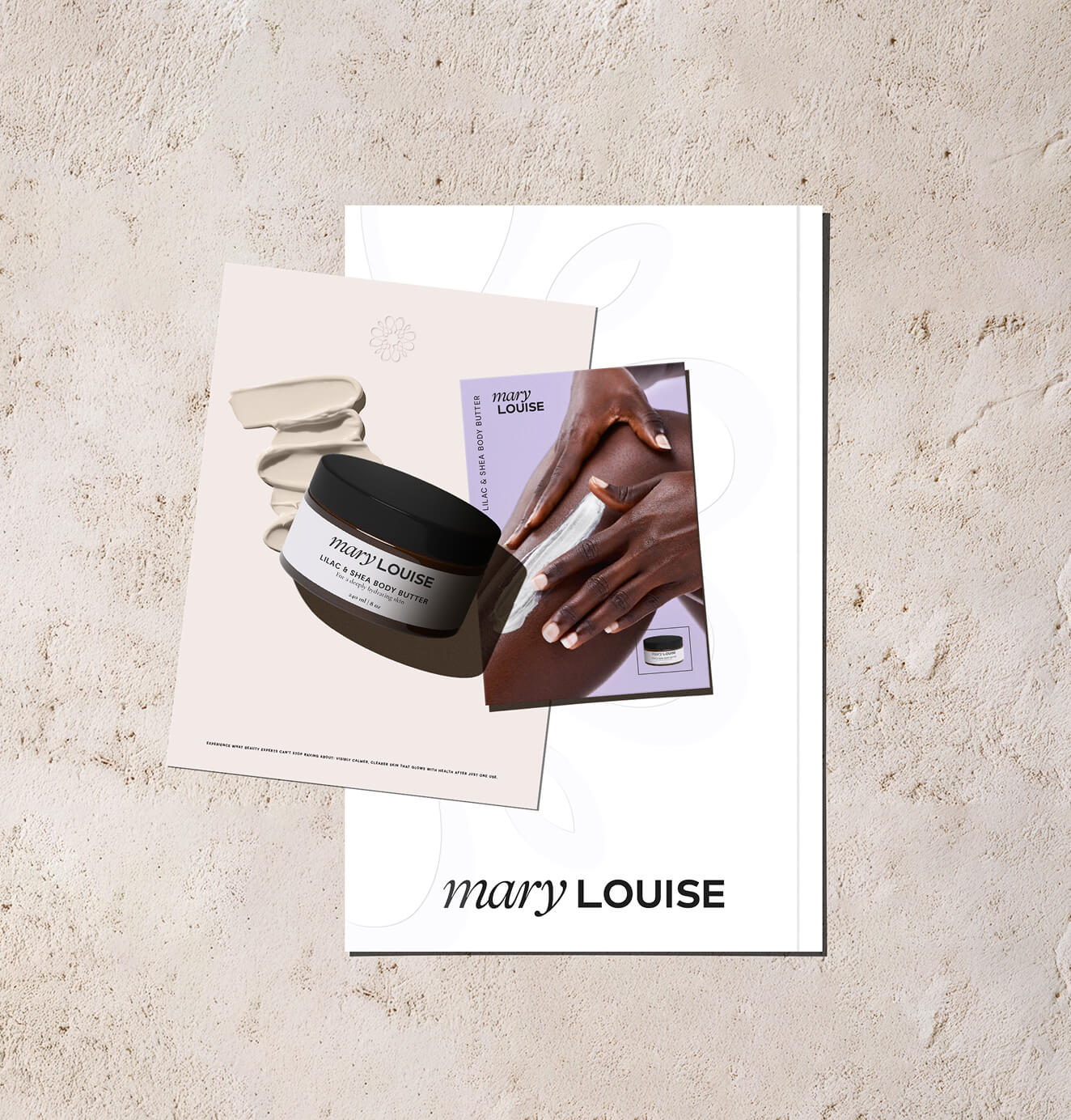


+91%Increase in conversion rate
+46%Increase in AOV

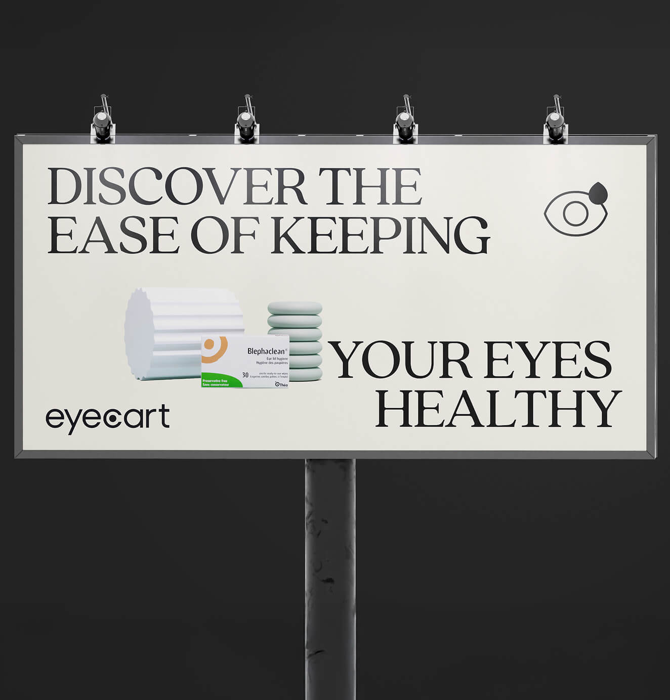


+200%Increase in conversion rate
+688%Increase in attributed revenue


