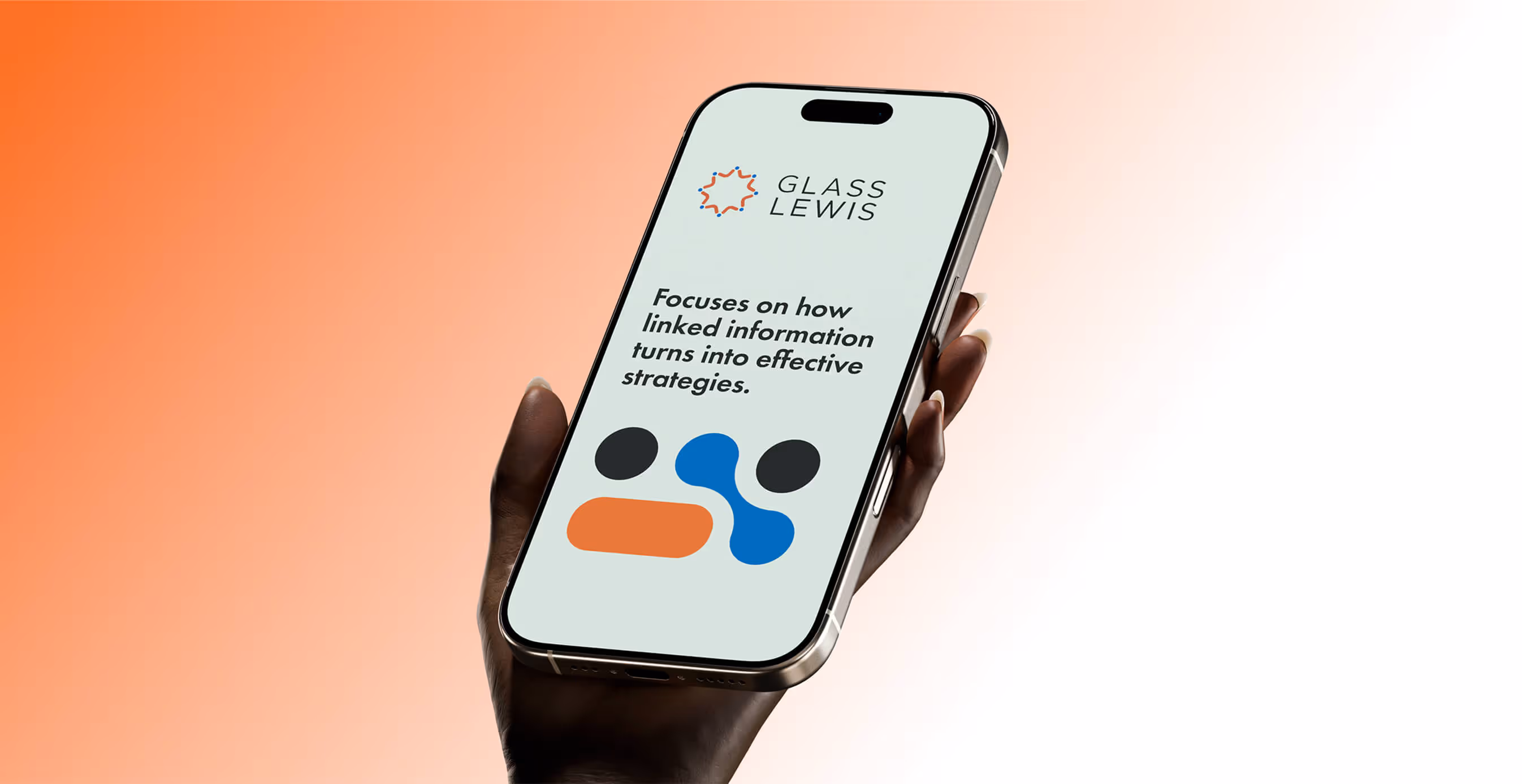
Glass Lewis
Brand Refresh
Creative
Website Design & Dev
Corporate Governance
Financial Technology
Background
The Challenge
Glass Lewis is one of the most trusted names in global corporate governance, powering decisions for investors managing over $40 trillion in assets. But trust isn’t static.
As the proxy advisory space evolved, Glass Lewis needed a digital presence that reflected both its enduring authority and its growing technological edge. Their existing site—home to thousands of pages across multiple global regions—was weighed down by legacy design, dense navigation, and inconsistent experiences.
Our task was both technical and strategic:
- Migrate and restructure a vast content ecosystem into Webflow.
- Modernize the user experience while preserving brand equity.
- Align internal teams around a new digital architecture.
In short: take what worked, redesign what didn’t, and deliver a future-ready platform—all in 90 days.

01. Insight
Authority is no longer projected through complexity. It’s earned through clarity.
Our strategic starting point was understanding how Glass Lewis’s different audiences—global investors, issuers, partners, and regulators—navigate complex information. The real challenge wasn’t just visual or technical. It was architectural.
The site needed to build trust without relying on density. That meant reframing how content was structured and how expertise was expressed. We didn’t throw out the brand—they asked us not to. Instead, we tightened it. We clarified hierarchy, introduced visual breathing room, and gave the brand space to express its confidence.
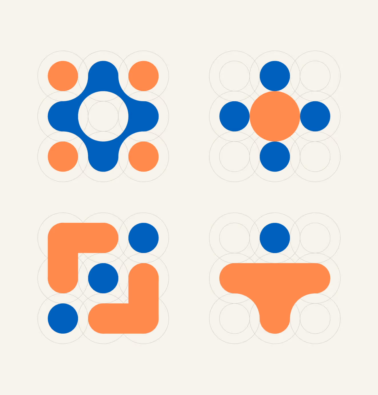
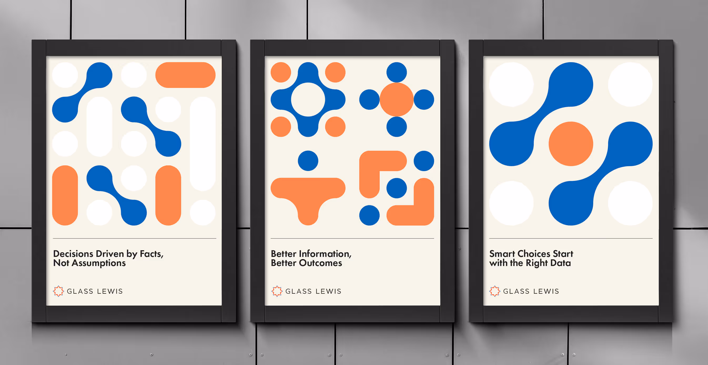
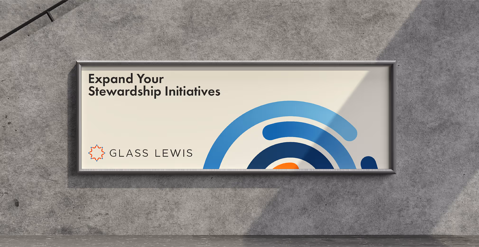
02. Brand Refinement
We respected the brand’s existing DNA, but elevated its usability and consistency.
We refined the existing color palette for better contrast and digital accessibility. We redefined typographic scales to create hierarchy without clutter. And we simplified the iconography and UI elements to reinforce clarity.
The result is a brand that feels more cohesive, more contemporary, and more confident without losing the recognition and gravitas it had earned over decades.
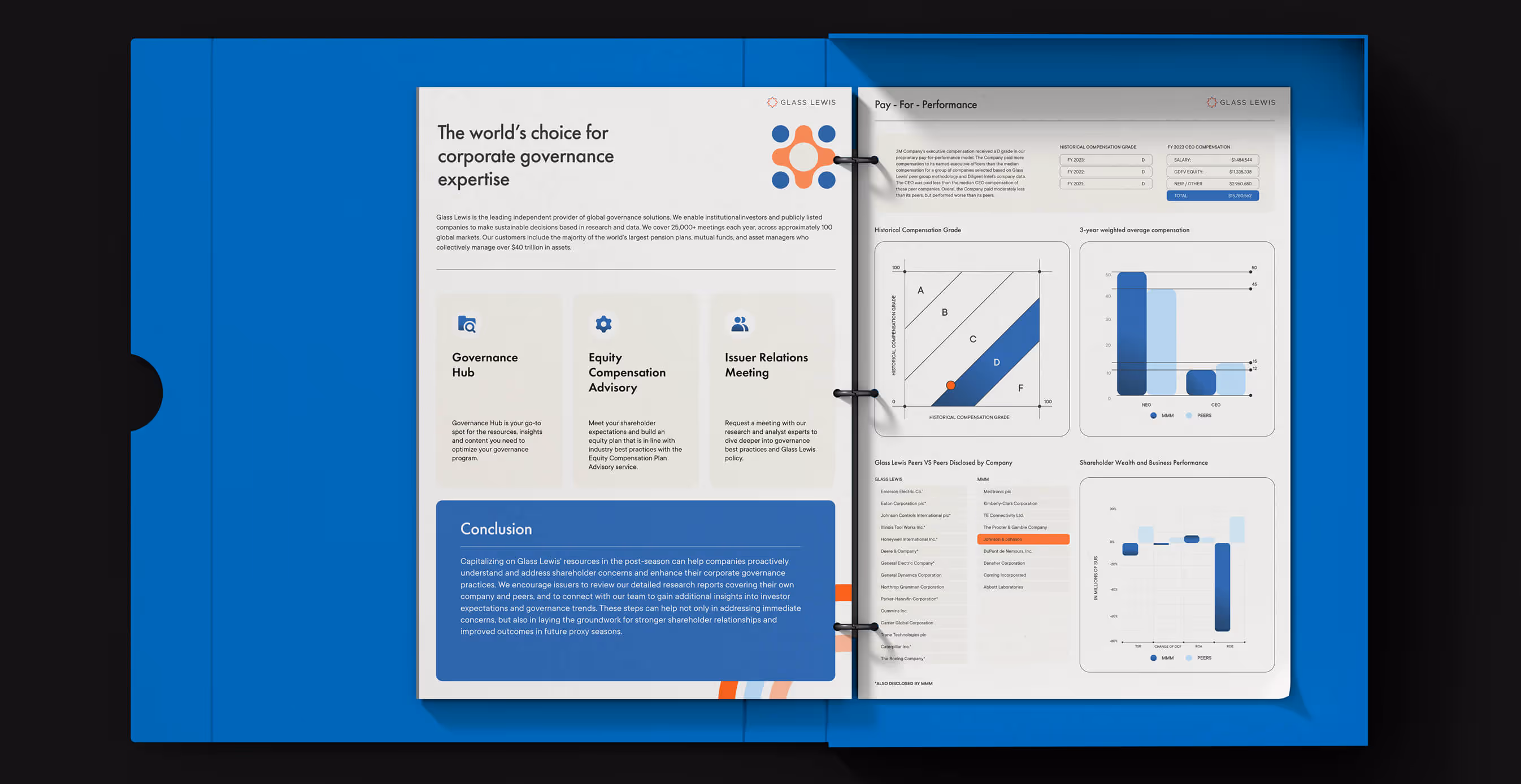
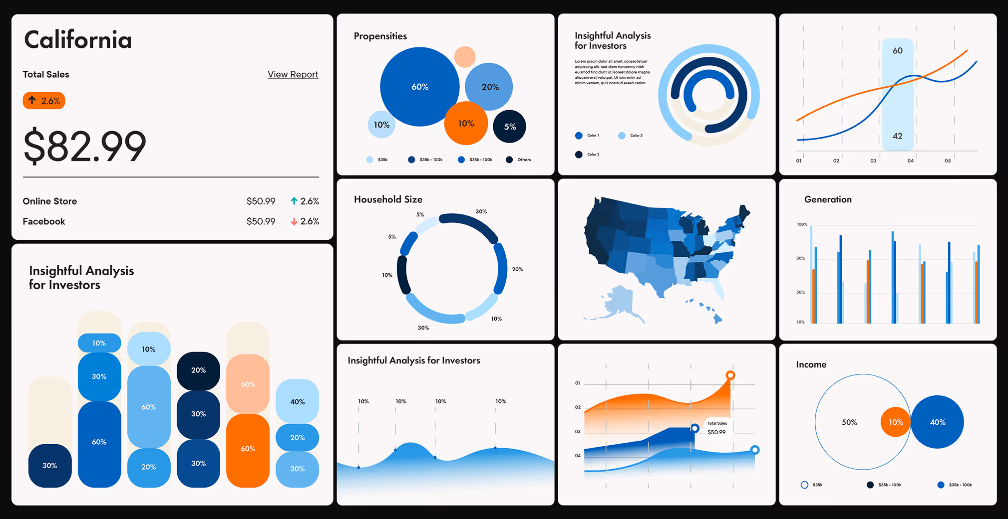
03. Website Architecture & UX
We completely rebuilt the Glass Lewis site to match how people actually use it. Instead of forcing users to hunt for what they need, we mapped out natural paths for different types of visitors and built the experience around those journeys.
The design challenge was significant: present complex regulatory data and analysis without overwhelming users. We developed layouts that layer information progressively, letting users dig deeper when needed while keeping essential insights accessible.
The end result is a fundamental shift in how Glass Lewis connects with their audience online.
04. Execution at Scale
Launching a new enterprise site with thousands of pages, dozens of stakeholders, and tight timelines is one thing. Doing it in 90 days is another.
Through a structured sprint model and close collaboration with Glass Lewis’s internal teams, we migrated, QA’d, and deployed the entire site without interruption to business.
The new platform now serves as the digital expression of their authority and innovation, helping the brand maintain leadership in a competitive, high-stakes space.
Outcome
- Thousands of pages migrated to Webflow without downtime.
- Streamlined user experience across multiple global markets.
- Brand refresh aligned with digital accessibility standards.
- Stakeholder buy-in across product, compliance, and marketing.
- Delivered in 90 days.

We’d love to partner with you and your team.
We partner with the world’s most ambitious companies—at every stage of growth. By understanding your unique challenges and opportunities, we design tailored solutions to move your business forward. Let’s talk about what’s next.