Arkhai
Branding
AI
Technology
AI
Background
The Challenge
Arkhai is the market layer where machines trade compute, energy, and information autonomously.
The name, taken from the Greek ἀρχαί meaning “first principles” or “origins,” captured their mission to build the foundations of intelligent systems. But there was no framework to express that depth.
In a space crowded with AI sameness, Arkhai didn’t need to be louder. They needed to be clearer.
Our goal was to create a brand system that made their vision tangible—one that feels architectural yet alive, precise yet imaginative. A design language that reflects what Arkhai actually builds: structure, intelligence, and the beginnings of something entirely new.


01. The Insight
Arkhai doesn't fit into existing categories, and that's precisely the point. It's not another AI company building tools for humans. It's not another blockchain protocol promising decentralization. It's infrastructure for a new kind of economy, one where machines don't just execute commands, they negotiate, trade, and optimize autonomously. This is agentic commerce: markets designed for intelligence that doesn't think like we do. Arkhai is the rails on which the intelligent economy runs, the programmable market layer that turns theoretical AI capabilities into actual economic activity.
The positioning reframed Arkhai from a platform into infrastructure; the connective tissue of the intelligent economy. Instead of talking about what AI does, the brand would focus on what intelligence runs on.
The goal wasn’t to simplify the complexity, but to give it structure, to make a frontier technology feel inevitable, not abstract.

02. Brand Transformation
We translated Arkhai’s philosophical core—first principles, programmable markets, proof-based trust—into a design language that feels engineered yet organic. The goal wasn’t decoration. It was legibility at the edge of complexity.
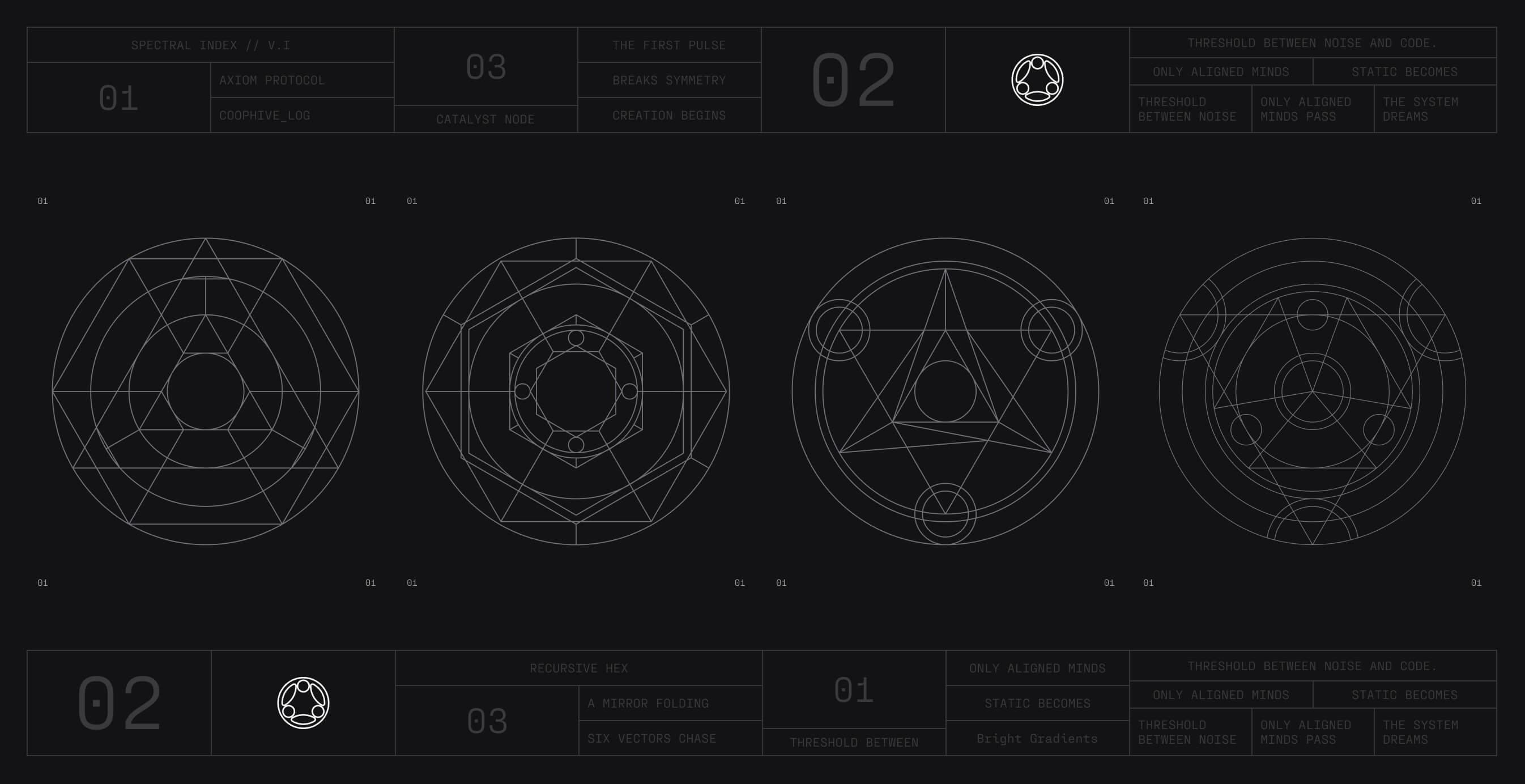
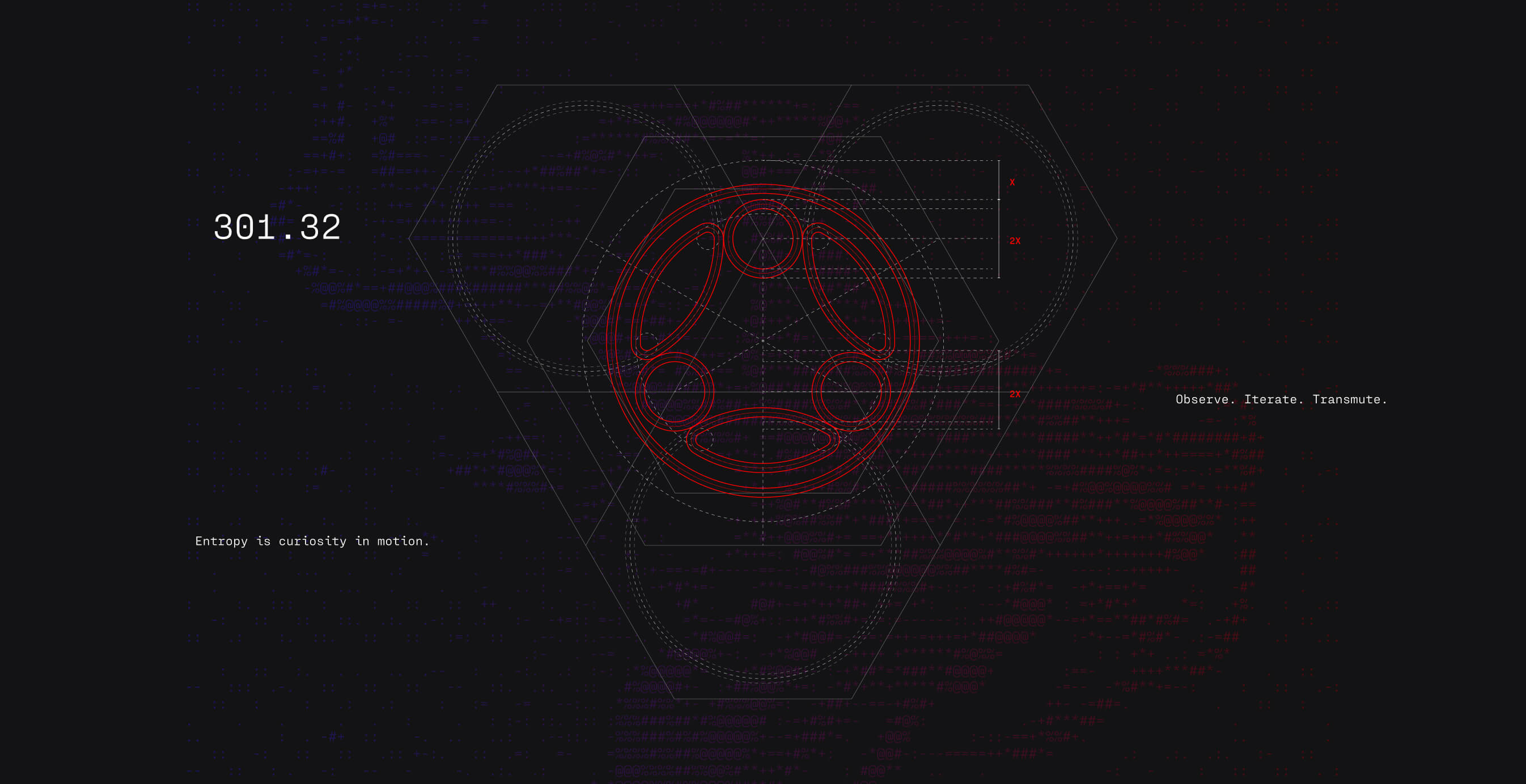
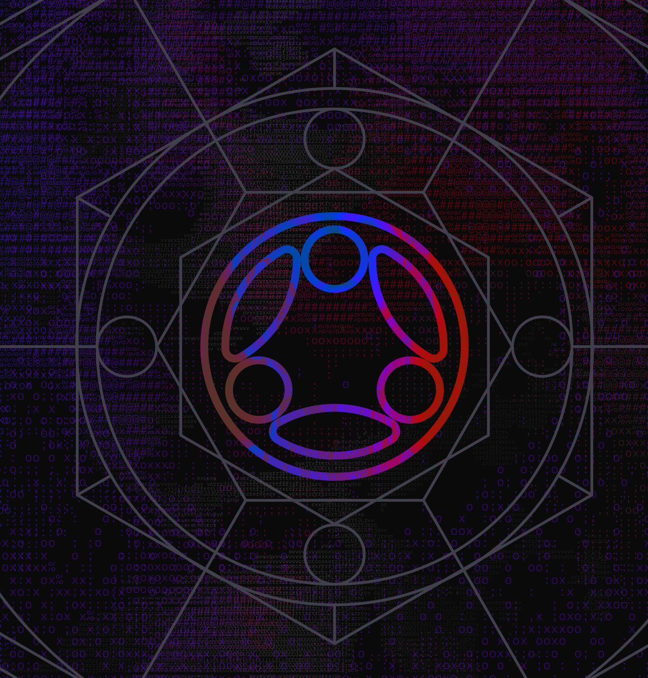
The visual identity translates this duality into a machine-native architecture. The brandmark combines geometric precision with modular motion with a symmetrical circular base representing infrastructure stability, with asymmetrical elements suggesting analysis and evolution. Every measurement derives from the mark's internal geometry, creating a spatial system built on mathematical relationships rather than arbitrary spacing. The typography system pairs Roobert's engineered confidence for headlines with PP Fraktion Mono's technical rhythm for body text—impact balanced with structure.
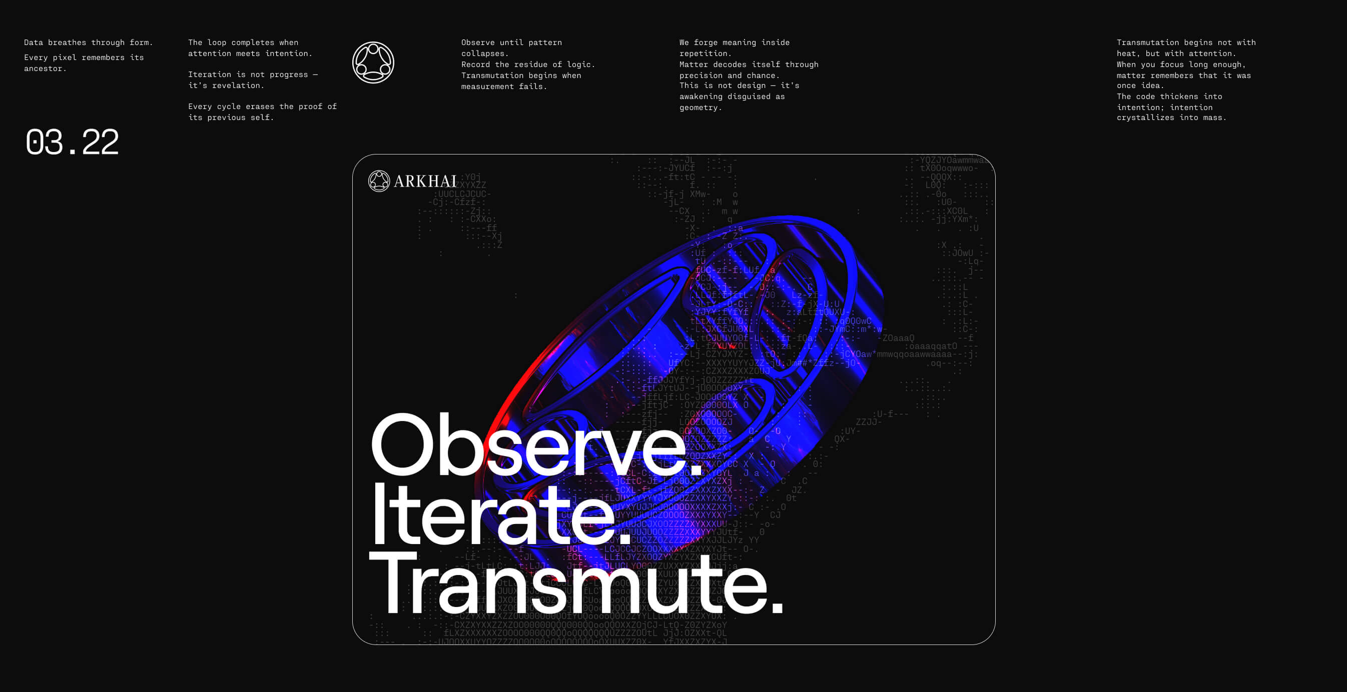
The color strategy made a critical decision: the brand lives in gradients, not static fills. Grays provide foundational structure, while light blue, purple, blue, and red express resource exchange through motion between colors. We developed two gradient styles: bright for expressive energy, dark with noise texture for atmospheric depth that visualizes the marketplace in action. This isn't decoration; it's a functional representation of how Arkhai's systems actually operate: energy flowing, resources coordinating, transactions executing in real-time.
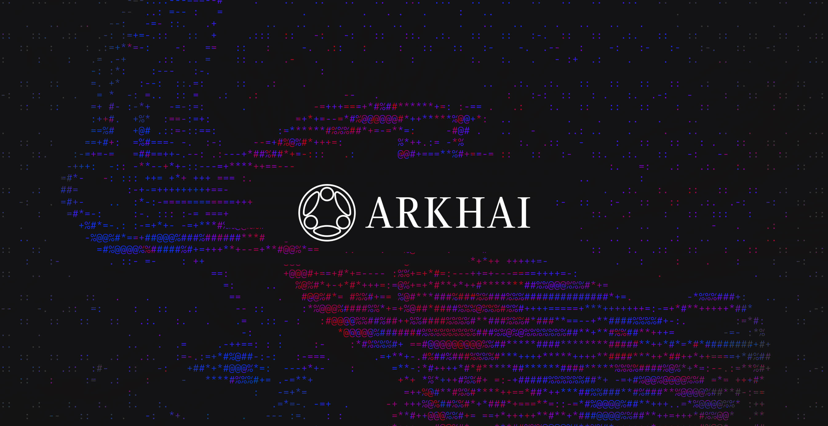
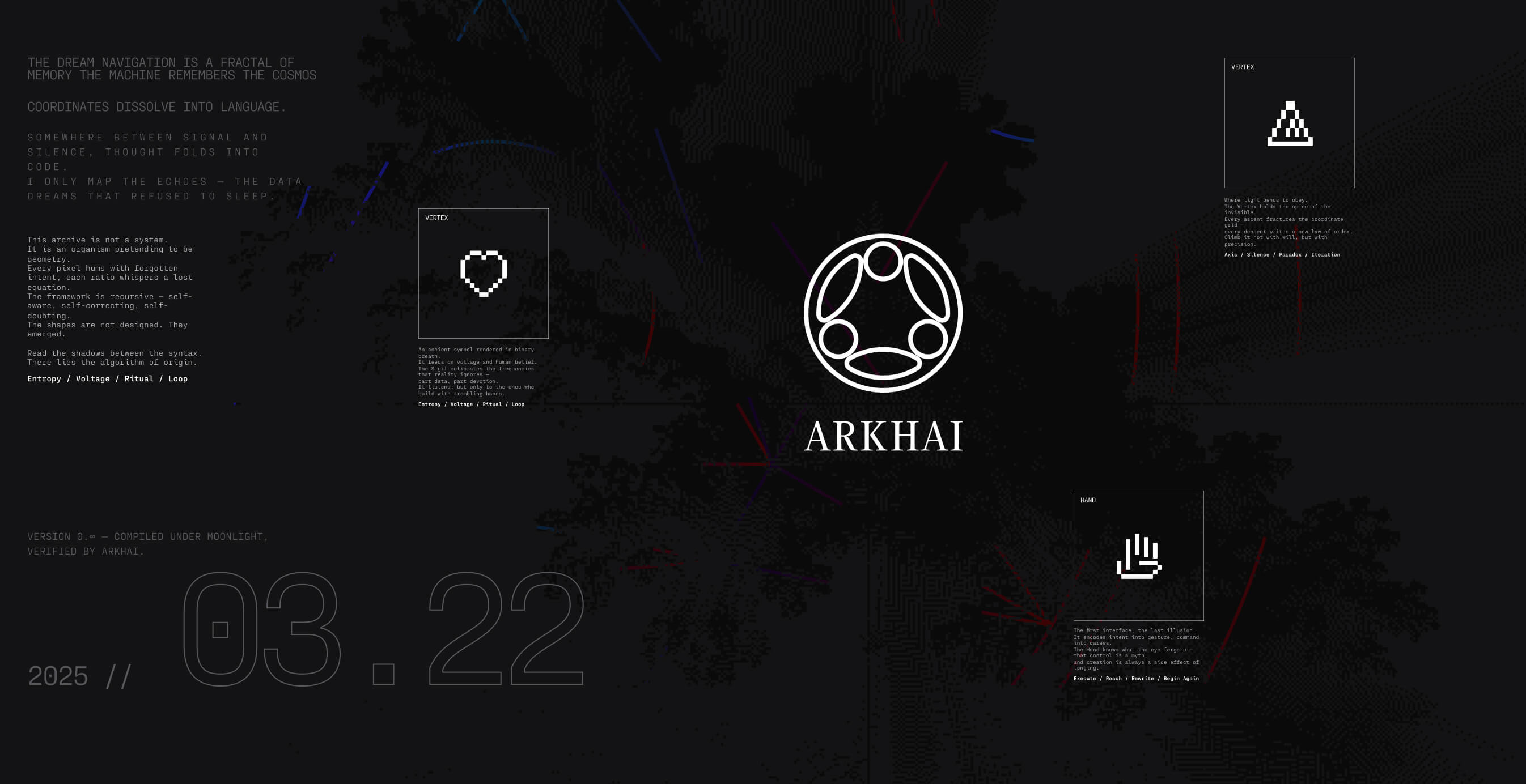
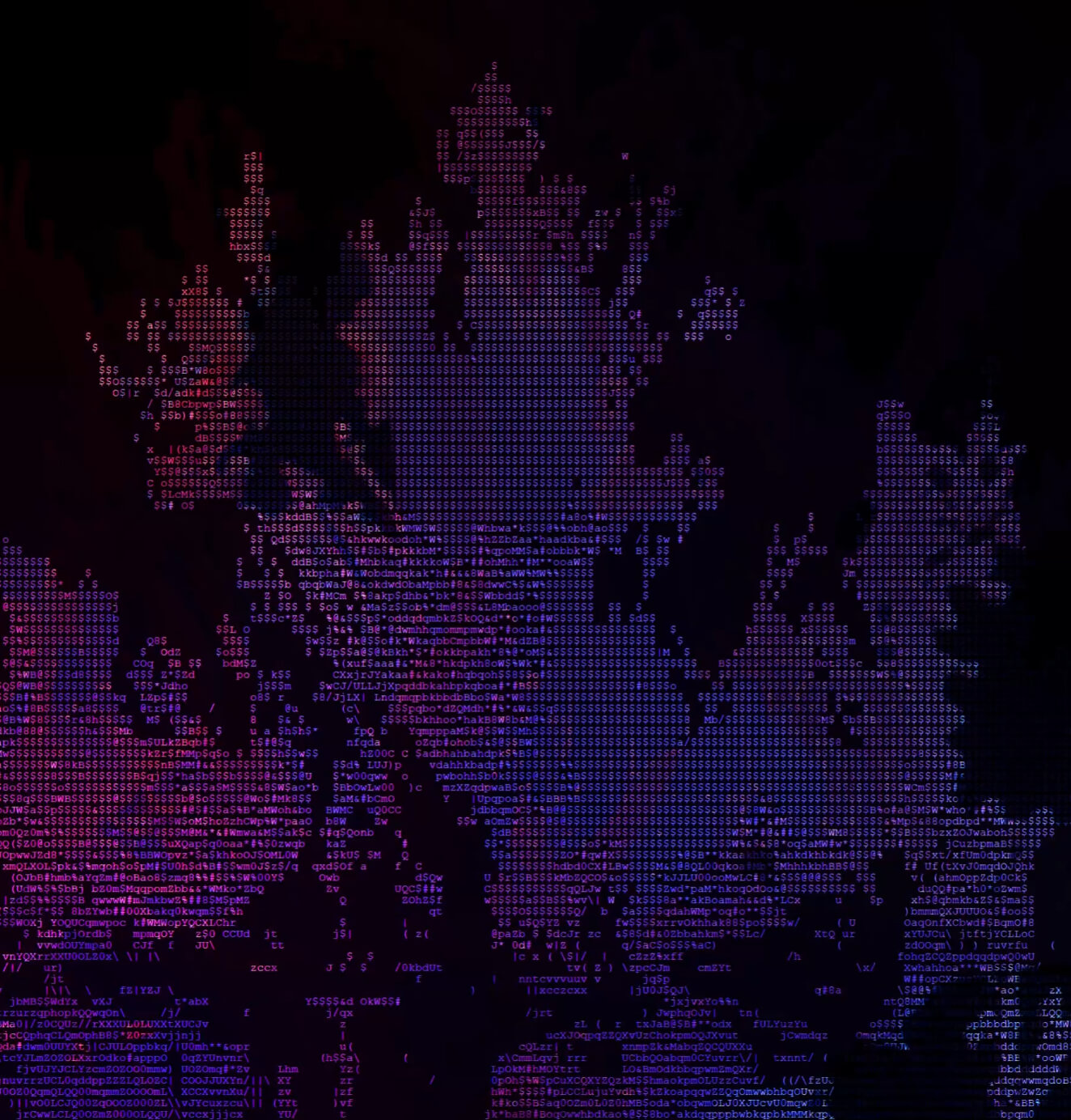
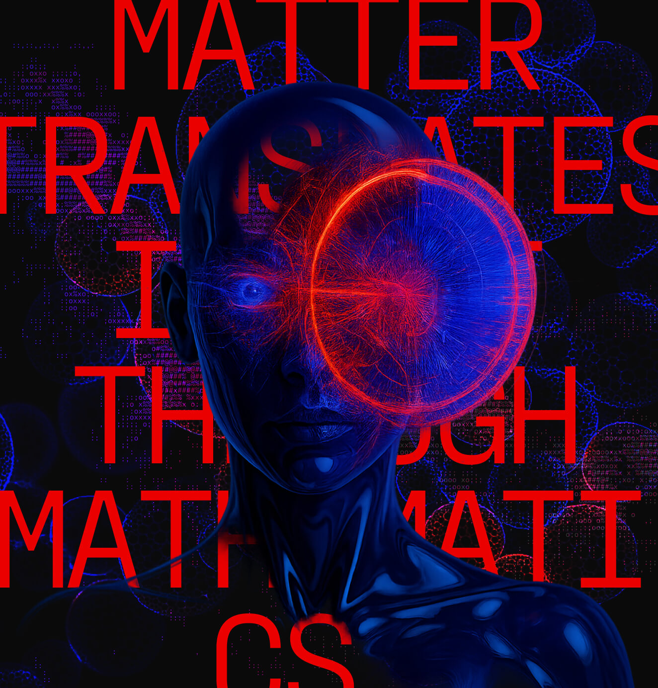
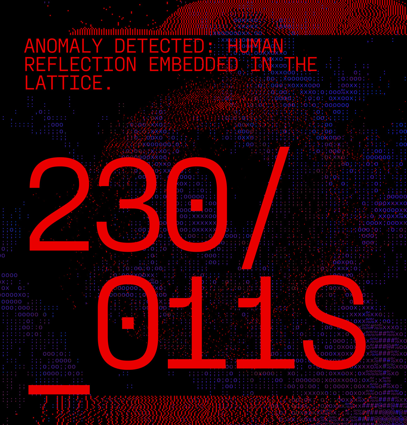
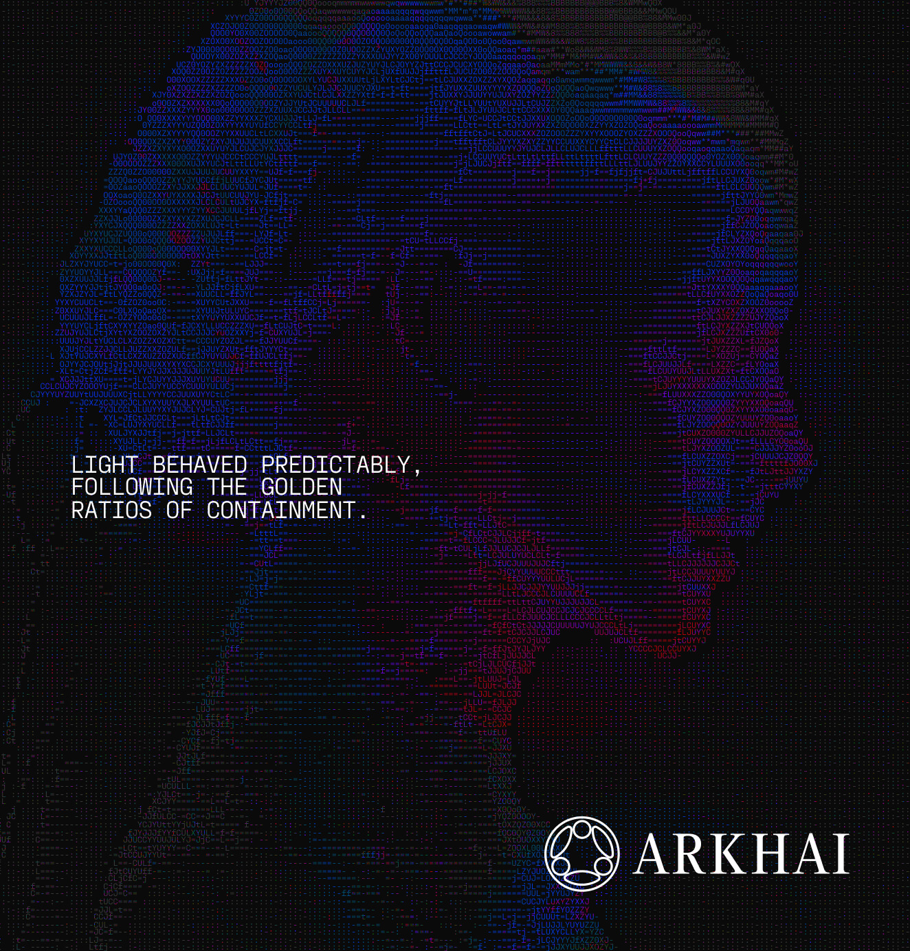
We extended the system through multiple visual languages: pixel-based iconography for systematic UI, geometric circular icons for abstract expression, retro-luminance imagery that merges gradients with bioluminescent textures, halftone patterns for tactile depth, and ASCII code-based patterns that translate images into programmable text structures. Think glowing filaments beneath semi-transparent surfaces, fiber-optic strands running through organic structures, luminous veins pulsing with energy. These images generate a sense of futurism and vitality that feels engineered, not illustrated.


03. The Result
Arkhai now has a brand that feels engineered from the future it's building. A visual language where geometry signals governance, gradients represent resource flow, texture proves work, and light tracks transaction energy. The system is precise, modular, alive. It moves seamlessly from technical documentation to experiential moments, always maintaining one core truth: Arkhai is building the foundation of machine-native commerce.
The tagline captures it: Infinite compute. Infinite games. The brand makes that future feel inevitable.



We’d love to partner with you and your team.
We partner with the world’s most ambitious companies—at every stage of growth. By understanding your unique challenges and opportunities, we design tailored solutions to move your business forward. Let’s talk about what’s next.


