Bomi 365
Branding
Print & Packaging
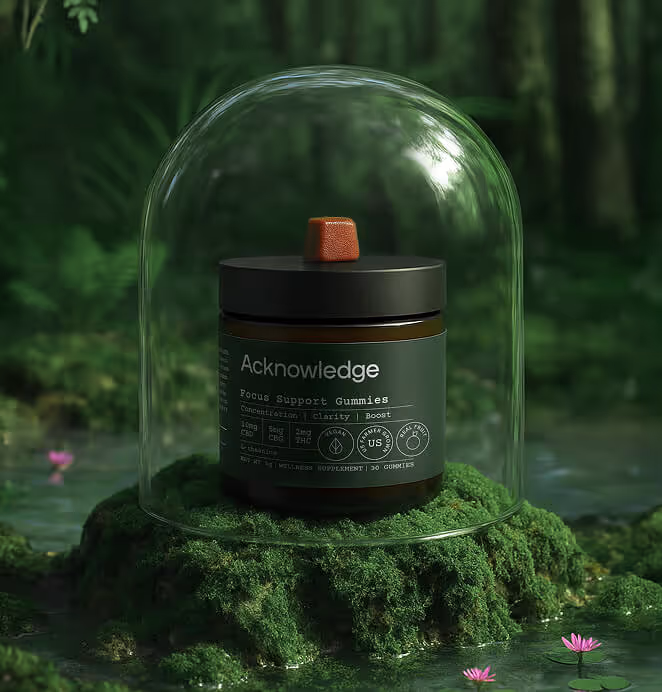
Health & Wellness

Background
The Challenge
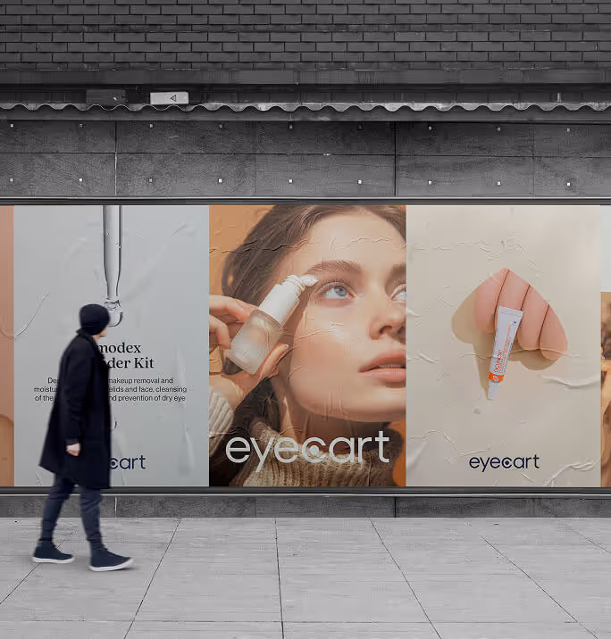
The supplements market was noisy and polarized. On one side were sterile, pharma-like brands that promised efficacy but felt intimidating. On the other side were pastel wellness products with vague promises and little proof. Neither inspired trust, and both reduced “beauty” to skin-deep quick fixes.
Bomi 365 was built on a different truth: beauty is the visible result of consistent internal health. But that idea didn’t yet have a clear language in the market. To break through, the brand needed a positioning and identity that made daily, plant-based supplementation feel both credible and aspirational. The challenge was to carve out that middle ground — not clinical vs. crunchy, but a lifestyle brand rooted in science and designed for modern rituals.


The Solution
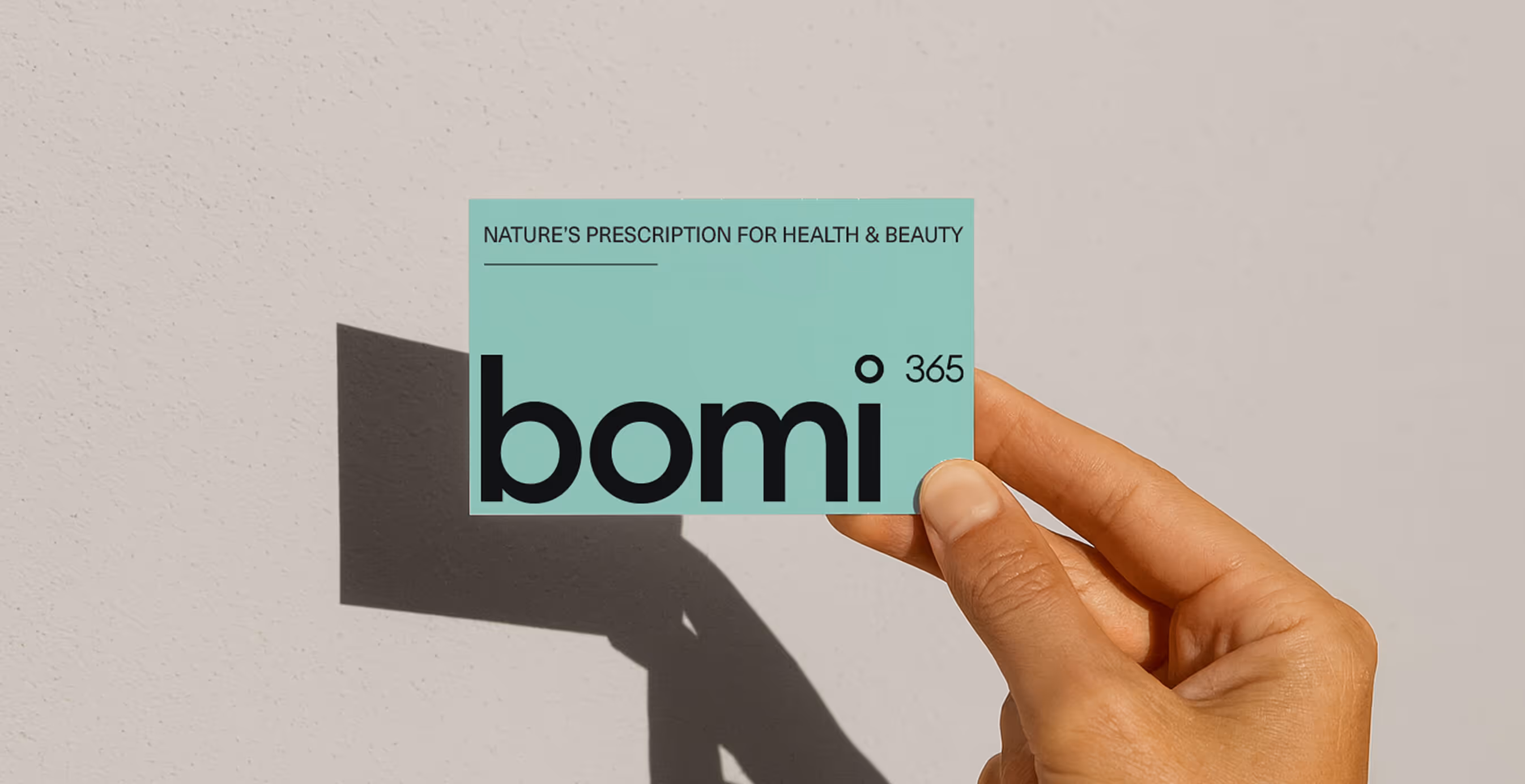
We anchored Bomi 365 in its core purpose: nature’s prescription for beauty. Not a passing trend, but a disciplined ritual that connects plant-based science to visible results.
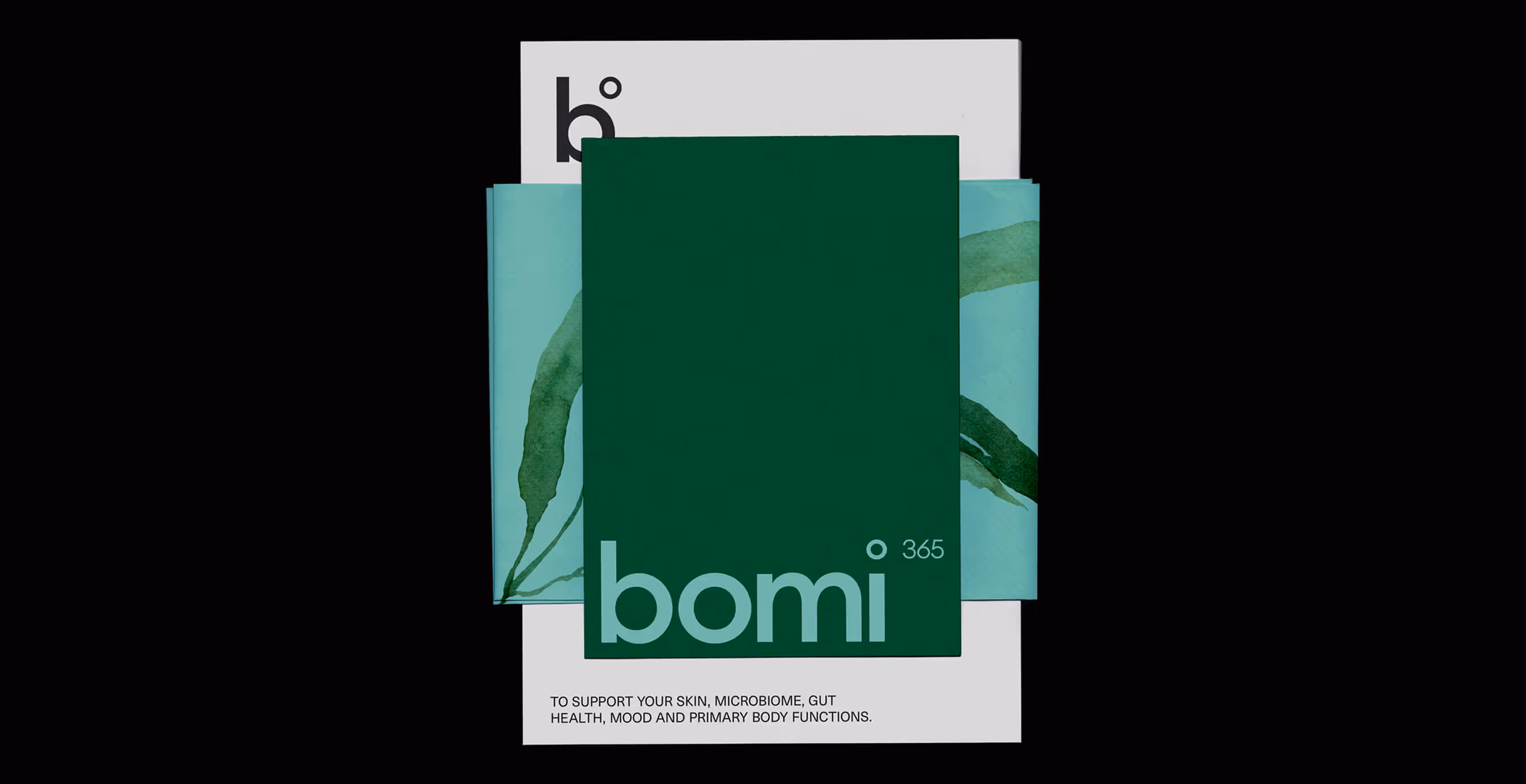
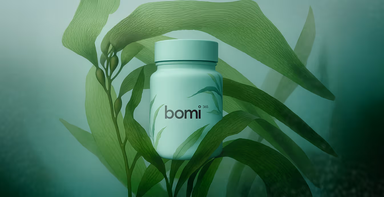
The name carried the idea forward. Bomi signals natural vitality, while 365 establishes consistency — beauty as a lifestyle, not a quick fix.
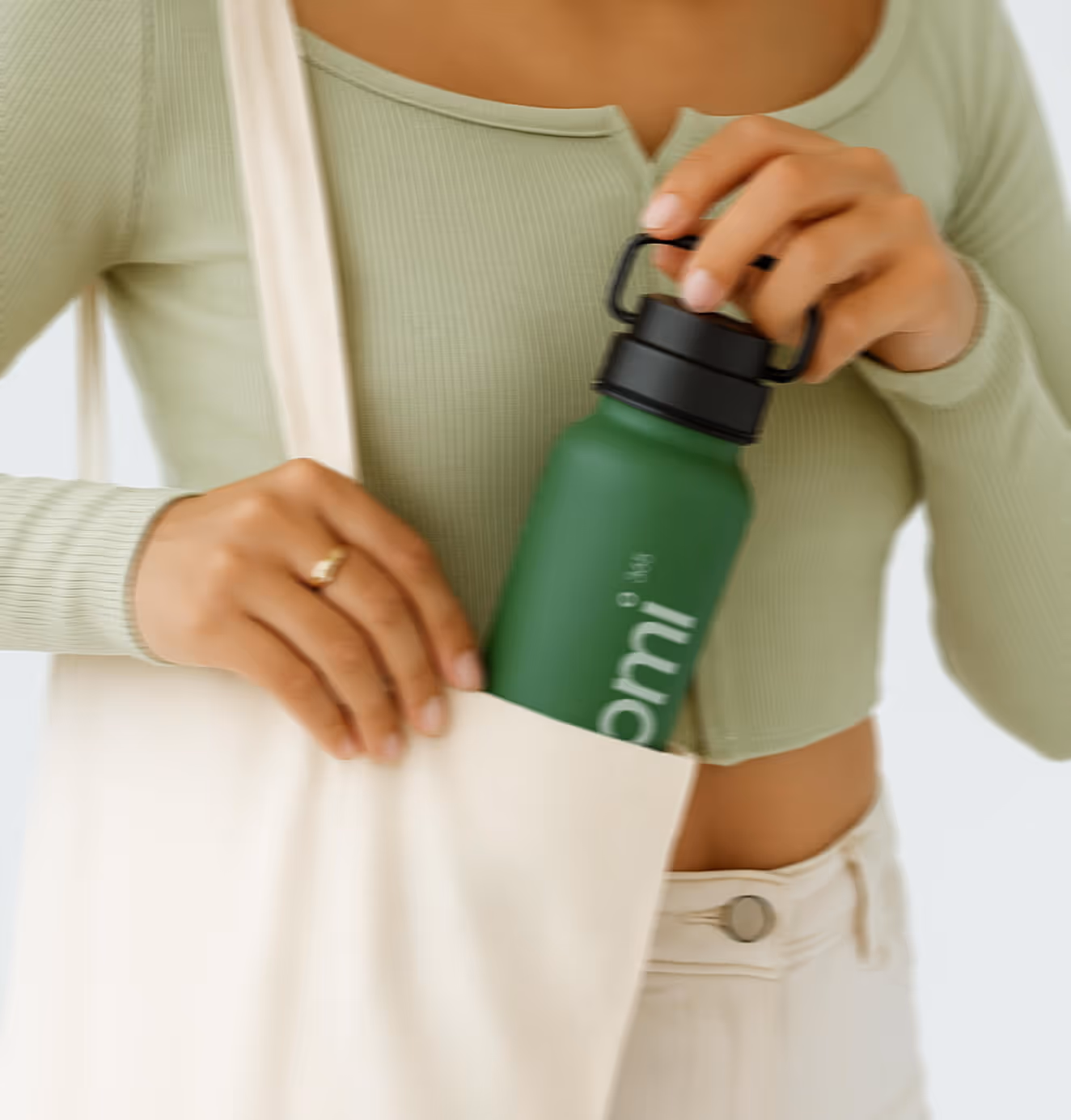
The identity system was designed to make that purpose tangible. A mint-and-midnight palette communicates freshness and calm authority. Watercolor ingredient illustrations ground the brand in transparency and storytelling, reminding customers of the natural origins behind every dose. Clean, structured typography reinforces credibility, elevating the brand above typical wellness aesthetics.
Packaging became the clearest expression of the idea. Each bottle and resealable pouch was designed to feel clinical enough to inspire trust yet approachable enough to live beautifully in a home. Built as a system, the range reinforced Bomi’s role as a daily ritual — modular, consistent, and always accessible.
Meet the new era of supplements. A culture of care where ‘nature’s prescription’ becomes a daily practice, something people live, prove, and trust every single day.


We’d love to partner with you and your team.
We partner with the world’s most ambitious companies—at every stage of growth. By understanding your unique challenges and opportunities, we design tailored solutions to move your business forward. Let’s talk about what’s next.