Look Optometry
Branding
Creative
Website Design & Dev
Content Marketing
Professional services
Background
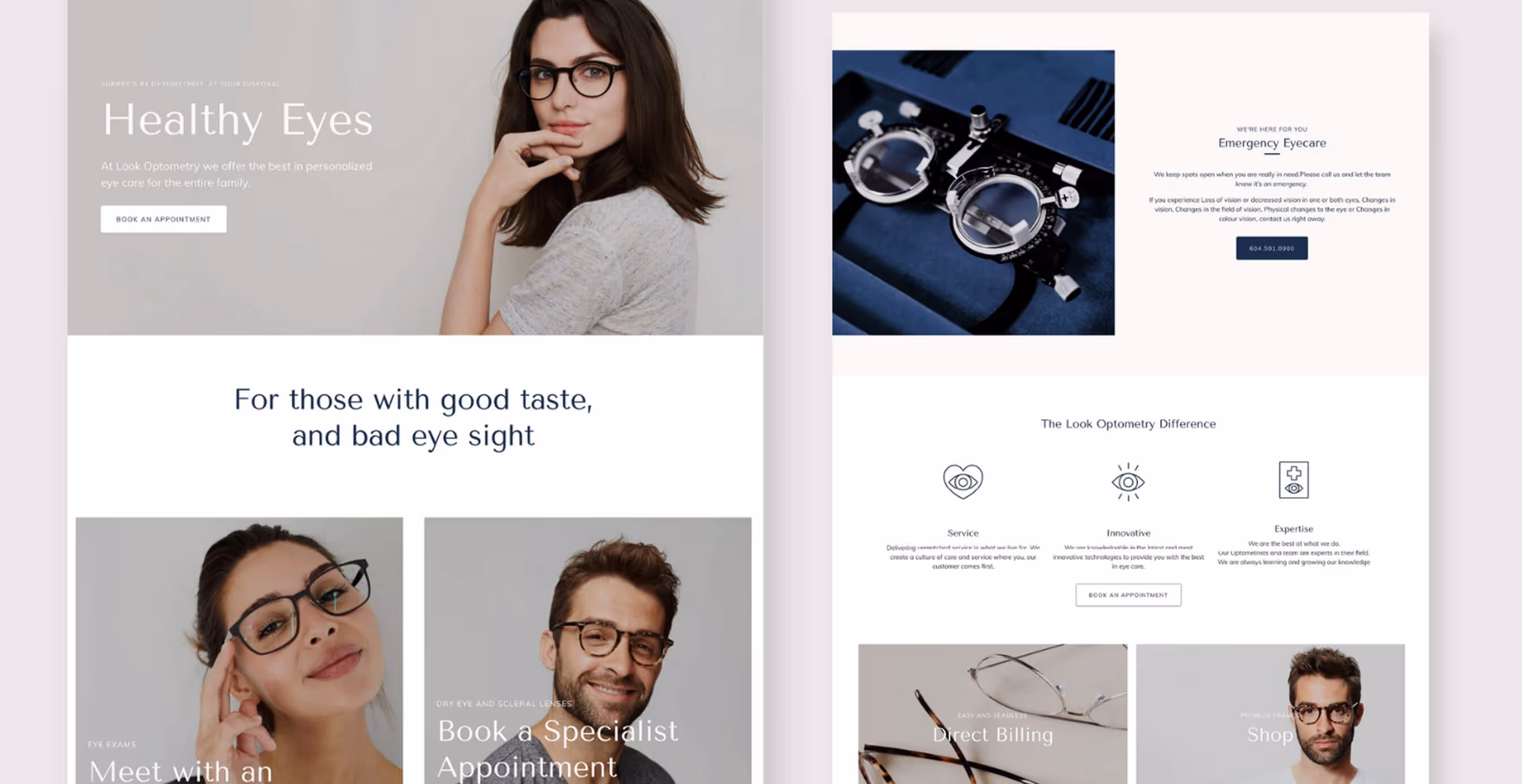
The Challenge
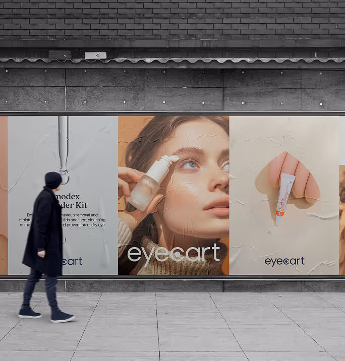
Optometry has always looked the same.
Muted blues. Bland fonts. The promise of efficiency over experience. Clinics that feel like waiting rooms, not destinations. A category built to be tolerated, not loved.
Look Optometry wasn’t that. They had the craft, the technology, the care. But from the outside, you’d never know it. Their identity flattened them into the same beige square as everyone else.
The challenge was about creating a brand that could make people actually want to engage with their eye care. A brand that could live as comfortably in the language of lifestyle as it did in the language of healthcare.

01. Our Insight
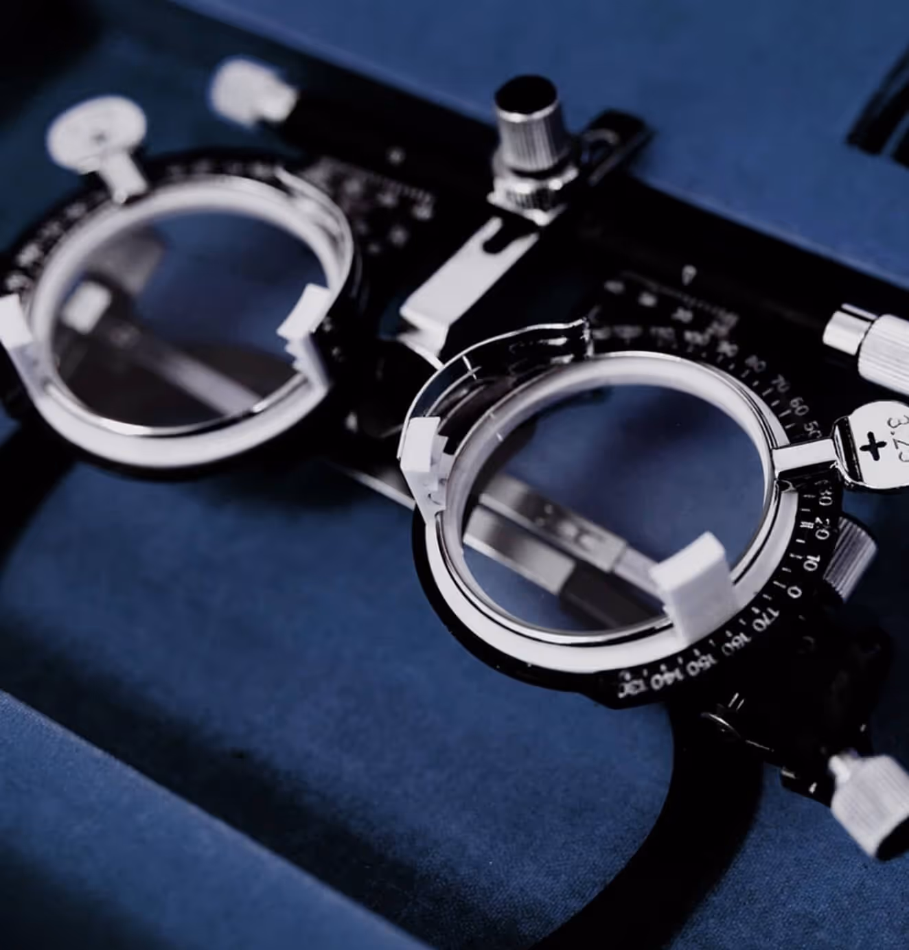
Vision isn’t just medical. It’s cultural.
People don’t come for an eye exam. They come for how they’ll see. How they seem themselves, their style, their world.
Our insight was simple: if optometry is about vision, then the brand itself had to look like something worth seeing.
So we reframed Look. Premium care, yes. Deep expertise, of course. But wrapped in an identity system that felt more like a boutique or gallery than a doctor’s office. Playful illustrations to disarm. Marble and navy to ground in trust. A voice that made you smile the moment you read it:
For those with good taste and bad eyesight.
The opportunity wasn’t to update a clinic. It was to rewrite the visual language of an entire category.

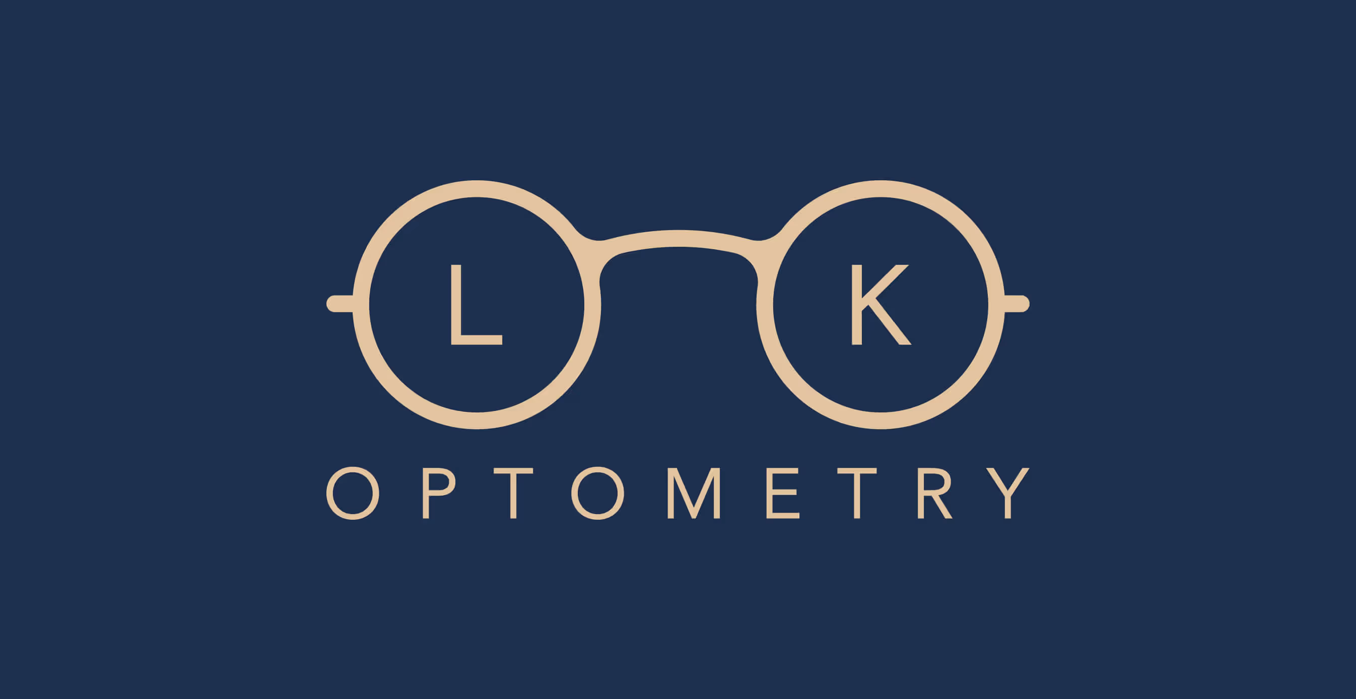
02. Brand Transformation
The breakthrough came in five words:
For those with good taste and bad eyesight.
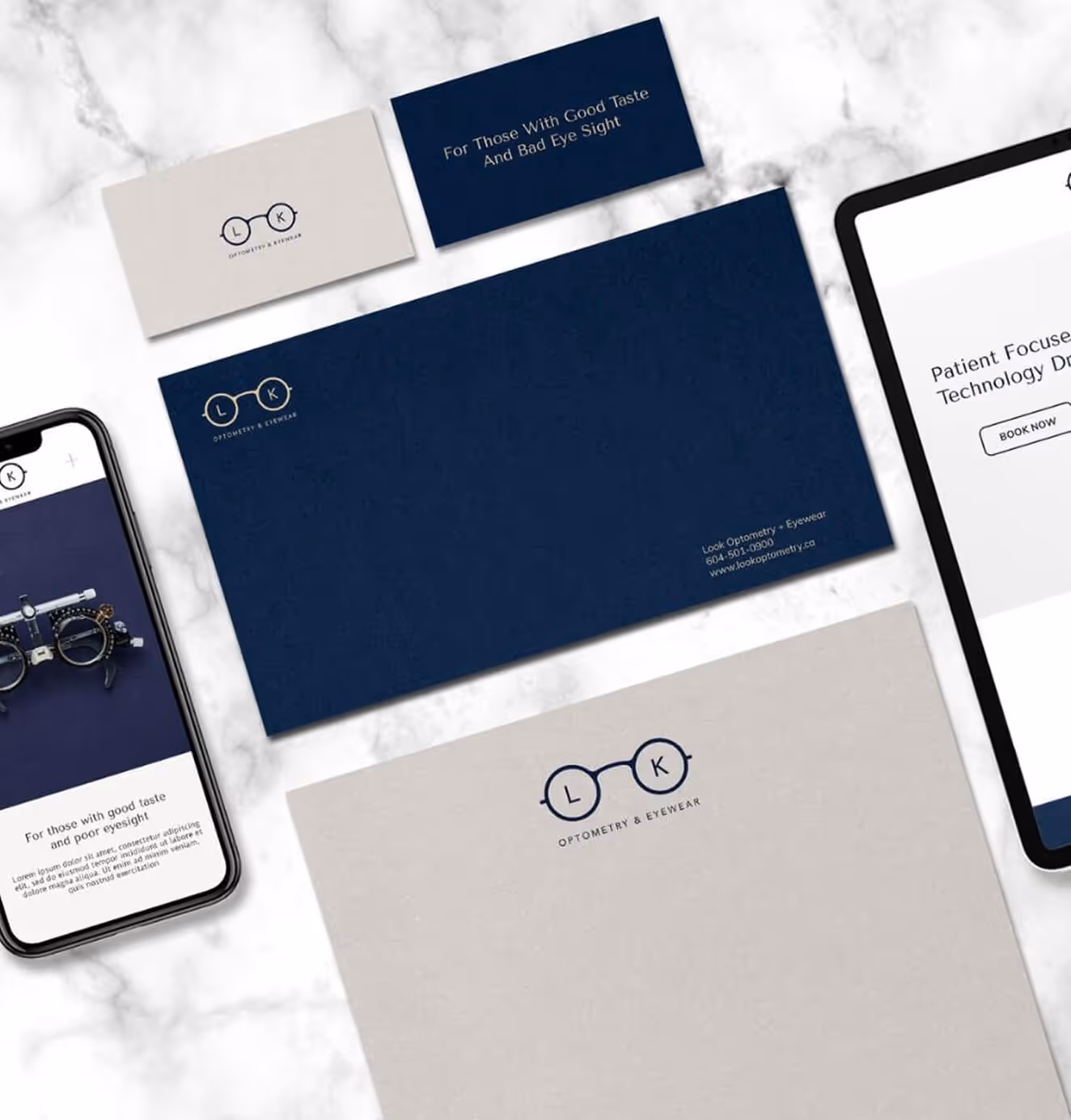
It wasn’t just a tagline. It was a manifesto. A wink that reframed the entire category. In a world of dry medical promises and generic “family care” slogans, Look dared to be both stylish and self-aware. The line gave us permission to design a brand that could hold opposites at once: premium and playful, expert and approachable, classic and modern.
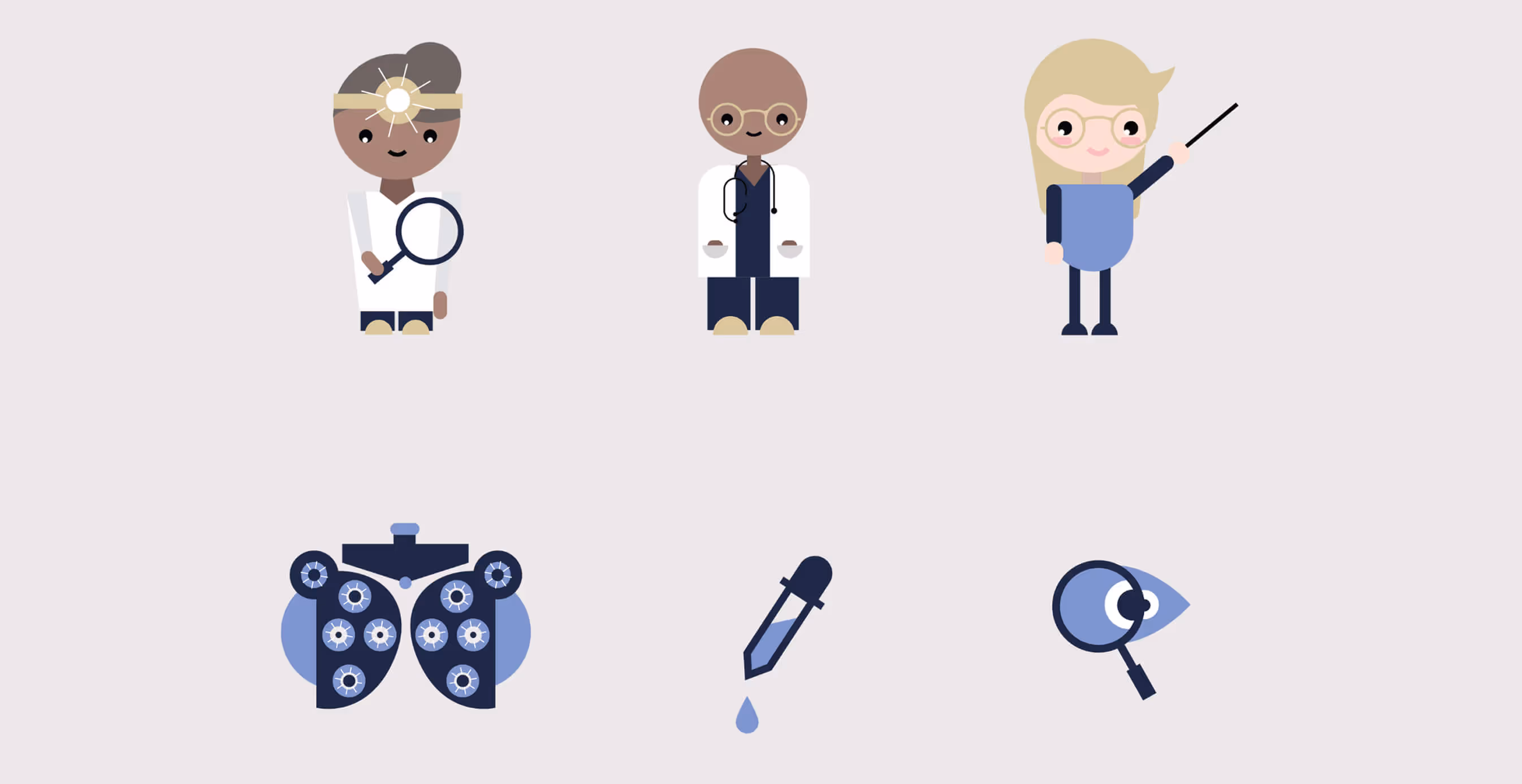
The identity was built around that tension. Royal Navy and marble grounded the brand in trust and tradition. Creams and golds warmed it into luxury. Clean typography and minimal layouts pulled it into the modern world. Then came the wit: hand-drawn illustrations of animals in glasses, playful iconography, and a voice that smiled at you from every surface.
The website carried the same energy. Not a sterile portal, but a boutique experience. Exams and eyewear sat side by side, with shoppable design and clear storytelling. Eye care didn’t have to look like healthcare. It could look like fashion.
The tagline set the tone. Everything else — color, typography, illustration, copy — flowed from it.


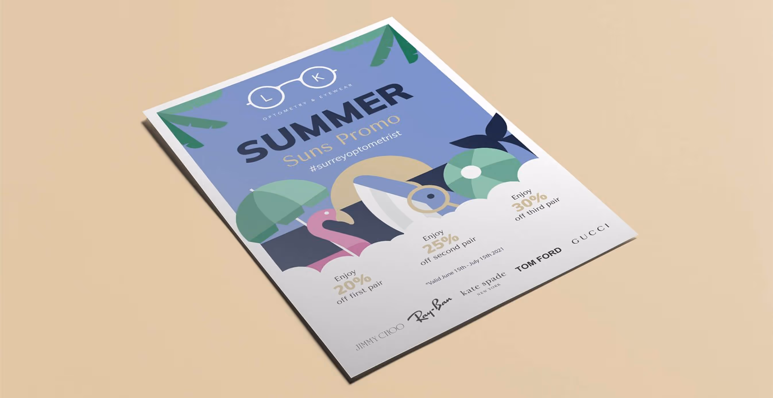
03. Brand Application
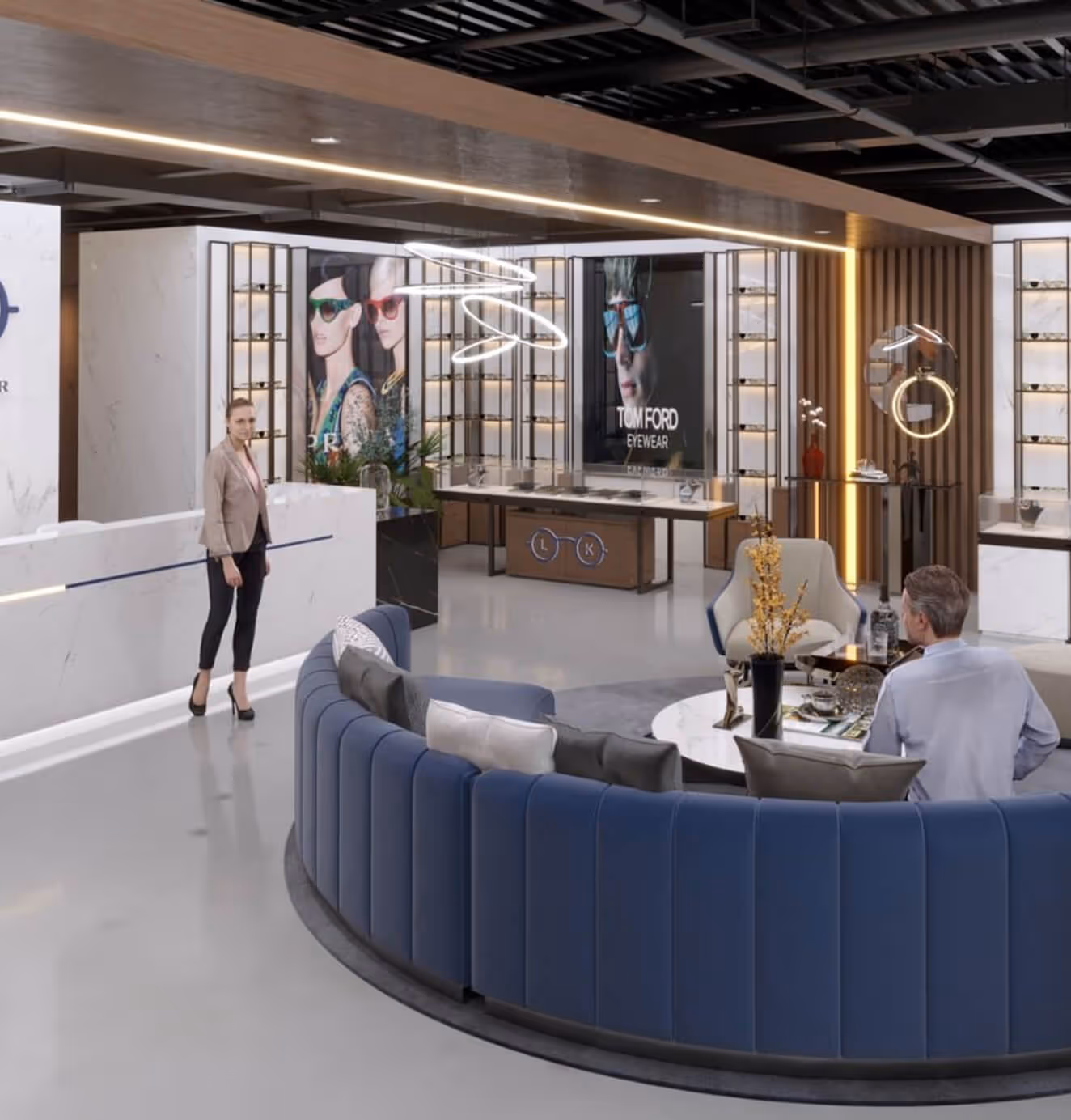
The brand found expression everywhere. On signage, it was bold. On packaging, it was cheeky. On uniforms, it was elevated. Every touchpoint carried the same wink: serious care, but never too serious.
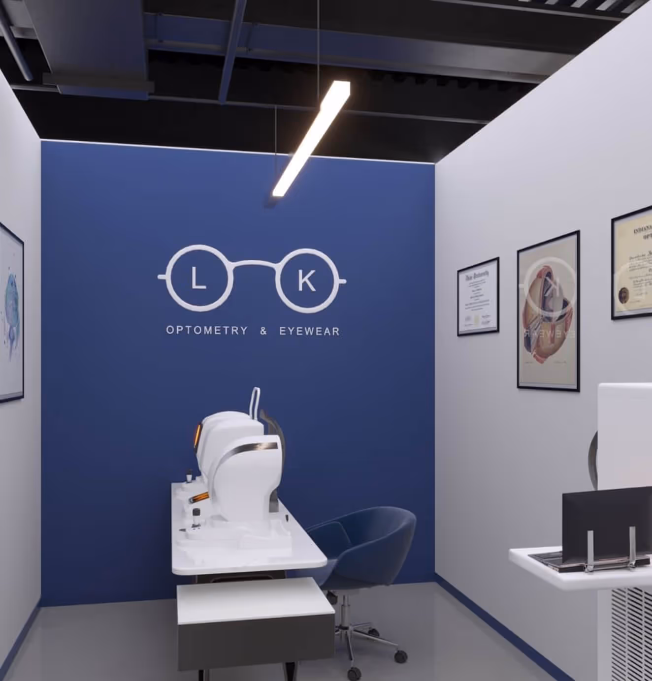
When Look expanded to a second location, the tagline became the guiding brief for space itself. Exam rooms were imagined with gallery-like poise, while waiting areas echoed boutique hotels. Brass fixtures and marble counters nodded to luxury; playful details reminded you this wasn’t an intimidating institution, but a brand with personality.
Illustrations turned social posts into shareable moments. Marketing campaigns leaned on the tagline’s duality, inviting people to see themselves — literally — in the brand. Each execution proved the line true: Look was built for people who care about how things look, even when their eyesight doesn’t cooperate.
The result wasn’t just a new identity. It was a new cultural stance. Look showed that optometry didn’t have to be faceless or functional. It could be stylish, witty, and aspirational — without losing an ounce of credibility.
We’d love to partner with you and your team.
We partner with the world’s most ambitious companies—at every stage of growth. By understanding your unique challenges and opportunities, we design tailored solutions to move your business forward. Let’s talk about what’s next.