LUV Health
Branding
Print & Packaging
Health & Wellness
Consumer Brands
Background
The Challenge
The wellness industry has a credibility crisis. On one side, you have centuries-old remedies dismissed as "woo-woo." On the other, clinical supplements that feel as appealing as a pharmacy aisle. Somewhere in between lies a massive audience: people who meditate with apps, track their sleep, and want their Lion's Mane backed by peer-reviewed studies.
Luv Health came to us with quality organic supplements and a vision: to occupy that vital space between mystic and molecule. But in a $4.4 trillion wellness market saturated with both snake oil and sterile science, how do you build trust while keeping the magic alive?
The Insight
Today's wellness consumer isn't choosing between ancient wisdom OR modern science—they're already living both. They're the generation that checks their horoscope and their blood work, who want their adaptogens organic AND clinically dosed.
The real gap wasn't in the market. It was in the messaging.
Our strategy: Stop treating holistic wellness like a compromise. Make it a celebration.


01. The Solution
We created an identity system that doesn't just bridge ancient and modern. It proves they were never opposites to begin with. Luv Health became the "Modern Sage," a brand archetype that's both wise teacher and energetic friend.
Strategic Design Decisions
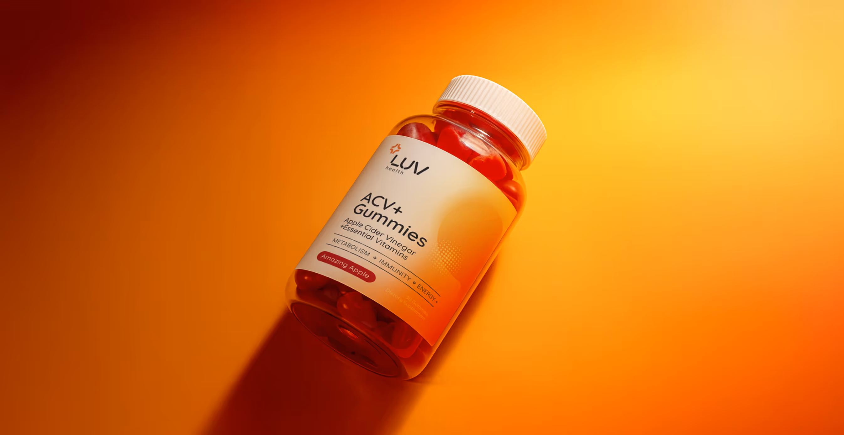
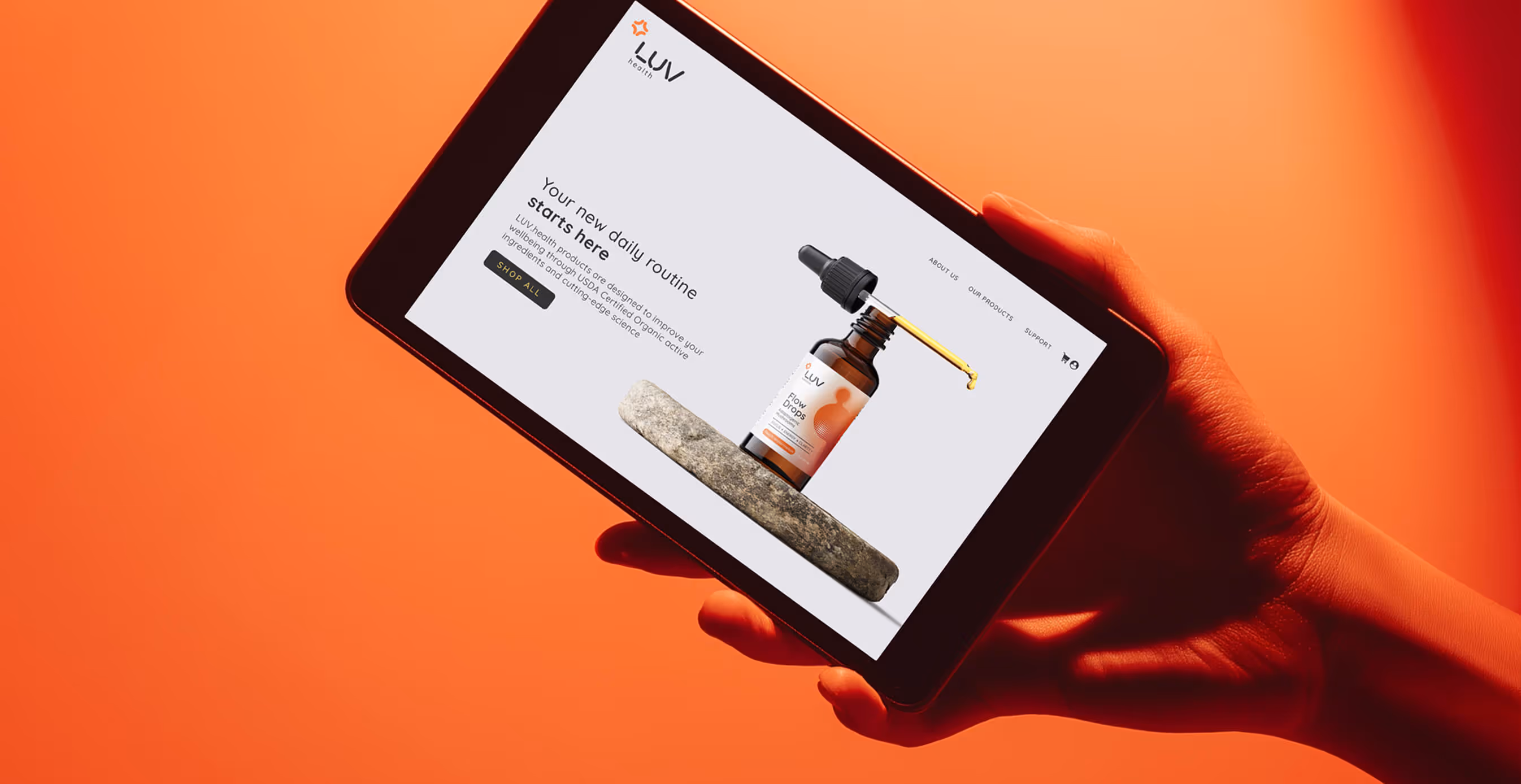
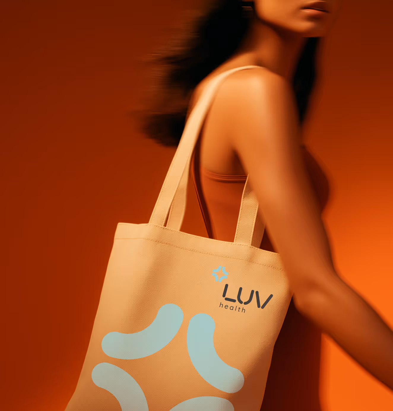
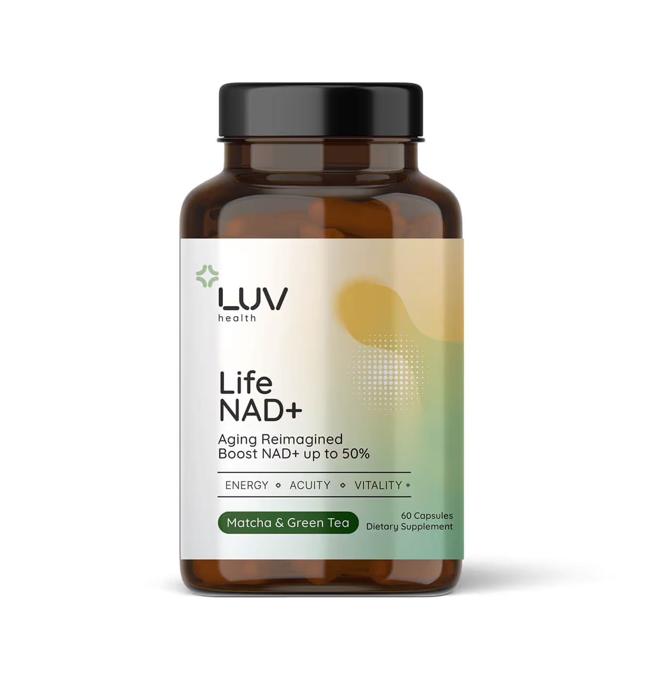
- The Sunrise Palette: Inspired by the golden hour. That transformative moment between day and night.our color story features warm yellows, vibrant oranges, and grounding greens. It's nature's own gradient, scientifically proven to trigger positive psychological responses.
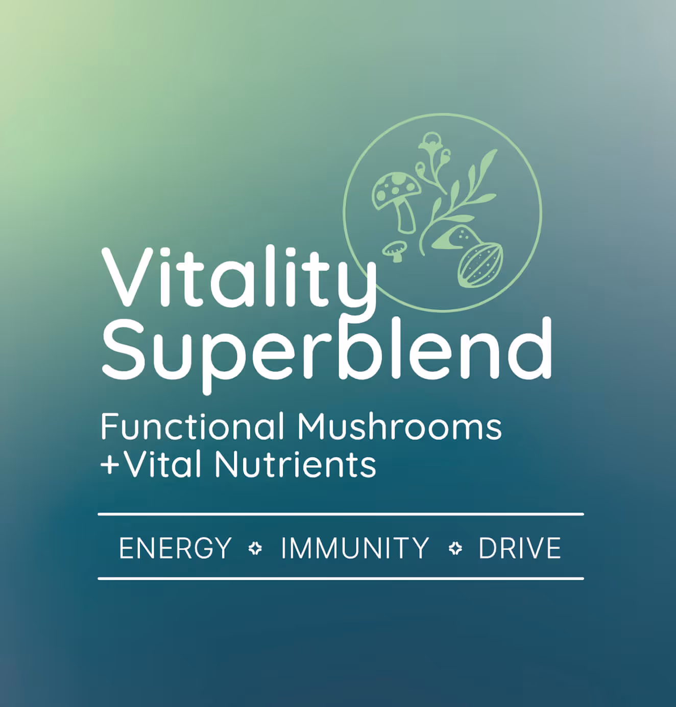
- Organic Geometry: We developed a visual language of flowing shapes inspired by mushroom gills and botanical curves, rendered with the precision of scientific diagrams. Each element feels both discovered and designed.
- Typography That Teaches: Quicksand's rounded terminals bring approachability to headlines, while Inter's clarity ensures ingredient lists and dosage information remain uncompromisingly legible. Wisdom shouldn't require a magnifying glass.
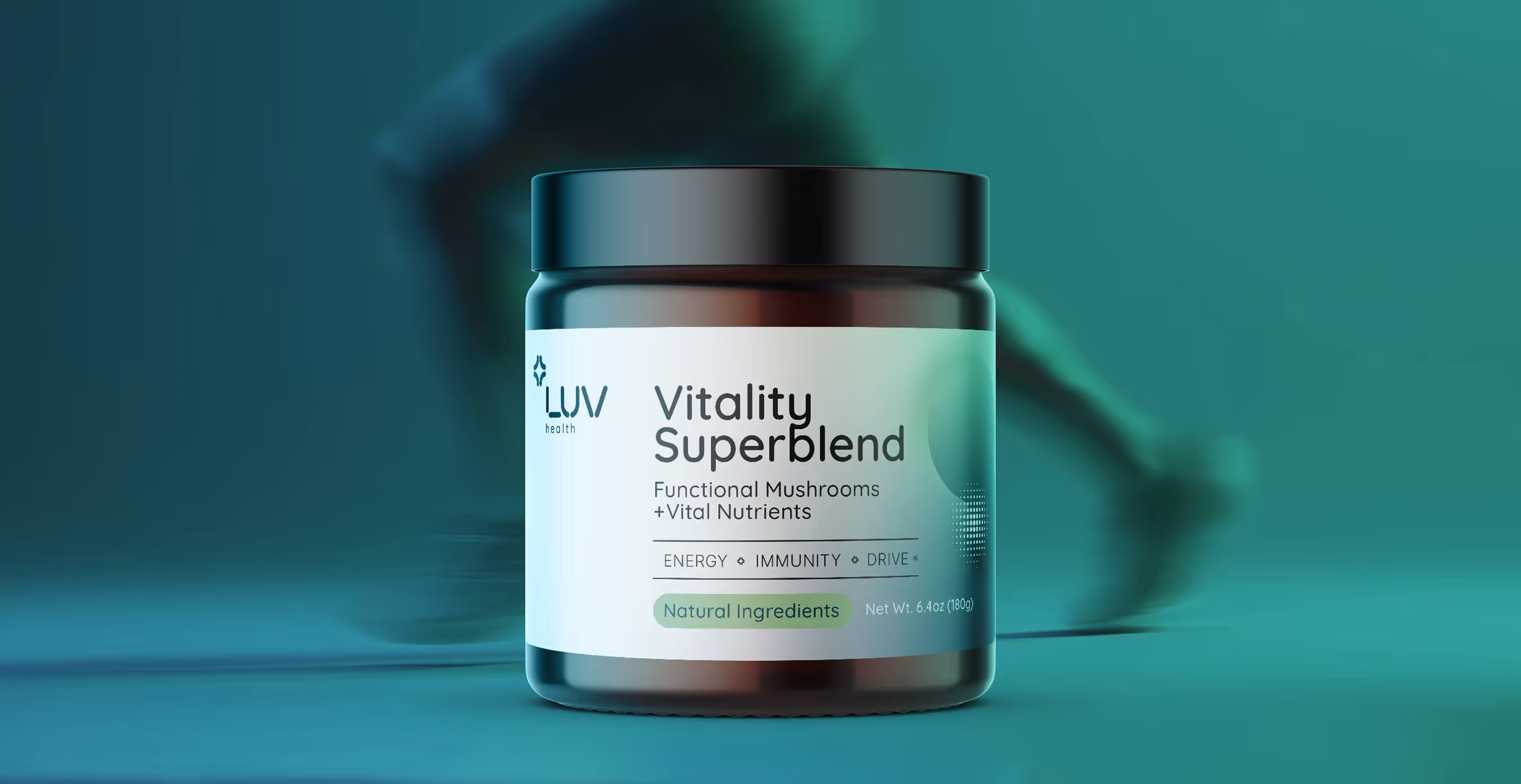
- Photography Philosophy: No more stark white backgrounds or mystical fog. Our imagery captures real people in warm, natural light, making wellness feel less like a pursuit and more like a daily practice.
The System at Work
The genius is in the flexibility. A Lion's Mane supplement features flowing neural patterns that mirror both mycelial networks and synaptic connections. Sleep aids use calming blue-green gradients that evoke both ocean depths and REM cycles. Each product tells its own story while maintaining the larger narrative: this is wellness for your whole being.

02. The Impact
Luv Health's new identity does what the best wellness brands do—it makes you feel better just looking at it. But more importantly, it solves the industry's fundamental tension:
- For the Science-Minded: Clear labeling, clinical dosing information, and a visual precision that signals quality control.
- For the Spirit-Seekers: Organic forms, natural photography, and messaging that honors traditional wisdom.
- For Everyone Else: An accessible, joyful brand that makes taking supplements feel like self-love, not homework.
The result is a brand that doesn't ask customers to pick a side. Because in the end, whether you call it biohacking or balance, the goal is the same: feeling good in your own skin.
As their tagline promises: "Luv Your Health." Not despite its complexities. But because of them.
We’d love to partner with you and your team.
We partner with the world’s most ambitious companies—at every stage of growth. By understanding your unique challenges and opportunities, we design tailored solutions to move your business forward. Let’s talk about what’s next.