OnLit (Dyslexia Canada)
Branding
Creative
Education
Background
The Challenge
Dyslexia Canada was about to launch a new online hub to help Ontario teachers navigate a major curriculum overhaul in language education. But they didn’t just need a platform—they needed a brand teachers would actually want to spend time with.
This wasn’t another top-down resource dump. It was about building a digital space that felt like a community—supportive, non-institutional, and deeply human. The brief? Create a new sub-brand, ONLit, that felt personal yet professional, designed for the people in the trenches: Ontario’s teachers.


01. The Insight
Most education tools are built for teachers, not with them in mind. They’re clinical, outdated, and emotionally disconnected.
But this moment demanded something different. Teachers weren’t just looking for resources; they were looking for reassurance, for connection, and for a little spark of joy in a time of change.
Our strategy: Design for community first, curriculum second.
We positioned ONLit not as a resource library, but as a movement. A place where teachers could see themselves, support each other, and feel empowered to shape the future of literacy in Ontario.


02. The Solution
We built a brand identity system that’s joyful, modern, and unmistakably inclusive. Because the best way to get teachers to show up is to make them feel seen.
Key Design Decisions:
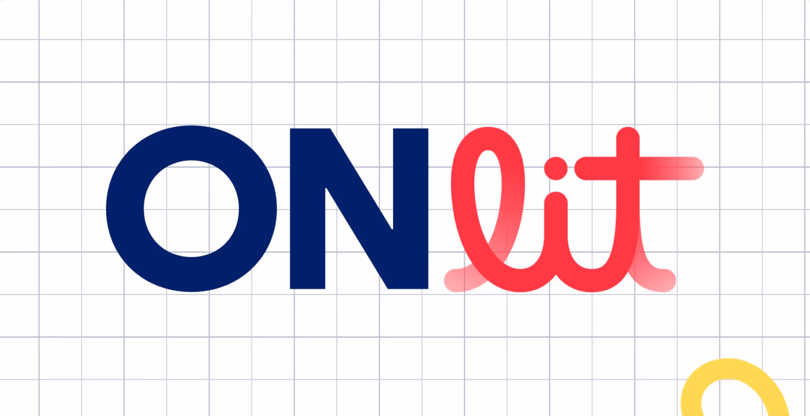
- Name as Message: “ONLit” works across English and French—doubling as “Ontario Literacy” and “On Lit” (“We read”). Simple, clever, bilingual.
- Color as Energy: A vibrant palette with warmth and contrast to cut through the institutional noise.
- Typography with Character: Clean yet personable. A type system that could flex from headline to help doc without ever losing tone.
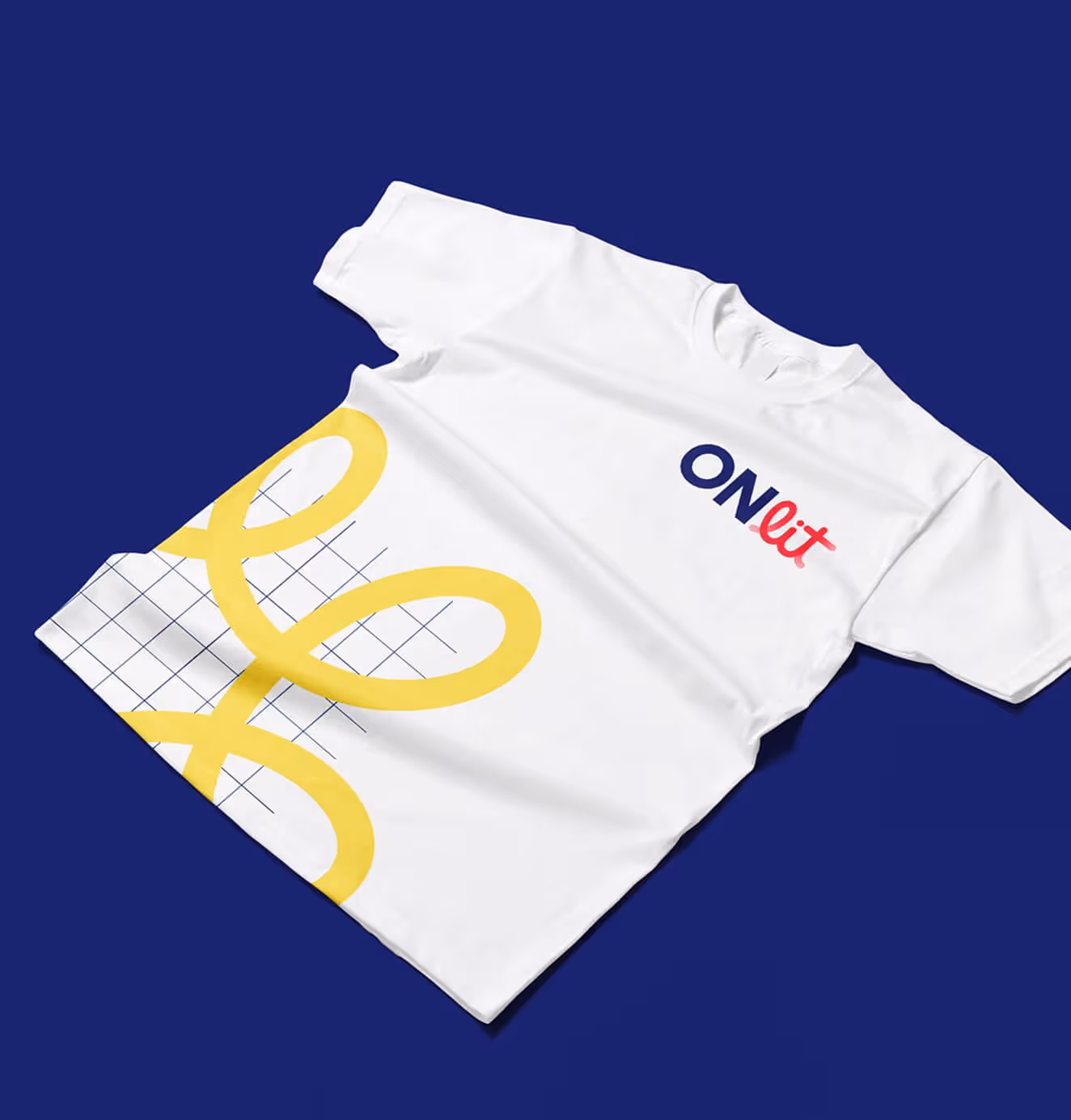
- Assets with Personality: From tote bags to teacher templates, we created collateral that felt like it belonged in the hands of real people, not policy makers.
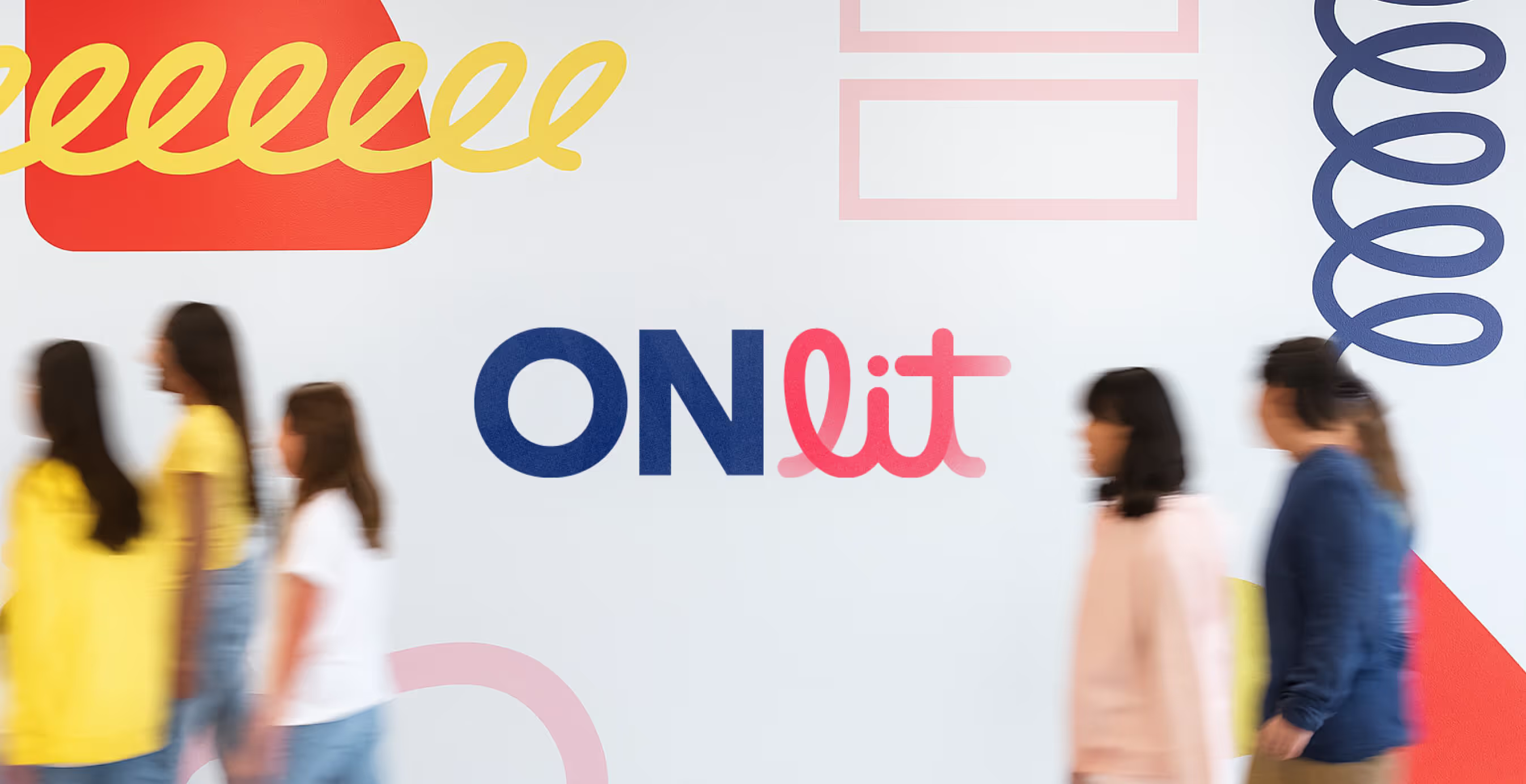
Visual Identity
The logo system balances play and professionalism.
- Bright, optimistic colors signal energy and accessibility.
- Friendly, rounded type with subtle geometric logic evokes trust.
- Modular iconography reflects the building blocks of literacy.
Applications
From digital templates to print collateral, every touchpoint was built for flexibility and ease-of-use. Whether a regional coordinator is sending a flyer or a teacher is exploring the site, the brand always feels cohesive and supportive.
Brand System Includes:
- Logo Suite
- Color + Type Systems
- Iconography
- App design
- Custom Templates for Flyers, Presentations, Social, and Web
- Tote Bags, Tees, and Community Collateral


03. The Impact
ONLit launched as a flagship initiative supporting thousands of educators across Ontario. The brand helped frame Dyslexia Canada not just as a resource provider, but as a true ally in literacy reform.
In a landscape full of bureaucratic bloat, ONLit feels like a friend.
- Teachers now have a central hub for curriculum-aligned resources and connection.
- Coordinators have the tools to run events and trainings with confidence.
- Dyslexia Canada has a vibrant, community-forward identity to grow with.


We’d love to partner with you and your team.
We partner with the world’s most ambitious companies—at every stage of growth. By understanding your unique challenges and opportunities, we design tailored solutions to move your business forward. Let’s talk about what’s next.