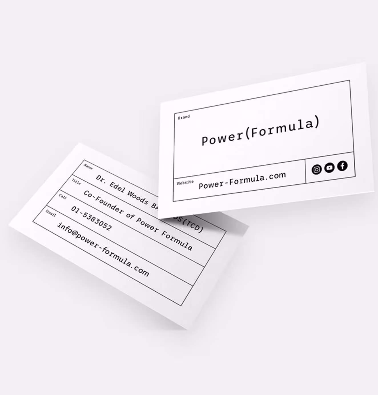
Power (Formula)
Branding
Naming
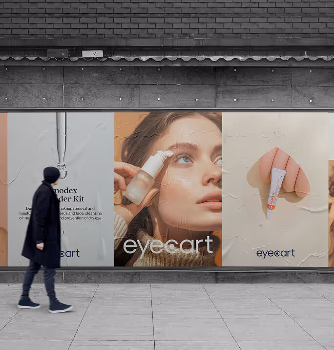
Fashion & Beauty

Background
The Challenge
Skincare had become too complicated. Shelves were crowded with products, claims, and multi-step routines that left people more confused than confident. Luxury brands sold status. Influencer brands sold personality. Drugstore brands sold price. None of them solved the real problem: people didn’t know what to trust or how to build a routine that actually worked.
Power (Formula) had the advantage of doctor-developed, evidence-based products designed to deliver results. But it needed more than clinical credibility. It needed a brand that could translate science into simplicity and show that fewer, more powerful products were all anyone needed.

01. Our Insight
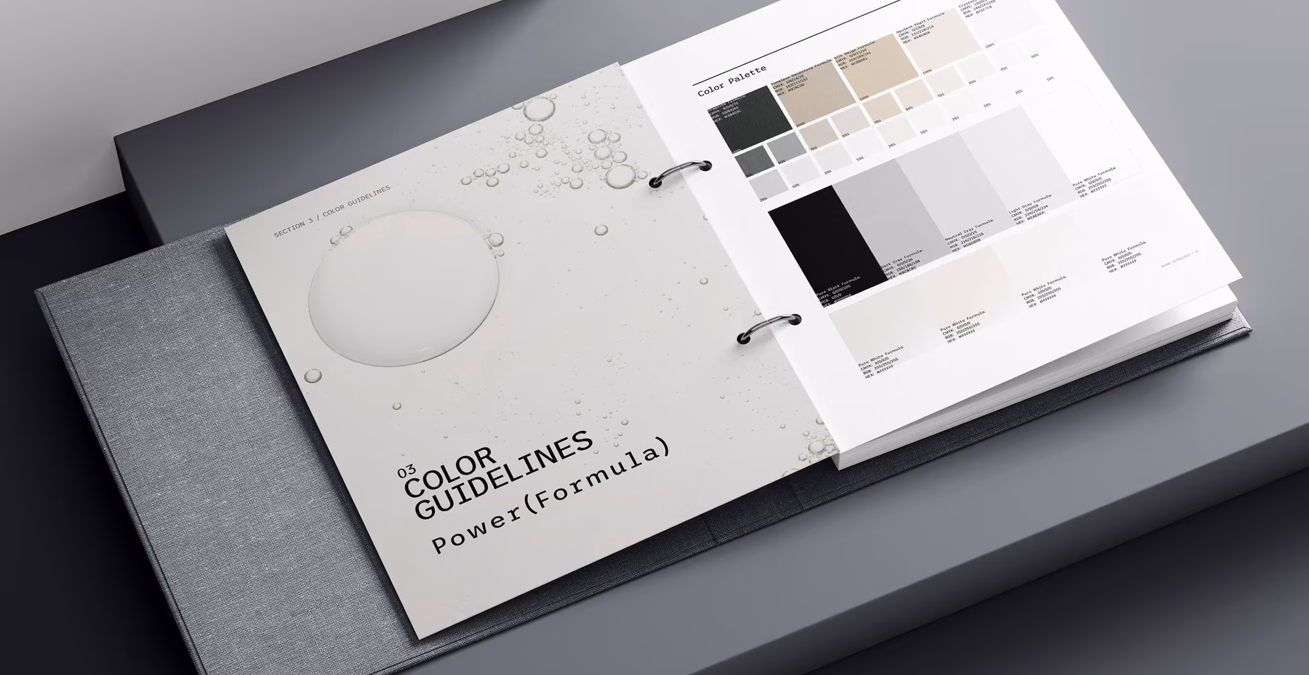
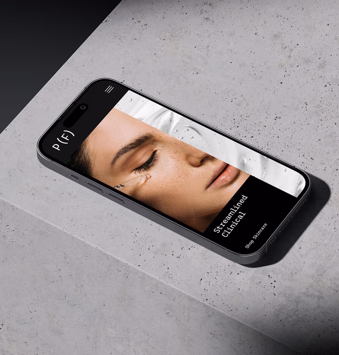
Our strategic response centered on the concept of "Streamlined Clinical," a visual and verbal identity that harnesses the authority of medical precision while maintaining human warmth and accessibility. We developed a brand positioning that emphasizes "power formulas" as the antithesis to the industry's fragmented approach, using prescription-inspired design elements and a monospace typography system that signals scientific rigor without sacrificing clarity.
The minimalist color palette rooted in monochrome with warm skin tones strategically balances clinical credibility with approachability, while our grid-based design system creates order from chaos by literally organizing information in a way that guides consumers through their skincare journey.
Every element, from the tagline "Discover the power of precision skincare" to the clean product hierarchy, reinforces the core promise: doctor-created formulations that simplify rather than complicate, educate rather than mystify, and deliver real results through scientific precision rather than marketing hype.
02. The Solution
Our insight was that people don’t want more skincare, they want certainty. That idea guided everything.
We developed a brand positioning that emphasizes "power formulas" as the antithesis to the industry's fragmented approach, using prescription-inspired design elements and a monospace typography system that signals scientific rigor without sacrificing clarity.
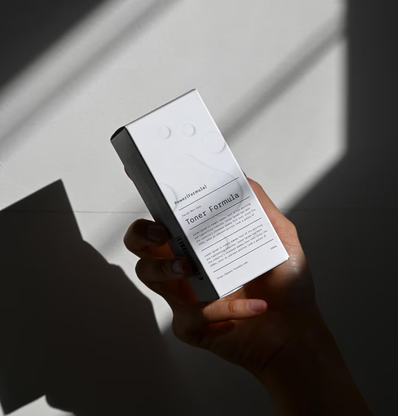
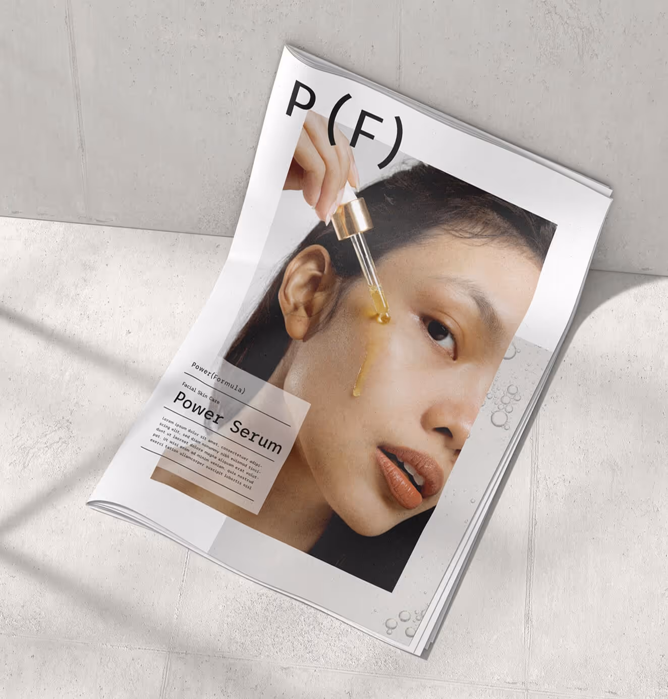
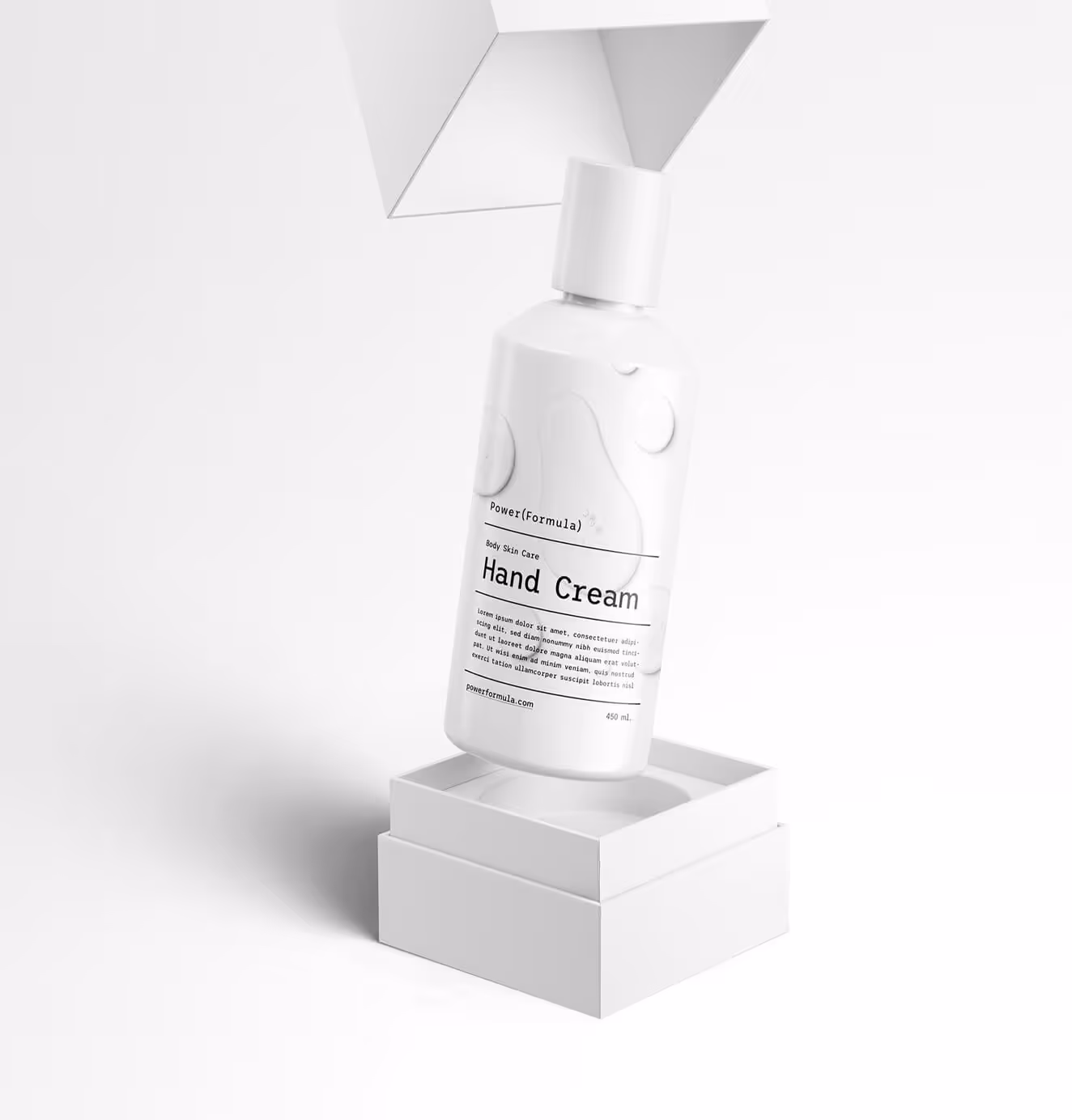
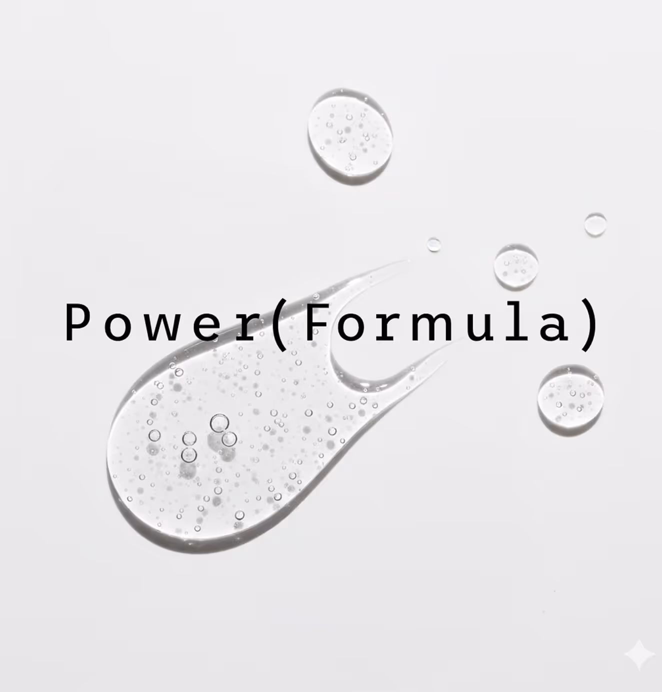
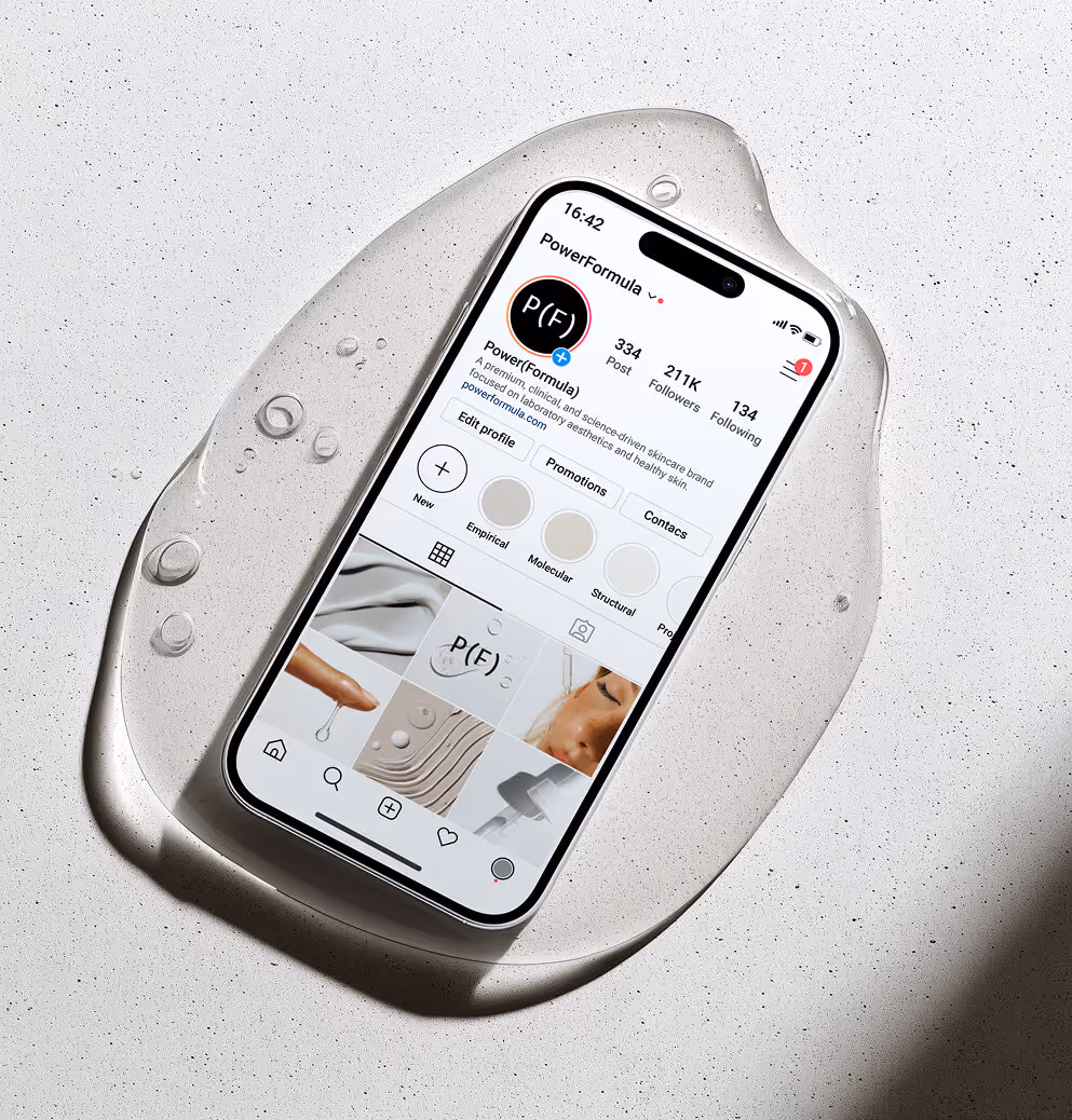
We named the brand Power (Formula) to express its core promise: fewer products, each more effective. The bracket in the logo became a visual cue for science and multiplication, symbolizing the idea of amplifying results with less.
The identity system was built to make science feel usable. The minimalist color palette rooted in monochrome with warm skin tones strategically balances clinical credibility with approachability, while our grid-based design system creates order from chaos by literally organizing information in a way that guides consumers through their skincare journey.
Every element was designed to communicate precision, focus, and trust. Power (Formula) entered the market as the skincare equivalent of a prescription: authoritative, professional, and radically accessible.
The result is a brand that makes complexity feel simple and science feel desirable. Power (Formula) proves that the future of skincare is not more, it is better.

We’d love to partner with you and your team.
We partner with the world’s most ambitious companies—at every stage of growth. By understanding your unique challenges and opportunities, we design tailored solutions to move your business forward. Let’s talk about what’s next.