Thousand Acres
Branding
Creative
Print & Packaging
Store Design
Food & Drink

Background
The Challenge
The grocery industry in Canada was dominated by two extremes: large corporate chains that felt impersonal, opaque, and disconnected from local communities, and small farmer’s markets that were vibrant but inconsistent and limited in access. Customers were caught in the middle. They wanted transparency, trust, and freshness, but they also wanted the convenience of a seven-day-a-week grocer.
Victoria, known for its island culture and sustainable mindset, lacked a destination that truly embodied this middle ground. Shoppers had to choose between bland convenience or the once-a-week ritual of the farmer’s market. Local producers lacked a platform that celebrated their work at scale, while customers faced rising distrust in big grocery, food waste, and the loss of connection to the source of their food.
The opportunity wasn’t just to open another grocery store. It was to create a destination: a place that merged the authenticity of a farmer’s market with the reliability of a modern grocer. A store that could serve both locals and tourists, feel premium yet approachable, and reframe shopping as a community experience rather than a chore.


The Solution
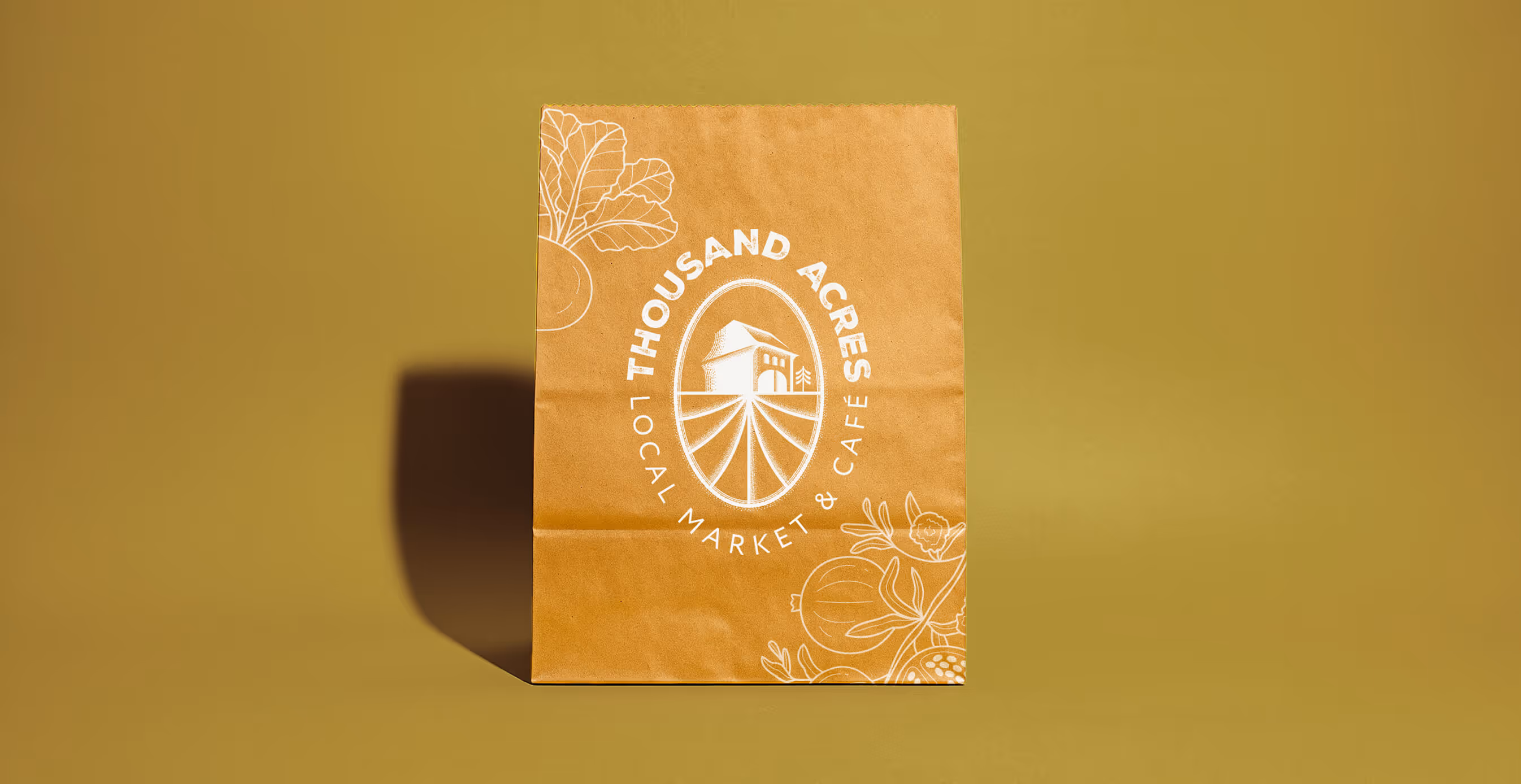
We named the brand Thousand Acres, inspired by the 100-mile diet, anchoring the identity in the promise of local sourcing and the abundance of the land. The name was built to feel both aspirational and grounded, instantly connecting customers to the idea of place and purpose.
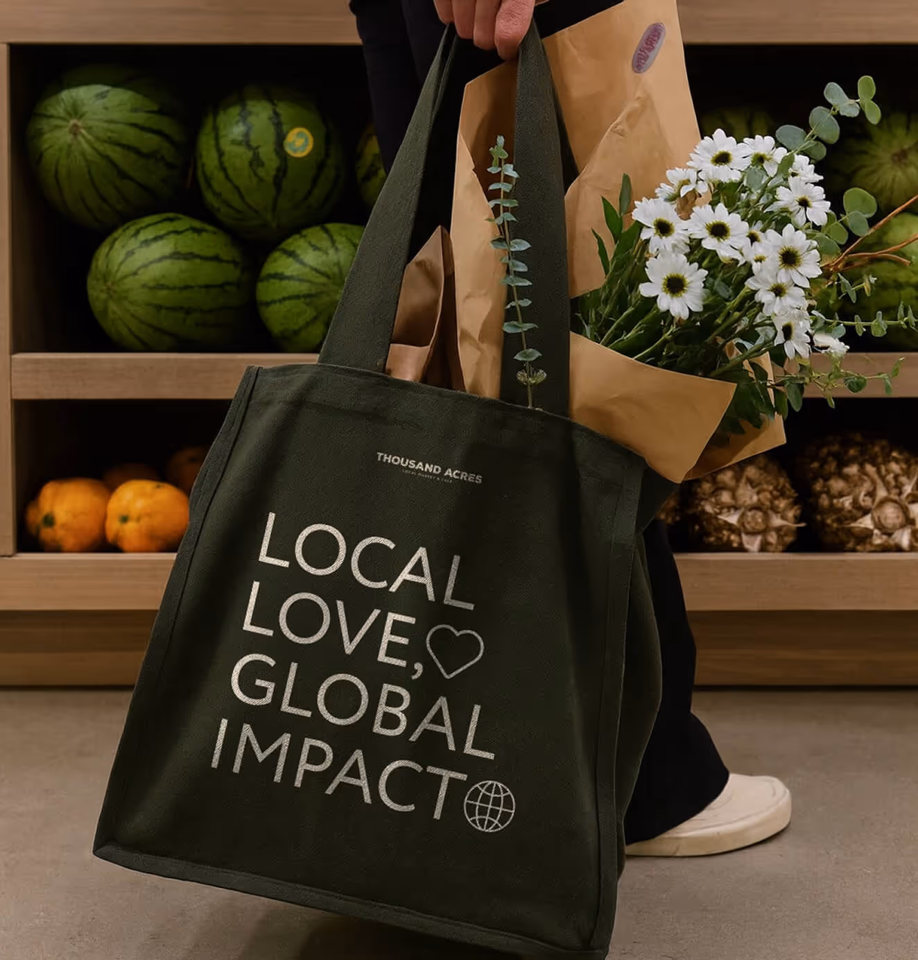
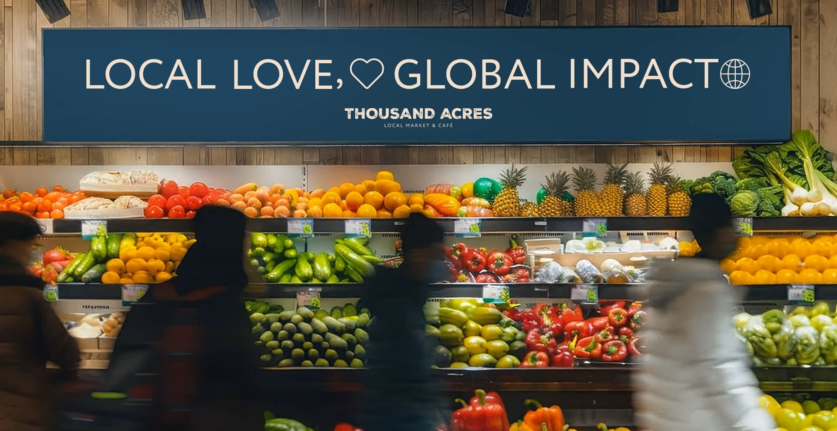
The positioning leaned into a white space: convenience meets farmer’s market freshness. By reframing the grocery experience as a lifestyle choice, not just an errand, we created a narrative that felt personal, ethical, and aspirational all at once.
The brand identity balanced authenticity and modernity. Warm colors, natural textures, and curated signage gave the store the feel of a community hub, while clean design and typography added a layer of credibility and sophistication. Every detail reinforced the story — from signage showing how far each product had traveled compared to industrial produce, to packaging and café menus that echoed sustainability and local pride.
Store design made the grocery itself a destination. Warm lighting, curated displays, and artisanal details gave shoppers the sense that every aisle told a story. Photography and communications highlighted real farmers and producers, creating transparency and trust.
The result was not just a grocery store, but a new kind of community anchor: a destination that could inspire locals, attract tourists, and make farm-to-table not a niche, but an everyday reality.


We’d love to partner with you and your team.
We partner with the world’s most ambitious companies—at every stage of growth. By understanding your unique challenges and opportunities, we design tailored solutions to move your business forward. Let’s talk about what’s next.