TOO GOOD Coffee Roastery
Brand Identity
Messaging
Website Design & Dev
Packaging Design
Illustration
Food & Beverage
Consumer Brands
Background
The Challenge
Specialty coffee had become a personality test. Either you were a connoisseur with a $300 grinder and opinions about fermentation, or you were drinking burnt water from a pod.
Too Good Coffee set out to close that gap. Born in Vancouver, the brand needed to embody two distinct identities: the creative grit of East Van and the adventurous spirit of the North Shore. At the same time, it had to spotlight an innovative product: single-serve drip-bag coffee that delivers a café-level brew whether you’re at your desk or halfway up a mountain.
The challenge wasn’t simply to build another coffee label. It was to create a lifestyle brand—one that educated, inspired, and empowered people to find their perfect brew, while feeling modern, approachable, and unmistakably West Coast.

01. Our Insight
Most people don’t know why they like the coffee they like. They just know when it tastes good. That gap, between what people drink and what they could be drinking, was our opening.
We uncovered that Too Good Coffee wasn’t just selling coffee. It was selling confidence for coffee lovers, whether they were weekend hikers, office professionals, or seasoned connoisseurs. By leaning into the founders’ passion and expertise—the self-proclaimed “coffee nerds”—we could reframe the brand as both a guide and companion.
Our insight: Coffee isn’t just about taste. It’s about lifestyle, identity, and the moments it fuels. Too Good Coffee needed to become the bridge between personalization, adventure, and expertise.

02. Brand Transformation
Brand Positioning
We positioned Too Good Coffee as the brand for people chasing their perfect cup, anywhere life takes them. Not another artisanal coffee that intimidates. Not another convenience brand that compromises. Instead: quality, convenience, and personalization in one.
Messaging centered around three pillars:
- Expertise & Guidance – founded by coffee nerds who make education fun and approachable.
- Quality & Convenience – premium roasts without compromise, even on the go.
- Connection & Adventure – coffee as a catalyst for stories, moments, and exploration.
Identity System
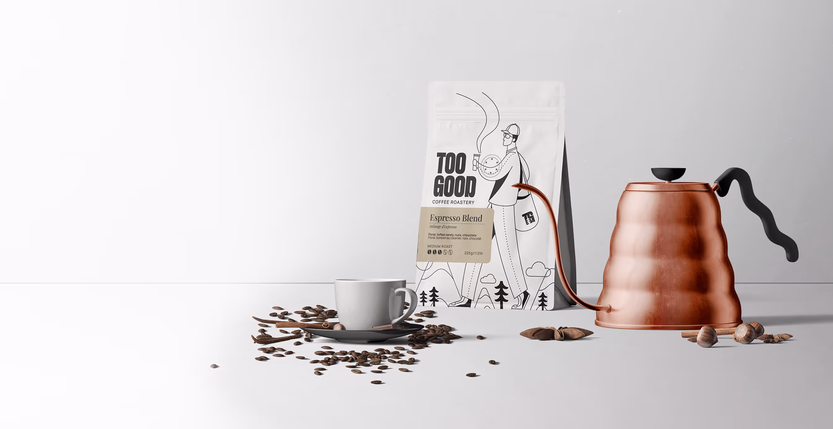
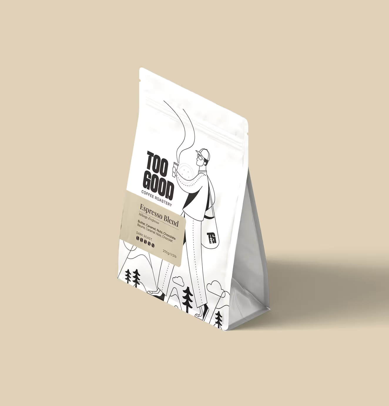
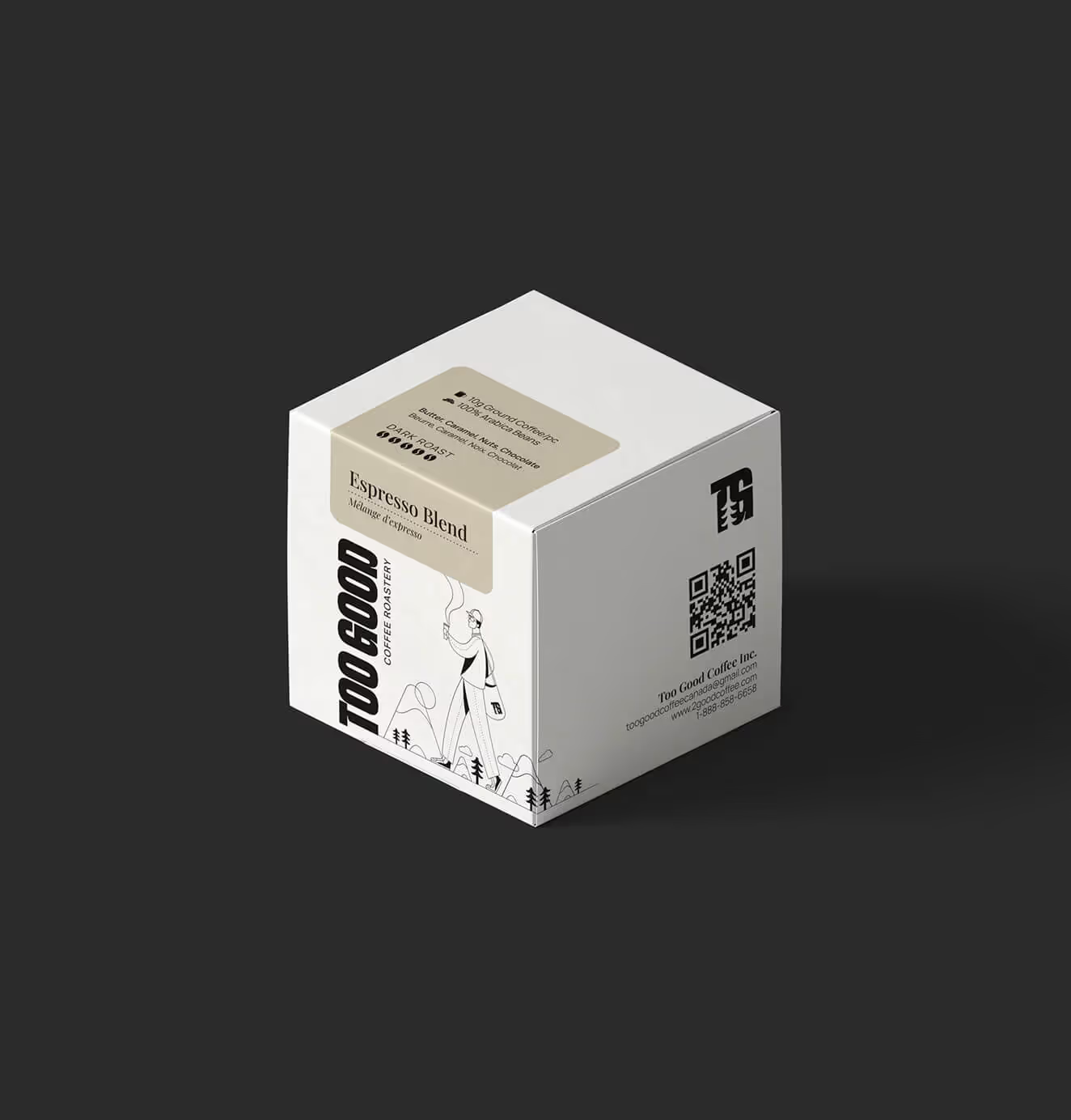
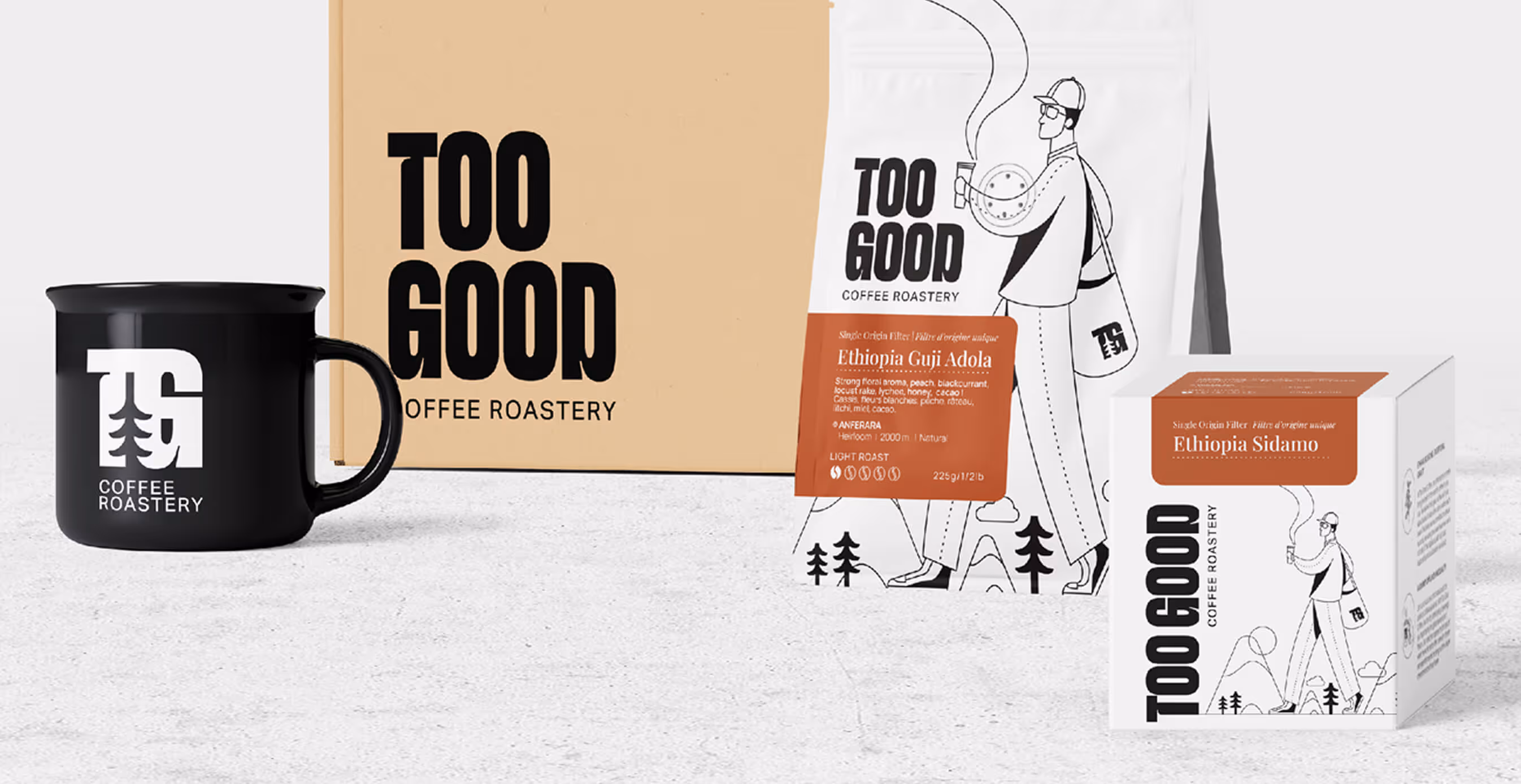
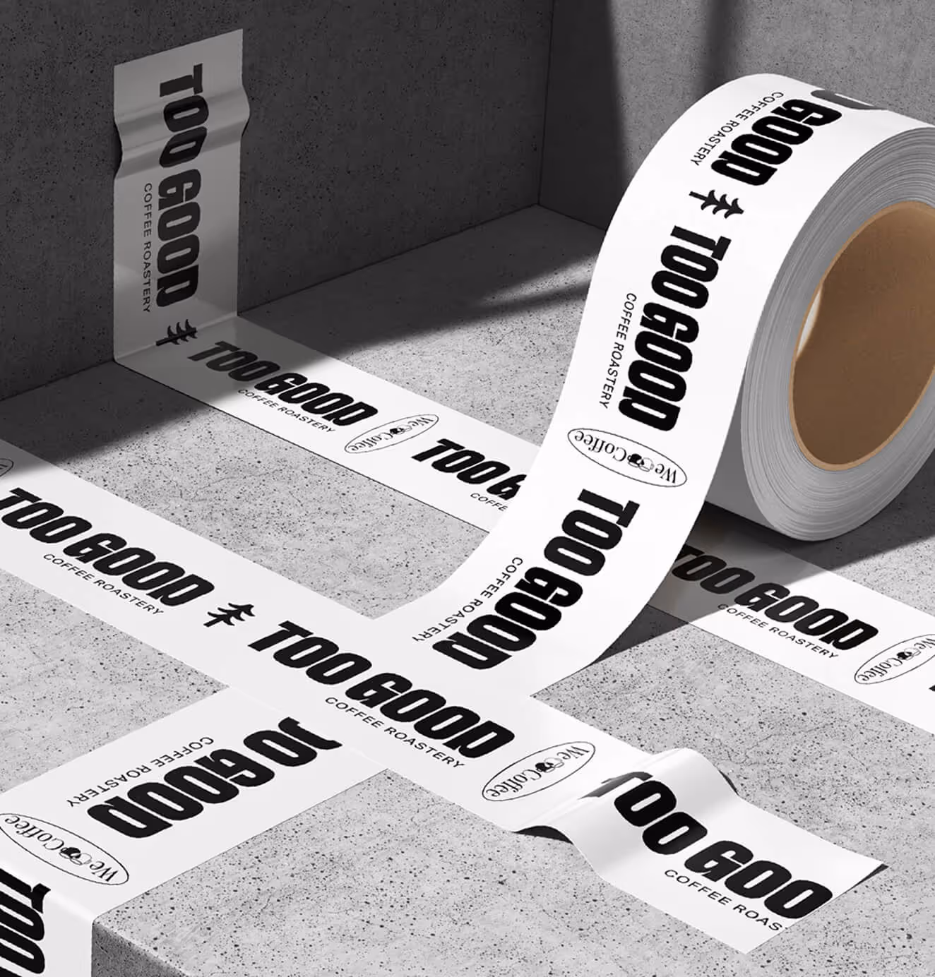
Visually, we built a brand that was modern, minimal, and clean, layered with textures and colors inspired by Vancouver’s forests, mountains, and coastline. Packaging became a sleek canvas: black and white with earthy accents, balanced by outdoorsy photography that spoke to adventure and lifestyle.
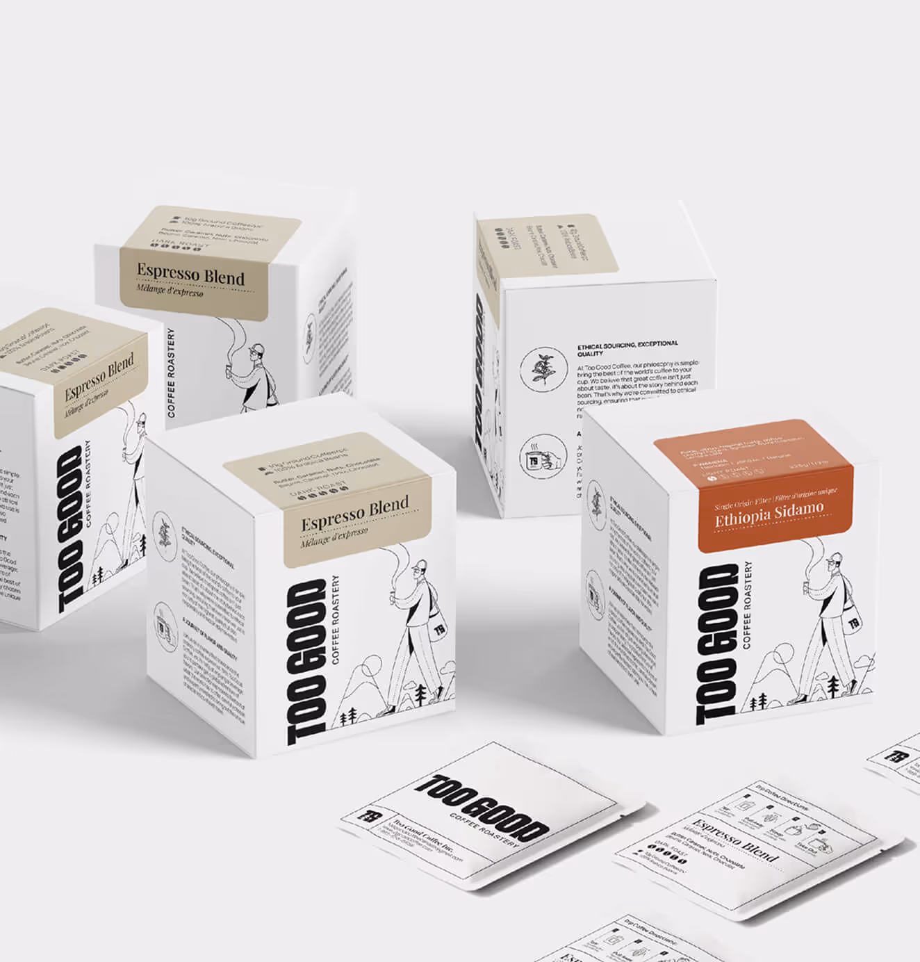
A custom illustration of the founder became a signature brand element: a playful, guiding presence that tied the brand’s education-first ethos to its adventurous soul.
Website & Packaging
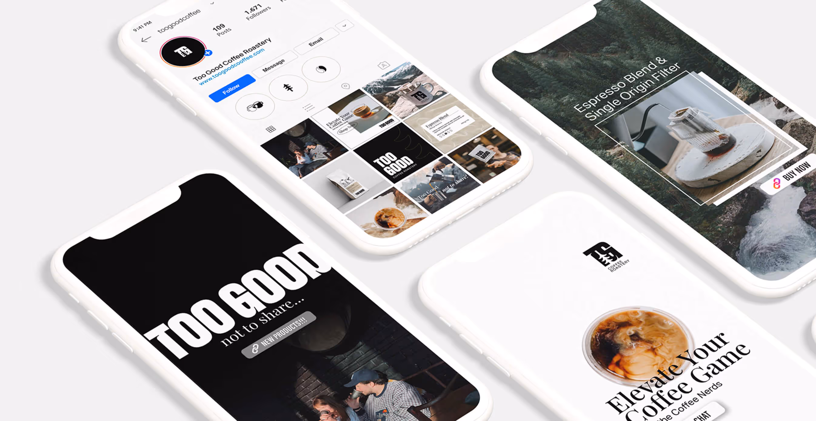
The website was designed as a personalized journey. Educational, clear, and approachable, helping customers “discover their signature brew.” Packaging followed suit: bold, minimal, and versatile enough to stand out on shelves while feeling premium in hand.
03. Brand Application
Website Experience
We designed Too Good Coffee’s digital home to feel like a conversation with a knowledgeable but laid-back guide. Visitors could explore coffee origins, brewing tips, and product details without ever feeling overwhelmed. Every touchpoint reinforced the promise: this is coffee made for you.
Packaging Design
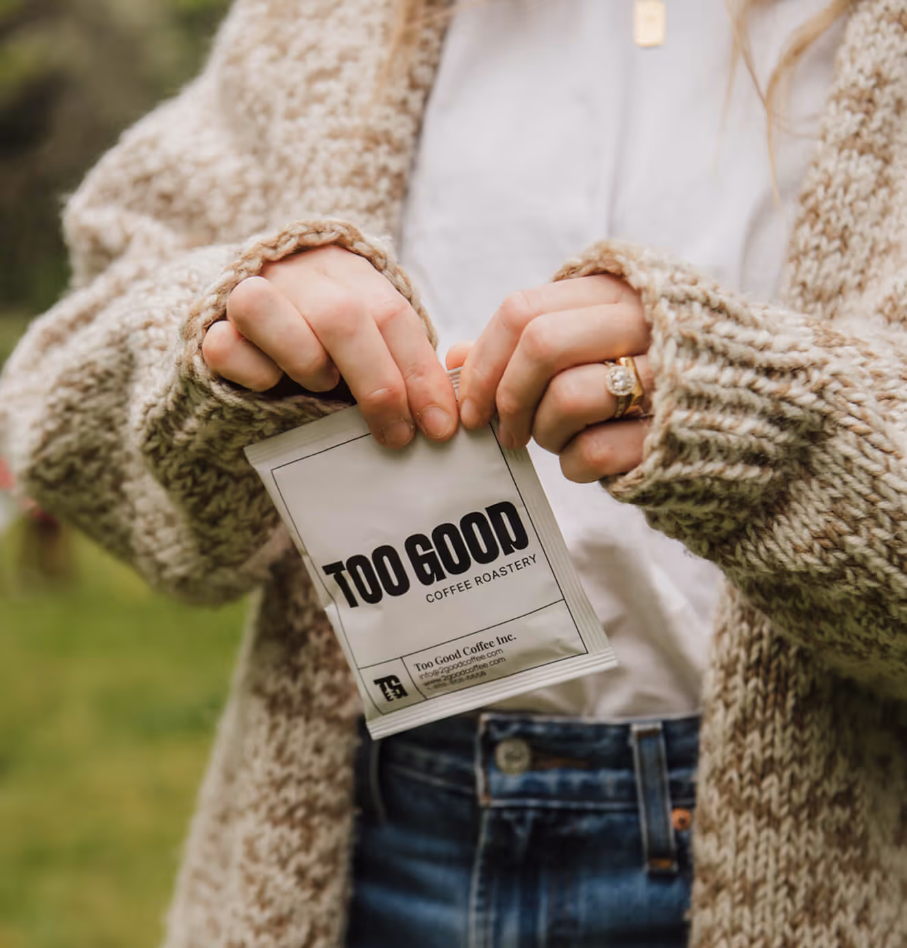
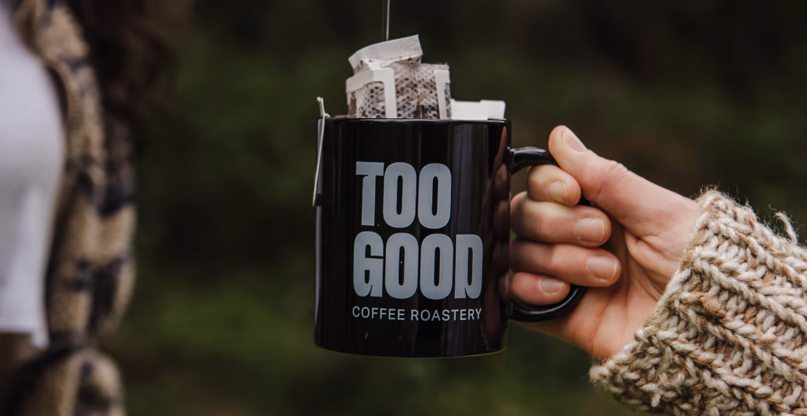
Clean lines, bold typography, and earthy tones created packaging that felt equally at home in a hip East Van café or pulled from a backpack on a North Shore trail. Each product label tied back to the brand’s identity system with adaptable color accents and iconography.
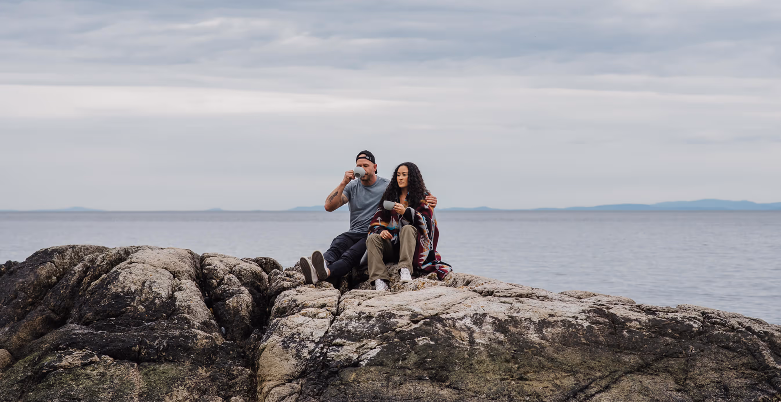
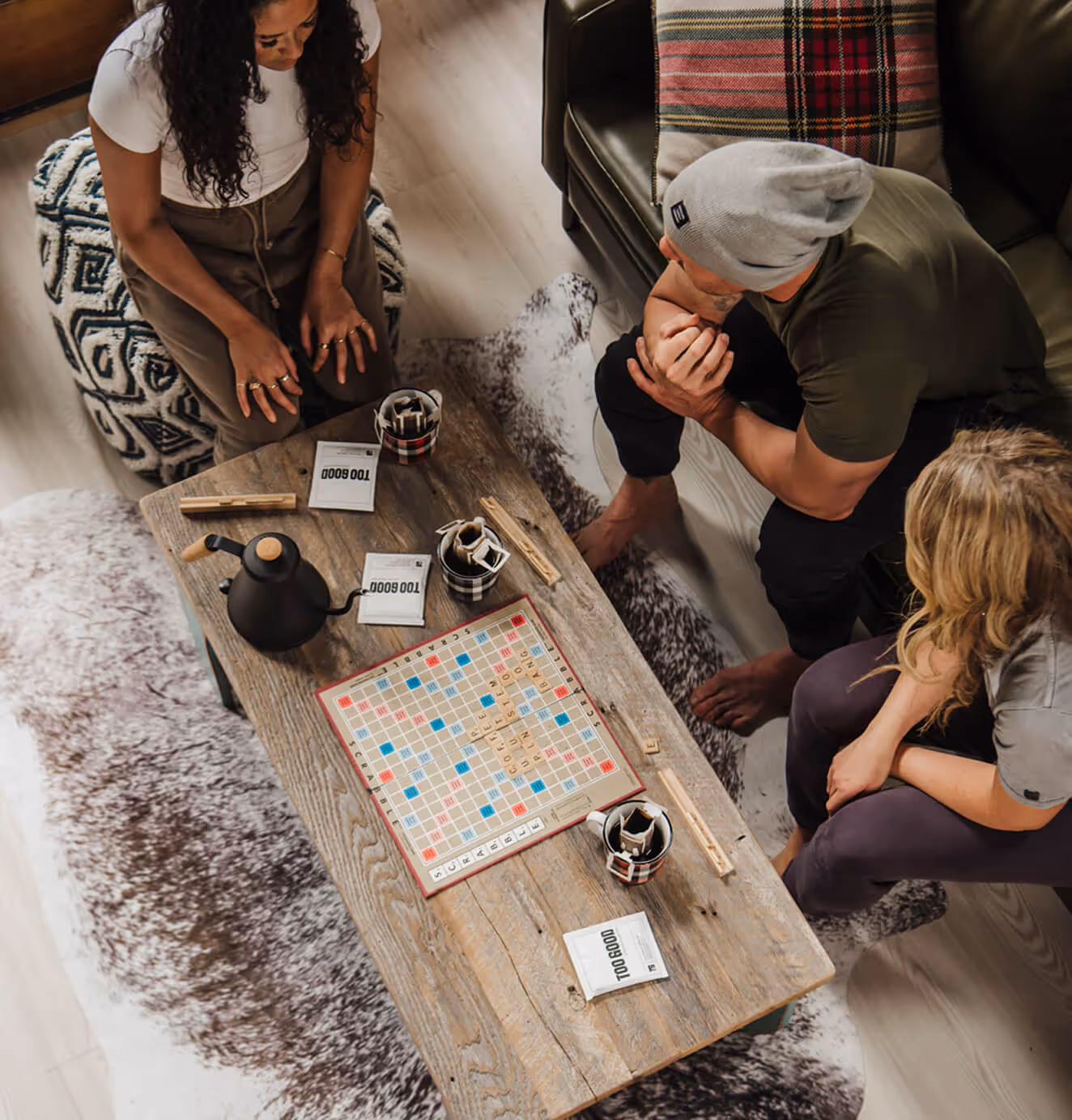
Lifestyle & Product Photography
We balanced crisp, minimal studio shots with lifestyle photography shot outdoors. Hikes, camping, cozy weekends, that reflected the real-world use case of the drip-bag innovation. The result: a visual language that made premium coffee feel as natural on a trail as it did in your office lunch box.
Illustration & Storytelling
The founder illustration anchored the brand’s storytelling, appearing across packaging, social media, and educational content. This character became the “coffee nerd guide,” embodying Too Good’s mission to educate, personalize, and connect.
We’d love to partner with you and your team.
We partner with the world’s most ambitious companies—at every stage of growth. By understanding your unique challenges and opportunities, we design tailored solutions to move your business forward. Let’s talk about what’s next.