Unified Transit
AI
Branding
Creative
Print & Packaging
Website Design & Dev
Transport

Background
The Challenge
The Opportunity: Five million Americans miss medical appointments each year due to transportation barriers. The industry had fractured into two inadequate extremes: rideshare services that moved fast but treated vulnerable riders as ratings, and legacy NEMT providers that understood medical needs but operated like it was 1995.
In the Non-Emergency Medical Transportation (NEMT) space, dignity, autonomy, and consistency have long been compromised. Rideshare services are fast, but indifferent. Traditional NEMT is often well-meaning but plagued by inefficiency.
Unified Transit saw what others missed—a massive gap where technology met humanity. They had the vision and the tech. But in a space dominated by billion-dollar rideshare platforms and entrenched medical transport companies, they looked like just another startup.
The real problem wasn't capability. It was category. They needed to stop competing in existing lanes and create their own.

01. Our Insight
Unified Transit lives in a category that doesn’t quite exist—yet. We helped them claim the “green space” between impersonal rideshare and outdated NEMT: a hybrid of healthcare-grade reliability and consumer-grade simplicity, with human connection at its core.
We discovered the unspoken truth: riders weren't looking for "non-emergency medical transportation." They were looking for dignity, independence, and someone who actually cared if they made it to their appointment.
So we repositioned Unified Transit as something the industry had never seen: compassionate, tech-enabled healthcare mobility. Not a service, but an extension of care itself. Not logistics, but lifeline.
This wasn't about competing with Uber or traditional NEMT. It was about making both obsolete by creating a new standard—where every ride restored confidence instead of creating anxiety.


02. Brand Transformation
Strategic Repositioning
We stopped talking about transportation and started talking about care continuity. Unified Transit wasn't moving bodies; they were protecting health outcomes. The shift was profound: from vendor to partner, from ride to relationship.
We crafted a narrative around the "green space"—the untapped territory between cold efficiency and outdated operations. Here, technology served humanity, not the other way around.
Every message reinforced a simple truth: missing care due to transportation isn't just wrong—it's preventable.
Identity System
The visual identity had to bridge worlds: approachable enough for an 85-year-old booking their first app-based ride, sophisticated enough for hospital C-suites.
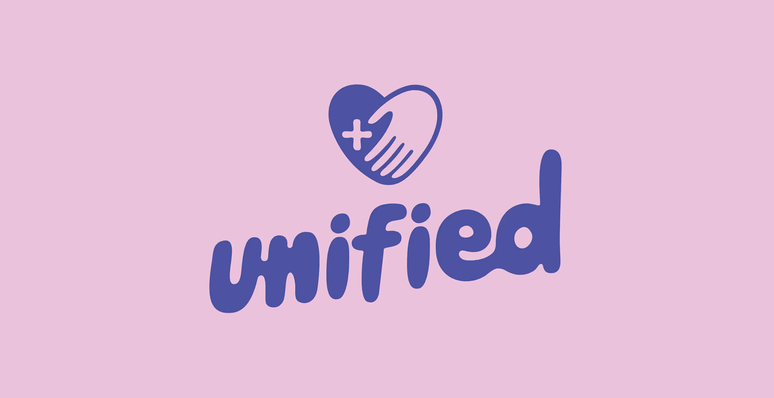
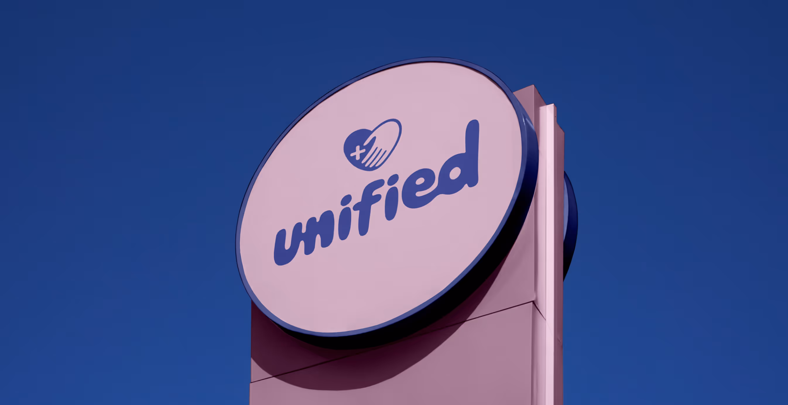
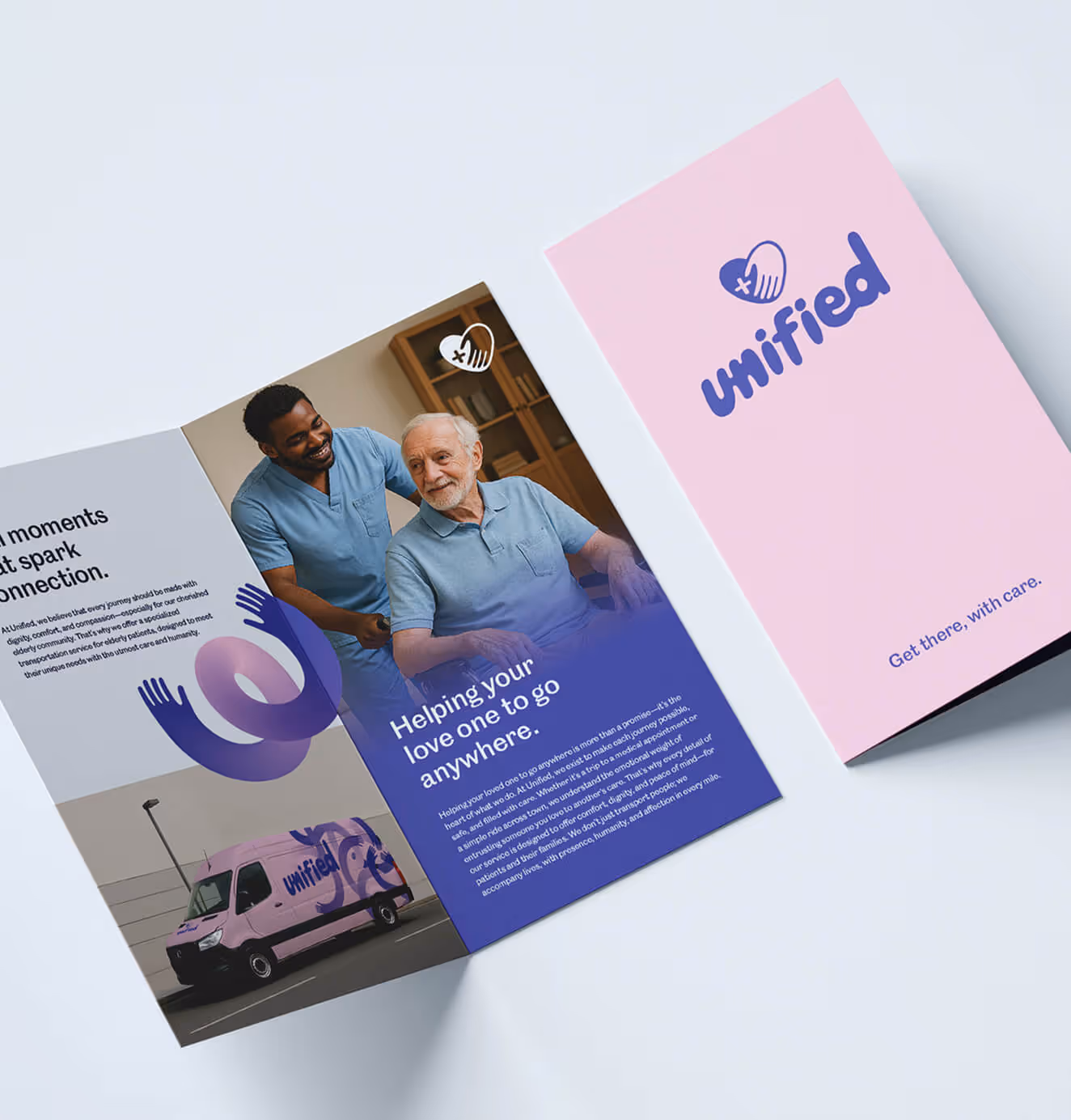
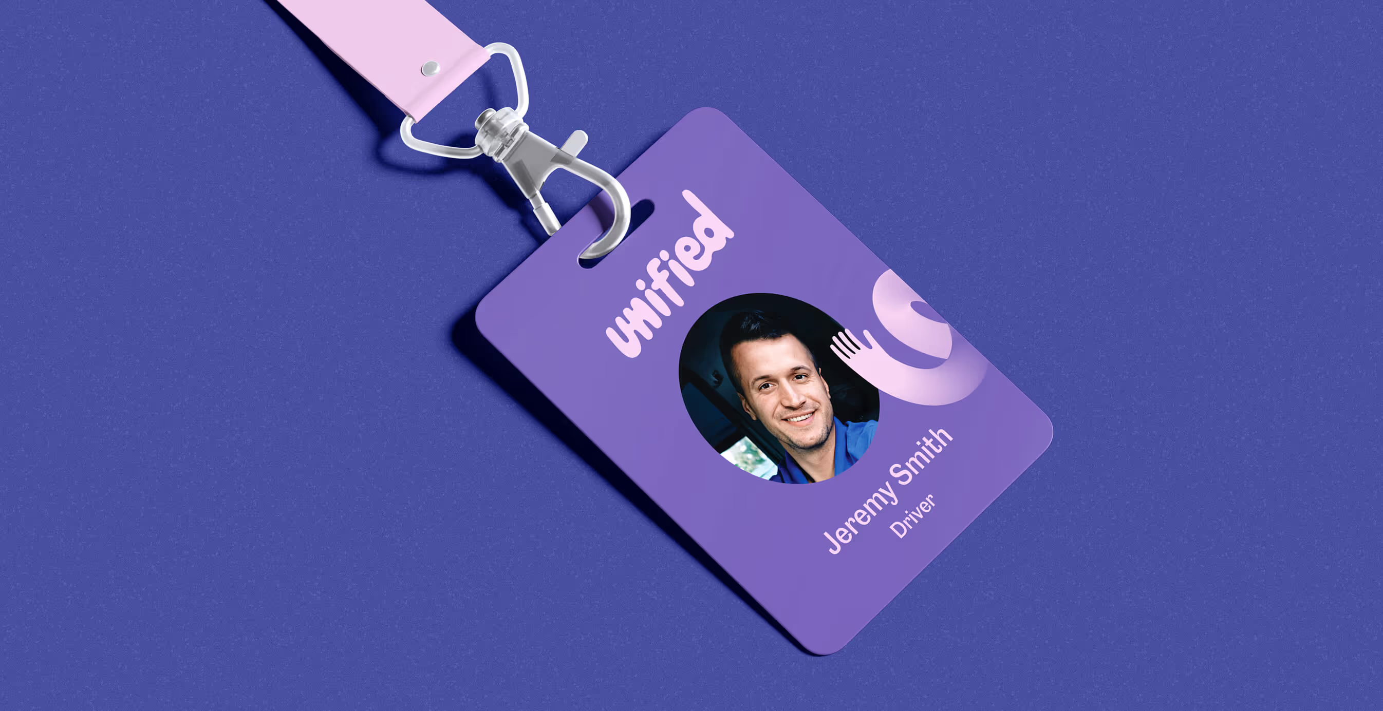
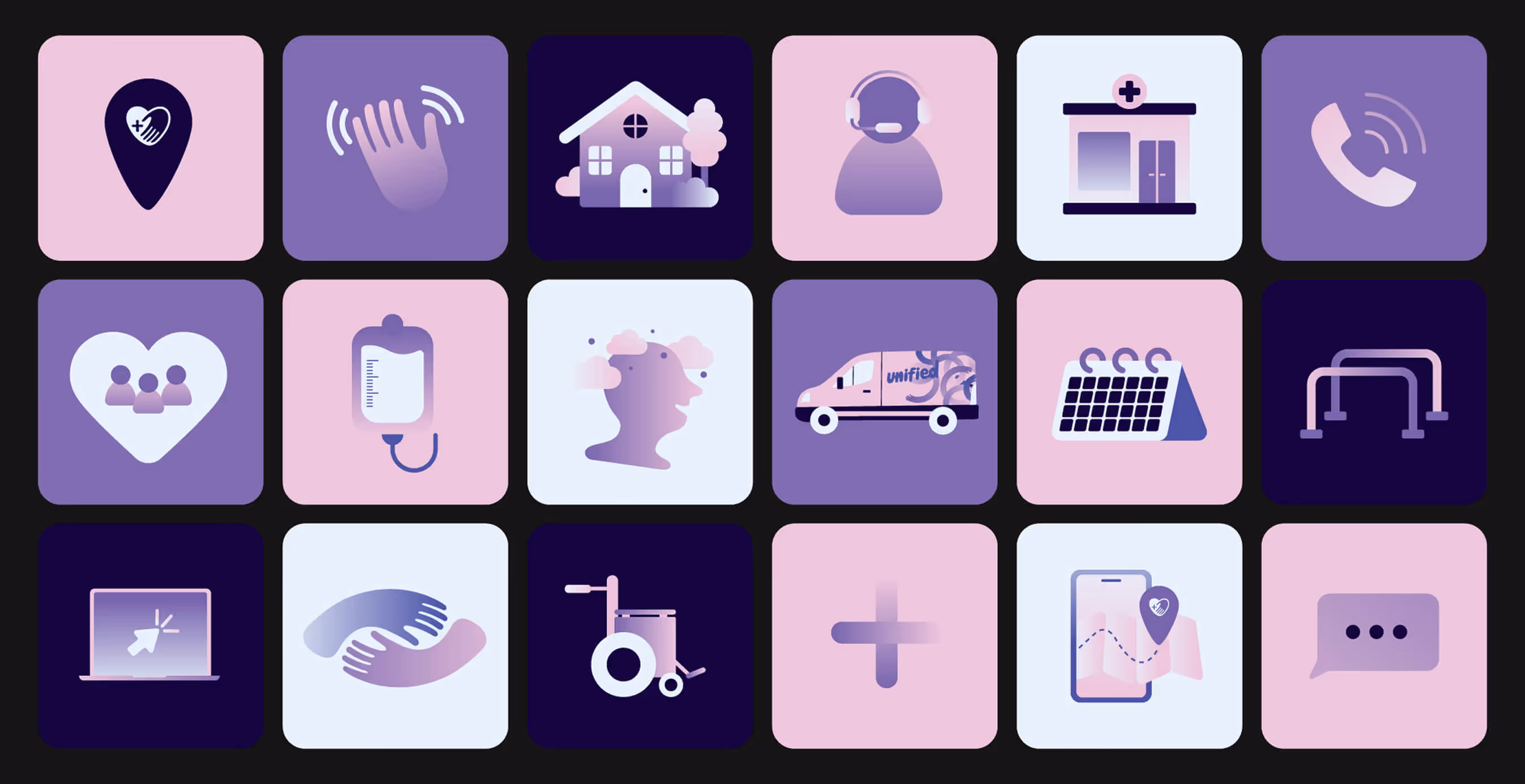
We developed an identity rooted in human connection. Organic typography with ligatures that literally connect. A color palette of vibrant purples and soft pinks that stood out in a sea of medical blues and corporate grays. Photography focused on genuine moments of care, not staged medical scenarios.
The logo mark—two hands forming a unified whole—became a symbol of the promise: someone will be there, someone will help, someone cares.


03. Brand Application
Website Design & Dev
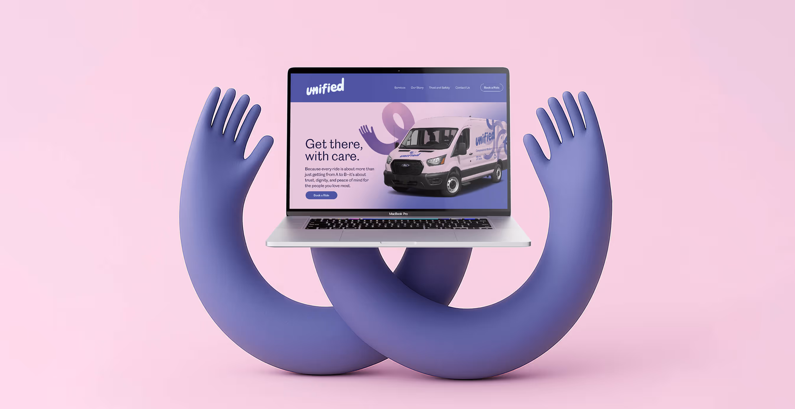
The digital experience had to solve for radical accessibility without sacrificing modern functionality. We designed for extremes: the tech-savvy caregiver managing multiple patients and the elderly user who'd never downloaded an app.
We broke from the cold, clinical aesthetic that dominates medical branding, creating something radically different—a digital experience that feels more like a trusted friend's recommendation than a medical service. The homepage leads with humanity, signaling this wasn't another medical website but something friendlier, more personal, more alive.
Navigation is effortless, with giant touch targets and simplified booking flows that work for both riders and caregivers. Each page anticipates and addresses unspoken fears: "Who We Serve" profiles that mirror your grandmother, your neighbor, yourself; driver profiles that emphasize training in empathy, not just certifications. While competitors buried booking behind logins and forms, we made scheduling a ride as simple as ordering lunch—three taps, no account required.
We transformed anxiety triggers into trust signals, creating a digital experience that felt less like using a medical service and more like being cared for by family.
Fleet Identity & Physical Presence
Every Unified Transit vehicle became a moving promise through the community. We designed fleet wraps that broke every rule of medical transportation: no clinical whites, no corporate blues, no apologetic invisibility. Instead, we brought their bold purple gradients and hand-drawn illustrations to life, transforming each vehicle into a beacon of care and connection.
We thought of these as more than vans; instead they were rolling reminders that someone in the community cared enough to do transportation differently. Designed to spark conversations at traffic lights, build recognition in neighborhoods, and most importantly, make riders feel safe and cared for when their ride arrives.
We developed a comprehensive template system that ensured brand coherence across every touchpoint—from vehicle wraps to social media. This systematic approach meant that whether someone encountered Unified Transit on the street, online, or in a healthcare facility, they experienced the same warmth, professionalism, and promise: this is healthcare that actually cares.


We’d love to partner with you and your team.
We partner with the world’s most ambitious companies—at every stage of growth. By understanding your unique challenges and opportunities, we design tailored solutions to move your business forward. Let’s talk about what’s next.