12 Strategy First Brand Guidelines Examples for Growth Stage Brands
11/04/2026
Branding
Explore 12 brand guidelines examples from leading companies and learn how to create a strategy-first brand system that strengthens consistency, streamlines creative production, and supports growth.

This page collects the brand guideline examples worth studying: public, downloadable manuals from NASA, Slack, Dow, Thoughtworks, and eight others, each annotated with what to steal for your own guide. The goal is simple. You get a checklist for turning inspiration into a working brand standards document, grounded in standards like WCAG and real published PDFs rather than theory.


What Makes a Brand Guidelines Document Actually Work?

A brand guidelines document works when someone unfamiliar with the brand can open it and produce on-brand work without asking a single follow-up question. That’s the bar. Most guides fail it because they document the logo and stop there, leaving voice, application rules, and digital specs to guesswork.
The strongest guides share a structure. They open with strategy, not visuals, because a logo system without a stated mission and positioning tends to get ignored the moment a new hire or freelancer touches it. Guides that lead with “why this brand exists” before “here’s our blue” produce more consistent output, since every downstream decision, from typography to photo selection, traces back to that positioning.
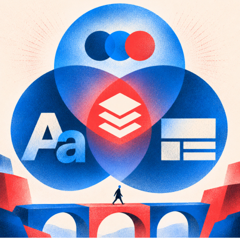
A complete brand style guide typically covers these components:
- Strategy: Purpose, positioning, audience, promise and differentiation.
- Verbal identity: Tone, voice, key messages, terminology and approved claims.
- Visual identity: Logo system, typography, colors, grids, photography, illustration and icons.
- Applications: Practical examples for web, email, social, presentations, campaigns and print.
- Digital operations: Tokens, downloadable templates, file naming and version history.
- Governance: Named owner, approval rules, accessibility and AI-assisted content standards.
Beyond those, the what to include in brand guidelines checklist that top public guides follow, from a strategy overview through downloadable assets, tends to make or break adoption. Modern guides add two things older ones skip: accessibility standards like WCAG contrast ratios for text-on-background combinations, and AI guardrails that specify how a brand’s voice and imagery can or can’t be generated by machine tools. Skip either one in 2026 and you’re publishing a guide with a blind spot your design team will eventually stumble into.
Curated Brand Guidelines Examples Worth Studying
Every entry below is publicly accessible, which means you can open the actual document, not just read a summary of it. That matters, because seeing how a real team formatted their color specs or wrote their misuse examples teaches you more than any checklist.
1. NASA Graphics Standards Manual
NASA’s 1976 graphics manual, revived and now circulated widely as a design cult classic, documents the “worm” logotype with a rigor rarely seen even in modern corporate guides: exact typographic construction, vehicle markings, and stationery templates down to the millimeter. Why we love it: it proves a guide from the analog era can still teach precision. Takeaway: define construction geometry for your logo, not just color and spacing, so it survives any resizing or reproduction method.
2. Slack Brand Guidelines
Slack splits its guide into distinct visual and verbal sections on its public media pages, making typography, color, and voice each easy to locate independently. Examples like NASA and Slack publish detailed public brand manuals, and Slack’s decision to separate “how it looks” from “how it sounds” is worth copying directly. Takeaway: give voice and tone their own standalone section instead of burying it in a paragraph at the end of the visual chapter.
3. Dow Brand Guide
Dow’s guide, updated in October 2025, is the enterprise heavyweight on this list. It runs through logo lockups, brandline usage, a full typographic system, and explicit color balance guidance using a 60/30/10 ratio, plus accessibility notes and a named document owner with version control. Takeaway: name an owner and a version number on your cover page. It sounds bureaucratic until three teams ship three different logo colors because nobody knew which PDF was current.
4. Thoughtworks Brand Identity
Thoughtworks treats its identity system as an extension of its consulting philosophy: bold typography, a confident color story, and application examples that show the system working across editorial content and conference collateral. Takeaway: if your brand sells expertise, your guide should look as considered as the work you’re selling.
5. Omsom Brand Guidelines
Omsom, the sauce and pantry brand, built a visual identity loud enough to stand out on a crowded grocery shelf, and its guide documents that boldness with specific pattern and color-clash rules rather than the safe, muted palettes most food brands default to. Takeaway: a guide can codify intentional rule-breaking. Just document exactly which rules you’re breaking and why, so the boldness stays consistent instead of becoming chaos.
6. Mailchimp Brand Guidelines
Mailchimp’s public guide is known for its illustration system and a distinctive, slightly irreverent voice that shows up in every microcopy example. Takeaway: document your brand’s sense of humor with actual example sentences, not an adjective like “playful.” Adjectives are interpreted differently by every writer on your team.
7. GitHub Brand Guidelines
GitHub’s guide covers its Octocat mascot usage, product UI color tokens, and a clear line between marketing assets and product interface assets. Takeaway: if your brand has both a marketing identity and a product interface, separate the rules for each explicitly. Conflating them is one of the most common sources of inconsistency in tech brands.
8. Spotify Brand Guidelines
Spotify’s design guidelines lean into a duotone color treatment system and a strict grid for its Circular typeface, with clear application across app UI, out-of-home advertising, and social content. Takeaway: pick one signature visual device (a duotone treatment, a specific crop ratio) and apply it everywhere so the brand is recognizable even without the logo present.
9. Airbnb Brand Guidelines
Airbnb’s identity system, built around the “Bélo” symbol, documents an unusually flexible logo lockup system alongside a warm, human photography direction that avoids stock-photo staging. Takeaway: photography direction deserves the same specificity as color codes. Write rules like “no posed smiling at camera” rather than just “warm and authentic.”
10. Apple Design Resources
Apple doesn’t publish a single consumer-facing brand book, but its Human Interface Guidelines and marketing asset resources function as a de facto standards document for anyone building on its platforms, with exhaustive rules on typography, spacing, and iconography. Takeaway: even a guide built primarily for developers benefits from HIG-style specificity: exact point sizes, exact spacing units, no room for interpretation.
11. Frontify’s Public Guide Archive
Public repositories that aggregate dozens of brand guideline examples in one place are worth bookmarking on their own. Browsing twenty guides back to back reveals formatting patterns faster than studying one guide in isolation. Takeaway: comparative research beats single-example study when you’re still deciding on your own format.
12. Canva’s Brand Kit Templates
Canva doesn’t publish one flagship guide but ships editable brand kit templates that smaller teams use as a starting structure, complete with placeholder sections for logo, color, and font. Takeaway: a template with blank sections you fill in beats a blank page every time you’re starting from zero.
Recurring Patterns Worth Stealing From These Guides
Line these examples up side by side and the same handful of rules keep resurfacing, regardless of company size or industry.
Repeatable visual rules:
1. Use meaningful semantic color roles rather than only a list of HEX values.
2. Show approved typography and spacing at realistic content lengths and screen sizes.
3. Pair each logo and image rule with an example of correct and incorrect use.
Documentation patterns that drive adoption:
1. Start with a one-page strategy summary, then move from foundations to applications.
2. Publish searchable sections, named asset downloads and a visible version/date.
3. Write examples that answer recurring questions without requiring a meeting.
Operational patterns:
1. Name the person who approves updates, exceptions and external vendor use.
2. Review the guide quarterly and archive outdated files rather than letting duplicate versions circulate.
3. Train sales, marketing and external collaborators using actual tasks and templates.
Pro Tip: Build your right/wrong examples using your own team’s actual past mistakes, not hypothetical ones. A misuse example pulled from a real ad that ran with the wrong logo color teaches faster than a generic illustration ever will.
Interactive brand centers, whether a web portal or a Figma component library, scale better than static PDFs once a team ships frequent creative work, since updates propagate instantly instead of requiring a new PDF export and re-distribution. For a deeper walkthrough of documenting the visual side specifically, the visual brand guidelines framework covers logo, color, and typography documentation in more depth than a checklist can.
Free Brand Health Audit
Make sure your brand is built to sell
Search has changed. Your customers aren't just Googling anymore. They're asking ChatGPT, Perplexity, Gemini and other AI platforms what to buy, who to trust and which brands they should consider.
If your brand isn't showing up clearly in those answers, you're already losing opportunities. Our free Brand Health Audit shows you where your brand stands across traditional search, AI search and brand positioning.

Sample brand audit
Live preview
Traditional search
72
AI search (GEO)
34
Brand positioning
58
Building or Adapting a Brand Guide: A Step-by-Step Checklist



Studying examples is the easy part. Turning that inspiration into your own usable document takes a defined process, and the guides that succeed tend to follow roughly the same five steps.
1. Collect the source material: existing positioning, approved identity assets and real mistakes from recent campaigns.
2. Set standards: document logo, palette, type, voice, imagery, accessibility and AI-use constraints.
3. Test the standards: create a homepage section, social creative, email and deck page from the draft alone.
4. Choose a delivery format: PDF for small teams, live brand portal for frequent updates, and linked design tokens where appropriate.
5. Launch and govern: publish templates, name an owner, train collaborators and schedule the first audit.
On format specifically: a PDF suits small teams or a single product launch, since it’s portable and easy to send, but it goes stale fast and nobody tracks who has the outdated version. An interactive web brand center suits growing teams shipping weekly content, since updates are live the moment you publish them. Figma tokens suit design-heavy teams building product UI, since color and type values sync directly into working files instead of living as a static reference nobody opens.
Whichever format you pick, add WCAG contrast guidance and an AI usage policy on day one, not as a later addendum. Also include starter templates for social, email, and presentations. For teams documenting voice specifically, a structured brand voice guidelines framework speeds up that section considerably.
What We’ve Learned Building Guides for Growth-Stage Brands
Most brand guidelines fail not because they’re poorly designed, but because nobody owns them after launch. We run quarterly audits with clients specifically to catch the moment a sales deck or a paid ad starts drifting from the documented system, before that drift becomes the new normal.
A few operational habits separate guides that get used from guides that get shelved:
- Maintain one source of truth for approved logos, fonts, tokens and templates.
- Require new collaborators to complete a sample assignment against the guide before live production.
- Review repeated asset rejections and add real right/wrong examples addressing the cause.
- Measure template adoption and production time rather than judging success by document downloads.
Want to learn more about brand platforms, Brand Strategy and Brand Identity? Keep reading!
If you need help with your companies brand strategy and identity, contact us for a free custom quote.
The Real Gap Between Inspiring Guides and Usable Ones
The conventional advice on brand guidelines obsesses over the wrong variable. Every list like this one, including this one, leads with the most visually stunning examples, NASA’s construction geometry, Spotify’s duotone system, because they’re satisfying to look at. But the guides that actually get used inside a company rarely win design awards. They win because someone assigned an owner, scheduled a review date, and wrote down real mistakes instead of hypothetical ones.
That’s the gap most teams miss. They’ll spend three weeks perfecting a color palette and five minutes deciding who updates the document when the logo changes next year. Flip that ratio. Lock your strategy paragraph before you open a design file, since a beautifully designed guide with no positioning statement gets treated as a mood board, not a rulebook. Then obsess over documentation format second, and visual polish third. The brands on this list that still get cited years later, Slack, Dow, NASA, all share that same ordering, whether they planned it that way or discovered it by accident.
Build a Guide Your Whole Team Actually Uses
Studying twelve public examples gets you inspiration. Turning that inspiration into a working document your sales, marketing, and design teams actually reference week to week takes structured execution, which is where most in-house efforts stall out after the initial excitement fades.
Brand guidelines are often built as part of a broader branding engagement for growth-stage marketing leaders and CMOs who need the strategy, the visual system, and the operational rollout handled together instead of stitched from templates and freelancer files. Rather than a static PDF that goes stale in six months, agencies develop the strategy-first foundation, document the visual and verbal system with real application examples, and set up the ownership structure that keeps it current. A common result reported by marketing teams is faster on-brand creative output, since designers and copywriters stop guessing and start referencing a document that actually answers their questions. If your current guide is a scattered slide deck or doesn’t exist at all, start with a conversation about executive-level branding built for growth-stage companies and see what a working system looks like for your team.
Frequently Asked Questions
What should brand guidelines include?
A useful brand guidelines document starts with purpose, positioning, target audience and brand promise. It then defines voice and messaging, logo usage, color roles, typography, imagery, and real applications across channels. Include accessibility requirements, approved templates, AI-use guardrails, and an owner responsible for updates so teams can apply the system without guessing.
What are the best brand guidelines examples to learn from?
The strongest example depends on the problem you are trying to solve. NASA is useful for precise logo construction and reproduction rules. Slack offers a clear separation between verbal and visual identity. Dow illustrates enterprise-level specifications and version control. GitHub is helpful when marketing and product interface rules need to coexist. Study the sections you can apply, rather than copying another brand’s aesthetic.
What is the difference between a brand style guide and brand guidelines?
The terms are often used interchangeably. In practice, a style guide may focus on visual and verbal execution, including colors, typography, logos and tone. Comprehensive brand guidelines also document the underlying strategy, cross-channel applications, ownership, approvals and governance. For a growing company, those operational rules are as important as the visual specifications.
How long should a brand guidelines document be?
There is no ideal page count. A small team may only need a concise, well-organized guide with downloadable templates, while a multi-product company may need a searchable brand portal and detailed component specifications. Judge completeness by whether a new teammate or external partner can create a correct asset without additional clarification, not by the number of pages.
How often should brand guidelines be updated?
Assign a named owner and review the guide at least quarterly, as recommended in this article’s governance checklist. Update it whenever positioning, products, brand assets, accessibility requirements or approved templates change. Keep a visible version history, archive outdated files, and notify teams so multiple versions do not circulate.

Quincy Samycia
As entrepreneurs, they’ve built and scaled their own ventures from zero to millions. They’ve been in the trenches, navigating the chaos of high-growth phases, making the hard calls, and learning firsthand what actually moves the needle. That’s what makes us different—we don’t just “consult,” we know what it takes because we’ve done it ourselves.
Want to learn more about brand platform?
If you need help with your companies brand strategy and identity, contact us for a free custom quote.
We do great work. And get great results.
+2.3xIncrease in revenue YoY
+126%Increase in repurchase rate YoY


+93%Revenue growth in first 90 days
+144% Increase in attributed revenue




+91%Increase in conversion rate
+46%Increase in AOV


+200%Increase in conversion rate
+688%Increase in attributed revenue