Top 10 Clever Logos That Will Inspire Your Brand Design
07/14/2026
Design / Branding
.png)


What Makes a Logo Design Clever?
Free Brand Health Audit
Make sure your brand is built to sell

Top 10 Most Clever Logo Designs
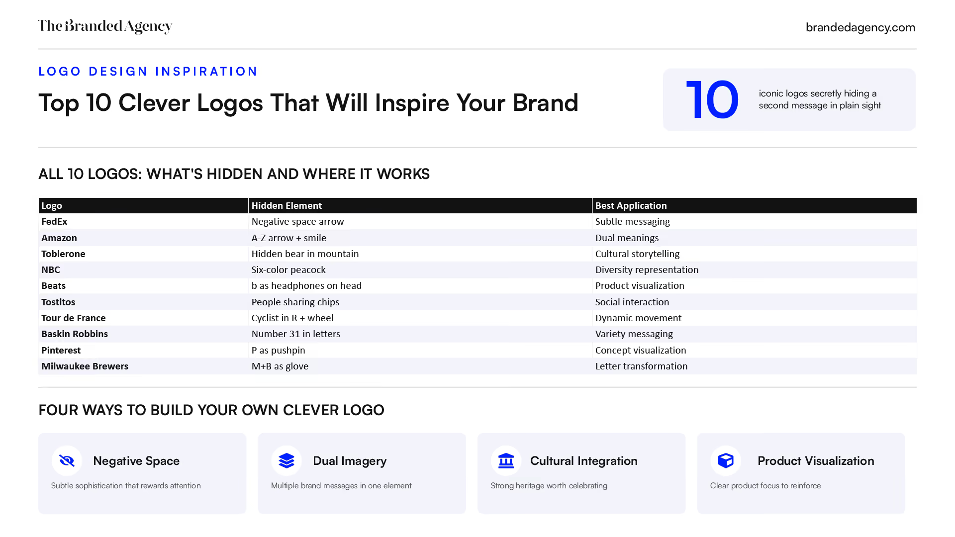
1. FedEx
The FedEx logo appears deceptively simple at first glance—purple and orange text spelling out the company name. But hidden within its typography lies one of the most celebrated design elements in branding history.
Why It Stands Out: Use of Negative Space
The FedEx logo features a hidden arrow in the negative space between the letters ‘E’ and ‘x’, symbolizing speed and precision in their delivery services. This arrow points rightward, conveying forward movement and progress. The use of negative space in logo design can create dual imagery, allowing for clever visual tricks that enhance the brand’s message and appeal.
Best For
- Companies wanting to convey movement, speed, or progress
- Brands seeking subtle sophistication over obvious imagery
Key Strengths
- Perfect integration of hidden element with typography
- Reinforces brand message of fast shipping
- Widely recognized and celebrated design
Possible Limitations
- Hidden element may not be immediately obvious to all viewers
- Relies heavily on specific font choice for effect
2. Amazon
The Amazon logo features clean, simple typography with a distinctive curved element beneath the wordmark that serves double duty. The arrow points from “A” to “Z,” symbolizing the vast range of products available, while also forming a smile to represent customer satisfaction. This clever design visually communicates Amazon's brand's mission of offering a comprehensive selection of products and delivering a positive customer experience.
Why It Stands Out
The Amazon logo includes an arrow that stretches from the letter ‘A’ to ‘Z’, representing the wide range of products available and also forming a smile to convey customer satisfaction. This dual meaning—complete product range and customer happiness—demonstrates how a single visual element can communicate multiple brand promises.
Best For
- E-commerce brands wanting to show product variety
- Companies emphasizing customer happiness
Key Strengths
- Clear brand message about comprehensive service
- Positive emotional association through smiling face imagery
- Works well across all media and sizes
Possible Limitations
- Arrow concept may be overused in logistics industry
- Requires specific color implementation for full impact
3. Toblerone
The Toblerone logo features the iconic Matterhorn mountain silhouette, connecting the chocolate to its Swiss Alps origins. But there’s more hidden within those peaks—the design cleverly incorporates a bear, symbolizing the city of Bern, where Toblerone was created. This subtle detail not only references the geographical roots but also weaves in elements of the brand's history, celebrating Toblerone's heritage and the cultural significance of its birthplace.
Why It Stands Out
The Toblerone logo features a bear hidden within the mountain silhouette, symbolizing Bern, Switzerland, where the chocolate originated. This hidden image pays homage to the brand’s history and geographical roots. Not everyone spots it immediately, but once you see the bear formed in the negative space inside the mountain, it becomes unforgettable.
Best For
- Heritage brands wanting to showcase origin story
- Companies with strong geographical connections
Key Strengths
- Deep cultural and geographical relevance
- Hidden element rewards closer inspection
- Timeless mountain imagery
Possible Limitations
- Bear may be too subtle for immediate recognition
- Cultural reference may not resonate globally
4. NBC
The NBC peacock is one of the most instantly recognizable logos in broadcasting, featuring vibrant colors that tell a deeper story about the network’s history.
Why It Stands Out
The logo reflects the network’s pioneering role in color television. Six colorful feathers represent different network divisions while the proud peacock stance suggests quality programming. Color selection for a logo should be based on the emotions they convey, aligning with the brand’s message—and NBC’s rainbow palette perfectly communicates vibrancy and diversity, illustrating the power of innovative creative design strategies.
Best For
- Media companies wanting to show diversity and vibrancy
- Brands with multiple divisions or services
Key Strengths
- Rich color palette stands out in media landscape
- Proud peacock symbolism aligns with quality content
- Historical brand significance
Possible Limitations
- Complex design may not work well at small sizes
- Heavy reliance on color for impact
5. Beats
The Beats by Dre logo represents a masterclass in product visualization within a simple lettermark.
Why It Stands Out
The circle represents a human’s head, while the lowercase ‘b’ becomes headphones wrapped around it. This creates immediate product association without requiring any additional imagery. A well-designed logo can encapsulate a brand’s mission and values through simple yet effective visual elements, making it memorable and recognizable to consumers and shaping how branding affects customer behaviour.
Best For
- Audio and tech companies with clear product focus
- Brands wanting human connection in their imagery
Key Strengths
- Immediate product association
- Personal connection through human imagery
- Simple execution with strong impact
Possible Limitations
- Very specific to headphone products
- May not work for brand extensions
6. Tostitos
The Tostitos logo transforms ordinary wordmark typography into a scene of social connection.
Why It Stands Out
The Tostitos logo features two ‘T’s that form the image of two people sharing a chip over a bowl of salsa, highlighting the social aspect of the brand. The red circle dot of the ‘i’ becomes the salsa bowl, while the two figures share a tortilla chip between them. This clever design emphasizes inviting customers into a shared snacking experience.
Best For
- Food brands emphasizing social sharing
- Companies promoting global community and togetherness
Key Strengths
- Fun, social imagery built into wordmark
- Reinforces product usage scenario
- Warm, inviting brand personality
Possible Limitations
- Hidden imagery may be too subtle for some viewers
- Specific to particular product category
7. Tour de France
The Tour de France logo masterfully integrates the sport directly into its typography, creating one of the most dynamic event logos in sports by cleverly using the yellow circle to represent a bike's wheel.
Why It Stands Out
The Tour de France logo incorporates a cyclist formed by the negative space in the letter ‘R’, with a yellow circle representing the bike’s wheel. This hidden cyclist figure represents the spirit of athleticism and the obstacles athletes overcome during the grueling race. The yellow connects to the famous jersey worn by race leaders.
Best For
- Sports and cycling brands
- Event logos needing dynamic movement
Key Strengths
- Perfect integration of sport imagery with typography
- Movement and energy conveyed through design
- Logo colors connect to race tradition
Possible Limitations
- Very specific to cycling industry
- Complex elements may not reproduce well at small sizes
8. Baskin Robbins
The Baskin Robbins logo uses color strategically to reveal a hidden number that communicates the brand’s core differentiator.
Why It Stands Out
The Baskin Robbins logo cleverly incorporates the number ‘31’ within the letters ‘B’ and ‘R’, representing the brand’s original variety of ice cream flavors. The pink coloring within the letterforms makes this number visible, creating a deeper meaning that directly supports the company name’s promise—31 flavors for every day of the month.
Best For
- Food brands emphasizing variety and choice
- Companies with numbered product offerings
Key Strengths
- Color-coded hidden message
- Reinforces key brand differentiator
- Fun, approachable design
Possible Limitations
- Requires color implementation for full effect
- Number may need updating if product range changes
9. Pinterest
The Pinterest logo achieves perfect alignment between brand name, function, and visual form.
Why It Stands Out
The letter ‘P’ is shaped like a pushpin, directly reflecting the platform concept of “pinning” content to virtual boards. This connection between analog and digital technologies—physical pinning and digital curation—creates intuitive understanding of the platform’s purpose.
Best For
- Digital platforms with physical world connections
- Brands based on collection and curation
Key Strengths
- Perfect brand name and visual alignment
- Intuitive understanding of platform purpose
- Simple, memorable execution that works across digital technologies
Possible Limitations
- Very specific to pinning/collection concept
- May limit brand evolution opportunities
10. Milwaukee Brewers
The Milwaukee Brewers logo demonstrates how clever letter manipulation can create surprising imagery while maintaining clear team identification.
Why It Stands Out
The letters ‘M’ and ‘B’ cleverly form a baseball glove shape—the ‘M’ creates the glove’s fingers while the ‘B’ forms the thumb and pocket. This logo stand out because it achieves multiple objectives simultaneously: conveying team initials, incorporating sport equipment, and connecting to the brand’s visual identity.
Best For
- Sports teams wanting to integrate location and sport
- Organizations with clear letter/imagery combinations
Key Strengths
- Dual functionality as both letters and sports equipment
- Strong fan recognition and nostalgia
- Unique approach to team branding
Possible Limitations
- Very sport and team specific
- May not work for broader brand applications
Want to learn more about brand platforms, Brand Strategy and Brand Identity? Keep reading!
Quick Comparison of the Most Clever Logos
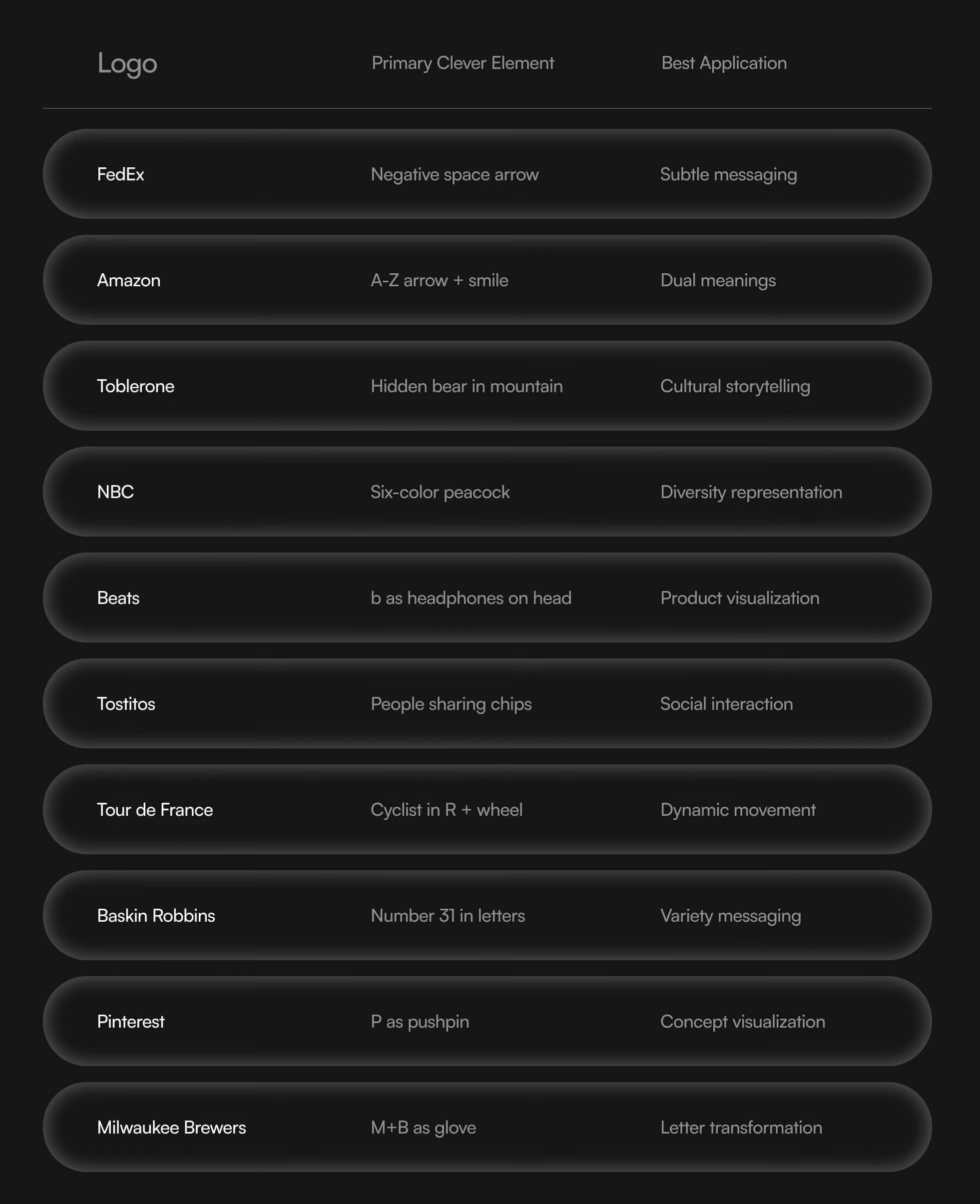
A great logo leaves a lasting impression, allowing it to be remembered after a brief glance. Each of these cool logos achieves that through different techniques.
How to Create Your Own Clever Logo
Start with Your Brand Message
Before exploring visual tricks, identify the core message your brand image needs to communicate. Grounding your decisions in a clear brand platform that defines purpose and positioning will make every visual choice more intentional. Consider:
- What hidden symbols or meanings support your brand’s mission?
- What’s your company’s deeper story that could be embedded?
- What unexpected elements could make your logo unforgettable?
Explore Typography Integration
Look for opportunities within letterforms of your company name. Utilizing the space around letters or shapes adds a “hidden” layer that makes a logo intellectually engaging and memorable. Consider all the details—even small unique elements can transform ordinary letters into something remarkable as part of broader creative design strategies that work.
Consider Cultural and Industry Connections
Think about geographical references, historical relevance, or industry-specific imagery opportunities as part of a broader complete brand strategy framework. The Hershey’s Kisses logo, for example, includes a hidden Hershey’s Kiss between the ‘K’ and ‘I’. Similarly, the Kölner Zoo’s logo incorporates local landmarks, the Goodwill logo features a hidden smiling face, the London Symphony Orchestra integrates letters into conductor imagery, and the Pittsburgh Zoo uses negative space brilliantly.
Other notable examples include the Atlanta Falcons logo (which forms an ‘F’), Sun Microsystems (letters creating patterns), Sony Ericsson (interlinked initials), the Yoga Australia design, the African Children Initiative, and even binary code integration in tech logos. Two Quiksilver logos combined famously create the Roxy brand mark. These demonstrate how deeply brand positioning frameworks that emphasize clear differentiation and brand identity can connect with s
Which Approach Is Best for Your Brand?

Quincy Samycia
Want to learn more about brand platform?