Design QA Checklist: 60 Checks Before Your Site Ships
11/16/2026
Web Design
Catch costly website design mistakes before launch with 60 practical checks that protect your brand, improve usability, and help your team ship confidently.

A design QA checklist is the list you use to compare a built page with the approved design, one detail at a time, before customers see it. Work through eight areas on a staging build: layout, typography, color, components and states, responsive behavior, accessibility, content and links, and sign-off. Log every miss with an exact expected value. The sections below give you the full list, the way to run it and the severity rules that decide what blocks a launch.


What design QA is, and what it is not
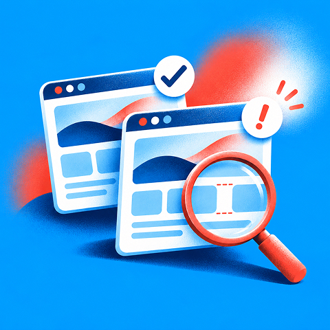

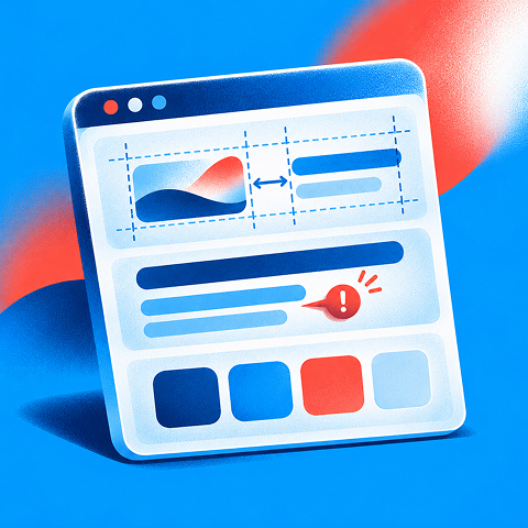
This guide is written for the executives and marketing leaders who own a launch, a redesign or a rebrand rollout. You may not run the pass yourself, but you decide what “done” means. A checklist that your team and any agency partner share is how you make that decision stick.
Design QA is a review step in which a person compares the finished build with the approved design and records every mismatch as a defect. Spacing, type, color, alignment, component states and responsive behavior are the usual subjects. A 16px margin in the mock that renders as 20px in the browser is a design QA defect, even though nothing is broken.
That separates it from three neighboring activities:
- Functional QA checks whether a task works, including submissions, authentication and payment.
- Accessibility testing checks barriers across assistive technologies and user needs; design QA covers selected visual and interaction requirements, not full conformance.
- Content and SEO QA verify accuracy, metadata, links and search readiness beyond pixel-level fidelity.
For a growth-stage company this matters commercially. Your site is where paid traffic lands, where a prospect decides whether you look credible, and where a brand system either holds together or visibly drifts. Small inconsistencies read as carelessness, and they surface at the moment you are spending the most to get attention.
Before you start: set up a fair comparison
Most failed QA passes fail in the setup, not in the checking. Settle these points first.
- Freeze the approved Figma or design reference and record its version.
- Use a staging URL with production-like fonts, content and breakpoints.
- Agree on browsers, viewport widths and the device matrix before reviewing.
- Assign a designer, developer, content owner and release approver.
- Define severity levels and a single defect log before the first pass.
Timing matters too. Run the pass after functional QA has cleared, because design QA assumes the page works. Run it before the release, and run a lighter, focused pass on changed components after any significant update.
The checklist: seven areas to check
Use each item as pass, fail or not applicable. Read values from the browser’s inspector instead of judging by eye from a screenshot. Eyes lie by a few pixels, and the inspector does not.
1. Layout and spacing
- Confirm sections appear in the same order as the approved design.
- Check page container and content maximum widths at each breakpoint.
- Compare section top and bottom padding against approved spacing tokens.
- Verify column widths, grid gaps and card alignment.
- Check headings, images and CTAs align to the intended grid.
- Confirm hero height and visible content match the reference.
- Check horizontal and vertical spacing between repeated components.
- Verify sticky headers, banners and floating elements do not obscure content.
- Ensure there is no unexpected clipping, overlap or horizontal overflow.
- Compare footer structure, spacing and alignment with the approved design.
Check page structure first, then small styling details. A broken section order matters more than a 2px offset, and finding it early saves you from polishing something that will move.
2. Typography
- Confirm the correct font families and licensed webfont weights load.
- Verify page title, H2 and H3 font size, weight and line height.
- Compare body copy size, line height and paragraph spacing.
- Check letter spacing, capitalization and text decoration.
- Verify line lengths and intentional headline wrapping.
- Confirm button, navigation and form label typography.
- Test missing-font fallback to prevent disruptive layout shifts.
- Check typography hierarchy is consistent across templates.
Typography is where brand drift shows first. If you have a documented system, our guides on visual brand guidelines and the visual identity system explain what a reviewer should treat as fixed and what as flexible.
3. Color and visual consistency
- Verify primary, secondary and neutral colors match approved tokens.
- Check text, link and background colors in every section.
- Compare gradient angles, opacity and transparency.
- Confirm borders, dividers, shadows and corner radii.
- Check icon style, line weight and color consistency.
- Confirm visual treatment of photos, illustrations and overlays.
- Verify dark and light sections retain intended contrast and hierarchy.
A static mock shows one state. A live page has many. For every interactive element, confirm each of these matches the design:
- Verify default button size, padding, color and label.
- Verify button hover and active/pressed states.
- Verify focus-visible styles and focus location.
- Verify disabled states are visually distinguishable and not falsely interactive.
- Verify input field default, focus and filled states.
- Verify error and success states, including accompanying messages.
- Verify checkbox, radio and dropdown states.
- Verify loading indicators, skeletons and pending button states.
- Verify menu, accordion and modal open/close states.
- Confirm all repeated components use the same approved variant.
Missing hover states and loading indicators are among the most common complaints at client handoff, so give this area real time. Also review behavior, not only appearance. A dialog can look perfect and still leave keyboard focus stranded behind it when it closes.
4. Responsive behavior
Test at least three widths: a phone (375px), a tablet (768px) and a desktop (1280px). Add a wide screen if your analytics show traffic there. Layouts tend to behave differently at each, and the in-between widths are where things quietly break.
- Check the phone layout at 375px and at a narrower supported width.
- Check tablet layout at 768px.
- Check desktop layout at 1280px and a wider viewport.
- Test widths immediately above and below responsive breakpoints.
- Verify navigation collapse and mobile menu behavior.
- Confirm text, grids and cards wrap without overflow.
- Check image crops, aspect ratios and focal points at each width.
- Verify CTAs, forms and sticky controls remain visible and usable.
If you want the principle behind it, our responsive design glossary entry covers the definition. A typical page takes roughly 15 to 30 minutes to check across widths. A focused pass on changed components takes a few minutes.
5. Accessibility
Accessibility is a design QA concern because contrast, focus and target size are all visual specifications. The numbers below come from the Web Content Accessibility Guidelines (WCAG), the standard most U.S. organizations test against. The Texas Department of Transportation’s UX checklist for UI components is a useful public example of how they translate into checks:
- Check normal text meets the applicable WCAG contrast ratio (typically at least 4.5:1 for AA).
- Check large text and essential UI component contrast (generally at least 3:1 for AA).
- Verify visible keyboard focus and logical tab order.
- Verify controls are keyboard operable, with no keyboard traps.
- Check text and interface at 200% zoom and narrow reflow widths.
- Ensure form labels, instructions and error messages are perceivable.
- Confirm meaningful images have useful alt text and decorative images are ignored by assistive technology.
- Verify touch targets meet the project’s selected accessibility standard, and spacing prevents accidental taps.
Add two checks the spec rarely states: where focus lands after a dialog closes, and whether each error message sits clearly next to its field. Automated accessibility scanners are one input, not a verdict. Move through the page by keyboard yourself.
6. Content, images and links
- Confirm headlines, body copy, prices, offers and legal disclaimers match approved content.
- Check spelling, grammar and punctuation across desktop and mobile.
- Confirm internal and external links resolve to the intended destinations.
- Verify image assets are correct, sharp and appropriately cropped.
- Confirm alt text, visible labels and link text describe their purpose.
- Check page title, headings and CTA wording are consistent with the live campaign.
7. Sign-off and release decision
- Record all unresolved defects with owners, severity and due dates.
- Retest fixed blockers and obtain design, engineering and content approval.
- Document the final release decision, version, approver and post-launch spot-check plan.
Free Brand Health Audit
Make sure your brand is built to sell
Search has changed. Your customers aren't just Googling anymore. They're asking ChatGPT, Perplexity, Gemini and other AI platforms what to buy, who to trust and which brands they should consider.
If your brand isn't showing up clearly in those answers, you're already losing opportunities. Our free Brand Health Audit shows you where your brand stands across traditional search, AI search and brand positioning.

Sample brand audit
Live preview
Traditional search
72
AI search (GEO)
34
Brand positioning
58
How to log a defect so it gets fixed
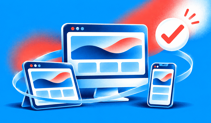
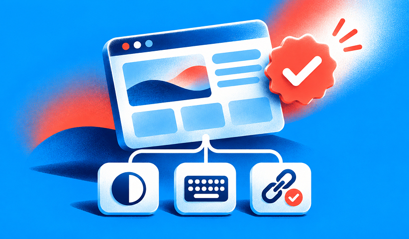
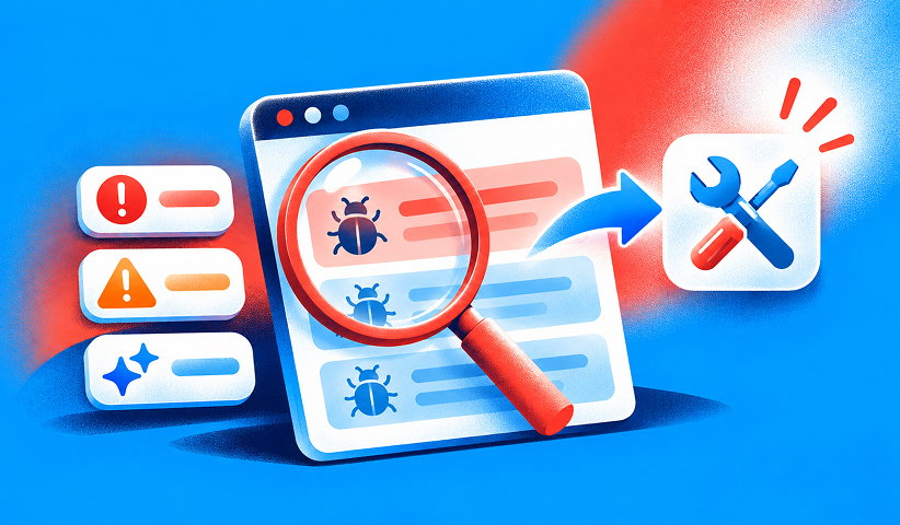

Vague notes (“spacing feels off”) cost a round trip. A good defect is reproducible by someone who was not in the room. Include:
- Page URL, template name, browser and viewport dimensions.
- Clear reproduction steps, expected design value and actual browser value.
- Screenshot or short recording, plus a link to the approved design frame.
- Impact level, named owner, status and retest result.
Here is a worked example: “Service page, 390px viewport. Open the enquiry section. Expected: the submit button stays inside the form container, per approved mobile revision 4. Actual: the button extends past the right edge and creates a horizontal scroll.” An engineer can fix that without asking a single question.
Then rank it.
- Blocker: Prevents comprehension, completion, accessibility or essential brand accuracy (for example a clipped checkout button). Release rule: do not launch.
- Major: Obvious off-spec presentation that weakens trust or usability (for example an incorrect heading weight on the primary landing page). Release rule: fix before launch where feasible and record any approved exception.
- Polish: Minor deviation with limited impact (for example a 2px card gap difference). Release rule: schedule after launch with an owner and date.
A simple rule keeps debates short: if a defect stops someone from understanding the offer or completing the action, it is a blocker.
Want to learn more about Website Design, Development and E-commerce? Keep reading!
If you need help with your company’s website and development, contact us for a free custom quote.
Who runs it, and who decides
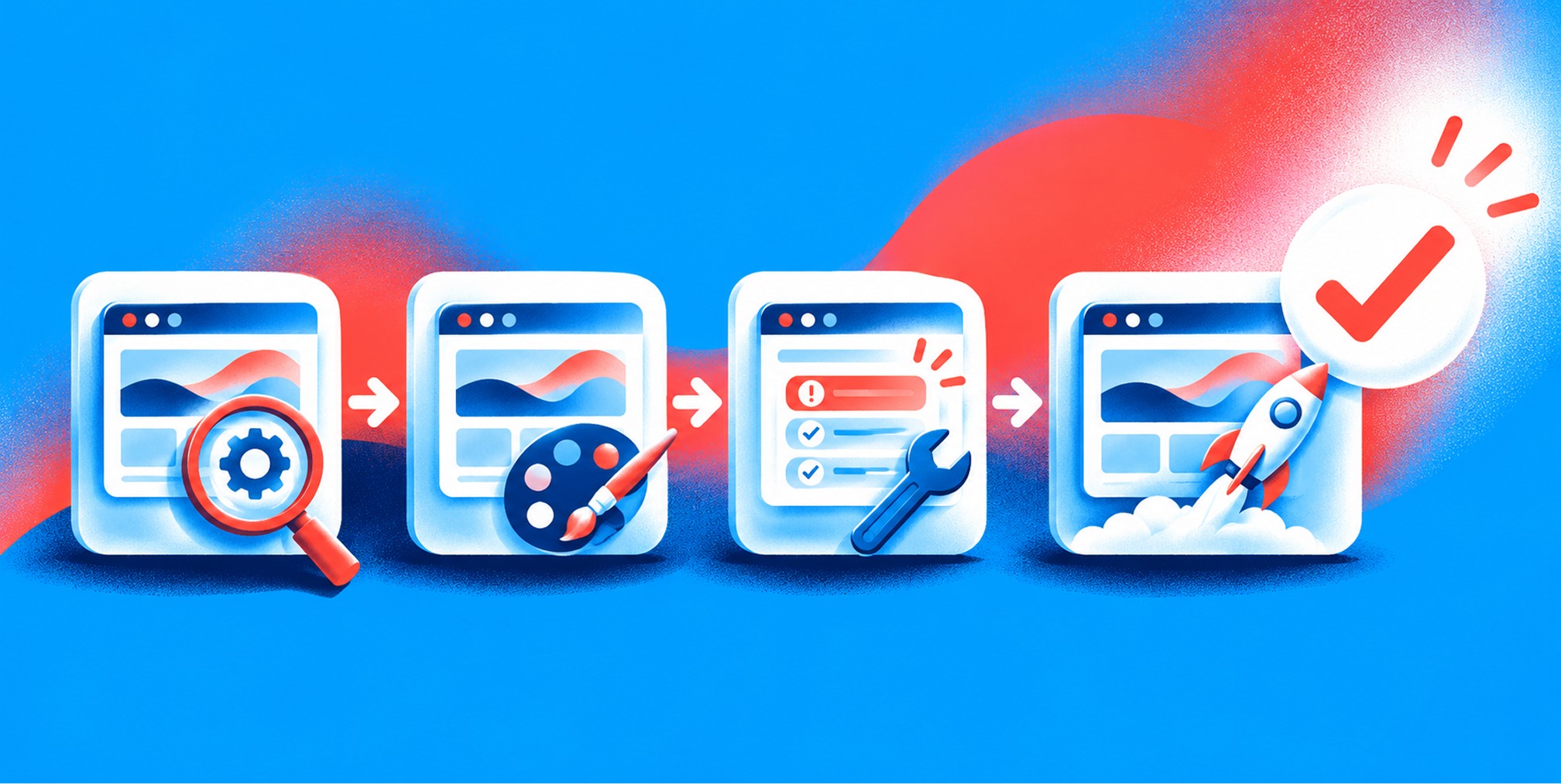
The designer who owns the screen should run the comparison, because they know which differences matter. The engineer stays the reviewer of the code and the gate for merging. Marketing owns the content check, since only marketing knows whether the claim, price or offer is current. A product or marketing owner makes the final call on what ships.
Two habits make the process faster. Review asynchronously on individual tickets so distributed teams can contribute without a meeting. And keep design QA separate from security testing, content approval and business integration testing. An attractive screenshot is not evidence that the whole site is ready.
When the checklist keeps finding the same problems
If every launch surfaces the same drift in spacing, type or color, the checklist is not the problem. The cause is usually upstream: a design system that is not specific enough, tokens that were never agreed, or a handoff that lets engineers guess. Fix it there and your QA passes get shorter every quarter.
The same logic applies when you redesign. A website redesign is the moment to fix your references, so build the QA checklist during design, not the week before launch.
Where we fit
If your team is shipping a new site, a rebrand rollout or a set of landing pages, the cleanest way to run design QA is to have the same partner own design and build, so the reference and the result are never far apart. Our website design, development and optimization work sits alongside branding, creative and performance marketing, so the brand system you approve is the one that gets built and measured. For ongoing creative production, our Creative Services start from $4,000 per month, and the full list is on our pricing page.
If you would like the pass built into your next launch, talk to us through The Branded Agency.
Our view on design QA
Most launch problems are brand problems that arrive late. A page can work perfectly and still say the wrong thing about your company, because a font weight is off, a color has drifted or a mobile layout was never designed on purpose.
We build brand and performance as one system, which we call brand-backed performance™. That is why we treat QA as a shared standard and not a last-minute inspection. When branding, creative, web and paid media work from the same references, there is far less to catch at the end, and the pass you do run is quick and objective.
Our advice to any CEO or CMO: write down what “matches the design” means before the build starts, name the person who signs off, and agree that a blocker stops the launch. Teams that do this ship with confidence, and their campaigns land on pages that look like the brand they paid to build.
- Quincy Samycia
Frequently Asked Questions
What is the difference between design QA and website QA?
Website QA is the broad pass: functionality, content, accessibility, SEO and design. Design QA is the visual part, which checks that the build matches the approved design in spacing, type, color, components and responsive behavior. Run functional checks first, then design QA on the same staging build.
How long does a design QA pass take?
For a typical page, a full pass across three widths takes about 15 to 30 minutes. A focused check of changed components takes around five minutes. A five-page flow reviewed by designers and developers together can be budgeted at roughly half an hour per pass.
Who should do design QA?
The designer who owns the screen should run it, since they hold the spec and know which deviations matter. An engineer reviews the code and controls the merge. Marketing confirms content and offers. One named person signs off on release.
When should design QA happen?
After the build is on staging and functional QA has passed, and before release. Repeat a shorter pass after any significant change. Checking the live site after release catches anything staging did not reproduce.
Which widths and browsers should I test?
At minimum, 375px, 768px and 1280px, in Chrome, Safari and Firefox on desktop, plus Safari on iOS and Chrome on Android. Add widths and browsers that your own analytics show are common among your visitors.
Sources
- W3C WCAG 2.2 standard — https://www.w3.org/TR/WCAG22/
- W3C WAI Easy Checks — https://www.w3.org/WAI/test-evaluate/easy-checks/
- W3C WAI accessibility evaluation overview — https://www.w3.org/WAI/test-evaluate/
- Web.dev responsive design guidance — https://web.dev/learn/design/responsive-images
- MDN CSS layout reference — https://developer.mozilla.org/en-US/docs/Learn_web_development/Core/CSS_layout

Quincy Samycia
As entrepreneurs, they’ve built and scaled their own ventures from zero to millions. They’ve been in the trenches, navigating the chaos of high-growth phases, making the hard calls, and learning firsthand what actually moves the needle. That’s what makes us different—we don’t just “consult,” we know what it takes because we’ve done it ourselves.
Want to learn more about brand platform?
If you need help with your companies brand strategy and identity, contact us for a free custom quote.
We do great work. And get great results.
+2.3xIncrease in revenue YoY
+126%Increase in repurchase rate YoY



+93%Revenue growth in first 90 days
+144% Increase in attributed revenue




+91%Increase in conversion rate
+46%Increase in AOV

+200%Increase in conversion rate
+688%Increase in attributed revenue