Mega Menu Design: How to Build Navigation That Users Actually Use
11/03/2026
Web Design
Learn how to design effective mega menus that simplify website navigation, improve user experience, and help visitors find what they need faster.
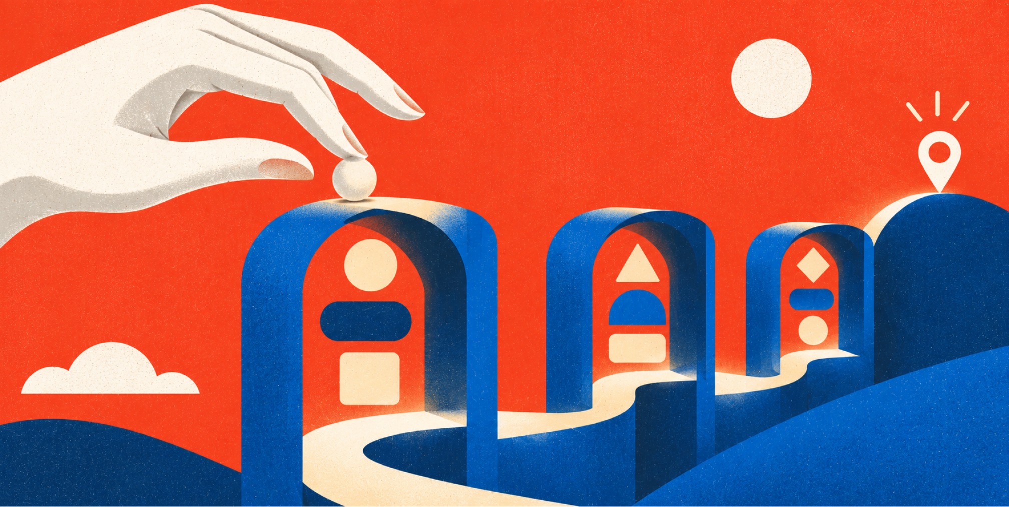
A good mega menu design does one job: it lets a visitor see where everything lives and get there in one or two clicks. A bad one buries them in a wall of links. The difference comes down to six decisions: whether you need a mega menu at all, how you group and label links, how the panel opens and closes, how much you put in it, whether everyone can operate it, and how it behaves on small screens. This guide walks through each one, with the research behind it and the checks we run before a menu goes live.


What a mega menu is, and when it earns its place
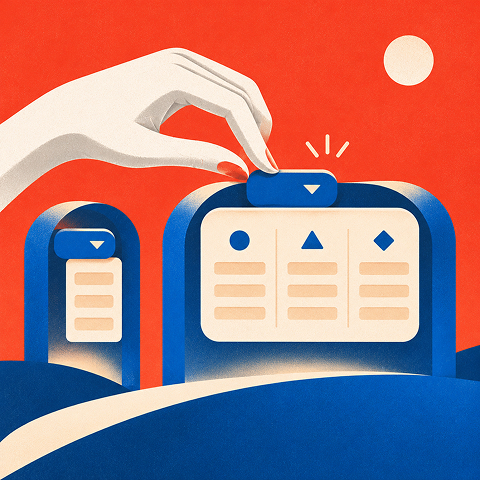

A mega menu is an expandable, two-dimensional panel that groups many navigation choices together. Instead of a narrow list that makes you scroll, you see the options laid out side by side. According to Nielsen Norman Group, that makes it an excellent choice for sites with many options or lower-level pages to reveal. It also reduces reliance on short-term memory, because visitors can compare many options at once instead of remembering what they scrolled past.
That does not make it the default. The NCI Design System treats the mega menu as an information-architecture solution for deep hierarchies, not a header pattern every site should adopt. We agree with that framing. If your whole site fits in six top-level links with a few children each, a plain dropdown is faster to build, easier to maintain and easier to use.
A useful rule of thumb comes from NN/g’s menu design checklist: a mega menu supports roughly two or three tiers of information better than a simple dropdown does. If your structure goes deeper than that, the fix is usually routing pages (landing pages that introduce a section and list its children), not a bigger panel.
Signs you need one
• Your navigation contains many distinct pages that visitors need to compare quickly.
• Users regularly ask where products, services, industries or resources are located.
• The site has meaningful second-level categories that benefit from simultaneous visibility.
• Tree testing or search data shows users struggle to find high-priority pages in basic dropdowns.
Signs you do not
• There are only a few top-level categories with short child lists.
• The sitemap is still unstable or category labels overlap.
• The proposed panel would be mostly decorative promotions instead of navigation.
• The menu would require scrolling, nested flyouts or more than a few information tiers.
Before you design a single panel, settle the structure underneath it. Our glossary entry on information architecture explains why the sitemap comes first and the visual layer second. A mega menu cannot rescue a confusing hierarchy. It only displays it more loudly.
Group and label links the way users think
The most common failure in mega menu design is a panel organized around the company’s org chart instead of the visitor’s task. NN/g recommends grouping links according to related concepts and users’ mental models, ideally informed by card sorting, where real users sort your pages into categories they find natural.
Pick a medium level of granularity
Huge lists are hard to scan. Many tiny clusters of one or two links fragment the panel and make each group feel arbitrary. Aim for medium-sized groups, a pattern the Mutual of Omaha design guide also recommends, along with meaningful ordering and no duplicated choices.
Write short, differentiated labels
Labels do the heavy lifting. A few practical rules:
• Lead with the words users recognize rather than internal product names or department labels.
• Keep group headings specific, distinct and brief, such as "Services by Goal" instead of "Solutions."
• Use parallel grammar: choose either action-led labels ("Build a Website") or category labels ("Website Design") within a group.
• Put distinctive words first so labels remain scannable, especially on narrower screens.
• Test unfamiliar terms with card sorting or short findability tasks before publishing.
Order by what matters
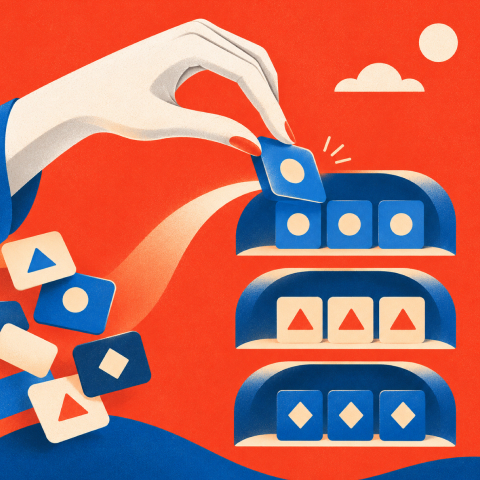
Within the panel, order groups by workflow, importance or frequency of use. A services panel might run from strategy to execution to measurement. A product panel might lead with the best-selling category. Then show each destination once. Repeating a link in two groups does not help people find it. It makes them wonder whether the two links differ.
A worked example
Say a B2B services company has 24 pages under “Services.” A first draft lists all 24 in four columns named after internal teams. A better version uses three groups of five to seven links each, named for what the buyer wants to do (for example, “Build the brand,” “Launch and optimize the site,” “Grow revenue”), ordered by the sequence a growth-stage company usually goes through. Pages that are rarely visited move to a section landing page. The panel gets smaller, and the pages that remain get more attention.
Decide how the panel opens, stays open and closes
This is where many mega menus fail quietly. Hover-triggered panels look slick in a design review and misbehave in real use. NN/g’s checklist advises preferring click-activated submenus for a consistent, reliable pattern across devices and input methods. Hover is not available on touch screens, and hover menus can open accidentally when the cursor passes over a trigger or close when it drifts a few pixels outside the panel.
The logic is about predictability. One activation model, a click or tap or Enter key press, serves mouse, keyboard and touch users alike. You build it once, test it once and it behaves the same everywhere.
Behaviors to specify
• Open the panel on click, tap, Enter or Space, and expose its state with aria-expanded on the controlling button.
• Close on Escape and return focus to the trigger when appropriate; also close when focus moves outside the navigation.
• Keep links in a logical Tab order, with obvious focus indicators and adequate targets.
• Make the open panel remain stable as users move from trigger to destination.
• Allow a second activation of the trigger to close the panel and avoid trapping focus.
• Treat hover as optional convenience only. Never require it to reveal essential navigation.
If your stakeholders insist on hover, treat it as an enhancement on top of click, never as the only path.
Free Brand Health Audit
Make sure your brand is built to sell
Search has changed. Your customers aren't just Googling anymore. They're asking ChatGPT, Perplexity, Gemini and other AI platforms what to buy, who to trust and which brands they should consider.
If your brand isn't showing up clearly in those answers, you're already losing opportunities. Our free Brand Health Audit shows you where your brand stands across traditional search, AI search and brand positioning.

Sample brand audit
Live preview
Traditional search
72
AI search (GEO)
34
Brand positioning
58
Keep the panel simple

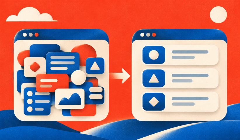
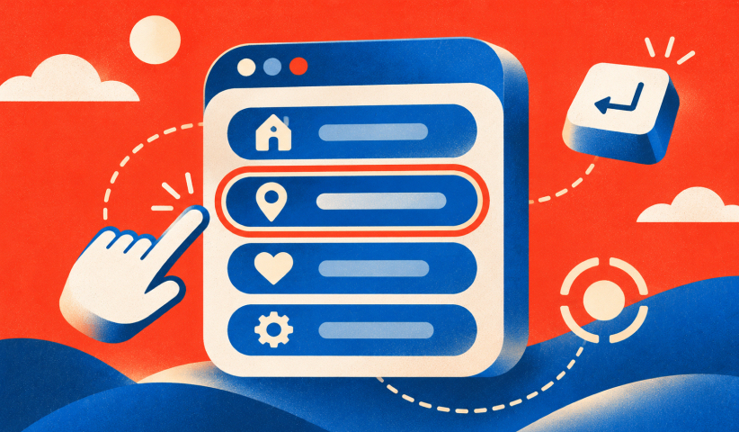
The panel is large, and that is the temptation. Teams fill it because the space exists. Resist it. NN/g’s advice is to keep mega menus simple: use fewer options, avoid advanced widgets, do not use them in place of dialog boxes, use clear panel boundaries and avoid tiny touch targets.
The UL Design System says the same thing from a component-library point of view. It recommends avoiding multi-click interactions and scrolling, grouping related options, minimizing unnecessary choices and using concise labels. Its core principle is easy to remember: more does not mean better. Add an option only when it adds real value, and prioritize scanability.
A pre-launch edit pass
• Remove duplicate links and low-priority pages that belong on section landing pages.
• Reduce each group to a scannable set of choices and give each group an informative heading.
• Check that the panel fits the viewport without its own scrollbar at common desktop sizes.
• Remove carousels, forms, complicated animation and unrelated calls to action.
• Keep text links visible even where thumbnails or promotional tiles are included.
Be careful with images and promo tiles
It is tempting to add a featured image or campaign banner to the panel. The evidence suggests caution. In NN/g’s usability study of the USA.gov mega menus, participants generally navigated quickly and completed tasks successfully, but success dropped when a task required clicking an image. Many participants ignored the images or did not realize they were clickable.
The practical takeaway: never make an image the only route to an important page. If you include one, pair it with a text link to the same destination.
Tailor each section, not each pixel
You do not need identical layouts for every top-level item. A products panel might suit columns with short group headings, while a resources panel works better as a simple list. Consistency in behavior matters more than consistency in layout. Keep the trigger, the open and close logic, the typography and the spacing the same, and let the content shape the columns.
Build for accessibility from the first wireframe
Accessibility is not a polish step. It determines how the panel is built. The W3C’s Web Accessibility Initiative guidance for designers asks teams to specify keyboard, mouse, touch and speech interactions from the start, and to adapt menus to text sizes, magnification, and different screen sizes and resolutions.
It also says menu designs should communicate hover, focus, current, active and visited states both visually and non-visually. In practice:
• Use semantic navigation elements with ordinary links; use buttons for controls that expand or collapse panels.
• Ensure every interactive element can be reached and activated by keyboard.
• Provide visible keyboard focus and communicate expanded/collapsed state programmatically.
• Support Escape to dismiss and avoid losing keyboard focus when the panel closes.
• Indicate the current page and maintain sufficient contrast without using color as the only cue.
• Test with zoom, longer translated labels and screen readers, not only desktop mouse input.
Test these with a keyboard alone before you test anything else. If you cannot reach a link without a mouse, neither can a portion of your audience.
Plan the small-screen version separately
A mega menu is a desktop idea. On a phone there is no room for columns, and hover does not exist. The NCI Design System is a clear example: its mega menu appears only at widescreen and desktop breakpoints, while tablet and mobile sizes use a menu button.
So design two experiences that share one structure:
• Desktop: an anchored multi-column panel with clear group headings and concise text links.
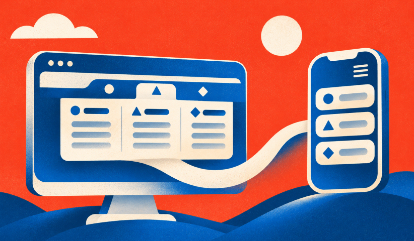
• Mobile and tablet: a navigation button opening a single-column list or accordion of the same groups.
• For both: retain the same category names and priority order, keyboard access and clear open/close controls.
• Test at narrow widths and 200% zoom to catch clipping and horizontal scrolling.
The W3C guidance adds a firm requirement: navigation has to adapt to changes in text size, magnification, viewport size, resolution and word length without forcing horizontal scrolling. Check your breakpoints at 200 percent zoom, not just at standard device widths.
Keep the same group names and order across both layouts. Someone who learns your structure on a laptop should recognize it on a phone.
Test the menu before and after launch
Opinions about menus are plentiful and cheap. Evidence is better. A few methods fit most budgets:
• Run a quick tree test to see whether category names match visitors' expectations before visual design.
• Give representative users five to ten real findability tasks and record completion rate, time and wrong turns.
• Test keyboard-only and touch operation, including opening, closing and returning to the page.
• After launch, review menu usage, internal search refinements, clicks to key pages and navigation-related support requests.
• Retest after adding a major product line or changing the sitemap; treat repeated navigation failures as a content-structure issue.
The USA.gov study is a good model for what to look for: speed, task success and the places where success dropped. Define the five to ten tasks that matter most to your buyers, and treat any task where people fail repeatedly as a design bug.
A mega menu design checklist
Use this checklist before launching or revising a mega menu:
• Need: Use a mega menu only when numerous destinations or meaningful lower-level categories justify it.
• Depth: Show roughly two or three information tiers. Use section landing pages rather than deeply nested panels.
• Grouping: Organize medium-sized clusters around users' tasks and mental models.
• Labels: Write short, distinct links and clear group headings; keep naming parallel.
• Duplicates: Give each destination a clear primary home instead of repeating it across groups.
• Trigger: Support click, tap and keyboard activation with predictable open and close states.
• Content: Keep options easy to scan, avoid embedded widgets and do not force panel scrolling.
• Images: Pair every important graphic destination with a visible text link.
• Accessibility: Provide visible focus, announced state, and Escape-to-close behavior.
• Mobile: Replace columns with a single-column menu that preserves the same information hierarchy.
• Validation: Test top user tasks, keyboard navigation, zoom and mobile behavior before launch.
Want to learn more about Website Design, Development and E-commerce? Keep reading!
If you need help with your company’s website and development, contact us for a free custom quote.
Our perspective on mega menus
A mega menu is a commitment to your information architecture, and your information architecture is a brand decision before it is a design one. Every label tells a buyer what you believe matters. Every group tells them how you think about their problem.
That is why we start with positioning and structure, then move to layout. When the brand story and the site structure line up, navigation stops being a cost center and becomes part of the sales process: the right page, in front of the right executive, at the right moment. This is what we mean by brand-backed performance: the way the site looks, reads and behaves all pull in the same direction, and the result can be measured.
For growth-stage companies, the menu often needs to carry more than it used to. New product lines, new audiences, regulated content, investor-facing pages. A well-built mega menu can hold that growth without turning the header into a maze, provided it is tested with the people who buy, not just approved by the people who build.
– Quincy Samycia
Where we can help
Navigation is rarely a standalone project. It sits on top of brand positioning, site structure, content and conversion goals, and it works best when those are planned together. Our team designs and builds sites for growth-stage companies, from information architecture and UX through development and ongoing optimization. If your menu has outgrown your site, or your site has outgrown your brand, our website team can look at the structure, the design and the performance together.
If you are planning a larger overhaul, our guide to redesigning your website covers what leaders should decide first. For a conversation about scope, see our services and pricing or get in touch.
Frequently Asked Questions

What is the difference between a mega menu and a regular dropdown?
A regular dropdown shows a short, usually single-column list under a top-level item. A mega menu is a large two-dimensional panel that groups many links, so visitors can compare options at a glance instead of scrolling. NN/g considers it a strong choice when a site has many options or lower-level pages to reveal.
Should a mega menu open on hover or on click?
Click is the safer default. NN/g’s menu checklist recommends click-activated submenus because hover is not available on every device and can cause accidental opening or closing. A click, tap or key press behaves the same for mouse, keyboard and touch users.
How many links should a mega menu have?
There is no magic number, but fewer is better. Keep the panel short enough to fit without scrolling, group links in medium-sized sets and add an option only when it adds real value. If the panel keeps growing, the better fix is often a section landing page.
Do mega menus work on mobile?
Not as a multi-column panel. Public design systems such as the NCI’s show the mega menu only at desktop and widescreen sizes, and use a menu button on tablet and mobile. Keep the same grouping and order inside that single-column mobile menu so the structure stays familiar.
How do I know if my mega menu is working?
Run task-based tests with real users before launch, then watch menu clicks, time to key pages and search use afterward. Pay attention to tasks where people fail repeatedly. In the USA.gov study, for example, success dropped when a task depended on clicking an image.

Quincy Samycia
As entrepreneurs, they’ve built and scaled their own ventures from zero to millions. They’ve been in the trenches, navigating the chaos of high-growth phases, making the hard calls, and learning firsthand what actually moves the needle. That’s what makes us different—we don’t just “consult,” we know what it takes because we’ve done it ourselves.
Want to learn more about brand platform?
If you need help with your companies brand strategy and identity, contact us for a free custom quote.
We do great work. And get great results.
+2.3xIncrease in revenue YoY
+126%Increase in repurchase rate YoY


+93%Revenue growth in first 90 days
+144% Increase in attributed revenue




+91%Increase in conversion rate
+46%Increase in AOV

+200%Increase in conversion rate
+688%Increase in attributed revenue