Diagnose Before You Design: Rebranding Strategy for Leaders
11/04/2026
Brand Strategy
Learn how to build a successful rebranding strategy, identify when your business needs a rebrand or refresh, and drive measurable growth without wasting budget.

If your positioning contradicts where the business is actually headed, that’s a rebrand. If the strategy is sound, but the identity feels dated, that’s a refresh. Start either path by commissioning a brand diagnostic before you touch a single design file. A refresh typically runs for several months; a full rebrand usually takes longer, with budgets varying widely depending on company stage.


When to Rebrand vs. Refresh: Triggers and the One-Sentence Test


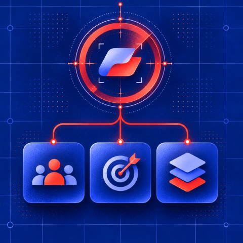
A rebrand is a strategic repositioning: new market position, new audience, sometimes a new name, always a new value proposition backed by business change. A refresh is a visual and messaging update. Same strategy, sharper execution. Confusing the two is the single most expensive mistake leadership teams make, because a refresh solves a design problem and a rebrand solves a business problem, and no amount of new color palette fixes a business problem.
Here’s the one-sentence heuristic: if the brand contradicts the business strategy, rebrand; if the brand simply looks tired but still tells the truth about the company, refresh. That distinction sounds simple because it is. Most teams overcomplicate it by starting with “we’re bored of our logo,” which is never a valid reason to spend six figures.
Four triggers reliably justify a full rebrand, and outside of these four, a refresh almost always does the job:
1. A material shift in business strategy, such as moving from a narrow product to a multi-solution platform.
2. A different priority customer or market whose buying criteria the current positioning no longer addresses.
3. A merger, acquisition or consolidation requiring a coherent market-facing brand architecture.
4. A measurable credibility or differentiation problem that constrains sales, recruitment or pricing.
Trend-chasing and internal fatigue with the logo do not belong on that list, no matter how loudly the marketing team argues for them.
Three quick tests separate a real trigger from a preference. Run recognition testing: show ten prospects your current logo and tagline with no context, and see whether they can state what you do. If they can’t, that’s a messaging problem, not necessarily an identity problem. Check sales friction: are reps hearing “you don’t look like a company that can handle our account” in enterprise deals? That’s a credibility cap. And audit procurement conversations directly. If RFP reviewers or enterprise buyers are commenting on brand maturity as a reason for hesitation, the identity is actively costing revenue, and that’s a business case a rebrand can solve. If none of these show up, save the budget and refresh instead.
Brand Diagnostic and Discovery: The Research You Need Before Anything Else
Every credible rebrand starts with evidence, not opinion. Strategy has to precede identity, and BrandQuarterly’s strategic framework makes the case plainly: most rebrand failures trace back to teams starting with design instead of diagnosing the actual commercial problem first. Skipping discovery to “get to the fun part” is how companies spend six figures on a new look that solves nothing.
A rigorous diagnostic moves through four stages in sequence:
1. Internal audit: Interview executives, sales, product and customer-facing teams about promises and objections.
2. External research: Interview target buyers and review competitors, awareness and buying criteria.
3. Asset and channel audit: Examine website, sales materials, advertising, product and customer communications.
4. Diagnose and decide: Compare the evidence against business goals and recommend retain, refresh or rebrand with owners and KPIs.
Collect hard numbers alongside the qualitative interviews: unaided brand awareness, branded search volume trends, funnel conversion rates by stage, competitive win rates, and a qualitative read on how prospects describe you unprompted. These become your pre-launch baseline, and without them, you have no way to prove the rebrand worked six months later.
The diagnostic should produce a concrete deliverable: a 10 to 15 page brand platform document with a clear recommendation, refresh or rebrand, tied to specific commercial KPIs the leadership team already cares about (deal velocity, average contract value, sales cycle length). If the deliverable doesn’t name a business metric it intends to move, the diagnostic wasn’t rigorous enough.
Positioning and Messaging: The Foundation Identity Has to Follow
Design should never be step one. Positioning and messaging come first because they determine every creative decision that follows, from logo tone to homepage copy to the words a sales rep uses on a discovery call.
Start with a positioning statement, built on a simple template: For [audience] who [need], [Brand] is the [category] that [differentiator], unlike [alternative], which [limitation]. Filling in that sentence forces the kind of specificity most brand briefs avoid. If you can’t finish it in one clean sentence, you don’t have a position yet. You have a list of features.
From there, prioritize your audiences. Most companies serve more than one buyer type, but they rarely deserve equal weight in the messaging hierarchy. Rank them by revenue contribution and strategic importance, then map messaging to each stage of that priority audience’s buyer journey: awareness-stage messaging answers “why should I care,” consideration-stage messaging answers “why you over the alternative,” and decision-stage messaging answers “why now.”
Pro Tip: Give your positioning statement to five customer-facing employees who had no part in writing it, and ask them to explain your company in one sentence, cold. If their answers scatter in five directions, the positioning hasn’t landed internally yet, and it won’t land externally either.
Identity work that starts before this messaging foundation is locked almost always gets redone, because a new logo built around the wrong positioning is just an expensive placeholder.
Identity and Creative Development: What Changes and What You Protect
Once positioning is locked, identity decisions get much easier, because you’re now designing around a clear brief instead of guessing. The hard part isn’t generating new options. It’s knowing what to leave alone.
Run through this checklist before any creative work starts:
1. Preserve recognizable assets that still communicate the right position, including distinctive color, symbol or naming equity.
2. List what must change to express the new strategy, and why a smaller refresh would not solve the problem.
3. Check trademark ownership, typography licensing, accessibility and URL implications before final approval.
4. Test design routes with current customers and target buyers for recognition, relevance and comprehension.
5. Approve core identity rules before producing a complete suite of templates and collateral.
Recognition testing matters here as much as it did in discovery. Inkbot Design’s guidance on rebrand execution makes a point worth internalizing: distinctive assets built over years, a specific shade of color, a mascot, a tagline cadence, carry real recognition value that a design refresh can accidentally erase. Test any proposed change against your current customer base before finalizing it. A general rule of thumb: if more than a third of a recognition test group can identify your current asset unprompted, think twice before discarding it entirely.
On resourcing, sequence the work deliberately. Positioning and messaging get finalized first, then core identity (logo, color, type), then the extended system (imagery, iconography, motion), then applied assets (templates, sales decks, product UI). Building applied assets before the core system is locked is the most common source of rework and wasted design hours.
It’s worth noting that AI design tools have lowered the barrier to producing visually competent work, which means visual polish alone is a weaker competitive advantage than it was five years ago. Strategic clarity and message coherence now do more of the differentiating work than the logo itself, which should shape how you allocate budget in the next section.
Free Brand Health Audit
Make sure your brand is built to sell
Search has changed. Your customers aren't just Googling anymore. They're asking ChatGPT, Perplexity, Gemini and other AI platforms what to buy, who to trust and which brands they should consider.
If your brand isn't showing up clearly in those answers, you're already losing opportunities. Our free Brand Health Audit shows you where your brand stands across traditional search, AI search and brand positioning.

Sample brand audit
Live preview
Traditional search
72
AI search (GEO)
34
Brand positioning
58
Implementation and Rollout: The Operational Playbook



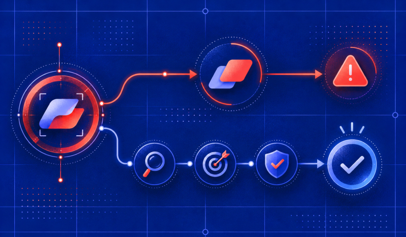
A rebrand strategy dies in execution more often than in planning. The launch sequence, the internal communication, and the redirect maps matter as much as the creative work that preceded them.
Roll out in phases rather than flipping every touchpoint on one date. Growigami’s rebrand checklist recommends prioritizing the highest-impact, highest-traffic touchpoints first, which typically means:
First: Employee communications, partner notifications and the most important customer-facing explanations.
Next: Homepage, highest-traffic landing pages, product pages and primary sales materials.
Then: Paid campaigns, lifecycle email, customer support templates and recruiting assets.
Finally: Lower-traffic PDFs, historical collateral and long-tail digital touchpoints, with a clear transition window.
Behind that sequence sits an operational checklist that’s easy to underestimate: DNS and redirect mapping (every old URL needs a 301 to its new equivalent), SEO migration monitoring (expect a temporary ranking dip and track it weekly), CRM and email template updates, trademark and legal clearance on the new name or mark, and direct outreach to partners and major accounts before the public announcement, not after.
Internal adoption deserves its own plan, separate from the external launch. Start with a leadership memo explaining the why, not just the what. Run live training sessions for sales and customer-facing teams, not just a shared slide deck nobody opens. Update sales decks and internal playbooks simultaneously with the external launch, and set adoption KPIs, like percentage of sales team using new decks within 30 days, so you can catch stragglers before old materials leak externally.
Phased rollouts exist for a reason beyond convenience. Growigami’s rollout guidance notes that a staged approach gives teams time to fix high-impact touchpoints properly instead of rushing everything simultaneously, which is exactly the discipline that prevents the kind of visible, abrupt identity shift that damages trust. Twitter’s overnight switch to X is the cautionary case study here: the rebrand drew mass one-star app-store reviews and public backlash almost immediately, a reminder that visual-only changes launched without preparation carry real reputational risk regardless of company size.
Measurement and Optimization: KPIs, Baselines, and the 30/60/90-Day Plan
You cannot prove a rebrand worked if you didn’t measure the “before.” Set your baseline in the same diagnostic phase where you gathered recognition and competitive data, then track the same metrics on a fixed cadence after launch.
Track these KPIs consistently, comparing every reading against the pre-launch baseline:
Brand: Unaided awareness, message comprehension, branded search, sentiment and distinctive-asset recognition.
Conversion: Landing-page conversion, qualified inbound lead rate and lead-to-opportunity conversion.
Sales: Competitive win rate, average contract value and sales-cycle length.
Retention: Customer complaints about the change, renewal rate and expansion signals.
Operations: Percentage of high-priority assets migrated and employee adoption of new sales materials.
BrandQuarterly’s strategic framework is explicit that awareness and sentiment gains mean little without a corresponding shift in revenue, conversion, or deal velocity. A rebrand that raises awareness but leaves conversion flat hasn’t solved the business problem it was funded to solve.
Set a simple review cadence: at 30 days, check for technical issues (broken redirects, indexing drops, confused support tickets) and address them immediately. At 60 days, compare early funnel metrics against baseline and look for directional movement, not final verdicts. At 90 days, run the full KPI comparison against pre-launch numbers and decide what needs a second pass.
Prioritize fixes by revenue impact, not visibility. A broken redirect chain losing organic traffic outranks a slightly-off tagline on a rarely-visited page. Where a metric moves in the wrong direction and the cause isn’t obvious, run a rapid A/B test on messaging or page layout rather than guessing and rebuilding the whole asset. Small, fast experiments beat a second full redesign cycle nine times out of ten.
Common Mistakes, Dos and Don’ts
The failures are predictable, and so are the fixes.
Avoid these:
1. Starting creative before the strategic diagnosis is approved.
2. Changing distinctive assets without measuring recognition loss.
3. Launching all channels simultaneously without a redirect, support and internal training plan.
4. Measuring awareness only, with no link to pipeline or business outcomes.
Do these instead:
1. Write a business-case statement, scope the audit and set a measurable baseline.
2. Bring current customers and sales teams into message and identity testing.
3. Assign a rollout owner for website, SEO, CRM, sales, legal and vendor handoffs.
4. Review results at 30, 60 and 90 days and iterate the highest-impact problems first.
Before approving the budget, leadership should be able to answer three questions: What specific business problem does this rebrand solve? What baseline metrics are we tracking? Who owns adoption internally, past launch day?
Want to learn more about brand platforms, Brand Strategy and Brand Identity? Keep reading!
If you need help with your companies brand strategy and identity, contact us for a free custom quote.
The Branded Agency Perspective: A Practical Framework for Getting This Right

Most rebrand failures aren’t creative failures. They’re sequencing failures. Teams build the logo before they’ve written the positioning statement, launch everything on one date instead of phasing it, and never set a baseline, so six months later nobody can say whether the investment paid off.
Our approach runs five stages in fixed order: diagnostic, strategy, creative, rollout, measure, with a named owner accountable at each gate before work moves forward.
Budget allocation follows the same logic as our creative sequencing: visual identity work has become a weaker differentiator as design tools commoditize execution, so we push clients to weight spend toward messaging and website work over logo iterations. That’s not a preference. It’s where the commercial return actually lives.
If you want the full rebrand road map or a look at how this plays out for companies rebranding after a merger, those resources walk through the templates in more depth.
Ready to Run Your Diagnostic? Here’s How The Branded Agency Helps
Most agencies sell you a new logo. We start by finding out whether you actually need one, because a diagnostic that recommends a refresh instead of a $200,000 rebrand saves you money and gets you the same commercial outcome. We offer strategic diagnostics paired with website-led launches and post-launch measurement, so the identity work is tied to KPIs leadership cares about, not just a new color palette.
If you’re weighing a rebrand against a refresh right now, the fastest way to get clarity is a branded audit rather than another internal debate. Our executive-level branding services are built for growth-stage companies making exactly this call, from the diagnostic phase through creative, rollout, and 90-day measurement. Book a diagnostic call and get a clear recommendation, backed by evidence, before you commit a single design hour.
Frequently Asked Questions

What Are The Four Main Branding Strategies?
The four widely used approaches are corporate branding (one master brand across all offerings), individual branding (separate brand names per product line), umbrella branding (a shared name with distinct sub-brand identities), and co-branding (two brands partnering under a joint identity). The right choice depends on how distinct your product lines need to feel to different buyers.
What Is The Difference Between a Rebrand and a Refresh?
A rebrand changes strategic positioning, sometimes including the name and target audience, while a refresh updates visual and messaging elements without altering the underlying strategy. Refreshes typically run 3 to 6 months; full rebrands run 6 to 12 months.
How Much Does It Cost To Rebrand a Company?
Costs scale heavily by company stage and scope, ranging from low five figures for a lean refresh to seven figures for an enterprise-wide rebrand involving a name change and product UI overhaul. A common practitioner guideline weights spend toward website and messaging work over the logo itself, since identity work alone has become a weaker differentiator as design tools have matured.
What is the 3-7-27 Rule in Branding?
This rule refers to attention spans in marketing and serves as a useful discipline check for messaging pillars, though definitions of the rule vary across sources. It’s a useful discipline check for messaging pillars, though definitions of the rule vary across sources.
How Do I Know if I Need to Rebrand Instead of Refresh?
Run the one-sentence test: if your current brand contradicts your actual business strategy, whether from a market pivot, merger, audience shift, or a credibility ceiling limiting pricing, that’s a rebrand trigger. If the strategy still holds and only the look feels dated, a refresh solves it at a fraction of the cost and timeline.
Can a Rebrand Hurt My Existing Customer Base?
Yes, especially when it’s abrupt or visual-only without clear communication, as seen when Twitter’s overnight shift to X drew widespread negative reviews. Phasing the rollout, preserving distinctive recognized assets, and communicating the “why” before the “what” substantially reduce that risk.
Sources
Google Search Central: Site moves with URL changes, https://developers.google.com/search/docs/crawling-indexing/site-move-with-url-changes
U.S. Patent and Trademark Office trademark search, https://www.uspto.gov/trademarks/search
W3C Web Content Accessibility Guidelines (WCAG 2.2), https://www.w3.org/TR/WCAG22/

Quincy Samycia
As entrepreneurs, they’ve built and scaled their own ventures from zero to millions. They’ve been in the trenches, navigating the chaos of high-growth phases, making the hard calls, and learning firsthand what actually moves the needle. That’s what makes us different—we don’t just “consult,” we know what it takes because we’ve done it ourselves.
Want to learn more about brand platform?
If you need help with your companies brand strategy and identity, contact us for a free custom quote.
We do great work. And get great results.
+2.3xIncrease in revenue YoY
+126%Increase in repurchase rate YoY



+93%Revenue growth in first 90 days
+144% Increase in attributed revenue




+91%Increase in conversion rate
+46%Increase in AOV




+200%Increase in conversion rate
+688%Increase in attributed revenue