Brand Iconography: How Symbols Shape Powerful Brand Identity
07/28/2026
Branding

Discover how a strategic brand iconography system helps your business stand out, reinforce brand recognition, and create a cohesive visual identity that customers instantly remember.
Brand iconography is more than decoration. It is how a brand turns strategy, values, and functionality into symbols people can recognize on a website, app, package, homepage, or browser tab.
.png)
How Brand Iconography Builds Recognition
Key Takeaways
- Brand iconography is the system of logos, symbols, and UI icons that visually express a brand identity and drive instant brand recognition.
- Consistent iconography across sizes, grids, colors, and style is as important as the logo itself for a coherent visual identity.
- Strong brand icons balance clarity and creativity, respecting user expectations, culture, and language barriers.
- Iconography should live inside a design system with rules, documentation, feedback loops, and a plan for evolution.
- Slack, Starbucks, TikTok, and other brands show how disciplined symbols can become standalone identifiers.
What Is Brand Iconography?
Brand iconography is the visual language of symbols and graphics used to communicate a company’s essence. It includes the logo, app icon, favicon, social avatar, UI icons, navigation marks, feature symbols, and marketing materials, all of which sit within a broader brand identity beyond the logo. In other words, brand iconography extends far beyond a core logo.
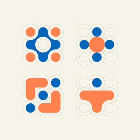
Visual elements like logos serve as distinctive brand identifiers, but an icon set helps people interact with a product every day. Effective iconography communicates brand values without words by using shapes, color palette, stroke weight, corner radii, filled icons, and basic shapes to reflect the brand's values and personality.
For example, Apple’s bitten apple, Nike’s swoosh, Twitter’s bird, and Google’s app icons are easily recognizable visual shorthand. In the dense digital world of 2024–2026, compact symbols on mobile screens, wearables, tabs, and apps are essential for brand recognition.
Brand Iconography vs. Brand Identity and Visual Identity

Brand identity is the strategy: positioning, voice, values, services, and promise. Visual identity is the visible layer: typography, fonts, images, colors, layout, illustration, logo, and iconography, all of which are governed by clear brand guidelines for consistency. Brand iconography sits inside the brand's visual identity and makes it usable across every touchpoint.
The best way to create consistency is to define icon rules early. Icons should share the same line logic, geometry, color, and spacing as the rest of the design system.
- Logo: identifies the brand in hero placements, signage, packaging, and profiles.
- Icon set: supports UI, search, navigation, dashboards, and functionality.
- Illustration style: adds story, emotion, and campaign-level inspiration.
When icons sit beside typography, labels, and buttons, they need the same sense of proportion. If the type is sharp and technical but the icons are soft and playful, the concept feels disconnected.
Why Brand Icons Matter for Brand Recognition
Human brains process imagery significantly faster than text, so icons provide visual shorthand for a brand's identity. Icons bypass language barriers, allowing instant brand recognition. Instant recognition allows consumers to identify a company at a glance.
Strong brand iconography enhances brand recognition and loyalty. A strong iconography system enhances brand recognition and loyalty because memorable icons help users trust and return to brands, reinforcing the measurable, data-backed impact of strategic branding on business performance. Consistent iconography across touchpoints builds brand familiarity, and a consistent icon style enhances brand recognition and trust.
Icons also simplify complex ideas and improve user navigation. A magnifying glass means search, a cart means buying, and a lock means security. Research from the EPFL+ECAL Lab found that concreteness, complexity, and aesthetics affect how quickly users understand icons.
Types of Brand Icons and When to Use Them
There are four main types of brand icons: literal, abstract, meaningful, and symbolic, and they all need to align with your broader visual brand guidelines framework.
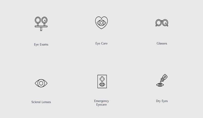
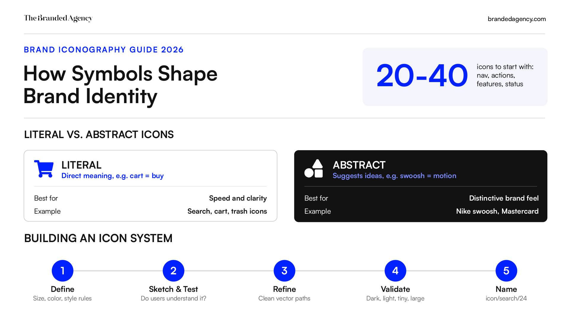
- Literal icons provide straightforward meanings like a shopping cart for buying. A trash can for delete or magnifying glass for search works best when speed and clarity matter.
- Abstract icons hint at ideas or emotions without showing the product directly. Nike’s swoosh suggests motion; Mastercard’s circles suggest connection.
- Meaningful icons reflect a brand's origin or mission, like Evernote's elephant for memory or WWF’s panda for conservation.
- Symbolic icons use universally recognized symbols like a heart for love, a bell for alerts, or a lock for privacy.Brand iconography is a system, not a folder of random objects. Here are the key elements to define.
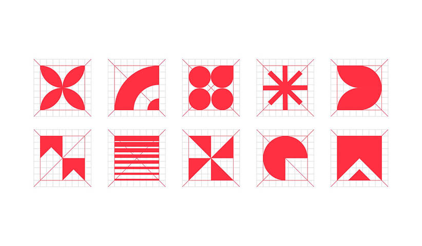
Size and grid: Set base sizes such as 16, 20, 24, and 32 px. All icons should be the same size for consistency within each use case, similar to the rules you’d set in your logo branding guidelines. Consistency in icon size is crucial for effective branding, especially across ui pages, dashboards, and mobile navigation.
Stroke and fill: Choose outline or filled icons, then document the rule. A common standard is 1.5–2 px stroke weight at 24 px. If paths are drawn too thin, they blur on small screens.
Geometry: Consistent corner radii, circles, angles, and proportions shape personality. Rounded shapes feel friendly; sharp shapes feel precise or premium.
Color: Using a single color for icons simplifies design consistency. Use a single color for product icons to maintain simplicity, then reserve accent colors for states like warning or success.
Metaphor clarity: Simplified designs work on small screens or large billboards. Icons should reflect the core values of your brand visually, and iconography should reflect the brand's core values visually without adding unnecessary detail.
Want to learn more about brand platforms, Brand Strategy and Brand Identity? Keep reading!
If you need help with your companies brand strategy and identity, contact us for a free custom quote.
Building Brand Iconography into a Design System
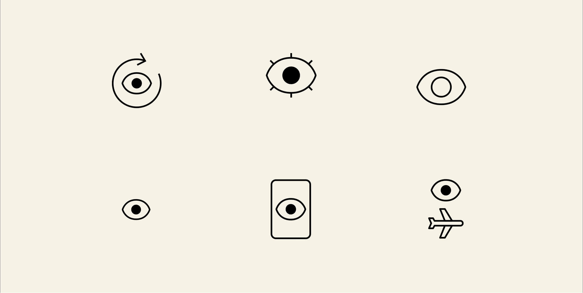
Robust brand iconography belongs inside a design system, not inside scattered files, and should be documented as part of a comprehensive brand bible or brand book. Designers can create icons in Figma, Sketch, or Illustrator, then export clean SVG paths for developers.
A practical process looks like this:
- Define principles for size, color, style, and metaphor.
- Sketch ideas and test whether users understand them.
- Refine vector paths and remove decorative elements.
- Validate each icon on dark, light, large, and tiny backgrounds.
- Name components clearly, such as icon/search/24 or icon/alert/filled/32.
Documentation should cover spacing, color overrides, dos and don’ts, and approved exceptions. This gives designers, developers, and marketers access to the same source of truth.
Best Practices for Using Icons Across Brand Touchpoints
Icons should be consistent across all brand touchpoints and customer interactions. A unified icon style binds a company's digital platforms and physical materials, from app navigation to packaging and event stands.
For digital products, focus on contrast, tap size, labels, and tooltips. Icons play a crucial role in helping users understand actions without slowing down and should fit within your broader digital branding strategy. For marketing and social, use the same visual language in email templates, infographics, ads, and landing pages.
For physical touchpoints, simplify icons before printing, engraving, embroidery, or signage. Small lines and complex detail can disappear in production. Favicons also matter; modern sites commonly need 16×16, 32×32, and larger app-ready versions, as noted in this favicon guide.
Lessons from Brands with Strong Iconography
Recognizable brands share a pattern: they reduce, align, and refine over time.
Slack simplified its old multi-colored octothorpe into a cleaner symbol that was easier to reproduce while keeping its collaborative feel. The redesign addressed practical consistency issues, including color and background use, as covered by CNBC.
Starbucks moved from a detailed, text-heavy mark to a simplified green siren that now works on cups, storefronts, and app icons globally. TikTok uses a minimal music-note form with neon cyan, fuchsia, and black to reflect sound, motion, youth culture, and innovation.
The lesson is simple: a brand icon can evolve, but the essence should remain stable.
The goal is not to make every figure unique. The goal is to determine which symbols users already understand, then add just enough brand detail to make them memorable.
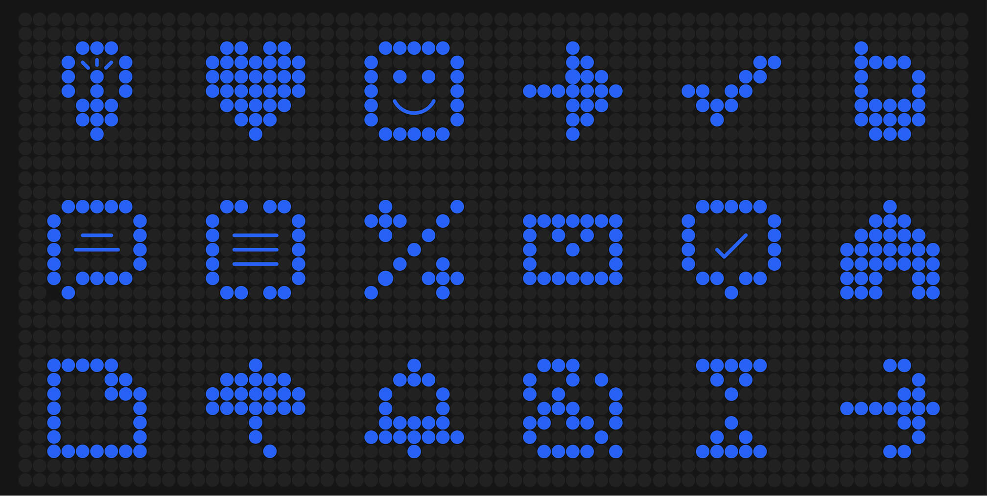
Core Design Principles for a Cohesive Icon System
Maintaining and Evolving Your Brand Iconography
Icon systems are living assets. As a business adds products, services, platforms, and audiences, its iconography needs governance.
Assign ownership to a brand or design systems team. Create a review process for adding, changing, or retiring icons. Version files so engineering, marketing, and product teams do not ship mixed styles.
When changing important icons, gather feedback through usability testing or A/B tests. Watch metrics like navigation errors, CTR on icon-only buttons, retention, and support questions. Good evolution improves clarity without breaking recognition.
FAQ
How many icons does a brand actually need to start with?
Most teams can start with 20–40 icons covering primary navigation, common actions, key features, and status messages. Expand only when a real user need appears.
Should startups invest in custom icons or use stock icon sets?
Stock icons are fast and affordable, but they can weaken differentiation. Custom iconography takes more effort, but it helps a brand create a more memorable and consistent visual identity.
What file formats should we use to share brand icons with developers and partners?
Use SVG for web and app implementation because it scales cleanly. Use PNG at multiple resolutions for presentations, documents, partner kits, and fixed-size placements.
How often should a brand refresh its iconography?
Minor refinements to spacing, stroke, or simplification can happen every 2–3 years. Full overhauls should be rare and tied to major brand, product, or market changes.
Can one icon style work for both product UI and marketing?
Yes. The base iconography system should stay shared, while marketing can add color accents, texture, or illustration as long as the core shapes and proportions remain consistent.

Quincy Samycia
As entrepreneurs, they’ve built and scaled their own ventures from zero to millions. They’ve been in the trenches, navigating the chaos of high-growth phases, making the hard calls, and learning firsthand what actually moves the needle. That’s what makes us different—we don’t just “consult,” we know what it takes because we’ve done it ourselves.
Want to learn more about brand platform?

If you need help with your companies brand strategy and identity, contact us for a free custom quote.
We do great work. And get great results.
+2.3xIncrease in revenue YoY
+126%Increase in repurchase rate YoY


+93%Revenue growth in first 90 days
+144% Increase in attributed revenue


+91%Increase in conversion rate
+46%Increase in AOV


+200%Increase in conversion rate
+688%Increase in attributed revenue