Forkin’ Good
Brand Positioning
Brand Naming
Product Positioning
Product Naming
Creative Direction
Brand Identity System
Packaging Design
Food & Beverage
Consumer Packaged Goods
Background
The Challenge
The Branded Agency has designed a new master brand, identity system, and packaging program for Forkin' Good (formerly Arbutus Foods), a Vancouver Island producer of fresh dips, salads, grains, sauces, and meal kits, founded in 1997 and based in the Cowichan Valley.
The Canadian retail food category has long been dominated by national CPG players with consolidated supply chains, predictable flavor profiles, and packaging systems designed for cost efficiency over distinction. Independent producers compete for shelf space in an environment where category cues are tightly coded, shopper attention is measured in seconds, and brand systems are expected to stretch across categories without losing coherence.
Arbutus Foods had grown into a multi-category producer over more than two decades, with SKUs across dips, salads, grains, sauces, meal kits, and side dishes. The food itself was well regarded by regional retailers and chefs, with a reputation built on real ingredients, globally inspired flavors, and small-batch production methods. The challenge was that the company's name had remained operational rather than consumer-facing, and the portfolio had outgrown the loose brand system meant to hold it together. Multiple product lines were operating without a single master identity strong enough to unify them on shelf or carry the next phase of category expansion.
The Branded Agency was asked to address this at the foundation. The work covered master brand positioning, renaming, brand architecture, identity system development, and packaging design across two priority lines, Dips and Meal Makers. The new system needed to appeal to grocery buyers, retail merchandisers, and end consumers, while remaining flexible enough to carry future product launches across categories.



01. Positioning the Brand
The first phase focused on defining the master brand position. The objective was to find an ownable space in the Canadian retail food category that matched the food being made: real ingredients, globally inspired flavor, prepared with care, but designed for the realities of how busy families actually eat.
The category context shaped the strategy. Convenience food has historically asked shoppers to choose: fast and forgettable, or healthy and joyless. Parents looking for quick weeknight options have been left with packaging that signals compromise either way, processed comfort on one side and clinical, earnest wellness on the other. Forkin' Good's food sat comfortably in neither lane. It was honest, fast, family-friendly, and unapologetically flavorful.
The brand thesis that emerged centered on bringing joy back to convenience food. Real ingredients, bold global flavor, and a tone that does not take itself too seriously, built for families who want healthier options without losing dinner to a chore. Joy became the strategic anchor, not as a marketing flourish but as the trait that would differentiate the brand across every layer of the system: the name, the wordmark, the color palette, the photography, the packaging language, and the in-store experience. This positioning informed every subsequent decision in the project.
02. Naming and Brand Architecture
Arbutus Foods had served the company well through its growth phase but presented two specific limitations as the business moved toward national distribution. The first was linguistic. Outside of British Columbia, the name was rarely recognized and frequently mispronounced. The arbutus is a Pacific Northwest tree, instantly familiar to West Coast Canadians and largely unknown to shoppers in the rest of the country, which made the brand difficult to remember, ask for, or repeat. The second was tonal. The name carried no consumer-facing personality, no category cue, and no signal of the lightheartedness the brand wanted to lead with at retail.
A full naming process followed, including competitive landscape research, linguistic and cultural screening, domain and handle availability, and high-level trademark review. The shortlist was developed in collaboration with the founder and leadership team.
The selected name, Forkin' Good, solved both problems at once. It is phonetic, easy to say, easy to remember, and frictionless to ask for at grocery. It is tongue-in-cheek without being immature, an instant signal that the brand carries personality and does not take itself too seriously. And it stretches comfortably across the company's full portfolio of dips, meal makers, salads, grains, chips, and seasonal lines, with room to keep growing.
A brand architecture system was then built beneath the master brand, with consistent naming logic at the product line and SKU level. Sub-naming systems were developed for retail salads, seasoning, grains, and Ricetime, each designed to retain category-appropriate character while staying inside the master brand framework.
03. Brand Identity
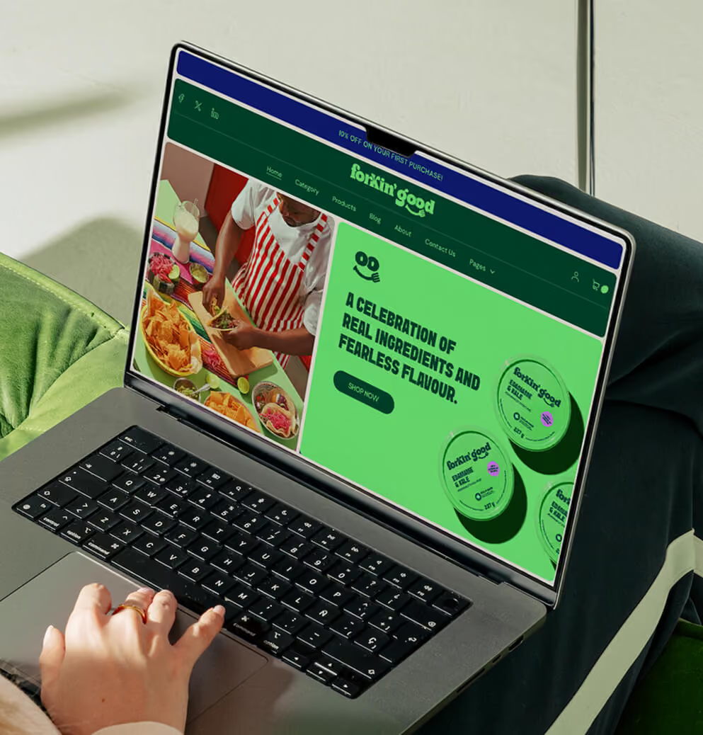
The new identity translates the brand's tone into a visual language that earns attention on shelf, signals personality before a single word is read, and holds together across an expanding portfolio.
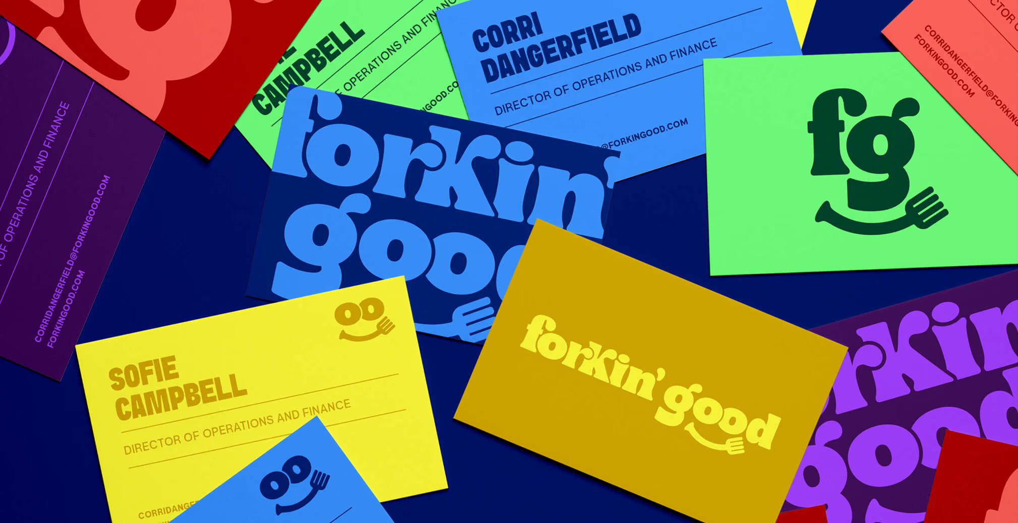
The wordmark is the heart of the system. Built on a chunky, weighted serif with generous curves and integrated with a custom fork glyph that curves into a subtle smile beneath the word "good," the mark is designed to feel warm, confident, and quietly playful. The brand smiles before the consumer has read it, and that single move does the emotional work most CPG identities try to manufacture across an entire system.
The typography system carries the same balance. A confident display face handles headlines and product names with attitude and presence, while a clean, neutral sans carries body copy and supporting information with clarity. Together they let the brand sound playful without sacrificing readability across packaging, web, and retail communications.
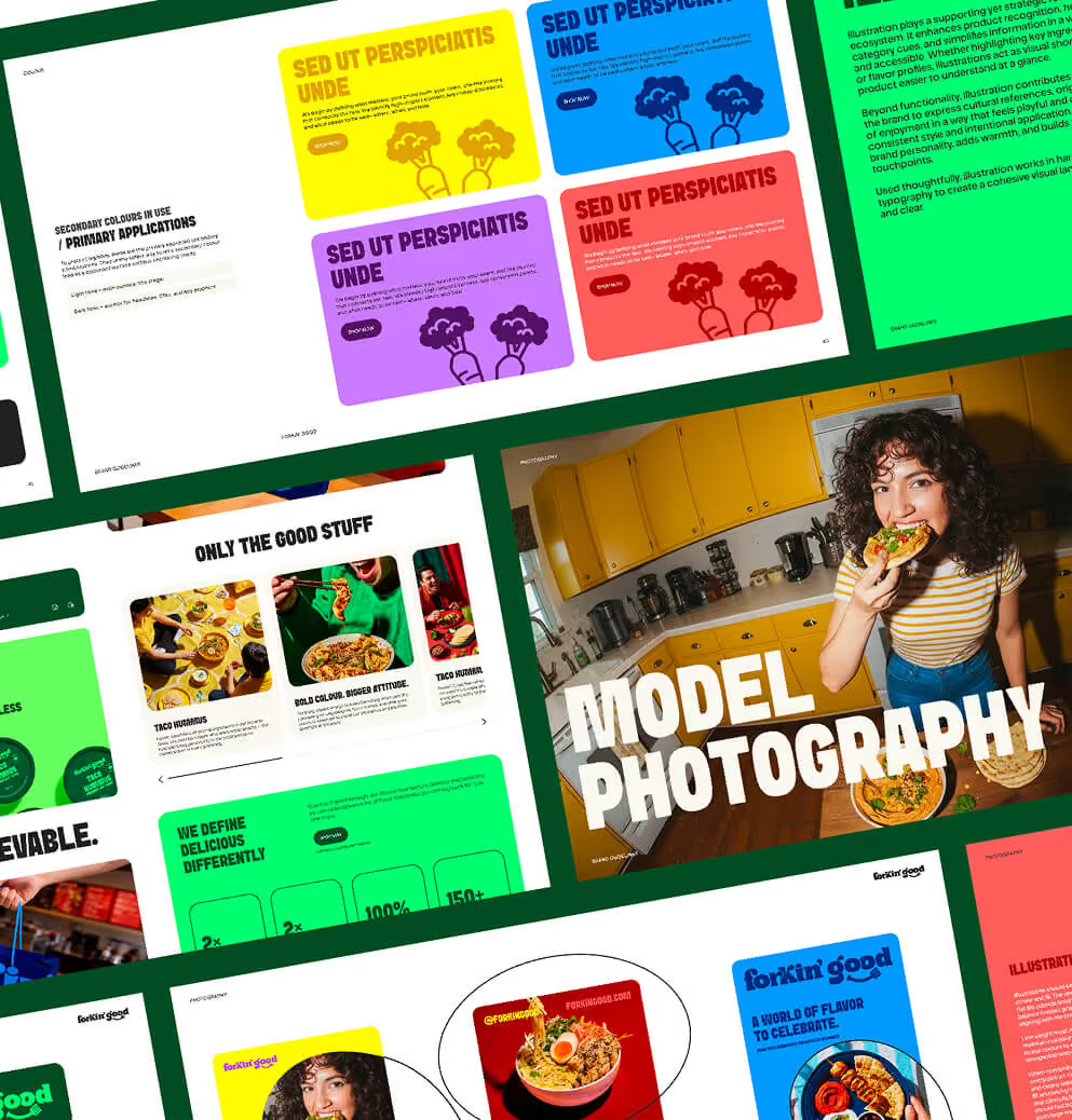
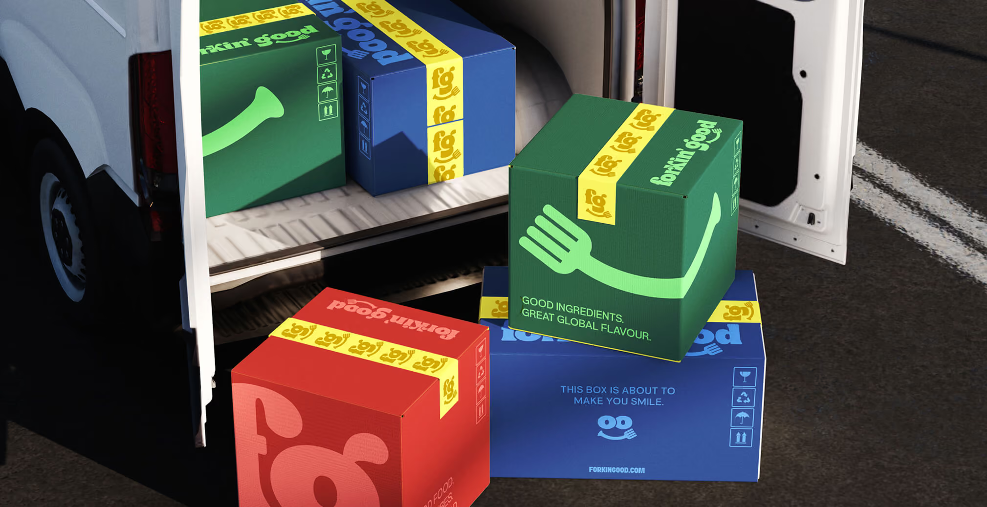
The color system was developed to express global flavor through tone-on-tone combinations. Each primary hue is paired with a brighter expression of the same family, creating depth and energy without visual noise. Greens anchor the master brand. Reds, blues, yellows, and purples differentiate product lines and SKUs at packaging level. The result is a system that gives every product its own personality while keeping the family visibly connected at shelf and online.
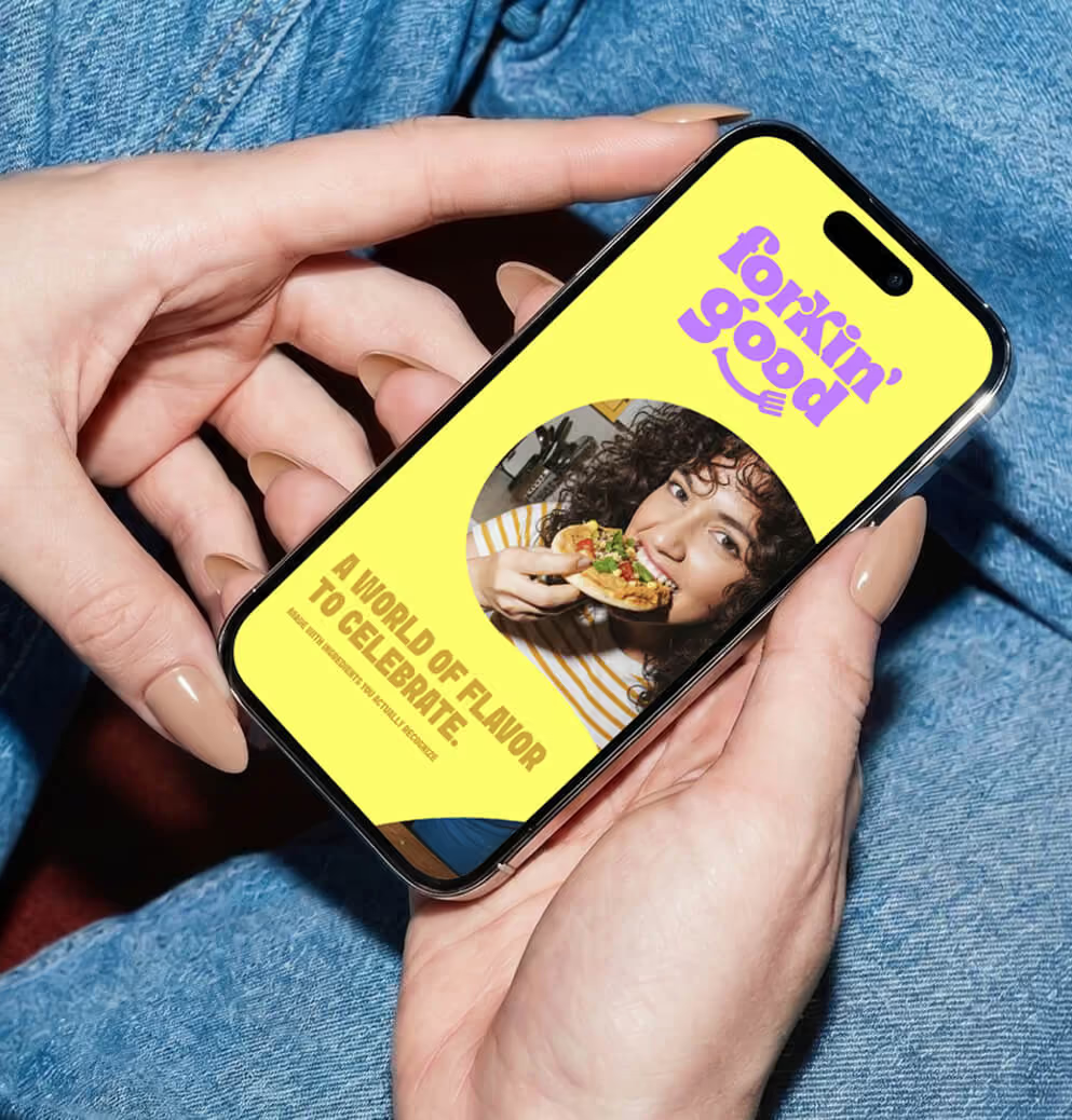
Photography was art-directed across four registers: model, kitchen, tabletop, and packaging. Each one is designed to communicate real moments of cooking and eating, with cultural cues drawn from each dish's origin built into props, surfaces, and styling. The point is to keep the brand grounded in the kind of joy that happens at actual family tables, not in stylized studio food.
An illustration system was developed in parallel as a category navigation tool, with bold, friendly icons organized by product type. A full style guide consolidates the verbal and visual elements into a working system, designed to keep the brand coherent as the portfolio scales and as future partners and designers come on to the brand.
04. Packaging
Packaging concepts were developed and tested across two priority product lines, Dips and Meal Makers. Several creative directions were explored in the early phase, ranging from more illustrative and editorial executions to more graphic and structural approaches. The final system was selected for its balance of shelf impact and production simplicity. It needed to stand out in store, hold together across an expanding flavor range, and remain affordable and straightforward to execute as the portfolio continued to grow. Independent food brands often lose margin to packaging complexity, so designing for production realities was a strategic decision, not a compromise.
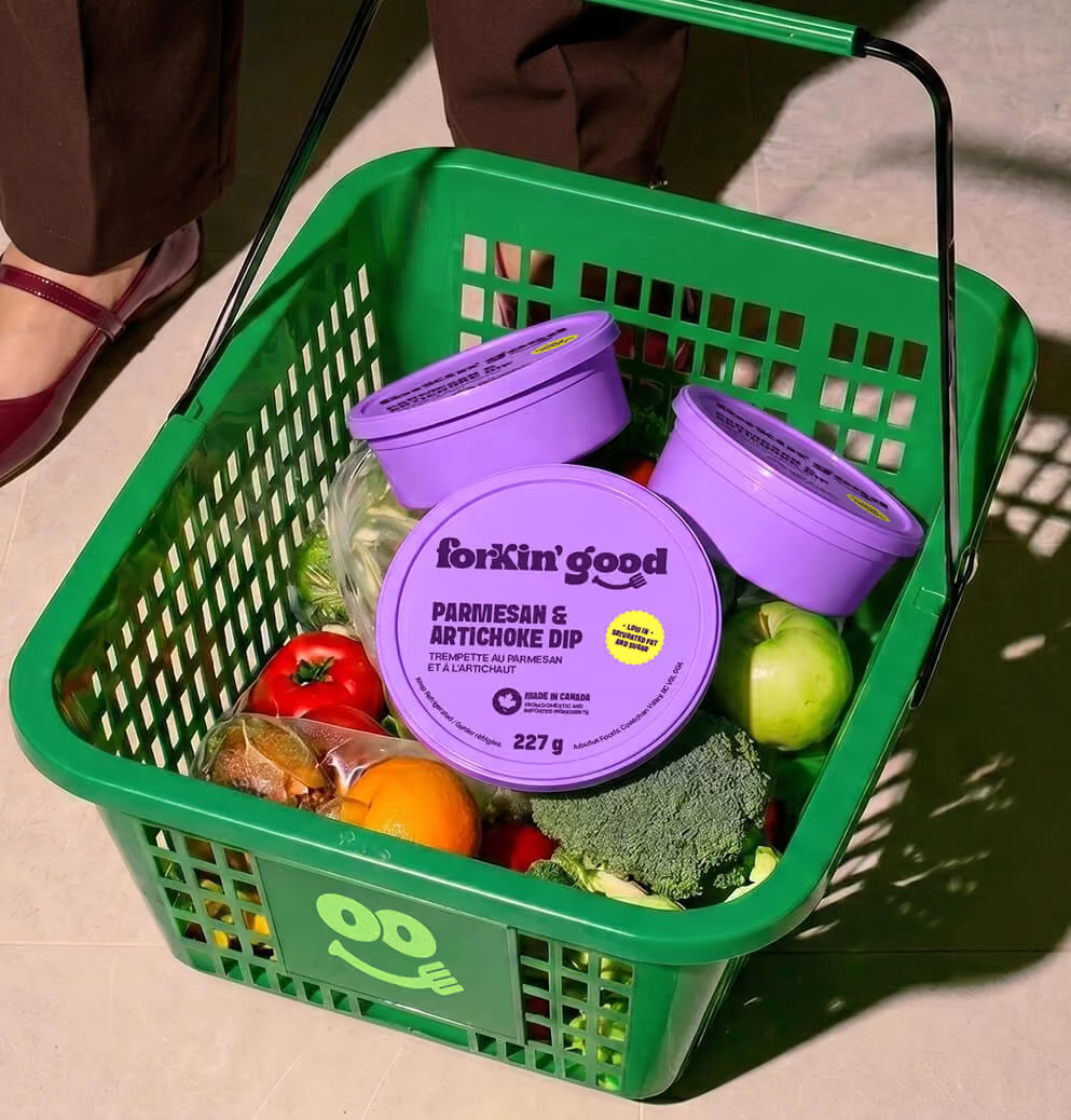
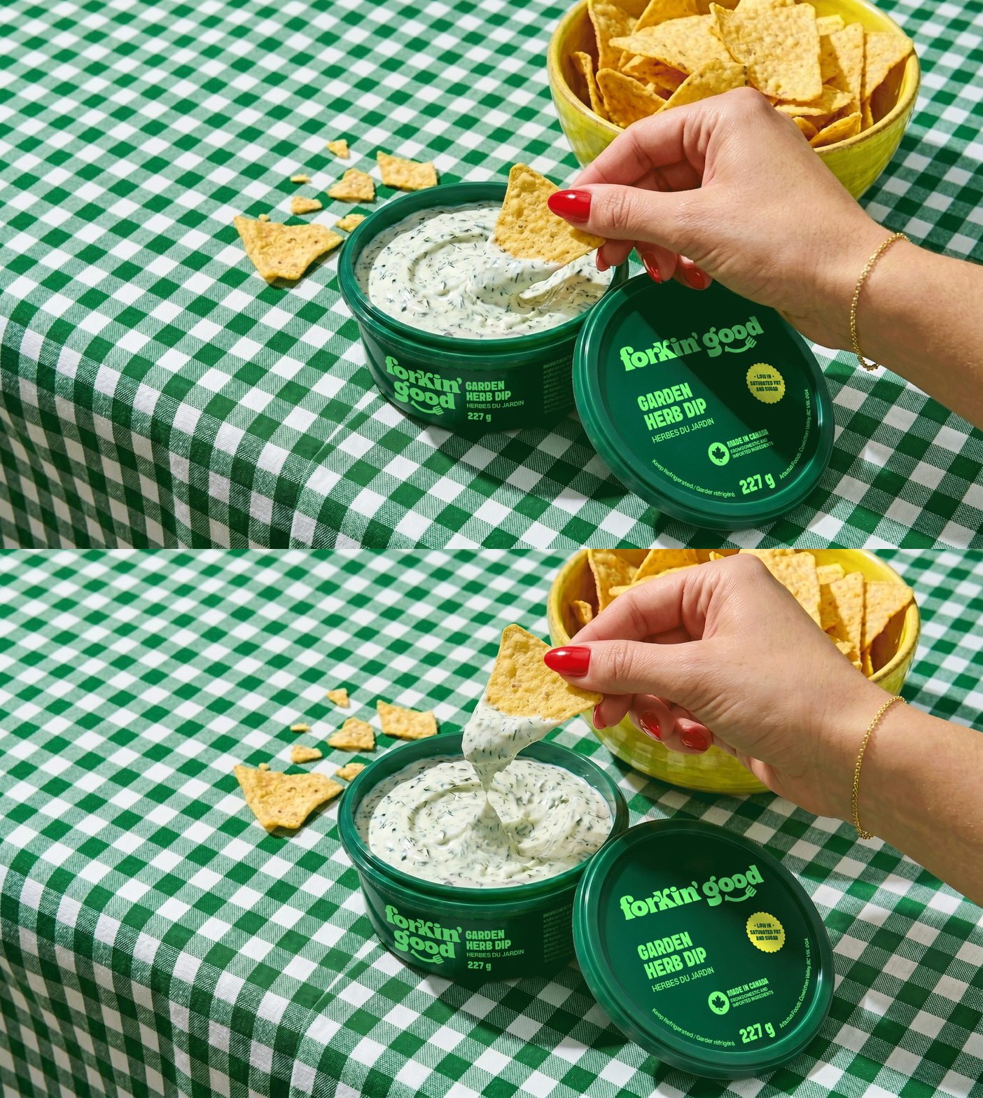
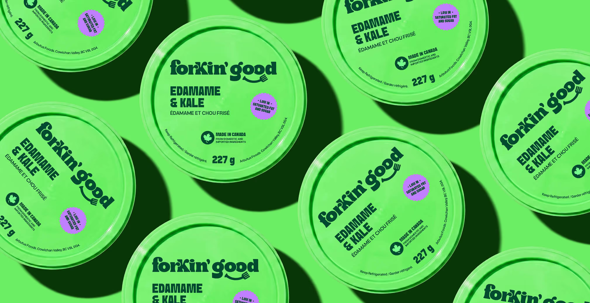
For Dips, the round tub format was used as a color-first system. Each flavor lives inside its own anchor color drawn from the primary or secondary palette, with the logotype and product name set in a tonal contrast from the same family. Color does the heaviest lifting, differentiating Fire Roasted Corn and Feta from Dill Pickle Hummus from Chimichurri Sauce without relying on photography or illustration to carry the SKU story. The result is a wall of dip lids that reads as one cohesive brand while allowing each flavor to hold its own identity at shelf.
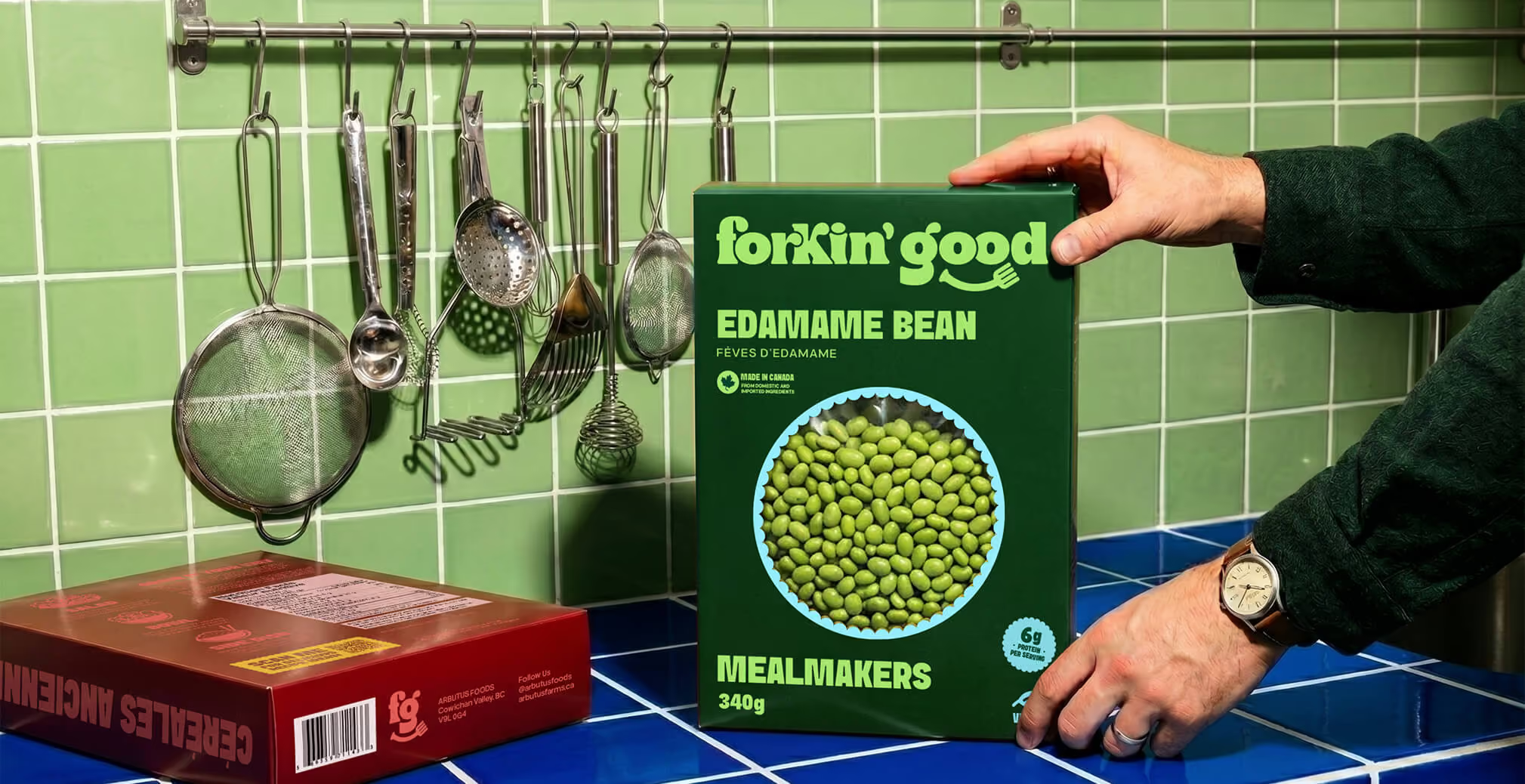
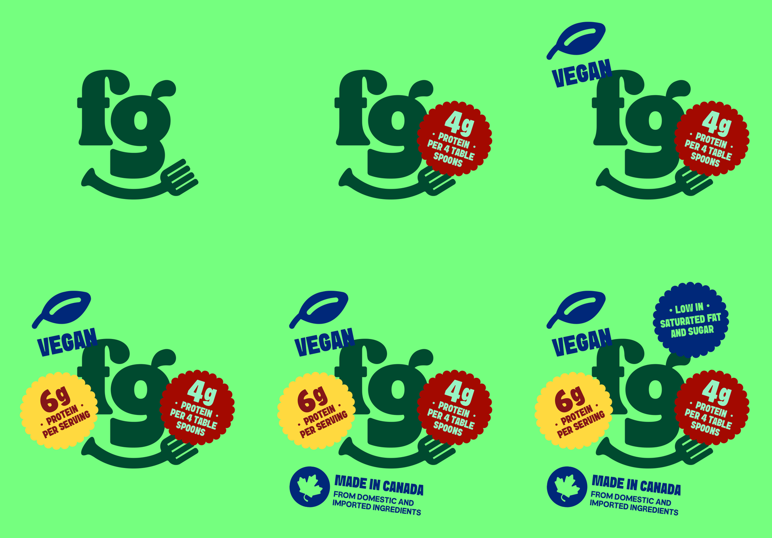
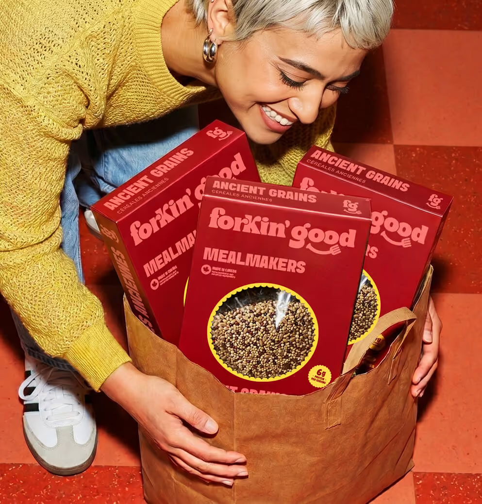
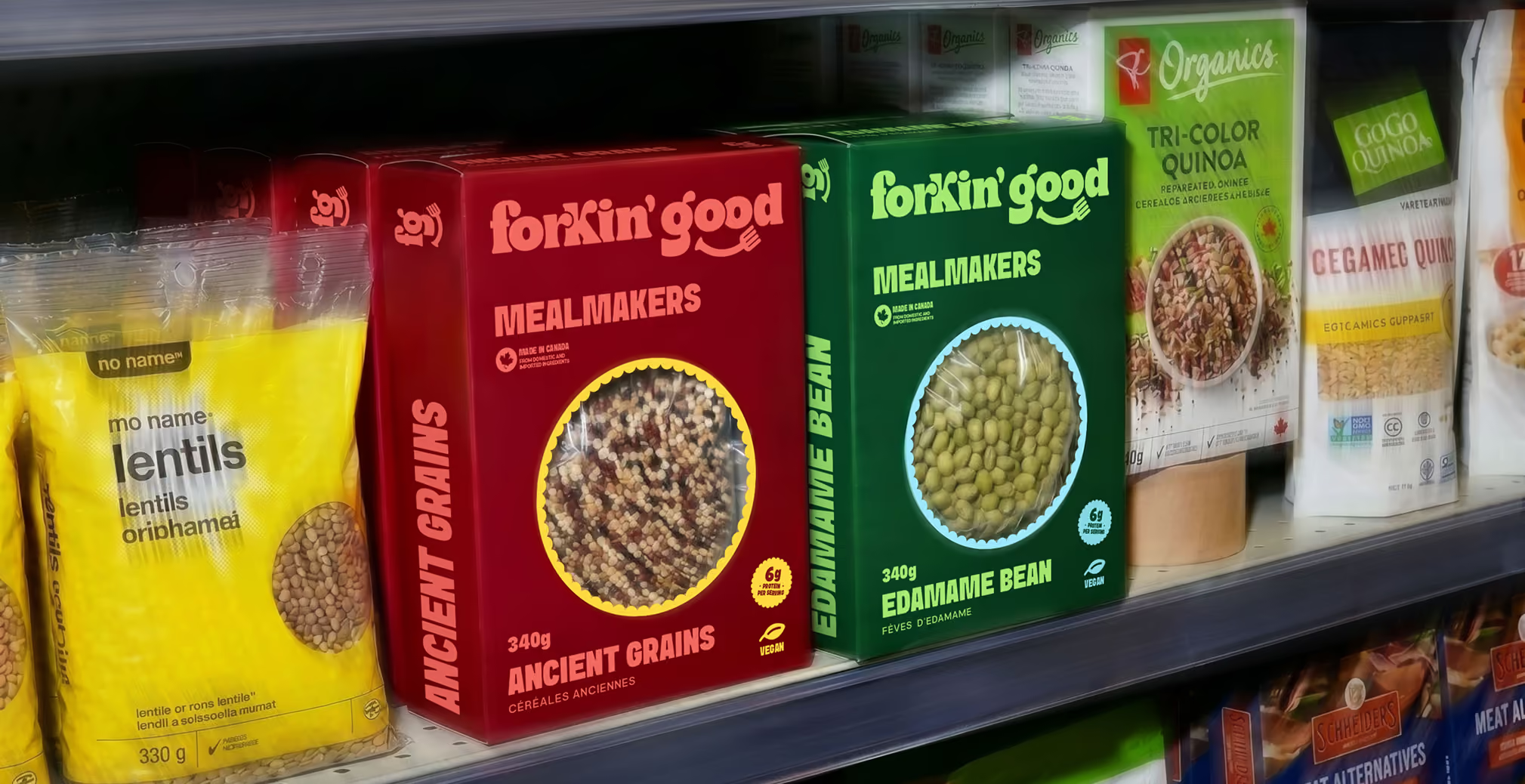
For Meal Makers, the boxed format was structured to carry more detailed informational content. The front-of-pack hierarchy was built to feel clean rather than crowded, an intentional move in a category where information density often turns into visual clutter. The structure moves from the logotype to the line name, to the product name in English and French, to call-out seals highlighting protein per serving, low saturated fat and sugar, and Made in Canada certification, and finally to the weight at the base of the pack. Nutritional and certification call-outs were integrated as part of the design system from the outset rather than added as stickers or afterthoughts, which kept the front of pack feeling considered and confident.
The same tone-on-tone color logic carries across formats, so Dips and Meal Makers read as part of the same brand family on shelf and online, even as each format does its own informational work.
Forkin' Good now operates as a unified master brand across a portfolio designed to scale nationally. The new system supports continued category expansion, retail growth, and consumer connection, with a strategic foundation, brand architecture, identity system, and packaging program built to carry the next phase of the company's growth.
We’d love to partner with you and your team.
We partner with the world’s most ambitious companies—at every stage of growth. By understanding your unique challenges and opportunities, we design tailored solutions to move your business forward. Let’s talk about what’s next.