Soloosh
Brand Positioning
Creative Direction
Brand Identity
Packaging Design
Website Design and Development
Fashion & Beauty
Consumer Brands
Background
The Challenge
Acne skincare is a $10B category built on a broken logic loop.
Strip the skin. Kill everything. Hope for the best. When it doesn't work, buy the next thing. Every major player in the space sells some version of this cycle. Different packaging. Same approach. Same damage to the skin's natural ecosystem.
Soloosh had cracked the science. Their patented Bioleveling technology does something no other acne treatment on the market does: it selectively targets harmful bacteria while leaving the beneficial microbiome intact. No scorched earth. No rebound breakouts. Real, lasting balance.
But they had no brand. No name system. No identity. No voice. No way to take years of clinical research and make it mean something to a 22-year-old scrolling TikTok at midnight, exhausted from products that over-promise and under-deliver.
That was our goal. Take legitimate biotech IP and build a brand around it that Gen Z would actually trust. Make the science feel accessible without making it feel dumbed down. And do it in a category that has systematically destroyed consumer confidence.


01. Our Insight
Gen Z is not confused about skincare. They're exhausted by it.
This is the most ingredient-literate generation in history. They read labels. They cross-reference on Reddit. They've been marketed to since they could hold a phone. And they've learned, through experience, that most claims are noise.
So the challenge was never awareness. It was belief.
We found a tension sitting right at the center of the audience. They want science. But they don't want to feel like a patient. They want to trust a brand. But trust has been weaponized against them so many times that the instinct is skepticism first.
The acne category talks to them in two modes. Clinical and cold. Or trendy and shallow. Nobody was being both credible and human at the same time.
That was the white space.
02. Brand Transformation
The science was real. The challenge was building a brand architecture that could carry it into a market that doesn't trust the category it belongs to.
We started where we always start, at the core of the Golden Circle, defining why Soloosh exists beyond the product itself. The answer wasn't "to sell better acne treatments." It was to set a new standard in how skincare is formulated, by proving that efficacy and biocompatibility aren't trade-offs and that people deserve solutions that work with their biology rather than against it. That belief became the internal compass for every strategic and creative decision that followed.
From there, we mapped the competitive territory. The acne space is crowded, but the positioning landscape is remarkably narrow. On one side, legacy clinical brands that lead with authority but feel cold, dated, and disconnected from how younger consumers discover and evaluate products. On the other, a wave of aesthetically-driven indie brands that win on shelf appeal and social presence but lack the scientific credibility to back their claims under scrutiny. Soloosh had genuine IP with clinical validation, which meant the positioning didn't need to be aspirational. It needed to be translational: taking what was real and making it resonate.
We built a pillar structure designed to solve a specific set of trust barriers we identified in the audience research. Gen Z doesn't just want to know what a product does. They want to know how it works, who made it, why it's different, and whether the brand is being honest about all of the above. The framework gives Soloosh a way to answer every one of those questions consistently, across every channel and touchpoint, long after our engagement ended.
The tagline, "Your clear skin soloosh," turns the brand name into a word. Part solution, part identity, personal without being precious and sticky without trying too hard. It works because it doesn't explain the science, it captures the feeling of finding something that finally works for you.
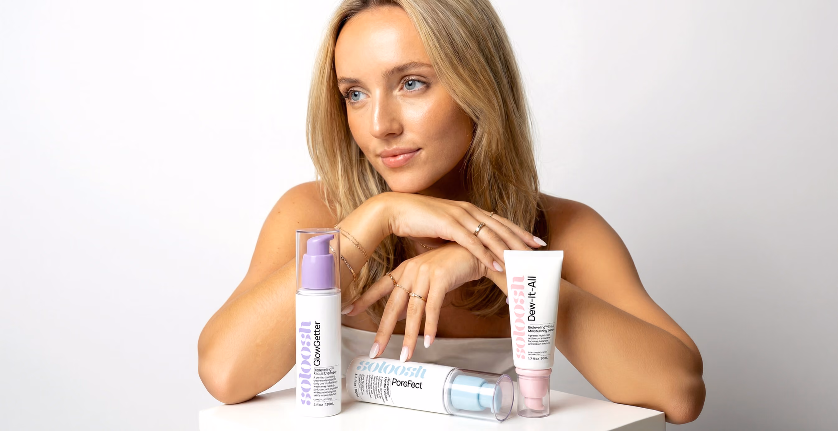
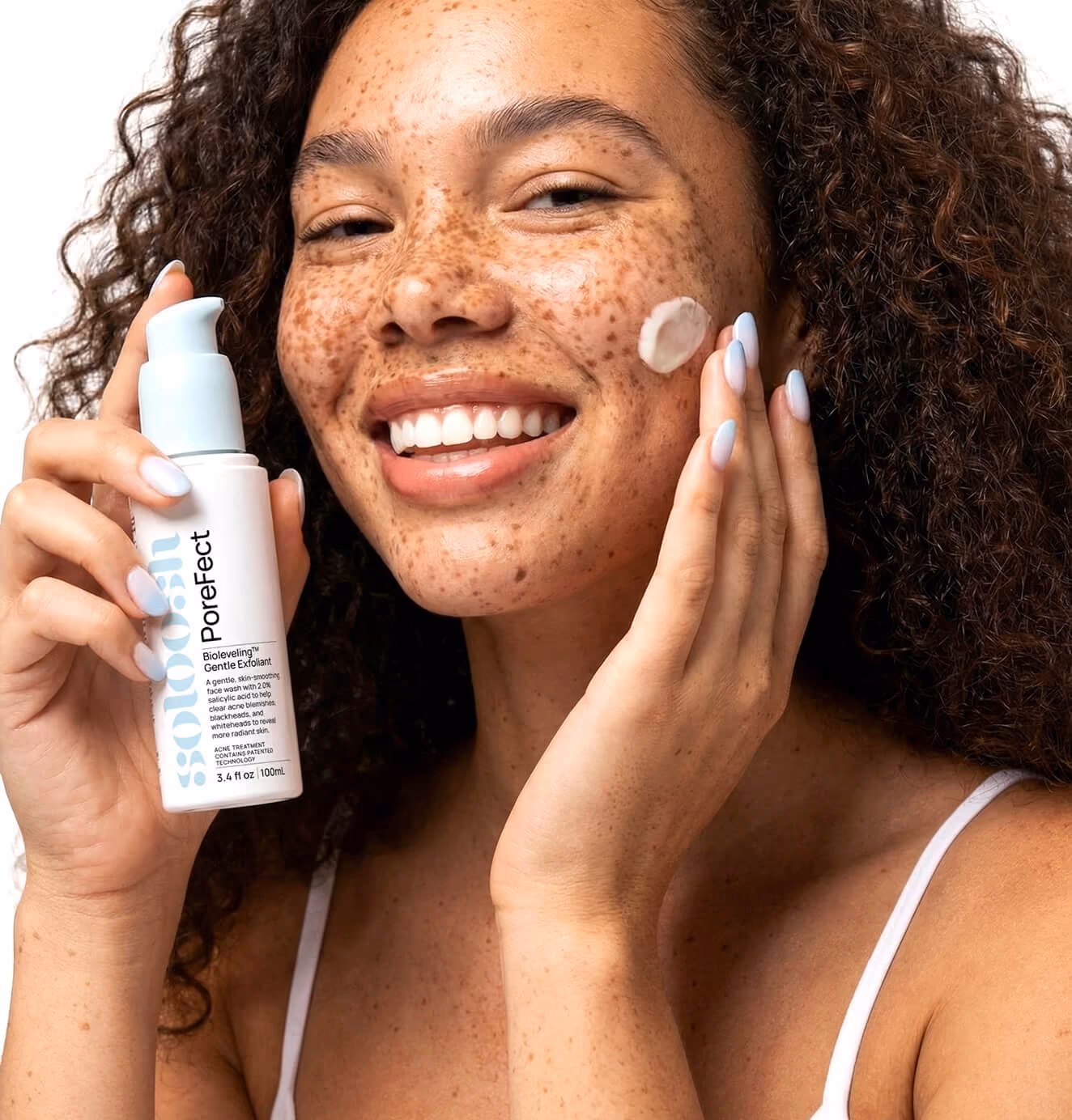
The visual identity was built to do one thing: make acne care feel like something you choose, not something you're ashamed to buy.
The entire category leans on visual anxiety. Stark clinical backgrounds, before-and-after shame, packaging that looks like it belongs in a medicine cabinet rather than on a shelfie. Every design decision we made was a deliberate counter to that pattern, engineered to signal calm, confidence, and self-expression in a space that has historically profited from the opposite. We wanted someone to see Soloosh in a feed and feel something different than what the acne aisle has trained them to feel. Not "I have a problem," but "this brand gets me."
The identity also had to function as a social-first system. Gen Z doesn't encounter brands on shelves first, they encounter them in stories, screenshots, and group chats. So we designed every element to be natively shareable, from a lettermark that reads clean at 16 pixels to a sticker kit and pattern library that give the brand personality and texture across platforms without ever feeling like an ad.
03. Brand Application
Every touchpoint was built to do the same thing: make the science disappear into the experience so the consumer absorbs the credibility without ever feeling like they're being educated at.
Packaging was designed to answer the two questions Gen Z asks fastest: what does this do for me, and why should I believe you. Each product in the three-step system leads with benefit-first callouts and carries the Bioleveling technology badge, so the consumer understands the value proposition and the credibility behind it before they ever flip the box over. The system format was intentional too, because a clear 1-2-3 routine removes the decision fatigue that keeps this audience cycling through products instead of committing to one.
The website was structured around a single conversion insight: this consumer doesn't need to be sold, we need to earn their trust. The homepage opens on the problem, moves into the science, and walks users through the system in a shoppable sequence that feels intuitive rather than transactional. A dedicated science page gives the skeptics a place to go deep on Bioleveling without cluttering the purchase path, and product pages lead with "Why you'll love it" before getting into formulation details. The depth is there for the consumer who wants it, and the clarity is there for the one who just wants to buy.
The result is a brand ecosystem where every piece reinforces the same idea from a different angle: skincare should work with your skin's intelligence, not override it. Credible enough for a dermatologist, cool enough for a group chat.
The brand is live. Go see it in the wild.

We’d love to partner with you and your team.
We partner with the world’s most ambitious companies—at every stage of growth. By understanding your unique challenges and opportunities, we design tailored solutions to move your business forward. Let’s talk about what’s next.