The Brand Equity Preservation Framework

04/07/2026

Branding

Learn how to protect brand equity during a rebrand with a proven framework that preserves recognition, reduces risk, and ensures your brand evolves without losing customer trust.

Abstract composition of intersecting red and blue shapes forming a central sphere, symbolizing balance and preservation of brand equity during change.

Rebranding isn’t just about what you change—it’s about what you keep. Every brand accumulates layers of recognition and trust over time, and when those signals are disrupted too quickly or without intention, the impact shows up immediately in customer behavior. The most successful rebrands don’t erase the past—they manage it carefully, preserving familiarity while introducing evolution in a way that feels both natural and credible.

The Brand Equity Preservation Framework

Quincy Samycia
Play IconPause Icon
0:00
0:00
https://cdn.prod.website-files.com/673ec61d219571e72b3eba03/69d3e93d4345ea3bca8f2e8e_365_The%20Brand%20Equity%20Preservation%20Framework.mp3

The Brand Equity Preservation Framework

Small house at the end of a winding path under contrasting red and blue lighting, representing foundational brand identity and direction.
Sphere balanced between two opposing curved surfaces, symbolizing tension between change and consistency in brand evolution.
No items found.

How to Protect Brand Equity During a Rebrand (Without Losing Customers)

Rebranding doesn’t fail because companies change their logo.

It fails because they unknowingly remove recognition, familiarity, and trust.

If you want to protect brand equity during a rebrand, you need more than a rollout plan. You need a structured way to identify what carries trust—and what would be dangerous to disrupt.

This is the Brand Equity Preservation Framework: a strategic approach to reducing brand equity risk while still allowing your company to evolve.

If you’re in the early stages of evaluating a rebrand, start with the broader strategic context in our full business rebranding strategy guide. This article focuses specifically on one of the most overlooked parts of rebranding: equity protection.

What Is Brand Equity (Really)?

Brand equity is accumulated trust and recognition over time.

It lives in:

Brand equity is not just “awareness.”

It’s the reason customers:

  • Choose you faster
  • Pay premium prices
  • Refer you
  • Feel confident purchasing again

When companies rebrand without understanding where equity lives, they introduce unnecessary risk.

Why Brand Equity Is at Risk During a Rebrand

Every brand contains recognition cues—some visible, some subtle.

When you remove or alter them:

  • Customers hesitate
  • Familiarity drops
  • Trust temporarily weakens
  • Sales friction increases

This is not because change is inherently bad.

It’s because familiarity is psychologically powerful.

Let’s break this down.

The Psychology of Familiarity (Why Recognition Matters)

Human beings prefer what they recognize.

This is known as the mere exposure effect—a psychological phenomenon where repeated exposure increases preference and trust.

In branding, this means:

  • Recognizable visuals feel safer.
  • Familiar names reduce purchase anxiety.
  • Consistent positioning increases confidence.

When a rebrand disrupts too many recognition signals at once, customers experience subtle uncertainty—even if they can’t articulate it.

That uncertainty shows up as:

  • Longer decision cycles
  • Lower conversion rates
  • Reduced engagement
  • Skepticism

Protecting brand equity during a rebrand means managing familiarity—not eliminating it.

The Brand Equity Preservation Framework

Figure standing on geometric platforms between contrasting environments, representing decision-making during brand transformation.
Tree growing across split terrain with exposed roots, symbolizing deep brand foundations and long-term equity.
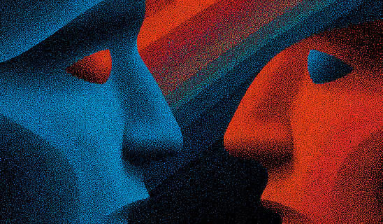
Two abstract faces facing each other in contrasting colors, representing alignment between brand identity and audience perception.
Two figures walking along a winding path through contrasting landscapes, representing guided brand transition and continuity.

1️⃣ Equity Asset Identification

Before changing anything, identify where equity actually lives.

Most companies assume equity lives in the logo.

Often, it doesn’t.

Common Equity Assets

  • Brand name
  • Signature color
  • Visual symbol
  • Founder identity
  • Tagline or phrasing
  • Product naming system
  • Customer success stories
  • Service methodology
  • Tone of voice
  • Category positioning

The question is not:
“What do we want to keep?”

It’s:
“What do customers already associate with trust?”

How to Identify Equity Assets

Use:

  • Customer interviews
  • Survey prompts (“When you think of us, what comes to mind first?”)
  • Review mining
  • Social mentions
  • Sales feedback
  • Recognition testing

You’re looking for repeated patterns.

If customers consistently reference a particular visual, phrase, or concept—that’s an equity carrier.

2️⃣ Recognition Hierarchy Mapping

Not all assets carry equal weight.

Some are critical recognition anchors.
Others are replaceable.

Create a hierarchy:

Tier 1: Core Recognition Assets

High familiarity + high trust impact.

Examples:

  • Company name
  • Core color
  • Primary logo shape
  • Category association

These require extreme caution before altering.

Tier 2: Secondary Familiarity Assets

Moderate familiarity + moderate trust impact.

Examples:

  • Taglines
  • Typography
  • Supporting visuals
  • Secondary messaging themes

These can evolve more safely.

Tier 3: Flexible Expression Assets

Low familiarity + low risk.

Examples:

  • Layout structure
  • Icon styles
  • Supporting graphics
  • Visual polish

These are safest to change.

Why This Matters

Most failed rebrands alter multiple Tier 1 assets simultaneously.

Example:

  • Rename
  • New color
  • New logo
  • New messaging
  • New category framing

That’s not evolution.
That’s perception shock.

3️⃣ Define What NOT to Change

Before defining what will change, explicitly define what will not.

This creates guardrails.

Ask:

  • Which assets drive immediate recognition?
  • Which elements are tied to trust?
  • Which signals shorten our sales cycle?
  • Which associations must be preserved?

Sometimes protecting equity means:

  • Retaining your core color
  • Preserving a recognizable shape
  • Keeping your founder visible
  • Maintaining category clarity
  • Gradually phasing out older terminology

Strategic evolution protects familiarity.

Reactive reinvention destroys it.

4️⃣ Measure Recognition Risk Before Launch

If you're serious about rebranding without losing customers, measure risk before rollout.

Here’s how.

Recognition Risk Factors

Evaluate proposed changes across these dimensions:
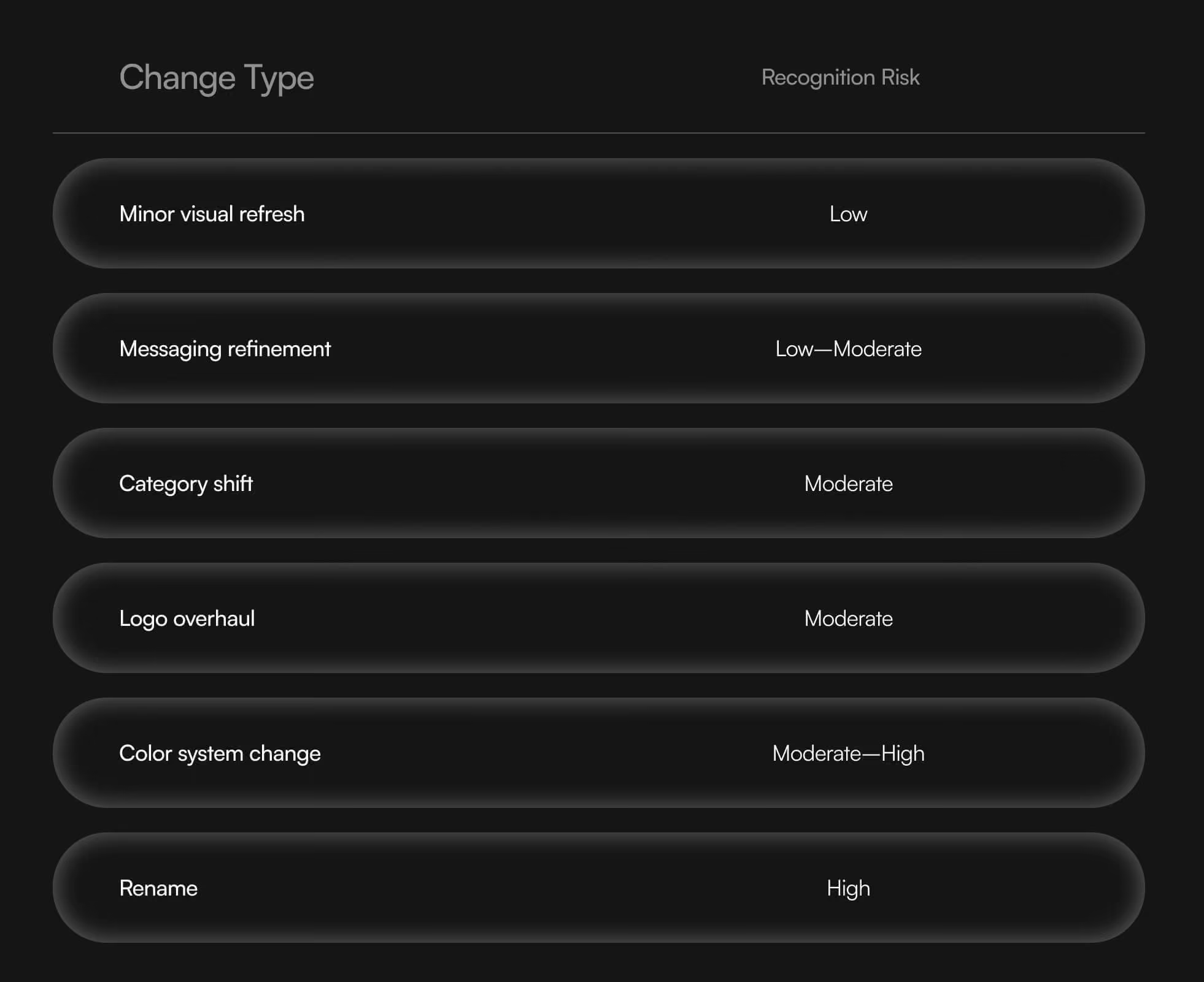
Then ask:

  • Are we changing multiple high-risk assets at once?
  • Is the benefit worth the recognition loss?
  • Have we validated perception through research?

The more Tier 1 assets you change simultaneously, the greater the brand equity risk.

5️⃣ Controlled Evolution Strategy

If transformation is required, familiarity can still be preserved through sequencing.

Options include:

  • Gradual logo evolution instead of radical replacement
  • Maintaining color while updating form
  • Retaining name while refining positioning
  • Dual-brand transition periods (for renames)
  • Reinforcing legacy messaging during rollout

Phased rollout reduces perception shock.

As discussed in our broader business rebranding strategy guide, structured rollout planning is critical when high-equity assets are involved.

Want to learn more about Rebrands, Brand Strategy and Brand Identity? Keep reading!

If you need help with your companies branding, contact us for a free custom quote.

How to Detect Early Brand Equity Damage

Single figure standing at the edge of contrasting red and blue environments, representing evaluation of brand positioning and risk.

After launch, monitor:

  • Direct traffic changes
  • Branded search volume
  • Conversion rate fluctuations
  • Customer inquiries about the change
  • Sales objections related to “Are you still the same company?”

Temporary dips can happen.
Sharp sustained drops may indicate overcorrection.

Real-World Brand Equity Risk Examples

Gap (2010 Logo Redesign)

  • Removed iconic blue box
  • Introduced generic redesign
  • No strategic repositioning
  • Reverted within days

Lesson: Don’t alter high-recognition assets without purpose.

Tropicana Packaging Redesign

  • Removed signature orange-with-straw visual
  • Sales dropped significantly
  • Quickly reverted

Lesson: Visual recognition cues drive purchase behavior.

Successful Example: Mastercard

  • Simplified identity
  • Retained core circles and color
  • Preserved recognition hierarchy

Lesson: Simplification works when equity anchors remain intact.

How This Connects to Rebrand Type

Person pulling a large crate through a structured space with strong lighting contrast, symbolizing the effort required to preserve and carry brand equity through change.

If you're choosing between an evolutionary or transformational rebrand, equity preservation becomes even more critical.

Evolutionary rebrands typically protect Tier 1 assets.

Transformational rebrands may change them—but require:

  • Research validation
  • Strategic justification
  • Strong rollout communication
  • Internal alignment

Choosing the wrong level of change increases brand equity risk unnecessarily.

A Simple Equity Protection Checklist

Before launching a rebrand:

  • We have identified Tier 1 recognition assets
  • We understand which elements customers associate with trust
  • We are not changing multiple high-risk assets simultaneously without reason
  • We have validated perception with customer research
  • We have a phased rollout plan if major changes are required

If you can’t check these boxes, pause.

Final Perspective: Evolution Is Safer Than Erasure

Rebranding should sharpen equity—not erase it.

The strongest rebrands feel intentional, not abrupt.

Customers should think:
“This makes sense.”
Not:
“Wait—who is this?”

Protecting brand equity during a rebrand requires structure, discipline, and understanding how recognition influences trust.

If you're planning a rebrand and want to evaluate risk before moving forward, revisit the full business rebranding strategy guide to ensure strategy leads execution—not aesthetics.

Because when familiarity disappears without explanation, trust follows.

And trust is harder to rebuild than a logo.

An image of the author Quincy Samyica

Quincy Samycia

As entrepreneurs, they’ve built and scaled their own ventures from zero to millions. They’ve been in the trenches, navigating the chaos of high-growth phases, making the hard calls, and learning firsthand what actually moves the needle. That’s what makes us different—we don’t just “consult,” we know what it takes because we’ve done it ourselves.

Want to learn more about brand platform?
If you need help with your companies brand strategy and identity, contact us for a free custom quote.

We do great work. And get great results.

DrTung’s
Breathed new life into a storied oral care brand with a smarter site and marketing for scalable growth.

+2.3x
Increase in revenue YoY

+126%
Increase in repurchase rate YoY

READ MORE
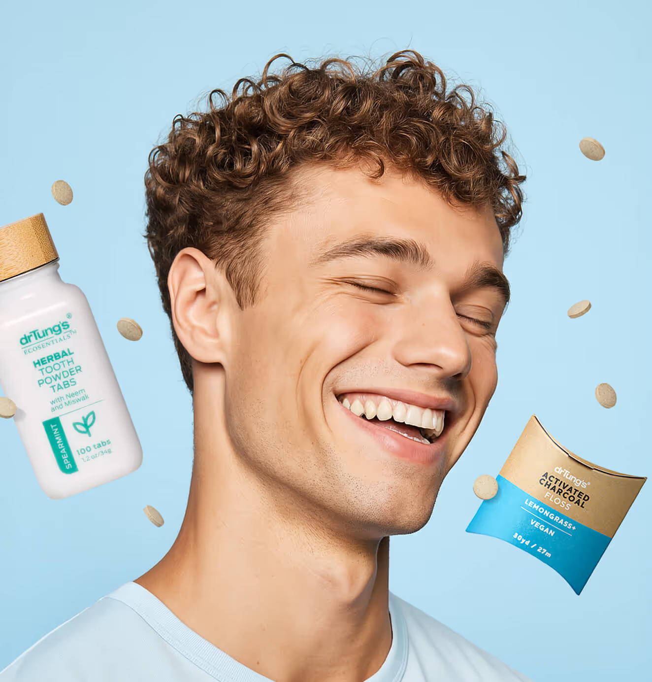
Smiling man with bright teeth on a light blue background, surrounded by floating DrTung’s herbal tooth powder tabs and packaging.
Smartphone on a textured blue surface displaying a DrTung’s ad with the text “Make the Switch” and an image of a woman holding herbal tooth powder tabs.
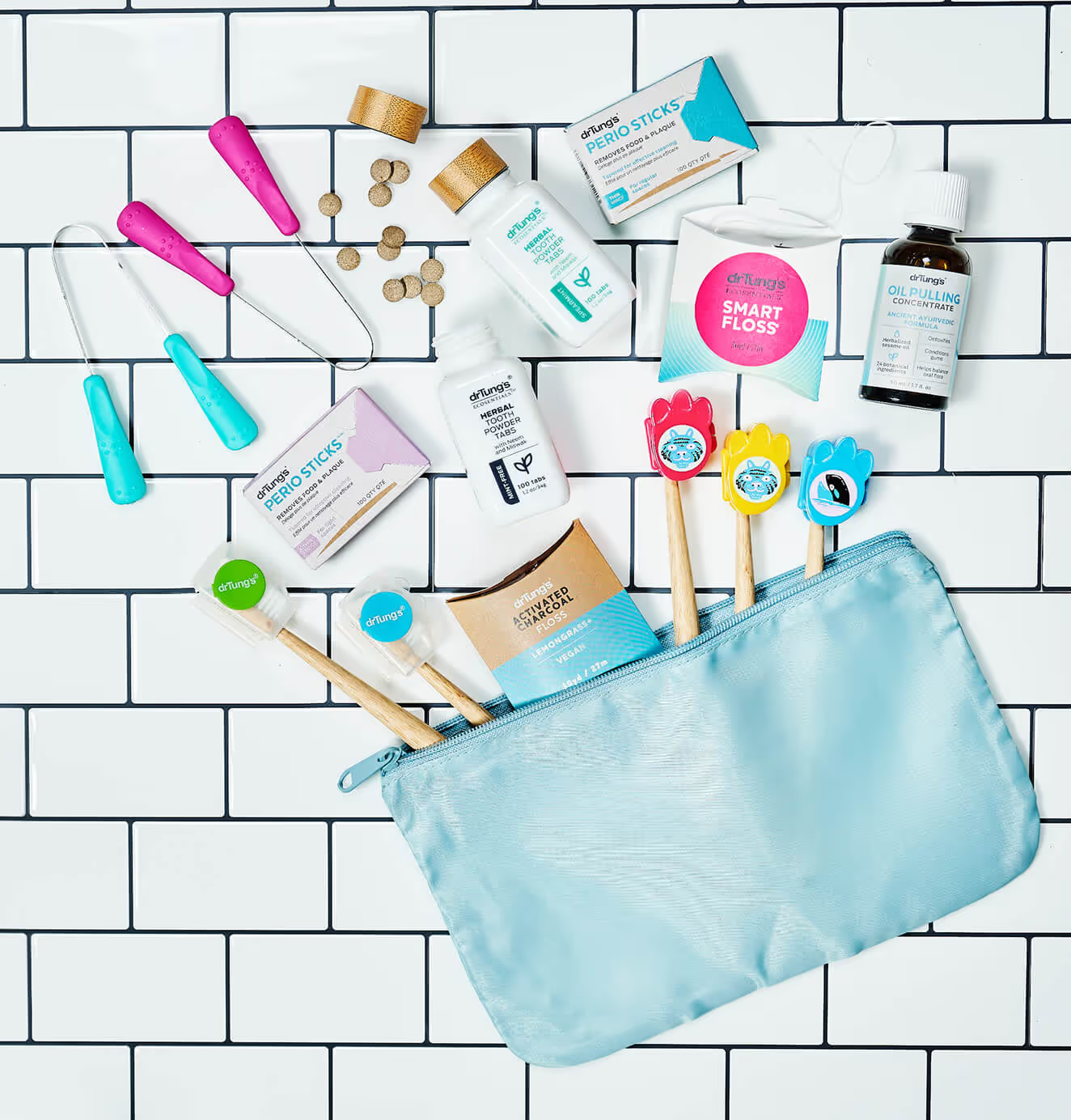
Flat lay of DrTung’s oral care products, including floss, tooth powder tabs, perio sticks, tongue cleaners, and toothbrushes, arranged with a blue pouch on white tile.
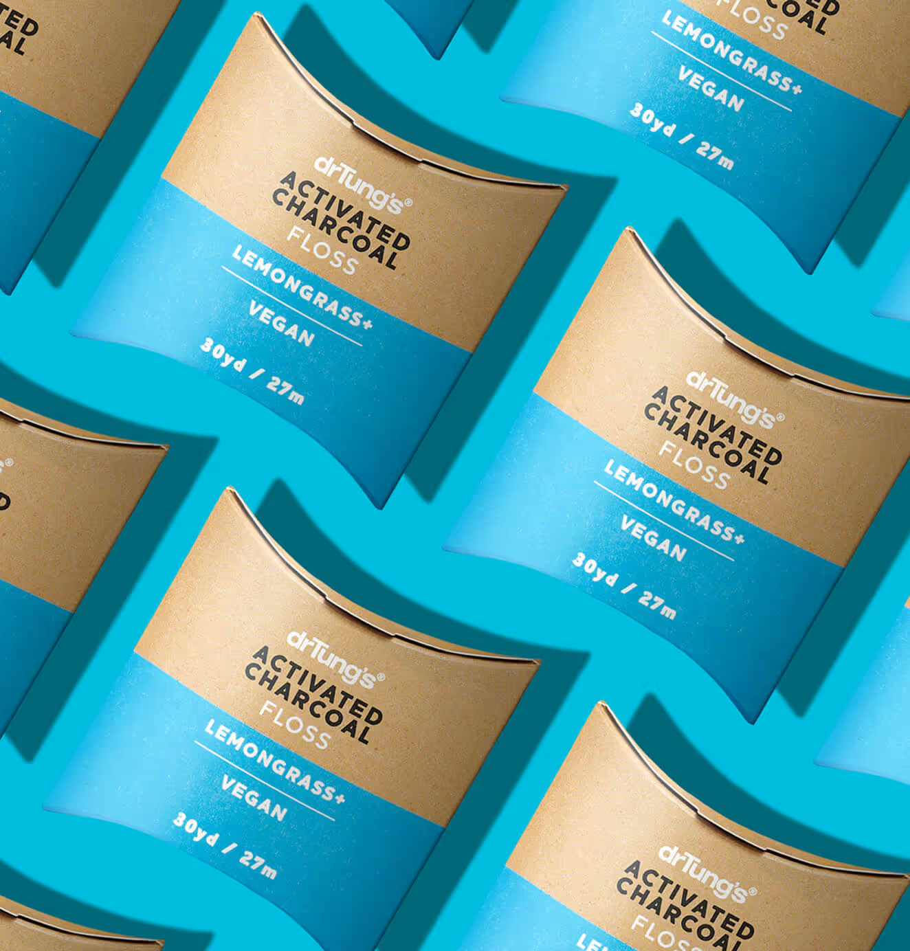
Pattern of DrTung’s Activated Charcoal Floss in brown and blue packaging, arranged diagonally on a bright blue background.
Smiling man with bright teeth on a light blue background, surrounded by floating DrTung’s herbal tooth powder tabs and packaging.
Smartphone on a textured blue surface displaying a DrTung’s ad with the text “Make the Switch” and an image of a woman holding herbal tooth powder tabs.
Flat lay of DrTung’s oral care products, including floss, tooth powder tabs, perio sticks, tongue cleaners, and toothbrushes, arranged with a blue pouch on white tile.
Pattern of DrTung’s Activated Charcoal Floss in brown and blue packaging, arranged diagonally on a bright blue background.
Mary Louise Cosmetics
Scaled a heritage-inspired clean beauty brand with modern performance marketing and farm-to-face storytelling.

+93%
Revenue growth in first 90 days

+144%
Increase in attributed revenue

READ MORE
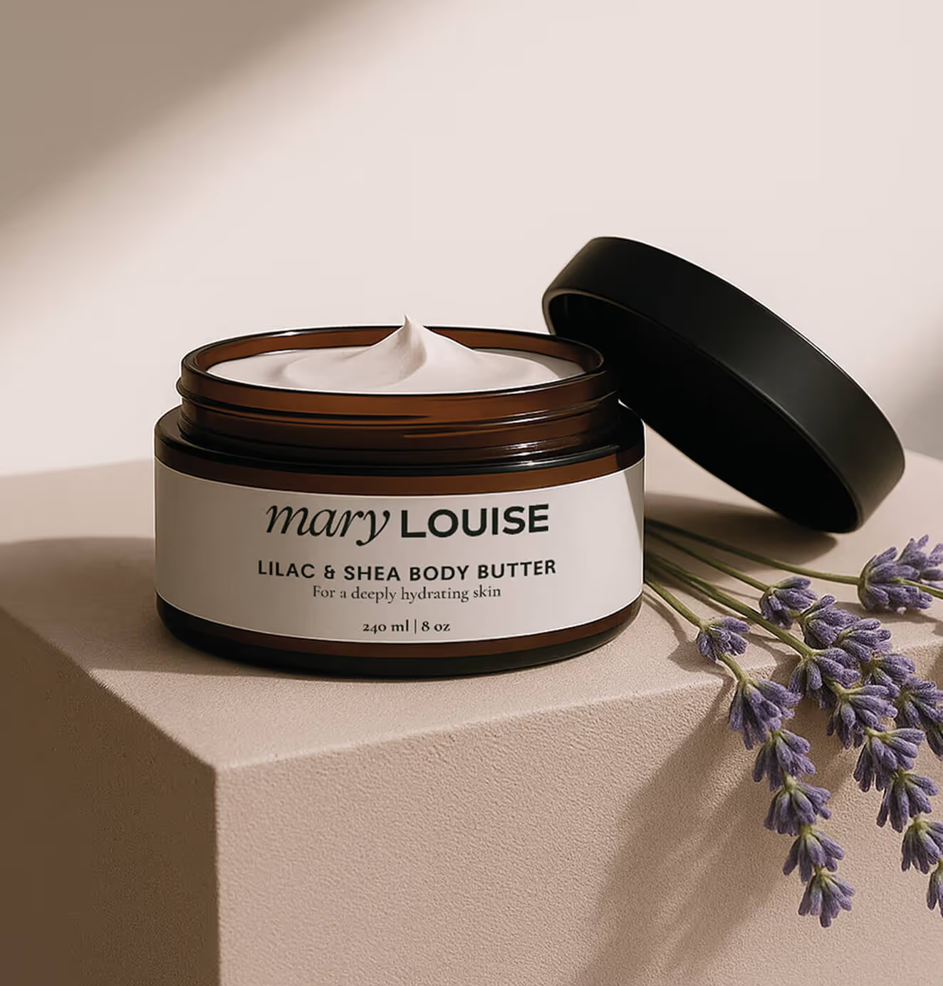
A jar of Mary Louise Lilac & Shea Body Butter with the lid open, showing creamy texture, placed on a beige surface beside sprigs of lavender.
A Mary Louise Miracle Serum bottle with a dropper cap, lying on a bed of small yellow flowers.
Mary Louise promotional print materials featuring the body butter, with images of skincare application and product photography on a textured beige background.
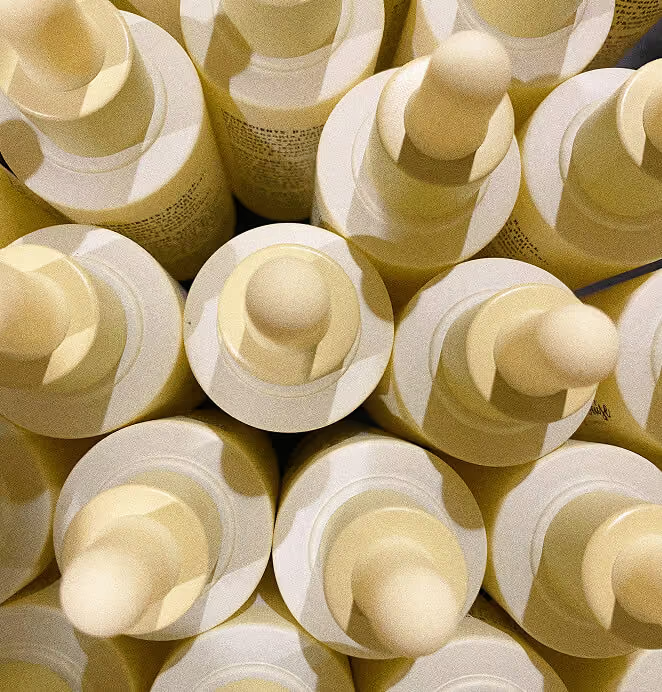
A close-up overhead view of multiple Mary Louise Miracle Serum bottles with yellow dropper caps arranged tightly together.
A jar of Mary Louise Lilac & Shea Body Butter with the lid open, showing creamy texture, placed on a beige surface beside sprigs of lavender.
A Mary Louise Miracle Serum bottle with a dropper cap, lying on a bed of small yellow flowers.
Mary Louise promotional print materials featuring the body butter, with images of skincare application and product photography on a textured beige background.
A close-up overhead view of multiple Mary Louise Miracle Serum bottles with yellow dropper caps arranged tightly together.
Eyecart
Made eye care feel modern, then marketed it like a DTC darling—with the results to match.

+91%
Increase in conversion rate

+46%
Increase in AOV

READ MORE
A smiling woman holds a magnifying lens with the word "eyecart" printed on it over her eye, creating a playful optical effect against a mint green background.
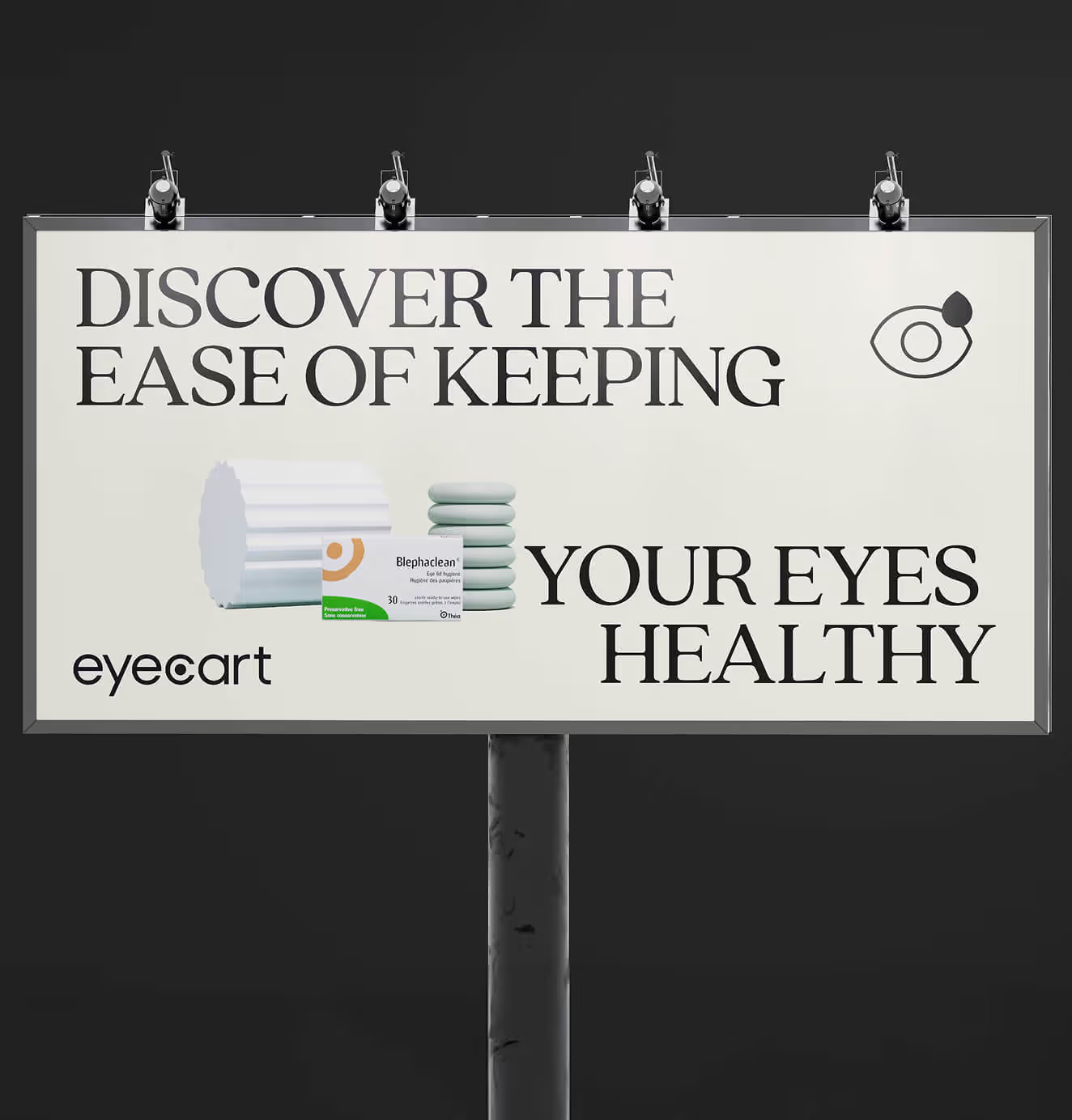
A billboard ad reads “Discover the ease of keeping your eyes healthy,” featuring Eyecart branding and Blephaclean eye care wipes packaging.
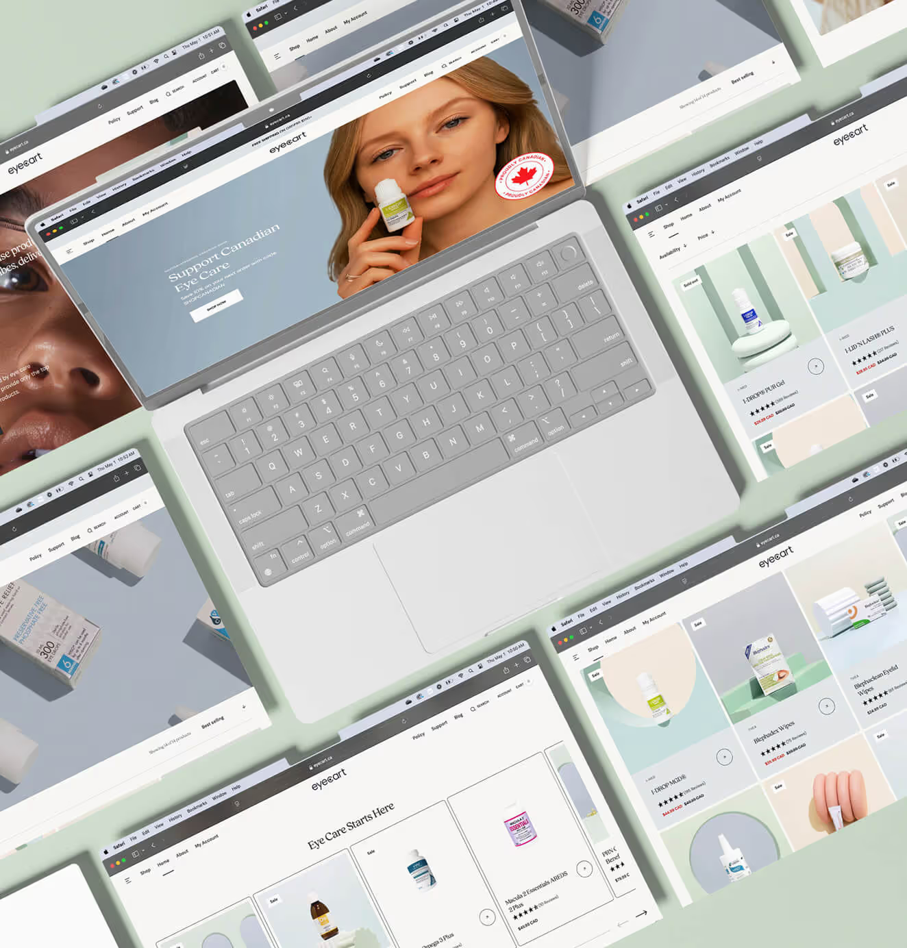
Multiple laptop screens display the Eyecart website, showcasing product pages and banners promoting eye care items.
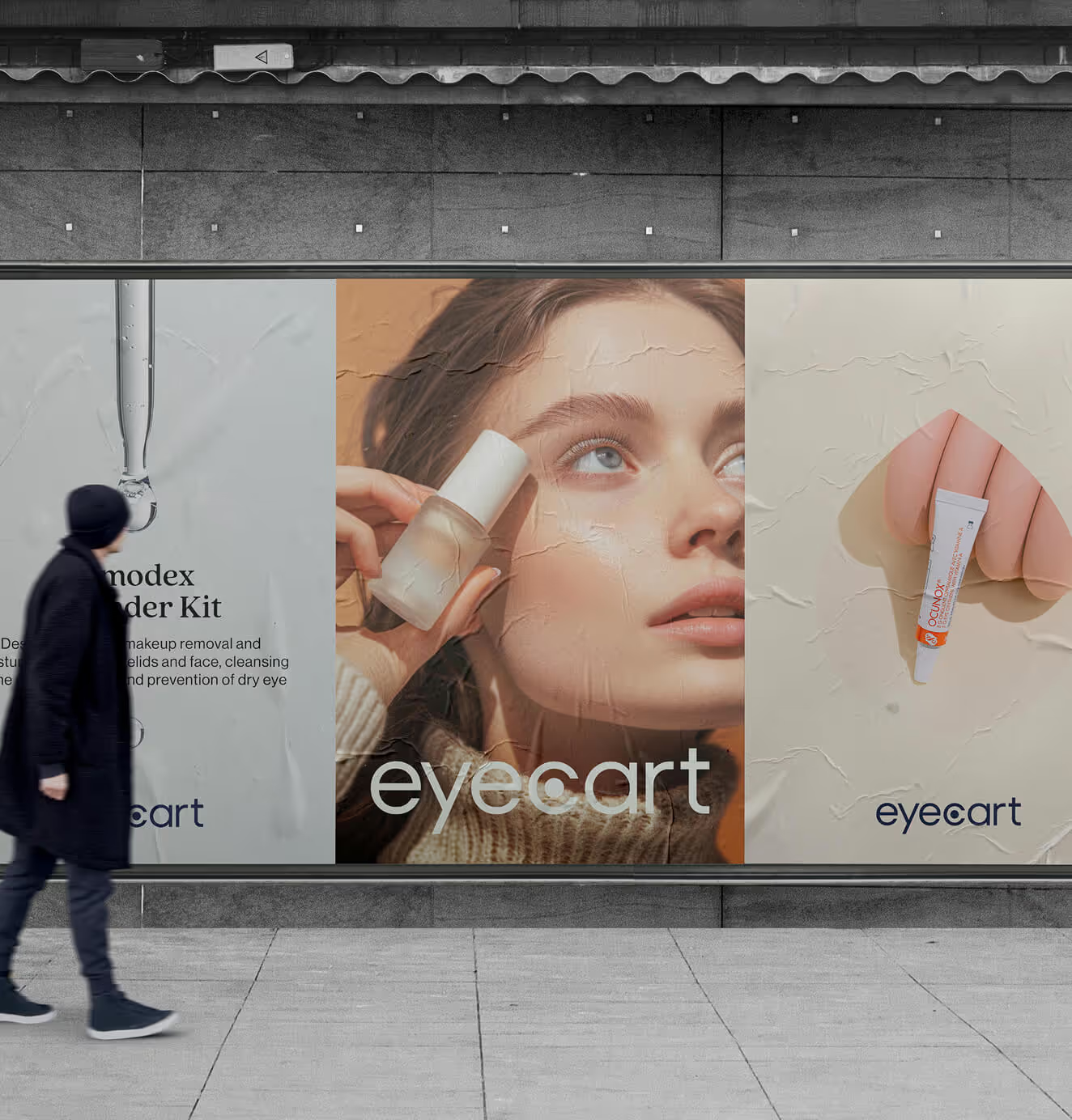
A person walks past large Eyecart posters on a city wall, featuring product photography of eye care serums and creams with clean, modern branding.
A smiling woman holds a magnifying lens with the word "eyecart" printed on it over her eye, creating a playful optical effect against a mint green background.
A billboard ad reads “Discover the ease of keeping your eyes healthy,” featuring Eyecart branding and Blephaclean eye care wipes packaging.
Multiple laptop screens display the Eyecart website, showcasing product pages and banners promoting eye care items.
A person walks past large Eyecart posters on a city wall, featuring product photography of eye care serums and creams with clean, modern branding.
Lucky Girl Rosé
We turned a zero-carb rosé into a lifestyle brand that makes every moment worth celebrating.

+200%
Increase in conversion rate

+688%
Increase in attributed revenue

READ MORE
A bottle of Lucky Girl rosé wine nestled among pink and white flowers in a rustic outdoor setting.
Lucky Girl rosé wine on a red-and-white checkered picnic blanket with cherries, strawberries, sunglasses, and a pink notebook titled The Lucky Club.
A wine glass filled with rosé on a gold tray surrounded by hands with red-painted nails, overlaid with the text “Pour yourself some luck.”
A bottle of Lucky Girl rosé wine with floral label design, dramatically lit against a soft pink background with a shadow cast.
A bottle of Lucky Girl rosé wine nestled among pink and white flowers in a rustic outdoor setting.
Lucky Girl rosé wine on a red-and-white checkered picnic blanket with cherries, strawberries, sunglasses, and a pink notebook titled The Lucky Club.
A wine glass filled with rosé on a gold tray surrounded by hands with red-painted nails, overlaid with the text “Pour yourself some luck.”
A bottle of Lucky Girl rosé wine with floral label design, dramatically lit against a soft pink background with a shadow cast.