Koots Canna
Brand Strategy
Creative Direction
Brand Identity
Logo Design
Cannabis
Consumer Brands
Background
The Challenge
In cannabis, the brand on the bag almost never grew the genetics inside it.
Most licensed producers buy or license their cultivars. They compete on packaging, price, and trend cycles, because the flower itself is borrowed. Strain names that read like signatures are usually inheritance, not invention. It is the only premium agricultural category in the world where most brands don’t actually own what they’re selling.
Koots Canna is the exception.
A family-owned, self-funded operation in Salmo, BC, Koots is one of the most genetics-obsessed cultivators on the continent. Every cultivar in the Koots library is bred in house. Nothing borrowed. Nothing licensed. The breeding program is the product, and proprietary genetics are the brand’s actual moat. While the rest of the category competes on marketing, Koots competes on what’s inside the bag.
Koots has spent years building the business through co-branding partnerships and white-label cultivation, supplying flower to other licensed brands that don’t grow their own. But the brand it had launched alongside that work was telling a different story than the operation behind it. The mark read like a legacy grower. The product line was operating at the leading edge of cannabis genetics. The two didn’t match.
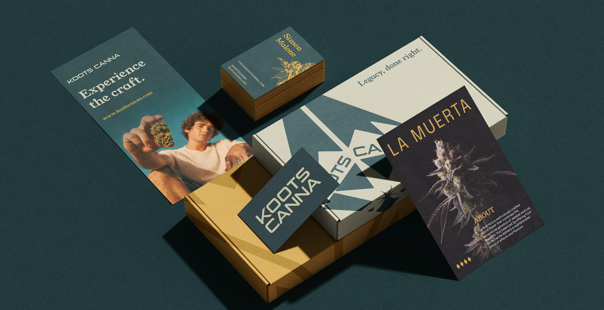
Our brief was to close that gap. Refresh the brand and logotype to signal what Koots actually is: a breeding-led cannabis innovator with generational cultivation knowledge and a premium product to back it. Keep the family, the craft, the BC roots. Add the rigour, precision, and genetic authority the original mark was missing.

01. The Opportunity
Cannabis brands typically position on one of three things. Lifestyle, where the brand is a vibe. Effects, where the brand is a function. Or strain hype, where the brand is a chase for novelty. Almost none of them position on genetics, because almost none of them own any.
That was the open lane. Koots wasn’t missing a story. It was missing a brand that told the right one.
In a category where most premium claims are aesthetic, real premium in cannabis lives upstream of the package. It lives in the breeding room. The seed library. The phenotype selection. The decision to spend years developing a cultivar before it ever reaches a consumer. Koots already did all of that. The brand needed to make that work visible without lecturing the consumer about it.
The refreshed brand had to operate on two levels at once. To a connoisseur, the visual system should signal genetic authority instantly. To a casual buyer, it should signal trust, quality, and consistency without requiring any technical knowledge.



02. Our Approach
We aligned on a mission the entire system could be built from.
Produce the most consistent, most genetically distinctive cannabis on the legal market by treating cultivation as an ongoing breeding program rather than a production line. Build a brand worthy of that work.
From that mission, four design goals.
Consistency you can trust.
Every product feels like part of the same library. Every new release feels reassuring, not risky.
Quality over noise.
Premium signalled through restraint, not hype. Cannabis is finally old enough to stop shouting.
Freshness and flavour first.
Standards Koots grows by, limited scale, direct packaging, controlled distribution, made legible at the shelf without ever being explained.
Confidence in new offerings.
The brand gives the consumer permission to try a new cultivar without hesitation, because every previous one has delivered.
Those goals translated into four design solutions. Build trust through consistency. Lead with science and craft. Signal premium through restraint. Make legacy feel actively maintained rather than nostalgically preserved.
Two commercial realities shaped every choice. The continuing co-branded and white-label work, where Koots appears as a credited cultivator on another brand’s package. And the refreshed direct-to-consumer brand, holding its own at retail. The identity had to flex between credit line and hero without losing voice in either context.
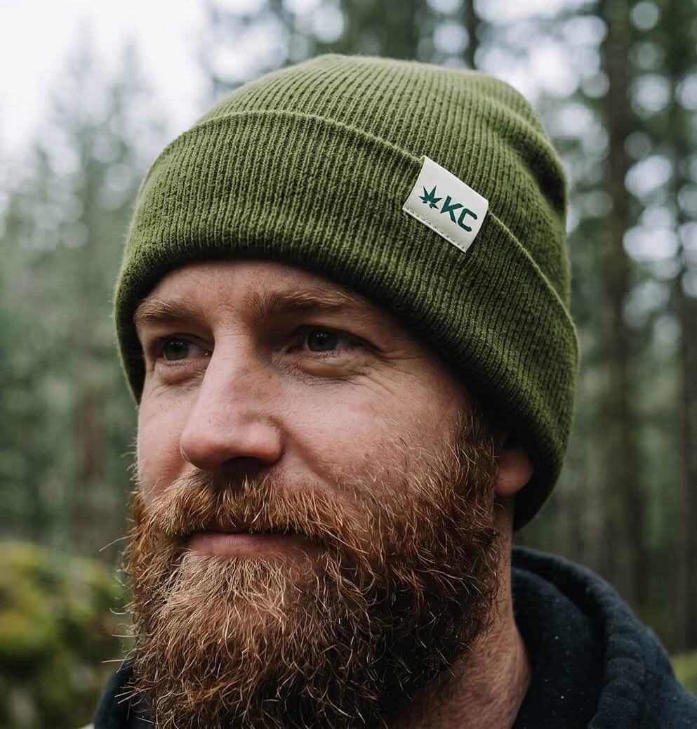

03. The Identity: Rooted Legacy
Rooted Legacy is the concept the rebrand was built from. It captures both halves of the Koots truth. Generational cultivation knowledge. And an active, modern operation pushing the leading edge of cannabis genetics.
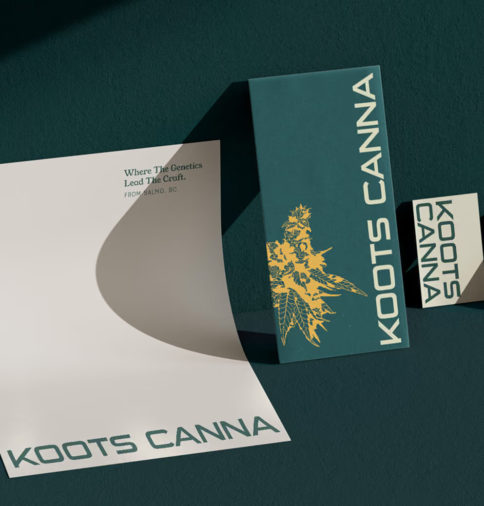
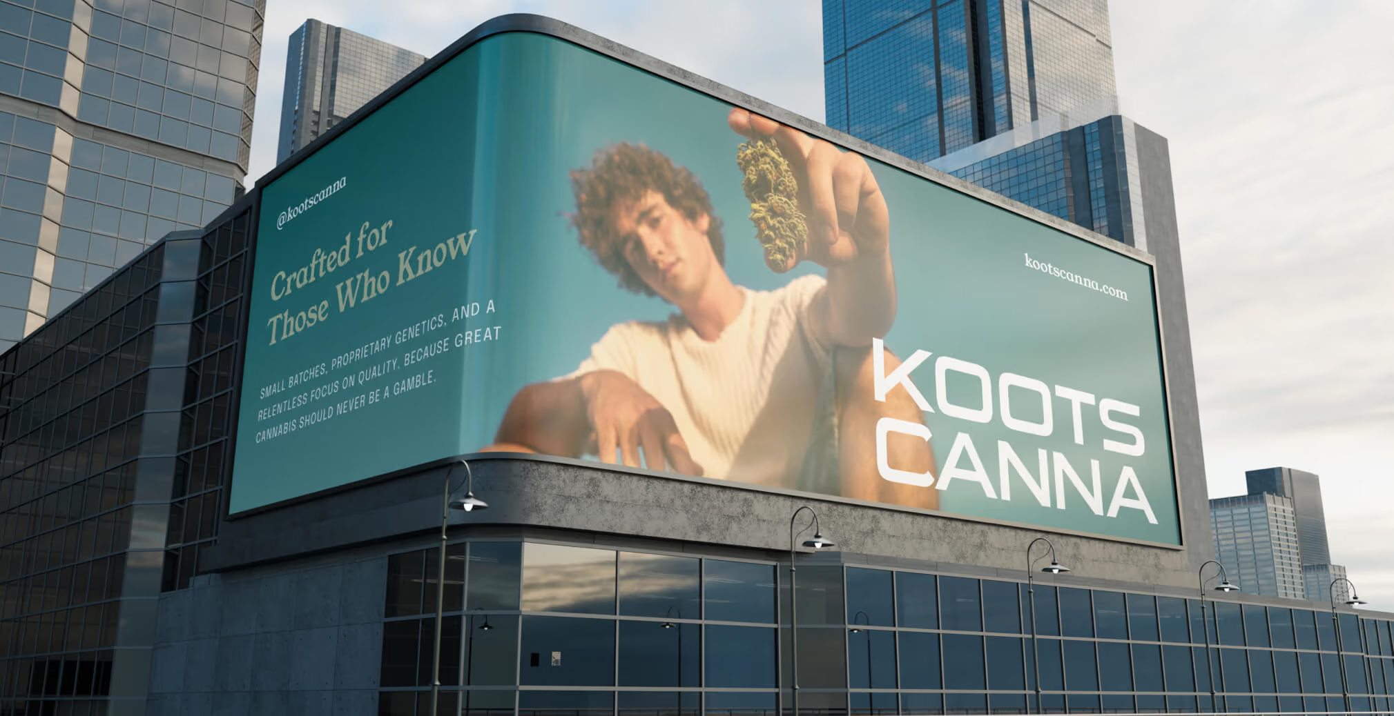
The logotype was refreshed for a more contemporary, engineered feel. Wider letterforms, controlled angles, sharper geometry. Built to read with authority at billboard scale and clarity at thumbnail. The original mark’s heritage equity stayed intact. What changed is the precision around it, the discipline of the construction, and the way it now signals an innovator rather than only an inheritor.
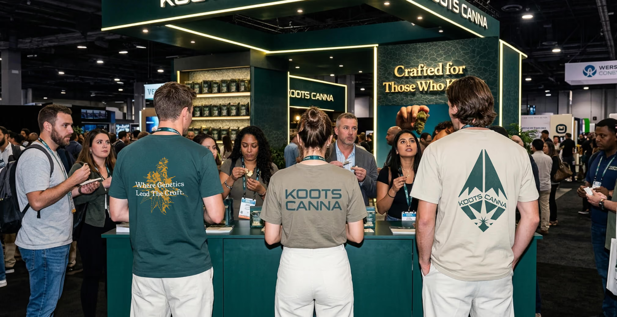
A refreshed secondary mark, drawn from the silhouette of the Kootenay mountains, and a wax-seal lockup give Koots two additional registers. The lettermark for confident graphic use. The seal for co-branded and white-label applications, where Koots needs to read as a credible cultivator credit on another brand’s package.
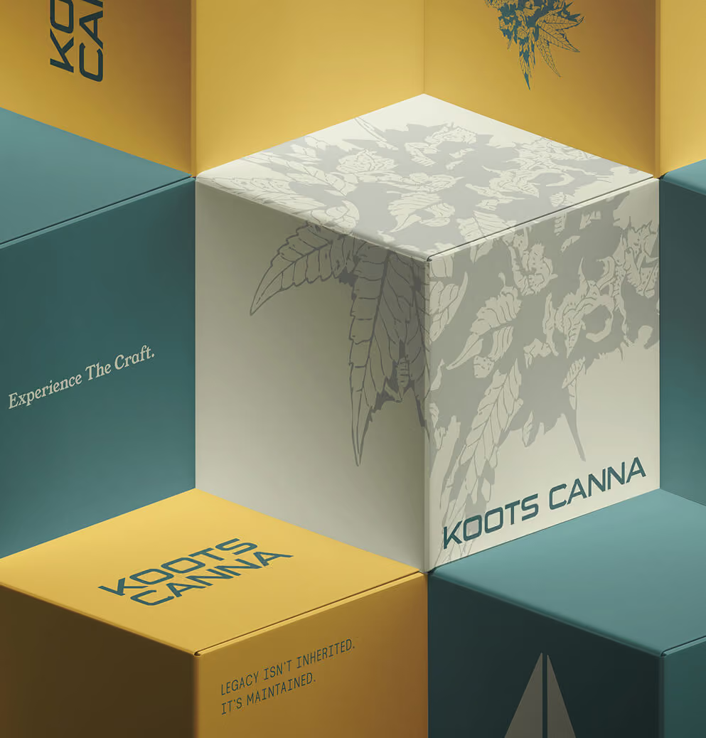
A scientific botanical illustration system runs through the brand. Cannabis flowers rendered with the precision of a classic botany text. Not decoration. Visual proof that genetics are the work, not the marketing.
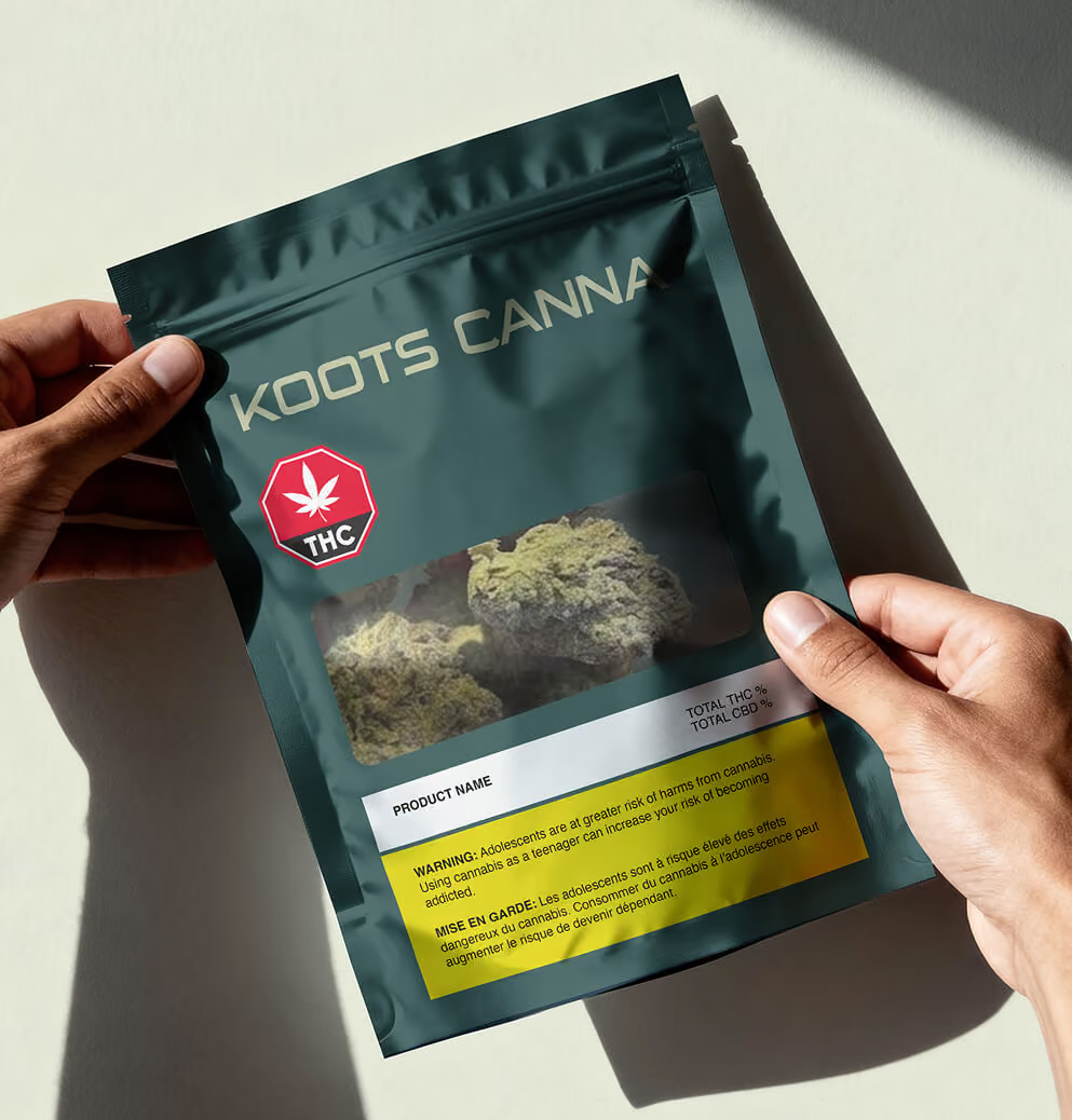
The palette is restrained on purpose. Deep forest greens, stone greys, muted sage, and a yellow gold accent reserved for emphasis. The colours of the place the cannabis actually comes from. No tropes. No neon. No leaf logos shouting from the package.
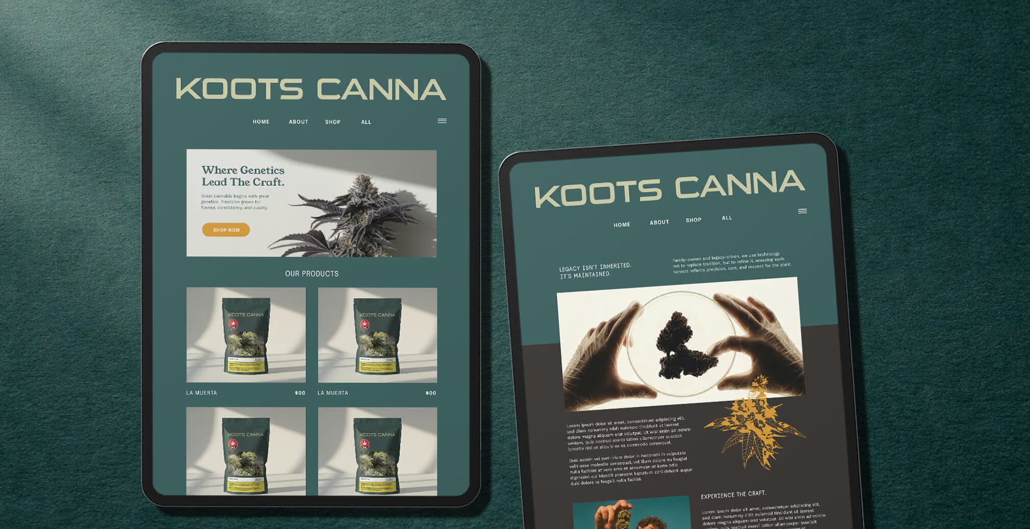
Typography pairs Young Serif, a high-contrast workhorse that carries the heritage weight, with Epilogue Variable for clarity in modern environments. The system reads grown up without reading old.
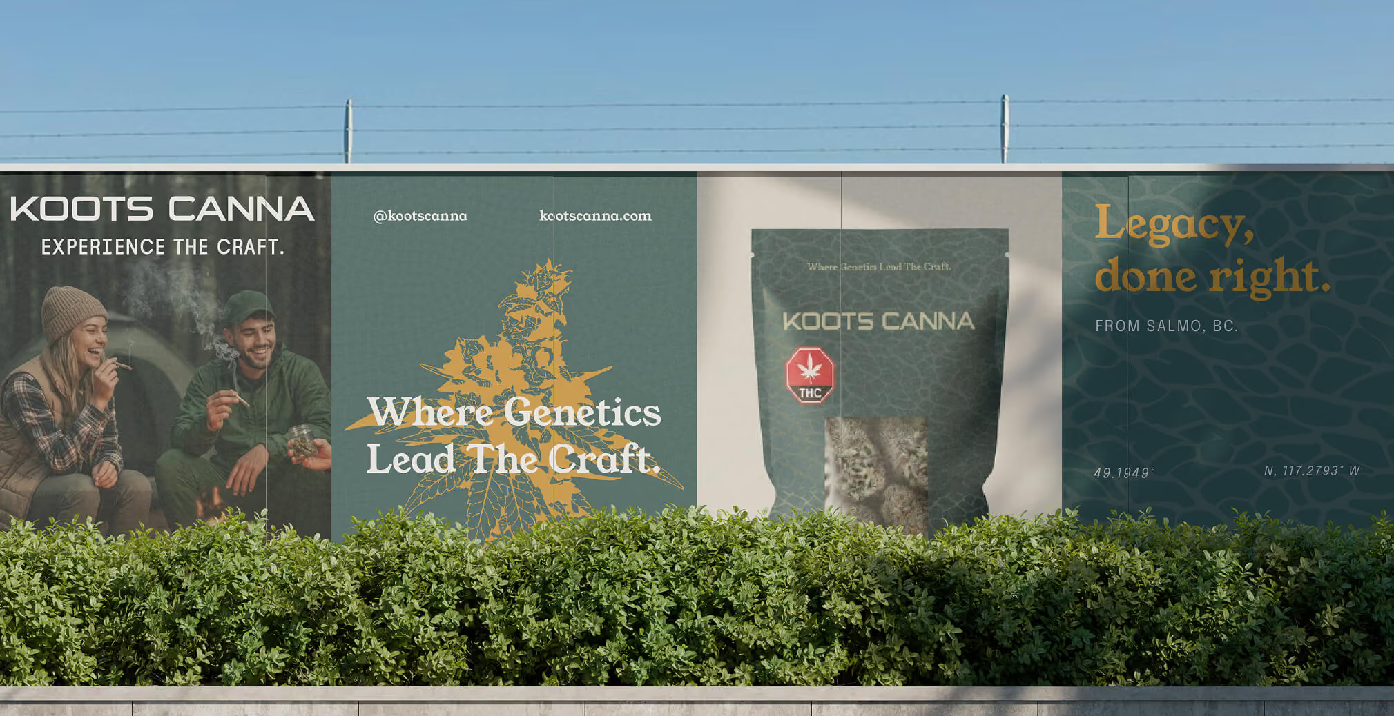
Photography is outdoor, lived in, and shot with the discipline of editorial product work. Forest light, mountain air, hands on flower. Lifestyle that doesn’t feel staged. Product captured like specimens, not like party props.
Across packaging, retail display, social, and web, the refreshed system holds. The brand now carries the same authority the operation has had all along.

04. Outcome
In legal cannabis, premium is still mostly a packaging decision. Koots makes it a cultivation one. The brand now signals what consumers will increasingly demand as the category matures. That the people selling the flower are also the people who grew it. That is the longer game. The brand doesn't just establish Koots in BC retail in 2026. It positions the company to define what credibility in cannabis looks like for the next decade. Not by claiming heritage. By demonstrating practice.
Legacy isn't inherited. It's maintained.

We’d love to partner with you and your team.
We partner with the world’s most ambitious companies—at every stage of growth. By understanding your unique challenges and opportunities, we design tailored solutions to move your business forward. Let’s talk about what’s next.